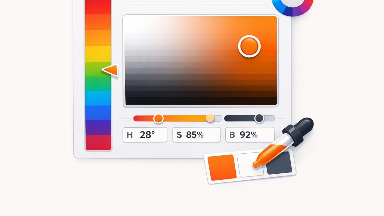
An HSB color picker (Hue, Saturation, Brightness) is one of the most practical ways to choose, adjust, and communicate color—especially when you’re building palettes for graphic design, UI, branding, or interior design. HSB is popular because it matches how many people naturally think about color: “make it more blue,” “less intense,” or “a bit brighter.”
This guide explains how HSB works, how it differs from RGB/HEX/HSL, and how to use an HSB color picker workflow to create consistent palettes you can reuse across tools and projects.
What HSB means (and why it’s useful)
HSB breaks a color into three editable parts:
- Hue (H): the “family” of the color on a 0–360° wheel (red → yellow → green → cyan → blue → magenta → red).
- Saturation (S): how vivid or muted the color is (0% = grayish/neutral, 100% = fully vivid).
- Brightness (B): how light the color appears (0% = black, 100% = the brightest version of that hue at that saturation).
In practice, HSB lets you do common design moves quickly:
- Keep the same hue while creating tints/shades by changing brightness.
- Make accents feel “premium” or “natural” by lowering saturation without changing the hue.
- Unify a palette by aligning hues while using varied saturation/brightness for hierarchy.
Design shortcut: If a palette feels messy, it’s often because saturation and brightness are inconsistent. HSB makes those inconsistencies easy to see and fix.
HSB vs HSL vs RGB/HEX (when to use what)
HSB, HSL, and RGB/HEX all describe the same colors in different coordinate systems. None is “more correct,” but each is better for certain tasks.
| Model | Best for | What you adjust | Common outputs |
|---|---|---|---|
| HSB/HSV | Fast visual tweaking, palette cleanup, creating tints/shades | Hue, vividness, perceived brightness | Often converted to HEX/RGB for delivery |
| HSL | Balancing “lightness” in UI systems, systematic color ramps | Hue, saturation, lightness (different from brightness) | CSS-friendly (hsl()) |
| RGB/HEX | Implementation and export across tools/dev | Red/Green/Blue channels | HEX (#RRGGBB), rgb() |
Rule of thumb: Use an HSB color picker to choose and refine colors, then store/share the final values as HEX (or RGB) for consistent handoff.
How an HSB color picker typically works
Most pickers map HSB into a two-dimensional field plus a slider:
- A Hue slider (0–360°) chooses the base color family.
- A 2D square often controls Saturation (left ↔ right) and Brightness (bottom ↔ top).
- Some interfaces swap axes or use separate sliders, but the concept is the same: one dimension for vividness, one for light/dark.
This layout matters because it encourages a clean workflow: pick a hue first, then decide how intense and how bright it should be in context.
A practical HSB color picker workflow (step-by-step)
1) Start with hue: choose the emotional “temperature”
Hue sets the basic mood: blues can feel calm and technical, reds energetic, greens natural, and so on. When you’re unsure, pick a hue that matches the project’s core intent (trust, warmth, elegance, playfulness).
- Brand/UI: choose 1–2 primary hues and keep them stable.
- Interiors: match a real-world reference (paint chip, fabric, wood tone), then adjust saturation/brightness to fit lighting.
2) Set saturation: decide “modern vs loud”
Saturation is where palettes often go wrong. Two colors with similar hue can look like they don’t belong if one is highly saturated and the other is muted.
- High saturation works for accents, calls-to-action, playful brands, and highlighting key UI states.
- Medium saturation is safer for primary elements that appear often.
- Low saturation is great for backgrounds, surfaces, and sophisticated/editorial looks.
3) Adjust brightness: build hierarchy and readability
Brightness controls contrast and hierarchy. In UI, it helps separate background, surface, and interactive elements. In print or interiors, it affects perceived weight and spaciousness.
Try this quick method:
- Pick your base color at a “comfortable” brightness.
- Create a darker variant by reducing brightness (for hover/pressed states or text on light backgrounds).
- Create a lighter variant by increasing brightness and often lowering saturation slightly (for backgrounds, subtle fills, or soft highlights).
4) Lock the palette with HEX (and note HSB for future edits)
HSB is excellent for editing, but many tools standardize on HEX/RGB. Export your final palette in HEX, and optionally keep the HSB values as “recipe notes” so you can recreate the same ramps later.
Common HSB mistakes (and how to fix them)
Mistake: raising brightness without lowering saturation
Very bright, highly saturated colors can look neon and overpowering. If you increase brightness, consider lowering saturation a bit to keep the color usable across larger areas.
Mistake: mixing muted and vivid colors without a plan
Instead of randomly mixing intensities, decide on a saturation “band” for each role:
- Neutrals/backgrounds: low saturation
- Primary UI elements: medium saturation
- Accents/alerts: higher saturation
Mistake: relying on hue differences alone for contrast
Contrast is heavily influenced by brightness (and perceived luminance). Two different hues can still be unreadable together if their brightness levels are similar. Use brightness to create separation, not only hue.
HSB for real-world color matching (photos, materials, and lighting)
When you’re extracting colors from photos—paint, textiles, packaging, scenery—HSB helps you correct what cameras often distort:
- Lighting shifts brightness: a color in shadow may need increased brightness to match the real object.
- Auto white balance shifts hue: you may need a small hue adjustment to neutralize warm/cool casts.
- Phone cameras oversaturate: lowering saturation can bring sampled colors closer to reality.
Workflow tip for photo-based palettes:
- Sample a few candidate pixels (not just one) from the same material.
- Average mentally by choosing a “middle” saturation/brightness (avoid specular highlights and deep shadows).
- Then refine with HSB: correct hue first, saturation second, brightness last.
HSB to HEX: a simple conversion you can reuse
Even if you pick colors in HSB, you’ll often need HEX for design systems, CSS, or handoff documents. Here’s a compact JavaScript function that converts HSB/HSV to RGB, and then to HEX.
// h: 0-360, s: 0-100, b: 0-100
function hsbToHex(h, s, b) {
  s /= 100; b /= 100;
  const k = (n) => (n + h / 60) % 6;
  const f = (n) => b * (1 - s * Math.max(0, Math.min(k(n), 4 - k(n), 1)));
  const r = Math.round(255 * f(5));
  const g = Math.round(255 * f(3));
  const bl = Math.round(255 * f(1));
  const toHex = (v) => v.toString(16).padStart(2, '0');
  return `#${toHex(r)}${toHex(g)}${toHex(bl)}`.toUpperCase();
}

// Example: a vivid blue
console.log(hsbToHex(210, 70, 85));
Note: Different tools may label the model as HSV instead of HSB, but in most design contexts they’re treated equivalently.
Building a small, usable palette using HSB
Here’s a straightforward palette recipe you can apply to UI, posters, or decor mood boards:
- Primary: pick a hue and set saturation/brightness for the “default” state.
- Primary dark: same hue, slightly higher saturation (optional), lower brightness for depth/pressed states.
- Primary light: same hue, lower saturation, higher brightness for backgrounds.
- Accent: choose a contrasting hue (complementary or split-complementary), keep brightness similar to primary for harmony.
- Neutral set: low saturation, multiple brightness steps for text/background/surfaces.
Quick checklist for an HSB-tuned palette
- Do my key colors share a consistent saturation “feel”?
- Do interactive elements stand out primarily via brightness contrast?
- Are background colors less saturated than foreground elements?
- Do I have at least 3 neutral brightness levels (background, surface, text)?
- Have I validated readability/contrast in the actual layout (not just in the picker)?
When HSB is the best choice (and when it isn’t)
HSB shines when you want intuitive editing: quick exploration, subtle refinements, and making a palette feel cohesive by aligning saturation/brightness.
HSB is less ideal when you need mathematically uniform ramps for accessibility or data visualization. In those cases, you may want to build ramps using perceptual color spaces (like OKLCH) and then convert outputs to HEX. Still, many designers start with an HSB color picker because it’s fast, then validate and adjust for contrast afterward.
Putting it all together
An HSB color picker is a practical “control panel” for color: pick a hue, decide how vivid it should be, then set brightness for hierarchy and readability. Use it to clean up palettes, correct photo-sampled colors, and create predictable variations (dark, light, muted) without losing the original character of the hue.
If you often build palettes from photos on iPhone or iPad and want to see HEX/RGB/HSL/HSB values instantly, a tool like Color Viewfinder can streamline sampling and exporting while keeping your palette edits consistent.
