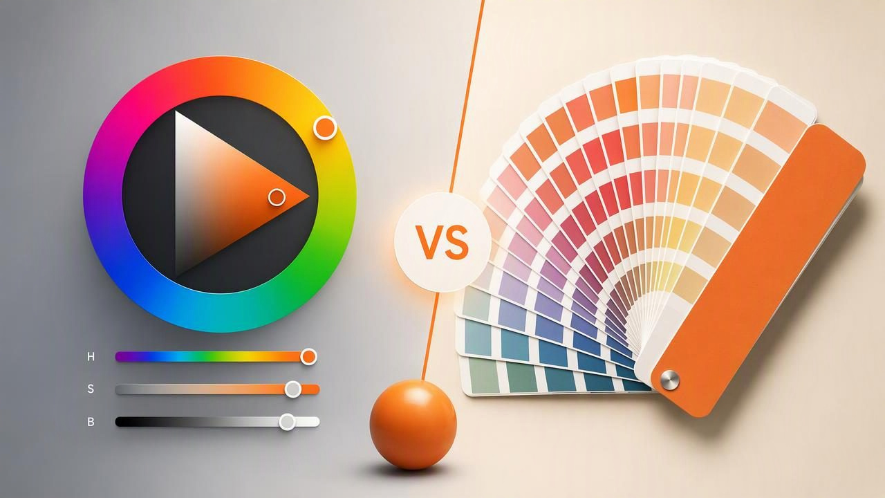
Choosing colors can feel straightforward until a digital color looks different after it is printed, viewed under new lighting, or placed beside a material sample. This is where the comparison between an HSB color picker and printed color swatches becomes important.
An HSB color picker helps you identify and adjust colors in a digital environment. Printed swatches provide a physical reference for inks, papers, finishes, fabrics, and other real-world materials. Both are useful, but they solve different problems. Understanding those differences can help graphic designers, interior designers, marketers, photographers, and DIY creatives make better color decisions.
This guide explains how HSB color pickers and printed swatches work, why they rarely match perfectly, and how to use each one in a practical color workflow.
What Is an HSB Color Picker?
HSB is a digital color model that describes a color through three controls:
- Hue: The base color family, such as red, blue, green, or yellow. Hue is commonly shown as a value from 0 to 360 degrees.
- Saturation: The intensity or purity of the color. A low saturation creates a softer, grayer appearance, while high saturation creates a vivid color.
- Brightness: How light or dark the color appears on a screen.
An HSB color picker lets you move through these dimensions visually. For example, you can begin with a warm orange hue, lower its saturation to create a muted terracotta tone, then reduce brightness for a deeper accent color.
Digital design tools may also display the same selected color as HEX, RGB, and HSL values. For a website, an HSB-picked color could be translated into a HEX value such as #C96F4A. That code can then be copied into CSS, a design system, or a graphics application.
What Are Printed Color Swatches?
Printed color swatches are physical samples that show how a color appears when reproduced with a particular ink, printing process, paper stock, coating, or production system. They may be part of a commercial color book, a printer proof, a paint card, a packaging proof, or a custom sample sheet.
Unlike a screen color, a printed swatch is affected by physical conditions. The same ink formula can look different on coated paper, uncoated paper, recycled stock, matte vinyl, glossy packaging, cotton fabric, or textured wallpaper. Lighting also changes what the eye sees: a swatch viewed near a window may appear different under warm household bulbs or cool retail lighting.
In short, an HSB color picker defines a digital color appearance, while a printed swatch shows a specific physical reproduction under real viewing conditions.
HSB Color Picker vs Printed Color Swatches at a Glance
| Factor | HSB Color Picker | Printed Color Swatches |
|---|---|---|
| Primary use | Creating and adjusting digital color values | Reviewing physical color reproduction |
| Best for | Web design, social graphics, UI, digital mood boards | Print, packaging, signage, materials, and production review |
| Color controls | Hue, saturation, brightness, plus RGB or HEX values | Ink, substrate, coating, finish, and viewing conditions |
| Ease of editing | Fast and flexible | Requires new samples or proofs for significant changes |
| Portability | Available on a phone, tablet, or computer | Physical book, card, proof, or material sample |
| Main limitation | Screen appearance is not a physical print guarantee | One swatch may not represent every printer or material |
Why Digital Colors and Printed Swatches Can Look Different
The largest difference comes from how screens and print create color. Screens use light. They combine red, green, and blue light to form colors, which is an additive process. Print uses ink or pigment on a surface. Ink absorbs and reflects light, which is a subtractive process.
A bright turquoise may look luminous on a high-quality phone display because the screen emits light directly. That same turquoise can lose intensity when reproduced with standard process inks on uncoated paper. Similarly, a dark blue that appears clean and rich on screen may print closer to charcoal if the ink, paper, and press settings are not suitable.
Other reasons for variation include:
- Screen calibration: Different phones, tablets, monitors, and brightness settings display color differently.
- Color spaces: A color designed in a wide-gamut display space may not reproduce the same way in a smaller print gamut.
- Paper and substrate: White, cream, textured, glossy, and matte surfaces change reflected color.
- Ink and printing method: Digital printers, offset presses, screen printing, and specialty inks can produce different results.
- Viewing light: Daylight, fluorescent lighting, LEDs, and warm lamps all influence perceived color.
Important: An HSB value is an excellent direction for a digital palette, but it is not a promise that a physical print, wall finish, or fabric will look identical.
A Practical Example: Building a Terracotta Brand Accent
Imagine a small coffee shop is refreshing its visual identity. The team likes the warm terracotta color in a photograph of a ceramic cup. A designer samples the image with an HSB color picker and finds a useful starting point:
Hue: 16°
Saturation: 63%
Brightness: 78%
HEX: #C76F4B
RGB: 199, 111, 75
For the website and social media templates, this is a practical digital color. The designer can use #C76F4B in buttons, icons, headings, and background accents. They can also create lighter and darker related colors by changing brightness and saturation rather than guessing randomly.
Next, the coffee shop wants printed loyalty cards. At this stage, the designer should not assume that the printed cards will match the phone screen exactly. Instead, the digital terracotta becomes a reference point for the printer. A printed proof or relevant swatch can reveal whether the result is too brown, too orange, too dull, or too dark on the selected card stock.
If the physical sample looks overly muted, the designer may need to revise the print specification, choose a different paper, or adjust the production color after discussing the options with the print provider. The original HSB color remains valuable as the source for the digital identity, while the final physical swatch guides the printed version.
When an HSB Color Picker Is the Better Choice
An HSB color picker is especially useful when your project will mainly be experienced on screens. It supports quick experimentation and makes color adjustment more intuitive than manually changing RGB numbers.
Use an HSB color picker when you need to:
- Extract color ideas from photographs, artwork, landscapes, or interiors.
- Create a website palette with editable HEX and RGB values.
- Develop coordinated colors for social posts, presentations, or digital ads.
- Explore lighter, darker, softer, or more vivid variants of an existing color.
- Build a visual mood board before selecting final materials.
- Share consistent digital values with developers or other designers.
HSB is particularly helpful for creative exploration because it separates color family from vividness and lightness. If a palette feels too energetic, lower saturation. If it feels too heavy, increase brightness. Those adjustments are easier to reason through than changing red, green, and blue channels independently.
When Printed Swatches Matter Most
Printed swatches become essential when a color decision affects a physical deliverable. They are not only for large commercial print jobs. A small brochure, restaurant menu, invitation, label, poster, packaging sample, or sign can benefit from reviewing a physical proof.
Prioritize printed swatches when:
- The final project will be commercially printed.
- You need to compare colors beside fabric, flooring, furniture, or finishes.
- Brand colors must be reviewed across packaging or merchandise.
- The project uses a specialty paper, coating, or unusual material.
- A color is critical to the design and small shifts would be noticeable.
For interior design, a printed color chip can be helpful for presenting a concept, but it should not be treated as a guaranteed match for paint, tile, upholstery, or timber. Material samples and manufacturer-approved specifications remain the more reliable reference for final purchasing decisions.
A Better Workflow: Use Both Tools Together
The strongest workflow is rarely HSB color picker or printed swatches. It is usually both, used at different stages.
- Start with visual inspiration. Choose a photo, object, material, or scene that captures the mood you want.
- Extract and refine digital colors. Use HSB controls to create a practical palette with clear HEX, RGB, HSL, or HSB values.
- Assign roles. Identify a primary color, secondary color, accent color, background, and readable text color.
- Design the digital version. Test the colors in layouts, interfaces, graphics, or mood boards.
- Request physical samples when needed. Review print proofs or material samples in appropriate lighting.
- Document the final choices separately. Keep digital codes for screens and production specifications for physical output.
This approach prevents a common mistake: trying to force one digital code to control every physical result. A brand can have a digital HEX reference and separate print or material specifications without being inconsistent.
How to Make More Reliable Color Decisions
Whether you are working digitally or physically, a few habits can reduce surprises:
- View important screen colors on more than one device.
- Keep screen brightness at a reasonable, consistent level while reviewing palettes.
- Check contrast before using an accent color for small text.
- Ask printers what file setup, color mode, proofing process, and substrates they recommend.
- Review physical samples under the lighting where they will actually be seen.
- Use descriptive notes such as warm red, muted olive, or soft charcoal alongside numeric values.
Final Takeaway
An HSB color picker is a fast, flexible tool for discovering, refining, and communicating digital colors. Printed swatches are physical references for evaluating how color behaves on real materials. Use HSB to build the palette and use swatches to validate important physical applications.
For photo-based palette exploration, Color Viewfinder's guide to choosing HEX colors from a photo explains how image sampling can provide a useful digital starting point before you move into print proofs or material samples.
