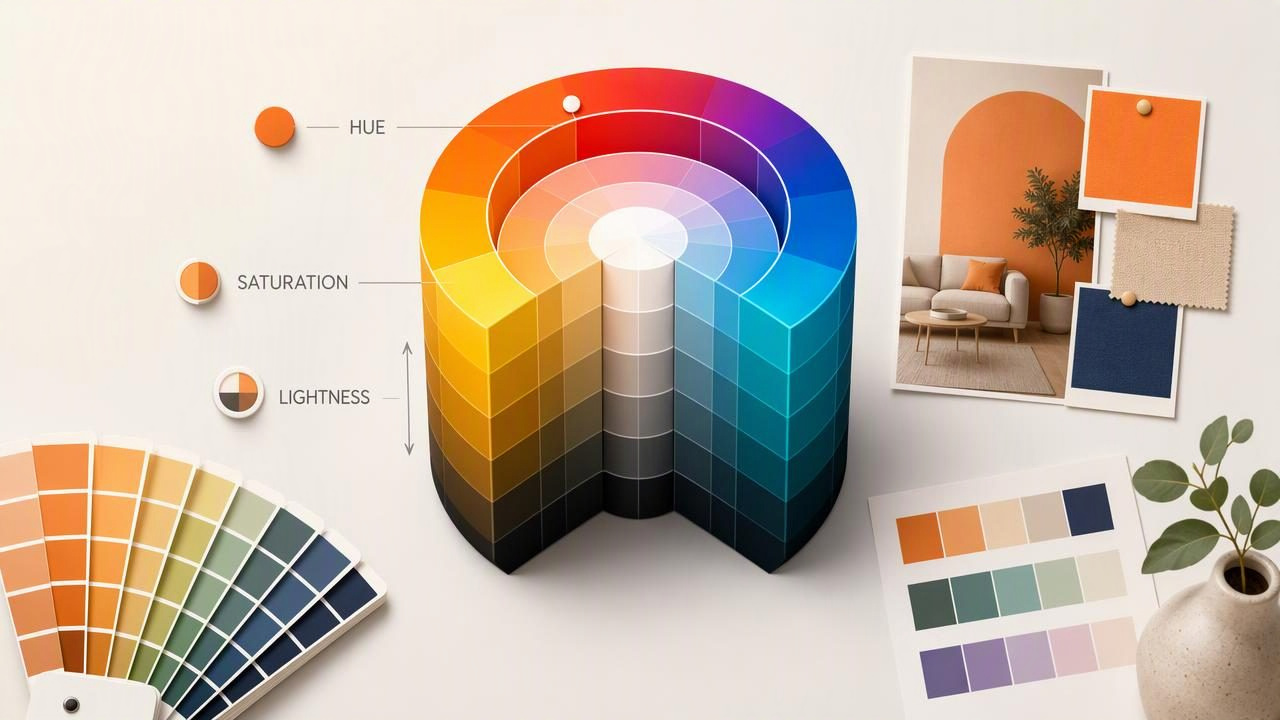
HSL color is one of the most useful ways to describe color for creative work because it separates a color into qualities people can understand visually: hue, saturation, and lightness. Rather than thinking only in red, green, and blue channel values, HSL helps designers answer practical questions such as: Should this blue be darker? Does this accent need less intensity? How can this palette feel softer without changing its overall color family?
For graphic design, web design, interior design planning, and other creative projects, HSL gives you a flexible framework for adjusting colors while preserving their relationship to one another. It is especially helpful when you are building color scales, refining a palette from a photograph, or creating interface states such as hover, active, and disabled buttons.
This guide explains what HSL color means, how to read HSL values, and how to use them in a practical palette-building workflow.
What Is HSL Color?
HSL is a color model that represents a color with three values:
- H — Hue: the basic color family, such as red, yellow, green, blue, or purple.
- S — Saturation: the strength or intensity of the hue.
- L — Lightness: how light or dark the color appears within the HSL model.
An HSL color is usually written like this:
hsl(210, 55%, 42%)In this example, 210 is the hue angle, 55% is saturation, and 42% is lightness. In CSS, modern syntax can also be written without commas:
hsl(210 55% 42%)Both versions describe the same idea: a moderately saturated, medium-dark blue.
How Hue, Saturation, and Lightness Work
Hue: the color family
Hue is measured in degrees around a color wheel from 0 to 360. Red begins at 0 degrees, green is near 120 degrees, and blue is near 240 degrees. Since the wheel wraps around, 0 and 360 both represent red.
| Approximate hue | Color family | Example HSL value |
|---|---|---|
| 0° | Red | hsl(0, 70%, 50%) |
| 30° | Orange | hsl(30, 80%, 52%) |
| 60° | Yellow | hsl(60, 75%, 50%) |
| 120° | Green | hsl(120, 50%, 42%) |
| 180° | Cyan | hsl(180, 60%, 45%) |
| 240° | Blue | hsl(240, 65%, 52%) |
| 300° | Magenta | hsl(300, 55%, 50%) |
Keeping the hue stable while changing saturation or lightness is an efficient way to create related colors. For example, a blue brand color can become a pale background, a readable text color, and a dark border without losing its visual identity.
Saturation: the intensity of the hue
Saturation runs from 0% to 100%. At 0% saturation, there is no visible hue; the result is a neutral gray whose brightness is determined by lightness. At 100% saturation, the hue is at its strongest within the HSL model.
High saturation attracts attention. It can work well for calls to action, small highlights, playful graphics, or energetic editorial layouts. However, using several highly saturated colors at once can make a layout feel noisy. Lower-saturation colors are often useful for large surfaces, backgrounds, and calm interior palette concepts.
Lightness: the color’s position between black and white
Lightness also runs from 0% to 100%. At 0%, a color becomes black. At 100%, it becomes white. Around 50%, the selected hue is generally at its most recognizable, although different hues do not appear equally bright at the same lightness value.
That last point matters. A yellow at 50% lightness often looks much brighter than a blue at 50% lightness. HSL is intuitive, but it is not a perfect measure of perceived brightness. Always review palette choices visually and test important text-background combinations for accessibility.
Why Designers Use HSL Instead of Only HEX or RGB
HEX and RGB are essential for digital production. They are precise formats for browsers, design files, and developer handoff. But values such as #356F91 or rgb(53, 111, 145) do not immediately tell you how to make the color warmer, more muted, or darker.
HSL describes those adjustments more directly. If you want a softer variation of hsl(210, 55%, 42%), you can reduce saturation:
/* Original blue */
hsl(210 55% 42%)

/* Softer blue-gray */
hsl(210 30% 42%)
If you want a lighter version while preserving the hue family, increase lightness:
/* Pale background variation */
hsl(210 35% 92%)
This makes HSL particularly useful for building systematic color palettes rather than choosing every shade independently.
A Practical HSL Color Palette Example
Imagine you are designing a calm, coastal website based on a reference photo containing muted blue water, warm sand, and dark driftwood. Instead of copying every visible pixel, identify the major visual roles in the composition:
- A dark anchor for headings and navigation
- A primary blue for links and interactive elements
- A pale blue for large backgrounds
- A warm neutral for secondary sections
- A restrained accent for small highlights
An illustrative HSL palette could look like this:
| Role | HSL color | Design use |
|---|---|---|
| Deep slate | hsl(205 28% 20%) | Headings, icons, dark text |
| Ocean blue | hsl(203 54% 42%) | Links, buttons, key UI elements |
| Sea mist | hsl(202 40% 92%) | Page backgrounds and cards |
| Warm sand | hsl(38 38% 87%) | Secondary background areas |
| Coral accent | hsl(12 62% 53%) | Badges, small highlights, alerts |
The important pattern is not the exact numbers. The blue colors share a similar hue range, but their saturation and lightness vary according to their jobs. The dark slate provides contrast, sea mist creates space, and coral adds controlled warmth without competing with the main blue.
How to Build a Useful HSL Color Scale
A color scale is a sequence of lighter and darker variations of a base color. It is more dependable than using one brand color everywhere because interface components need different contrast levels and visual emphasis.
- Choose a base hue. Start with a representative color, such as
hsl(210 55% 42%). - Create lighter surface colors. Reduce saturation slightly and raise lightness for backgrounds.
- Create darker functional colors. Lower lightness for text, borders, and active controls.
- Keep changes purposeful. Do not change hue, saturation, and lightness randomly at every step.
- Check contrast in context. A color that looks balanced in a swatch may be difficult to read when used as text.
:root {
  --blue-100: hsl(210 35% 94%);
  --blue-300: hsl(210 45% 75%);
  --blue-500: hsl(210 55% 42%);
  --blue-700: hsl(210 52% 30%);
  --blue-900: hsl(210 40% 18%);
}
This approach gives a project a clearer visual hierarchy. Use lighter values for large areas, middle values for interactive elements, and darker values for text or strong structural details.
HSL Color for Interior Design Planning
HSL can also help when organizing an interior design mood board from a room or inspiration photo. Hue helps you identify dominant families, such as olive green, terracotta, navy, or warm beige. Saturation helps distinguish quiet, earthy tones from vivid accents. Lightness helps plan balance between dark furniture, mid-tone walls, and light textiles.
For example, a room with deep green cabinetry, pale stone, and brass hardware may have a green hue as its visual anchor. You could use lower-saturation, high-lightness neutrals for walls and fabrics, reserve darker green values for focal elements, and use warm accents sparingly. This produces a more organized palette than selecting several unrelated colors that merely looked appealing in isolation.
Still, digital HSL values should be treated as planning references, not as physical paint specifications. Lighting, material texture, screen calibration, coatings, and surrounding colors can all change how a color appears in a real room.
HSL Color Limitations to Keep in Mind
HSL is practical, but it has limitations. Equal changes in HSL lightness do not always produce equal visual changes. Yellow, green, blue, and violet have different perceived brightness at the same numerical values. A 10% lightness adjustment may appear dramatic for one hue and subtle for another.
For that reason, HSL is excellent for quick visual adjustments and organized palette work, but it should not replace visual review. When accessibility is important, test text contrast with the actual foreground and background colors. When preparing print materials, use an appropriate print workflow and proofs rather than assuming a screen-based HSL color will reproduce identically.
Useful rule: Use HSL to make intentional color adjustments, then validate the result in the medium where the design will be seen.
Using Photo Colors as HSL Starting Points
Photos are valuable sources of palette direction because they contain natural relationships between shadows, highlights, neutrals, and accents. Extract a few representative colors rather than treating every sampled pixel as a design decision. Then inspect the HSL values to see which colors share hue families, which are muted, and which should become accents.
For a photo-based workflow that lets you inspect color values and turn visual references into workable palettes, see the HEX color picker from photo guide from Color Viewfinder. Reviewing sampled values in HSL alongside HEX and RGB can make it easier to adjust a palette for a specific creative project while keeping the original visual mood intact.
Final Thoughts
HSL color makes color decisions easier to explain and refine. Hue identifies the family, saturation controls intensity, and lightness helps shape contrast and hierarchy. Whether you are creating a website palette, developing graphics, or organizing an interior mood board, HSL provides a practical language for moving from a color reference to a deliberate design system.
Start with a small set of purposeful colors, adjust one HSL property at a time, and review every palette in its final context. That combination of numerical control and visual judgment is what turns a collection of attractive colors into a palette that works.
