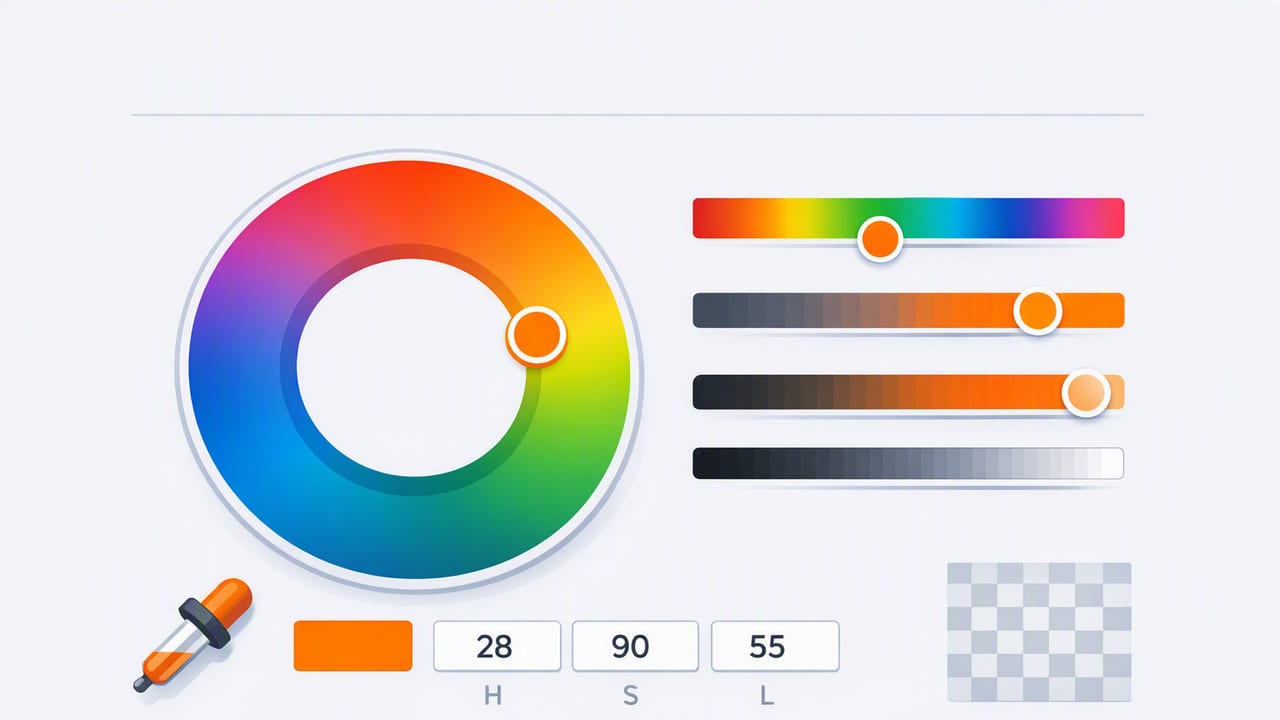
If you have ever tweaked a color and thought, “Why did that tiny change make everything look wrong?”, you are not alone. Many designers start with HEX or RGB values, then struggle to adjust colors in a controlled, repeatable way. That is where an HSL color picker earns its place in a modern workflow: it lets you think in terms of hue (what color), saturation (how intense), and lightness (how bright/dark) instead of juggling red/green/blue channels.
This guide explains what HSL is, why it is useful for palette building, and how to use an HSL color picker to create consistent results for UI, branding, illustration, and even interior design concepts.
What is HSL (and why designers like it)
HSL stands for Hue, Saturation, and Lightness. It is a color model that maps more closely to how people describe color changes in plain language.
- Hue (H): the position on a 0–360° color wheel (0 = red, 120 = green, 240 = blue).
- Saturation (S): intensity from 0% (gray) to 100% (vivid).
- Lightness (L): brightness from 0% (black) to 50% (normal) to 100% (white).
In practice, HSL makes it easier to do common design moves:
- Create a darker hover state by reducing lightness.
- Mute a color for backgrounds by lowering saturation.
- Shift a palette warmer/cooler by nudging hue.
When you can describe the change you want (“slightly darker and less saturated”), HSL is often the fastest path from intention to a usable color value.
HSL vs HSV vs RGB vs HEX: a quick comparison
Designers commonly move between models. An HSL color picker is not replacing HEX; it helps you arrive at better HEX values faster.
| Model | Best for | What you control | Common gotcha |
|---|---|---|---|
| HEX | Sharing colors in design/dev | Final output value | Not intuitive to edit by “feel” |
| RGB | Screens, digital color mixing | Red/green/blue channels | Small channel changes can feel unpredictable |
| HSL | Palette tuning, UI states, harmony | Hue/saturation/lightness | Equal lightness ≠ equal perceived brightness across hues |
| HSV/HSB | Picking vivid colors quickly | Hue/saturation/value (brightness) | “Value” behaves differently than lightness in mid-tones |
What to look for in an HSL color picker
Not all pickers expose HSL in a designer-friendly way. If you are choosing tools (especially on mobile), prioritize features that support real workflows rather than one-off sampling.
1) HSL sliders plus numeric entry
Sliders are fast, but numeric entry is what makes a palette reproducible across files and teams. Look for:
- Hue in degrees (0–360)
- Saturation and lightness in percentages
- Easy copy for HEX/RGB output
2) Live preview and “before/after”
When you adjust lightness for a button hover, you want to compare states quickly. A good picker shows the original swatch and the adjusted swatch side-by-side.
3) Palette building tools
HSL is most powerful when you can build a set, not just a single color. Helpful features include:
- Save swatches into a palette
- Reorder and label colors (primary, accent, background)
- Export formats for design systems (ASE, CSS variables, JSON, etc.)
4) Optional: sampling from photos
Sampling from images is a practical way to start, then refine with HSL. For example, you can extract a base tone from a reference photo, then dial saturation down for backgrounds and increase lightness for UI surfaces.
A practical HSL workflow for building a usable palette
Here is a repeatable process you can use whether you start from scratch, a moodboard, or a photo.
- Pick a base hue that matches the project tone (e.g., 210° for calm blues, 20° for warm oranges).
- Set a target lightness range for each role:
- Backgrounds: 92–98% L
- Surfaces/cards: 85–95% L
- Text on light backgrounds: 10–25% L
- Primary buttons: often 35–55% L (depends on hue)
- Adjust saturation by context:
- Large areas (backgrounds) generally need lower saturation
- Small accents can handle higher saturation
- Create states with lightness steps (e.g., default, hover, pressed) by changing L in consistent increments such as 4–8%.
- Check contrast early (especially for text, icons, and charts), then iterate.
- Export as HEX for implementation, keeping HSL notes for future adjustments.
Example: creating button states with HSL
Suppose your brand primary is:
- Primary: HSL(210, 70%, 45%)
In an HSL color picker, you can build interaction states by holding hue constant and changing lightness and (sometimes) saturation:
- Hover: HSL(210, 70%, 40%) (slightly darker)
- Pressed: HSL(210, 75%, 35%) (darker + a bit more saturated)
- Disabled: HSL(210, 15%, 75%) (desaturated + lighter)
This approach keeps the color “family” consistent. With RGB-only tweaks, it is easier to accidentally shift the hue and end up with states that feel unrelated.
Converting HSL to HEX (for handoff)
Even if you design in HSL, development and design tools often store final colors as HEX. Here is a small JavaScript snippet that converts HSL to HEX so you can generate tokens, docs, or quick checks.
function hslToHex(h, s, l) {
  s /= 100;
  l /= 100;

  const c = (1 - Math.abs(2 * l - 1)) * s;
  const x = c * (1 - Math.abs(((h / 60) % 2) - 1));
  const m = l - c / 2;

  let r = 0, g = 0, b = 0;
  if (0 <= h && h < 60) [r, g, b] = [c, x, 0];
  else if (60 <= h && h < 120) [r, g, b] = [x, c, 0];
  else if (120 <= h && h < 180) [r, g, b] = [0, c, x];
  else if (180 <= h && h < 240) [r, g, b] = [0, x, c];
  else if (240 <= h && h < 300) [r, g, b] = [x, 0, c];
  else if (300 <= h && h < 360) [r, g, b] = [c, 0, x];

  const toHex = (v) => {
    const hex = Math.round((v + m) * 255).toString(16).padStart(2, '0');
    return hex;
  };

  return `#${toHex(r)}${toHex(g)}${toHex(b)}`;
}

// Example:
// hslToHex(210, 70, 45) => e.g., "#2273c4" (will vary slightly by rounding)
Using an HSL color picker for interior and spatial palettes
HSL is not only for UI. If you are building palettes for interiors, events, or decor mockups, HSL can help you keep variations coherent:
- Same hue, different lightness creates a tonal family (paint shades, textiles, wall-to-trim relationships).
- Lower saturation often produces more “livable” neutrals that still harmonize with the accent hue.
- Hue nudges of 5–15° can fix clashing undertones (e.g., pulling a green slightly toward blue to feel cleaner next to gray).
One practical trick: if you sampled colors from a photo of a room, try reducing saturation by 10–25% for large surfaces. Photos often contain lighting artifacts that push colors more intense than they feel in real life.
Common mistakes when working in HSL (and how to avoid them)
Mistake 1: treating equal lightness as equal brightness
Human vision perceives yellow as brighter than blue at the same numeric lightness. If you are building accessible UI, verify contrast with actual luminance/contrast checks rather than relying on L values alone.
Mistake 2: over-saturating large areas
A 100% saturation background can look loud and reduce readability. Keep saturation lower for big fills and reserve high saturation for small accents or data highlights.
Mistake 3: changing hue when you meant to change lightness
Some pickers make it easy to drag the wrong control. When creating states, lock hue mentally: adjust lightness first, then tweak saturation only if the result feels muddy.
A quick checklist for building a palette with an HSL color picker
- Choose 1–2 primary hues (brand + accent)
- Create a lightness scale (text, surfaces, background, borders)
- Set saturation guidelines (low for backgrounds, higher for accents)
- Generate UI states by stepping lightness consistently
- Validate contrast with real checks (not just “it looks fine”)
- Export final values as HEX/RGB for handoff
Final thought: start with intent, refine with HSL
The biggest benefit of an HSL color picker is that it matches how designers think: “make it darker,” “make it calmer,” “shift it warmer.” Use HSL to explore and systematize your palette decisions, then output HEX for production. If you also like sampling starting points from photos, an iOS tool such as Color Viewfinder can help you grab base colors and then fine-tune them using HSL values in your workflow.
