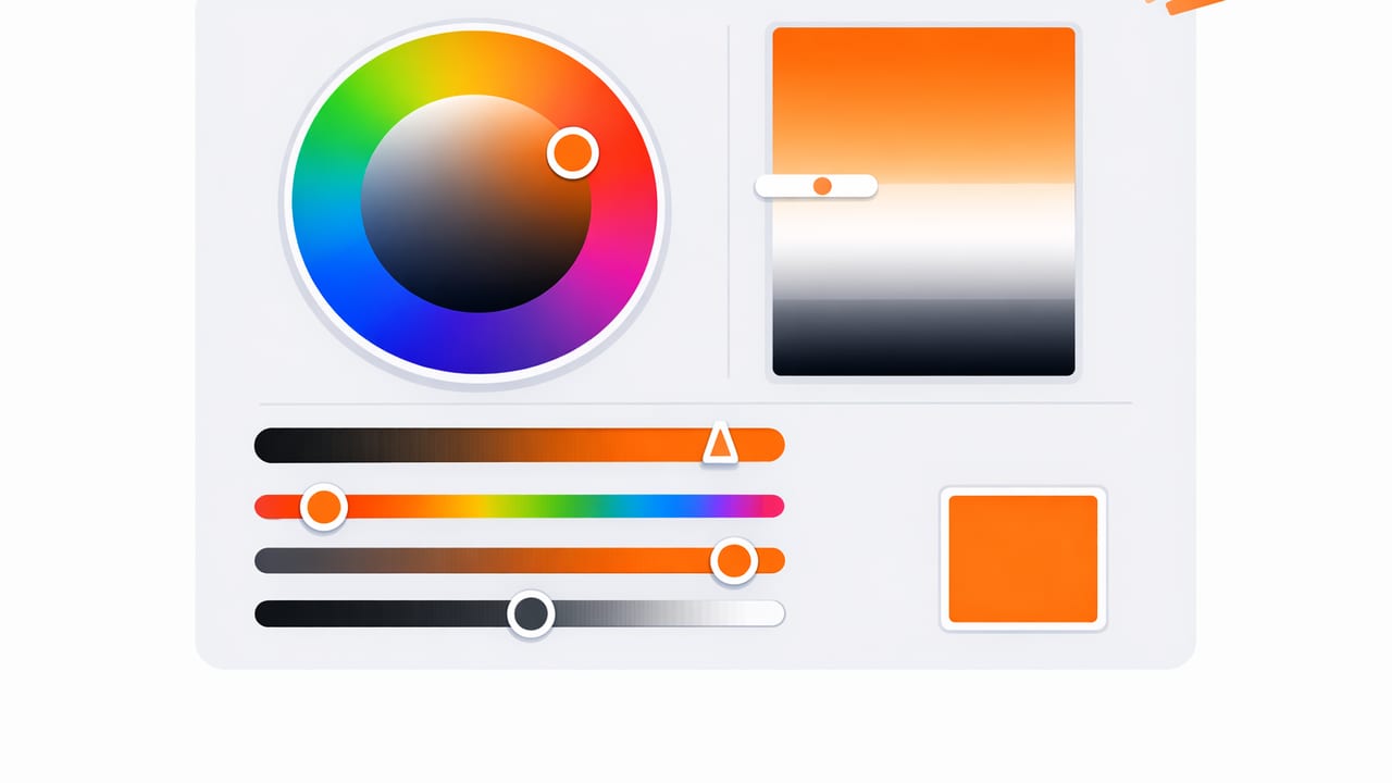
If you’ve ever picked a color that looked perfect in a photo, then turned muddy on a website or too intense on a wall, you’ve run into a common problem: color values alone don’t explain how a color behaves. HEX and RGB are essential for accuracy, but they don’t make it easy to answer design questions like:
- “How do I make this color lighter without changing its character?”
- “How can I mute this accent color so it feels more premium?”
- “How do I build a set of tints and shades that stay consistent?”
That’s where an HSL color picker earns its place in your workflow. HSL (Hue, Saturation, Lightness) gives you intuitive control over the three qualities designers adjust most when building palettes, UI themes, illustrations, or room color stories.
This guide explains how HSL works, when to use it instead of (or alongside) RGB/HEX, and how to turn a single inspiration color into a flexible palette you can actually use.
What is HSL, and why designers like it
HSL is a way of describing colors that maps well to human perception:
| Component | What it controls | Typical range | Practical meaning |
|---|---|---|---|
| Hue (H) | Color family | 0–360° | Red → orange → yellow → green → blue → purple → back to red |
| Saturation (S) | Color intensity | 0–100% | 0% = gray; higher = more vivid, “punchy” color |
| Lightness (L) | Brightness | 0–100% | 0% = black; 50% = “normal”; 100% = white |
Compared with RGB (which mixes light) and HEX (a compact RGB notation), HSL makes it easier to perform deliberate edits:
- Keep the hue, change the lightness to create a clean tint/shade scale for UI states or paint options.
- Keep hue and lightness, reduce saturation to create muted neutrals that still relate to your brand or room palette.
- Shift hue slightly to harmonize multiple photos or materials (wood, fabric, tile) without starting over.
HSL doesn’t replace HEX—it explains it. Use HEX to communicate exact color, and HSL to shape the palette around it.
When an HSL color picker is the best tool
You can use HSL anytime you need systematic control. It’s especially helpful in these scenarios:
1) Building a tint and shade scale for UI
Design systems rely on consistent steps (e.g., 100–900). With HSL, you can hold hue constant and adjust lightness in predictable increments. That gives you:
- Hover/pressed/disabled states that feel related
- Background, surface, and border colors that don’t clash
- More predictable contrast changes than “eyeballing” RGB
2) Taming colors pulled from photos
Photo-extracted colors are often too saturated to use as UI backgrounds or large painted areas. In HSL, you can simply lower saturation (and sometimes slightly raise lightness) to get a more usable version that still matches the inspiration.
3) Creating harmonious room palettes
Interior design palettes often need one hero color plus calmer supporting tones. HSL makes it straightforward to generate:
- a muted wall version (lower saturation, higher lightness)
- a trim/ceiling neutral (very low saturation, high lightness)
- an accent version (higher saturation, controlled lightness)
How to use an HSL color picker: a repeatable workflow
Here’s a practical workflow you can apply whether you’re designing a landing page, a poster, or a living room palette.
Step 1: Start with one “anchor” color
Choose a single color that represents the vibe you want—pulled from a logo, a photo, a fabric swatch, or an illustration. Convert it to HSL (most tools show HSL alongside HEX/RGB).
Tip: If your anchor is extremely dark or extremely bright, consider choosing a mid-tone from the same source as your anchor. Mid-tones are easier to expand into a full palette.
Step 2: Create a usable neutral set (low saturation)
Many palettes fail because they don’t include enough supportive neutrals. In HSL, neutrals are just “near-gray” colors:
- Keep the anchor hue (H) roughly the same
- Drop saturation (S) to 5–20%
- Set lightness (L) to common surface values (e.g., 96%, 92%, 86%, 24%)
This gives you backgrounds and text-adjacent surfaces that feel coherent without overpowering the main color.
Step 3: Build a tint/shade ramp (control lightness)
Now create a series of steps for the anchor color itself. A simple approach:
- Pick your anchor as the “base” (often around L=40–60% for UI accents).
- Create lighter tints by increasing L in 8–12% increments.
- Create darker shades by decreasing L in 8–12% increments.
Keep saturation steady at first. If light tints look “neon,” reduce saturation slightly as lightness increases.
Step 4: Add harmony with small hue shifts
Once you have tints, shades, and neutrals, add one or two supporting hues using classic relationships:
- Analogous: H ± 20–40° (calm, cohesive)
- Complementary: H ± 180° (high contrast, use carefully)
- Split complementary: H ± 150–210° (balanced contrast)
- Triadic: H ± 120° (playful, needs restraint)
Use these supporting hues primarily for accents, icons, charts, or small decor moments. If you try to make every color a “main character,” the palette gets noisy.
Step 5: Sanity-check contrast and readability
HSL is intuitive, but accessibility depends on contrast, not intuition. After choosing candidate colors:
- Test text on backgrounds using a contrast checker
- Verify interactive states (hover/pressed/focus) are distinguishable
- Check the palette in grayscale to ensure value separation still works
Practical example: turning one color into a mini system
Imagine your anchor is a muted teal used for buttons. In HSL terms, it might sit around a teal hue (roughly 180–200°), moderate saturation, and mid lightness.
- Base button: keep H stable, choose L around the middle for a solid fill
- Hover: drop L slightly (darker) or raise S slightly (richer), not both
- Pressed: drop L a bit more for a clear “down” state
- Background: same H, very low S, very high L
- Border: same H, low S, mid-high L
The key is that you’re not guessing random HEX values—you’re making controlled moves along one dimension at a time, which is exactly what an HSL color picker makes easy.
Common HSL mistakes (and how to fix them)
Over-saturating light colors
High lightness + high saturation often looks fluorescent on screens and “toy-like” in print. Fix it by reducing saturation as lightness increases. Many professional palettes intentionally desaturate their lightest steps.
Assuming equal lightness equals equal perceived brightness
HSL is not perfectly perceptual. A yellow at L=60% may appear brighter than a blue at L=60%. When matching two colors for equal visual weight, you may need to adjust lightness unevenly and validate by eye and contrast tests.
Changing hue when you meant to change lightness
Some pickers or conversions can drift hue slightly when you tweak values. If brand consistency matters, keep a close eye on H and lock it when possible, then adjust S and L.
HSL vs HSV/HSB: which one should you use?
You’ll often see HSB (also called HSV) next to HSL. Both share hue, but the “brightness/value” behavior differs.
- HSL is great for creating balanced tints/shades around a mid-tone because lightness centers around 50%.
- HSV/HSB can feel more direct when you’re thinking “make it brighter/darker” for vivid colors, because value relates more to the strongest channel.
If your goal is palette systems (neutrals + steps + accents), HSL is typically the more controllable model. If your goal is picking a vivid color quickly, HSV can feel snappier. Many designers use both, then finalize in HEX/RGB for delivery.
Optional: convert HSL to HEX (useful for dev handoff)
If you’re experimenting with HSL but need to deliver HEX to a developer or export to tools that expect HEX, here’s a compact JavaScript function:
function hslToHex(h, s, l) {
  s /= 100;
  l /= 100;

  const c = (1 - Math.abs(2 * l - 1)) * s;
  const x = c * (1 - Math.abs(((h / 60) % 2) - 1));
  const m = l - c / 2;

  let r = 0, g = 0, b = 0;

  if (0 <= h && h < 60) [r, g, b] = [c, x, 0];
  else if (60 <= h && h < 120) [r, g, b] = [x, c, 0];
  else if (120 <= h && h < 180) [r, g, b] = [0, c, x];
  else if (180 <= h && h < 240) [r, g, b] = [0, x, c];
  else if (240 <= h && h < 300) [r, g, b] = [x, 0, c];
  else if (300 <= h && h < 360) [r, g, b] = [c, 0, x];

  const toHex = (v) => {
    const hex = Math.round((v + m) * 255).toString(16).padStart(2, '0');
    return hex;
  };

  return `#${toHex(r)}${toHex(g)}${toHex(b)}`;
}

// Example: hslToHex(190, 45, 50) => "#..."
This makes it easy to generate a consistent scale programmatically once you decide on the HSL rules for your palette.
Checklist: what to look for in an HSL color picker
- Shows HSL + HEX + RGB side-by-side for handoff
- Lets you fine-tune values precisely (sliders plus numeric input)
- Supports palette organization (tints, shades, neutrals, accents)
- Exports in formats you actually use (images, swatches, or code-ready values)
- Works well with photo-based inspiration if that’s your starting point
Wrap-up: use HSL to design with intent
HEX gives precision, but HSL provides control. By separating hue, saturation, and lightness, you can build palettes that are harmonious, adaptable, and easier to scale across screens, print, and real-world materials.
If your workflow often begins with photos or real-life references, you can extract a base color and then refine it with HSL adjustments; apps like Color Viewfinder can be a helpful starting point for capturing values before you shape the palette into a system.
