When you sample colors from a photo, you often get values that are technically accurate—but not immediately usable. A shadowed wall reads darker than it feels in real life. A bright product shot pushes saturation beyond what prints well. A brand color looks “almost right” but not consistent across screens.
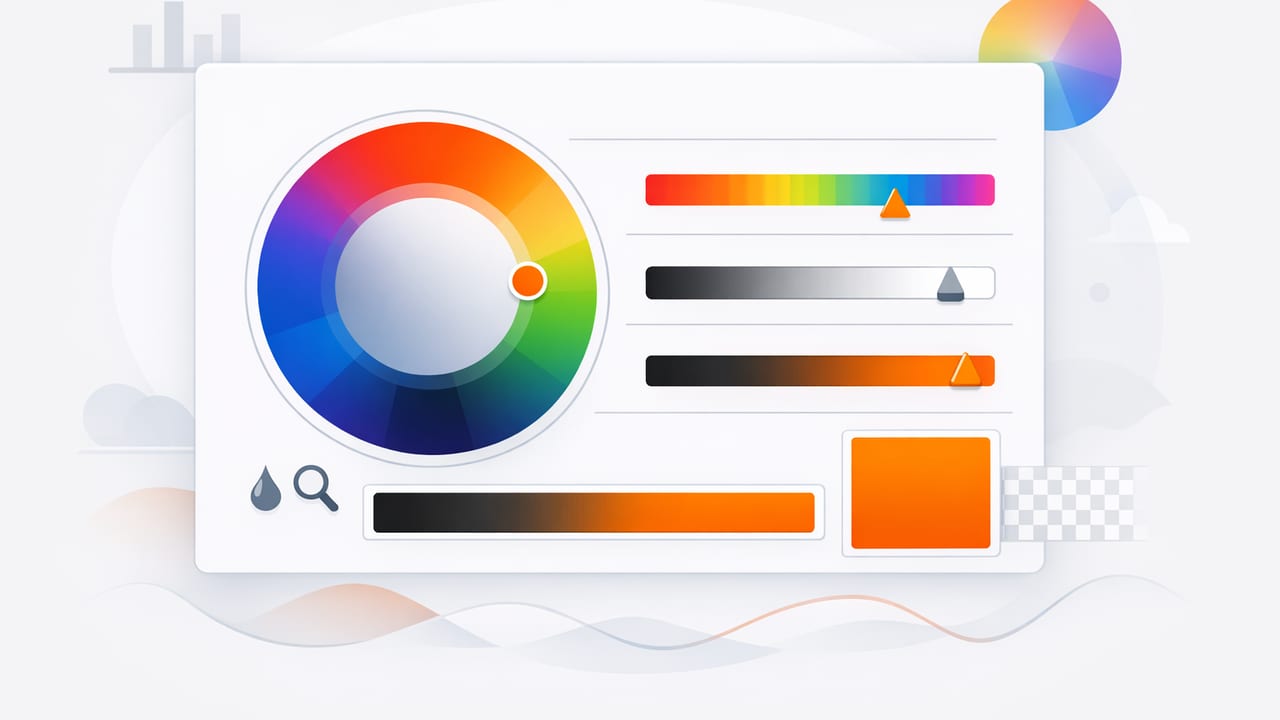
This is where an HSL color picker becomes a practical design tool. Instead of nudging raw RGB channels and hoping for the best, HSL lets you edit color in the same way humans describe it: hue (what color), saturation (how intense), and lightness (how bright/dark). The result is faster iteration, cleaner palettes, and more reliable color systems for graphic design, UI, and interior design mood boards.
What HSL is (and why designers like it)
HSL stands for Hue, Saturation, Lightness:
- Hue (H): the angle on the color wheel (0–360). 0 is red, 120 is green, 240 is blue.
- Saturation (S): intensity (0–100%). 0% is gray; 100% is vivid.
- Lightness (L): perceived brightness (0–100%). 0% is black; 100% is white; ~50% is “mid.”
Many designers prefer HSL for refinement because it separates color identity (hue) from color strength (saturation) and value (lightness). That separation makes it easier to build coherent palettes, create tints/shades, and maintain contrast.
“HSL makes color adjustments feel intentional: keep the hue, tune the saturation, then set lightness for hierarchy and accessibility.”
HSL vs HEX vs RGB (when each helps)
HEX and RGB are excellent for implementation and precision, but they’re less intuitive for editing. HSL is typically better for decisions, while HEX/RGB are better for delivery.
| Format | Best for | What’s awkward |
|---|---|---|
| HEX (#RRGGBB) | Design handoff, dev specs, tokens | Hard to “see” how to adjust it |
| RGB (r,g,b) | Screen math, imaging, programmatic work | Small changes can shift hue unexpectedly |
| HSL (h,s,l) | Palette tuning, tints/shades, UI states | Not always the final format you deliver |
A practical HSL color picker workflow (step-by-step)
This workflow is designed for anyone extracting colors from photos (branding, social graphics, UI inspiration, interior design references) and turning them into a palette that holds up in real projects.
1) Start with a small set of “anchor” colors
From your reference photo(s), pick 3–6 anchor colors:
- One dominant background color (wall, sky, surface)
- One mid-tone supporting color
- One accent (high attention)
- Optional: a dark neutral and a light neutral
Avoid over-sampling early. Too many colors makes the palette noisy and harder to standardize.
2) Convert anchors to HSL and “stabilize” hue
Photos often contain micro-shifts in hue because of lighting, reflections, and camera auto white balance. In an HSL color picker, check whether anchors that should match (e.g., two “same” blues) are actually drifting (e.g., 210° vs 225°).
Stabilize hue by choosing a consistent hue value for each color family:
- Pick one hue for your primary color family (e.g., 222° for “brand blue”).
- Snap related colors to that hue, then adjust saturation/lightness instead of hue.
3) Tune saturation to match the medium (screen, print, room)
Saturation is where many photo-derived palettes go wrong. Cameras make colors look punchier than they’ll feel in a UI, and printed materials often require a calmer saturation range to avoid harshness.
Use these rules of thumb:
- Reduce saturation for large surfaces (backgrounds, panels, walls).
- Increase saturation for small accents (buttons, icons, highlights) where you need “pop.”
- Keep neutrals truly neutral: if something is meant to be gray, lower saturation until it no longer reads tinted.
4) Set lightness for hierarchy (and reliable contrast)
Lightness is the fastest way to build usable hierarchy:
- Light backgrounds typically sit in L 92–98%.
- Text/darks often sit in L 10–20% (depending on hue and saturation).
- Mid-tones (cards, surfaces) usually land around L 80–90% (light UI) or L 20–30% (dark UI).
If two colors need to be distinguishable at a glance, separate their lightness more than you think—especially for adjacent UI elements or tonal interior schemes.
5) Build a controlled palette scale (not random swatches)
Once you have one clean “base” color in HSL, you can generate a scale by changing lightness while keeping hue steady and making small saturation adjustments. This is how design systems produce predictable color ramps.
| Scale step | What you change | Why it works |
|---|---|---|
| Light tints | Increase L, slightly reduce S | Prevents neon pastels and keeps surfaces calm |
| Core/base | Balanced S and L | Most recognizable “brand” color |
| Deep shades | Decrease L, slightly reduce S | Avoids muddy, overly intense darks |
Micro-adjustments cheat sheet (fast fixes)
- Color feels “off” compared to the photo: check hue drift first, then saturation.
- Color looks childish or loud: reduce saturation by 5–20% before changing hue.
- Color feels dull: increase saturation slightly or raise lightness a bit (don’t always jump to higher saturation).
- Two colors clash: align their lightness levels or separate them more; clashing is often a value problem, not a hue problem.
- Neutral looks tinted: drop saturation toward 0–5% and re-check in context.
Example: turning a photo sample into a usable UI palette
Imagine you sampled a “teal” from a travel photo. Your raw extraction might be close, but too intense for UI surfaces.
- Anchor teal (sampled): H 186°, S 68%, L 42%
- UI primary (refined): keep H 186°, reduce S to 52%, set L to 40%
- Surface tint: H 186°, S 25%, L 94%
- Pressed state: H 186°, S 55%, L 34%
Notice the pattern: hue stays stable, while saturation and lightness create states and surfaces. This is exactly the kind of control an HSL workflow encourages.
Implementing HSL in CSS (with variables)
One advantage of HSL is how readable it is in modern CSS. You can store the hue once, then create variants using lightness and saturation.
:root {
  /* store the hue once */
  --brand-h: 186;

  /* core */
  --brand: hsl(var(--brand-h) 52% 40%);

  /* tints and shades */
  --brand-100: hsl(var(--brand-h) 25% 94%);
  --brand-200: hsl(var(--brand-h) 30% 88%);
  --brand-700: hsl(var(--brand-h) 55% 34%);
  --brand-900: hsl(var(--brand-h) 60% 22%);
}

.button {
  background: var(--brand);
  color: white;
}

.button:active {
  background: var(--brand-700);
}
This structure makes it easy to keep a palette coherent while still delivering production-ready values.
Using HSL for interior design palettes (real-world color matching)
In interior design and decorating, photo sampling is popular for capturing a vibe (stone, textiles, paint, foliage). HSL helps because:
- Lightness maps to perceived value (critical for how a room feels).
- Saturation helps you avoid overly intense wall colors when translated from a photo.
- Hue stabilization keeps coordinating elements aligned (e.g., warm beige vs slightly greenish beige).
Tip: when building a room palette, create two versions:
- “Photo-faithful” for reference
- “Material-ready” with slightly lower saturation and carefully spaced lightness steps
Common mistakes when using an HSL color picker
Over-editing hue
If a palette looks inconsistent, many people rotate hue repeatedly. Often the real fix is adjusting saturation/lightness while keeping hue stable, especially within one color family.
Ignoring context
A swatch that looks perfect alone can fail when placed next to white, black, or another saturated accent. Always review colors in the layout or mood board context where they’ll live.
Forgetting about accessibility
HSL makes it tempting to rely on “looks good” instead of measurable contrast. Even small lightness tweaks can make text readable or unreadable. If your palette is for UI, validate contrast with a checker and adjust lightness first.
A quick checklist for photo-to-palette success
- Sample 3–6 anchors (dominant, support, accent, neutrals).
- Convert to HSL and stabilize hue within each family.
- Adjust saturation to fit the medium (calmer for large areas).
- Adjust lightness to create hierarchy and contrast.
- Build a small scale (tints/shades) rather than isolated swatches.
- Test in context (mockup, room board, poster layout) before exporting.
Final thoughts
An HSL color picker is less about finding a “perfect” color and more about creating a palette that behaves predictably: consistent hue, controlled intensity, and purposeful lightness steps. Whether you’re translating a photo into a UI theme, a brand system, or an interior mood board, HSL gives you a repeatable way to refine what you sampled into something you can confidently reuse.
If you’re building palettes on iPhone or iPad, a photo-based extractor like Color Viewfinder can help you capture starting colors quickly—then refine them using the HSL approach above.
