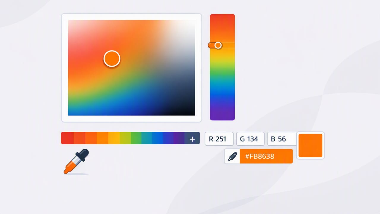
An image color picker helps you pull precise color values (like HEX, RGB, HSL, or HSB) from any photo—so you can turn visual inspiration into usable palettes for web design, branding, graphic design, and interior design. It sounds simple: tap a pixel, get a color. In practice, accuracy depends on lighting, compression, display settings, and how you sample.
This guide walks you through a reliable, repeatable workflow for extracting colors from images, validating them, and converting them into practical palettes you can confidently use across creative projects.
What an Image Color Picker Actually Measures
When you sample a point in a photo, you’re not capturing an “absolute” color from the real world—you’re capturing the color value of a pixel after a chain of transformations:
- Lighting (warm indoor bulbs vs. daylight) shifts hues.
- Camera processing (auto white balance, HDR, sharpening) changes contrast and saturation.
- Compression (especially JPEG) introduces artifacts and blends neighboring colors.
- Color profiles and display calibration affect how colors appear on-screen.
That doesn’t make an image color picker less useful—it just means you should treat sampled values as starting points and use a method that reduces bias and noise.
Best Use Cases for Picking Colors From Images
Extracting colors from photos is especially effective when you need to build a palette quickly from real-world inspiration.
- Brand mood boards: pull primary and accent colors from campaign photography.
- UI theming: derive a hero color and supporting neutrals from product imagery.
- Illustration & digital art: match a reference image’s key tones.
- Interior design: capture wall, fabric, and wood tones from room photos.
- Content creation: keep a consistent look across thumbnails, slides, and social posts.
A Reliable Workflow: From Photo to Usable Palette
Use this step-by-step workflow whenever you want your extracted colors to hold up across different formats and contexts.
1) Start with the best source image you can
Higher-quality inputs produce cleaner swatches. If possible:
- Prefer original photos over screenshots of screenshots.
- Avoid heavy filters when accuracy matters.
- If downloading online images, choose higher resolution and avoid overly compressed versions.
2) Identify the roles your palette needs
Before sampling, decide what you’re extracting. A practical palette usually includes:
- Primary color: the main brand/UI anchor.
- Secondary color: supports the primary (buttons, highlights).
- Accent: used sparingly for calls-to-action or visual emphasis.
- Neutrals: light background, dark text, mid-gray UI surfaces.
- Optional status colors: success, warning, error (often adjusted for clarity).
3) Sample smart: avoid edges, noise, and specular highlights
Most inaccurate picks happen because people sample the wrong pixels. Use these rules:
- Avoid edges (where anti-aliasing blends multiple colors).
- Avoid highlights (glare on metal, glossy paint, sun reflections).
- Avoid deep shadows if you’re trying to match the “true” material color.
- Sample flat, evenly lit areas whenever possible.
Pro tip: If a surface is textured (fabric, wood grain), sample multiple points and average your choice by selecting the most consistent mid-tone.
4) Pick clusters, not single pixels
A single pixel can be an outlier due to noise or compression. Better approach:
- Sample 3–7 points in the same area.
- Compare the values visually in swatches.
- Choose the median-looking color (often closer to what you perceive).
5) Normalize for real usage (small adjustments are normal)
After extraction, you may need slight tweaks so the color behaves well in design:
- Increase contrast for text and UI elements.
- Reduce saturation if the sampled value feels too “digital.”
- Adjust lightness to create consistent steps (e.g., 100–900 scale).
Color Formats You’ll See (and When to Use Them)
Your image color picker may output multiple formats. Here’s how to choose:
| Format | Best for | Example | Notes |
|---|---|---|---|
| HEX | Web/UI design | #2F6FED |
Compact and widely used in CSS and design tools. |
| RGB | Screen-based work | 47, 111, 237 |
Good for calculations and programmatic adjustments. |
| HSL | Palette refinement | 222°, 83%, 56% |
Intuitive to tweak lightness/saturation while keeping hue. |
| HSB/HSV | Creative tools | 222°, 80%, 93% |
Common in illustration and color pickers; good for brightness control. |
How to Build a Balanced Palette From a Single Photo
Once you’ve extracted several candidate colors, turn them into a palette with clear roles:
Step A: Choose your anchors
- 1 primary: the color that best represents the image’s mood.
- 1 accent: a contrasting pop (often a complementary or split-complementary hue).
- 2 neutrals: one light, one dark (for backgrounds and typography).
Step B: Create light/dark variants
For UI work, you usually need tints and shades. If you have HEX values, you can build a quick set of CSS variables and adjust later:
:root {
  --color-primary: #2F6FED;
  --color-primary-700: #2458BD;
  --color-primary-500: #2F6FED;
  --color-primary-300: #7AA3FF;

  --color-accent: #F36B3C;
  --color-bg: #F7F8FA;
  --color-text: #111827;
}
If you prefer HSL, keep hue constant and adjust lightness in steps (for example: 20%, 35%, 50%, 65%, 80%). This typically produces smoother, more predictable ramps than editing RGB directly.
Step C: Sanity-check contrast (especially for UI and print)
For digital interfaces, verify that text on backgrounds is readable. A quick approach:
- Test dark text on your light neutral background.
- Test white text on primary and accent colors.
- If contrast is low, darken the background color or lighten the text color until it’s comfortable.
Common Problems (and How to Fix Them)
“The color I picked doesn’t match what I see”
This is usually lighting and white balance. Try:
- Sampling from a more evenly lit area in the image.
- Choosing a mid-tone instead of a highlight or shadow.
- Comparing several picks and selecting the one that looks most stable across swatches.
“My palette looks muddy or dull”
You may have extracted too many similar mid-tones. Fix by:
- Adding a true neutral (near-white or near-black) for structure.
- Including one high-chroma accent (a cleaner, more saturated color).
- Separating roles: not every color should compete for attention.
“The values change when I open the image elsewhere”
This can happen due to color profiles and platform handling. For consistency:
- Use the same source file and avoid re-saving as heavily compressed JPEG.
- When possible, work with images that embed standard profiles (commonly sRGB).
- Do a final visual check on multiple screens if the project is high-stakes.
Practical Example: Extracting a Room Palette for Interior Design
Let’s say you photographed a living room with a warm oak floor, off-white walls, and a deep green sofa. A strong palette might look like this:
- Wall neutral: a warm off-white for backgrounds.
- Wood tone: a mid warm brown for natural texture.
- Sofa green: the primary, grounding color.
- Accent brass: a muted gold highlight (lamps, fixtures).
- Ink neutral: a dark charcoal for contrast and text-like elements (frames, hardware).
When sampling, avoid sunlit patches on the floor and bright reflections on metallic objects. Pick from mid-tone areas to get values that translate better when buying paint, fabrics, or digital mockups.
Checklist: What to Look for in an Image Color Picker App
If you’re choosing a tool, prioritize features that support accuracy and workflow—not just novelty:
- Multiple color formats (HEX/RGB/HSL/HSB) available instantly.
- Palette building (save multiple swatches per image, organize by project).
- Zoomed sampling for pixel-level precision.
- Export options (text, CSS variables, ASE, or shareable formats depending on your stack).
- Layout controls to visualize palettes as grids/stripes/swatches.
Putting It All Together
An image color picker is most powerful when you treat it as part of a workflow: start with a good source image, sample thoughtfully, extract clusters instead of single pixels, and then refine the palette into roles that serve your design. Whether you’re building a UI theme, a brand system, or a room concept, the goal isn’t just to capture colors—it’s to create colors that behave well when applied.
If you prefer doing this on iPhone or iPad, an app like Color Viewfinder can help you extract HEX/RGB/HSL values from photos and organize them into palettes you can export into your creative process.
