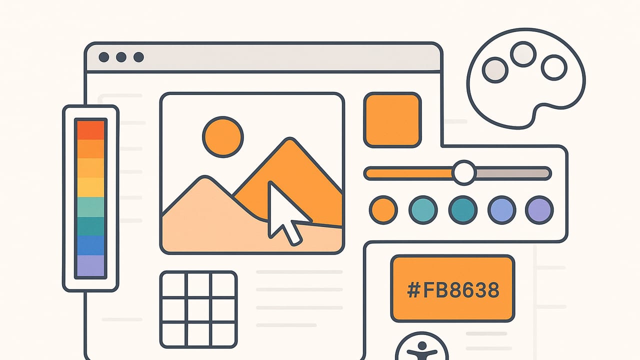
An image color picker is a simple idea with powerful results: you sample a pixel or region from a photo, and you get precise values like HEX, RGB, HSL, or HSB/HSV. Designers, developers, photographers, and decorators use it to translate visual inspiration into reproducible color choices. This guide explains how an image color picker works, how to avoid common accuracy pitfalls, which algorithms and color models matter, and how to build a reliable, professional workflow from raw pixels to polished palettes.
How an Image Color Picker Works
At its core, an image color picker reads pixel data from a raster image (JPEG, PNG, HEIC, etc.), then displays that pixel’s value in your chosen color model. Under the hood, the image is rendered in a color space (often sRGB or Display P3). The picker samples pixel components (R, G, B), applies gamma and color profile conversions, and then exposes the result as RGB, HEX, HSL, or HSB.
Most pickers offer two modes:
- Single-pixel sampling for pinpoint precision (ideal for UI elements, brand marks, or flat areas).
- Averaged sampling over a radius or grid (great for noisy textures, skin tones, or gradients).
In practice, accuracy depends on the rendering pipeline and color management. If the software honors embedded ICC profiles and displays in a calibrated space, what you sample is faithful to what you see. If not, you risk subtle shifts—especially on wide-gamut displays or compressed images.
Single Pixel vs. Averaged Sampling (with a Mini Demo)
Single-pixel picks are fast, but they can latch onto noise or compression artifacts. Averaging a small region reduces noise and yields more stable values. Here’s a tiny JavaScript canvas example that returns both the pixel color and a 5×5 average around the cursor:
// Basic canvas-based image color picker (single vs. averaged)
function getPixel(imgData, x, y) {
  const i = (y * imgData.width + x) * 4;
  return [imgData.data[i], imgData.data[i+1], imgData.data[i+2]]; // RGB
}

function getAverage(imgData, x, y, radius = 2) {
  let r = 0, g = 0, b = 0, n = 0;
  for (let dy = -radius; dy <= radius; dy++) {
    for (let dx = -radius; dx <= radius; dx++) {
      const px = Math.min(Math.max(x + dx, 0), imgData.width - 1);
      const py = Math.min(Math.max(y + dy, 0), imgData.height - 1);
      const [pr, pg, pb] = getPixel(imgData, px, py);
      r += pr; g += pg; b += pb; n++;
    }
  }
  return [Math.round(r/n), Math.round(g/n), Math.round(b/n)];
}

function rgbToHex(r, g, b) {
  return '#' + [r, g, b].map(v => v.toString(16).padStart(2, '0')).join('');
}
Try both methods on the same area—skin, fabric, foliage—and you’ll see how averaged sampling stabilizes your palette.
Picking a Method for Palettes: Algorithms at a Glance
When your goal is more than a single swatch—say, a 5–10 color palette—you need clustering or quantization. Popular choices include k-means, median cut, and octree. Each emphasizes different trade-offs in speed, fidelity, and contrast separation.
| Algorithm | Strengths | Considerations | Best for |
|---|---|---|---|
| k-means | Good cluster separation; customizable k | Iterative; sensitive to initialization | Curated palettes with distinct hues |
| Median cut | Fast; classic quantization | May favor frequent colors over accents | General-purpose palette extraction |
| Octree | Efficient spatial partitioning | Implementation complexity | Large images, balanced speed/quality |
| Hierarchical k-means | Scales better for big data | Complex tuning | Batch processing or automation |
For product shots or brand assets, start with k-means and a small k (5–7), then prune near-duplicates and adjust lightness. For textures and photographs with subtle gradients, median cut often yields smooth, representative palettes with minimal tuning.
Color Models: HEX, RGB, HSL, and HSB/HSV
An image color picker typically returns one or more of these models:
- HEX: A compact RGB encoding used heavily on the web, e.g., #1a4b8f.
- RGB: Additive components (0–255). Best for screens and digital assets.
- HSL: Hue, Saturation, Lightness. Great for adjusting perceived lightness while keeping hue constant.
- HSB/HSV: Hue, Saturation, Brightness/Value. Useful for UI sliders and quick adjustments.
Converting is straightforward. For example, you can round-trip between RGB and HEX easily:
// RGB to HEX (already shown above): rgbToHex(r,g,b)
// HEX to RGB:
function hexToRgb(hex) {
  const val = hex.replace('#','');
  return [0,2,4].map(i => parseInt(val.slice(i, i+2), 16));
}
HSL and HSB are excellent for design tweaks. If your swatch feels too dark but the hue is perfect, bump Lightness (HSL) or Brightness/Value (HSB) without changing Hue. For consistent contrast across a UI, keep Lightness steps regular while adjusting Saturation modestly to avoid neon or muddy tones.
Avoiding Accuracy Pitfalls
Even with a great image color picker, a few technical traps can skew your results. Keep these safeguards in mind:
- Honor color profiles: Prefer tools that read embedded ICC profiles and render in your display’s space (e.g., sRGB vs. Display P3). Conversions should be explicit and consistent.
- Unify your pipeline: If you sample in sRGB, export CSS, images, and design tokens in sRGB. Mixing spaces invites hue/lightness drift.
- Average sensibly: For photos, use a small radius to tame noise and compression artifacts. For logo files, stick to single-pixel sampling.
- Watch for lighting bias: Photos with warm indoor lighting can push picks toward orange or yellow. Consider white balance correction before sampling.
- Beware of auto-enhance: Some OS viewers apply invisible boosts to contrast or saturation. Sample in apps that keep pixels “as is.”
- Mind wide-gamut displays: On P3 screens, highly saturated colors may be out of sRGB gamut. If your output is the web, soft-proof to sRGB before finalizing.
- Zoom with a pixel grid: Use magnification to avoid sampling anti-aliased edges. Aim for flat interior pixels of the region you want.
Accessibility: Contrast and Color Vision
Once you pick a color, ensure it’s readable and inclusive. Contrast ratio is the key metric. The WCAG standard requires minimum contrast between text and background. Quick formula (relative luminance, sRGB):
// Contrast ratio between colors a and b (0..1 luminance)
const contrast = (La, Lb) => {
  const [L1, L2] = [La, Lb].sort((x,y) => y - x);
  return (L1 + 0.05) / (L2 + 0.05);
};
Typical thresholds:
| Text Size | AA | AAA |
|---|---|---|
| Normal | 4.5:1 | 7:1 |
| Large (≥18pt or bold ≥14pt) | 3:1 | 4.5:1 |
| UI Icons/Graphics | Discernible contrast | Follow context |
Also consider color vision deficiencies. Avoid encoding meaning with color alone; pair with icons, patterns, or labels. When building palettes from photos, test a deuteranopia and protanopia simulation to ensure critical distinctions remain clear.
Practical Workflows for an Image Color Picker
1) Web/UI designer: From photo to CSS tokens
- Open your source image and sample 5–7 key colors using averaged sampling for photos.
- Convert to sRGB HEX values and test contrast for text/background pairs.
- Export as design tokens (CSS variables) to keep the system consistent.
:root {
  --brand-primary: #1a4b8f;
  --brand-accent:  #f9a21b;
  --surface-100:   #0f172a;
  --surface-000:   #ffffff;
}
2) Interior decorator: Calibrated picks for paints and fabrics
- Photograph surfaces in neutral light; disable auto-enhance.
- Use an image color picker with a moderate radius to offset texture noise.
- Convert to HSL and compare Lightness across candidate swatches to maintain harmony in a room.
3) Brand/marketing: Consistency across channels
- Sample from official product photos or print proofs (not random social posts).
- Lock master colors in sRGB HEX and Pantone/CMYK equivalents after proofing.
- Create a small palette with neutral tiers (light/dark) and a single accent to avoid brand drift.
Choosing an Image Color Picker: Feature Checklist
Whether you prefer a desktop tool, a browser extension, or a mobile app, look for these capabilities to work faster and more accurately:
- Color management: Honors embedded profiles; supports sRGB and Display P3.
- Sampling radius: Switch between single-pixel and averaged picks.
- Magnifier: Pixel grid zoom to avoid anti-aliased edges.
- Multiple models: Instant HEX, RGB, HSL, and HSB/HSV readouts.
- Palette building: Group, reorder, label, and save color sets.
- Export options: HEX lists, ASE/ACO, CSS variables, JSON tokens, or SVG swatches.
- Contrast checking: WCAG ratios built-in for text/background pairs.
- Batch and clipboard: Quick copy, drag-and-drop, and multi-image handling.
- On-device performance: Smooth sampling of large images without lag.
- Privacy: Local processing for sensitive assets (no required uploads).
Quick Reference: Common Ways to Pick Colors from Images
- Browser DevTools: Many browsers include an eyedropper in color pickers for CSS editing.
- Desktop OS utilities: macOS Digital Color Meter; Windows PowerToys Color Picker.
- Design software: Most vector and raster apps offer robust eyedroppers and palette tools.
- Command-line: ImageMagick can sample pixels or quantize palettes in scripts.
- Mobile apps: Handy for sampling real-world photos and building palettes on the go.
Testing and Iteration
Picking a color is step one; validating it is step two. Always test colors in context—your real UI, a printed mock, or a staged room photo. On the web, preview in sRGB and dark/light modes. For print, soft-proof and check out-of-gamut warnings. If your palette must work across product photography, verify that accent colors remain distinct over both light and dark backgrounds. Gather feedback from stakeholders early, then codify approved colors in a shared style guide or design token system.
Putting It All Together
An image color picker is more than a digital eyedropper. It’s a bridge from inspiration to implementation: from a single pixel to a tested, accessible palette that works across screens and media. By understanding sampling methods, choosing the right algorithm for palette extraction, respecting color management, and validating accessibility, you can capture the essence of a photo—and make it usable everywhere.
If you prefer working on iPhone or iPad, apps like Color Viewfinder can extract HEX, RGB, HSL, and HSB values from photos and help you build palettes with flexible exports.
