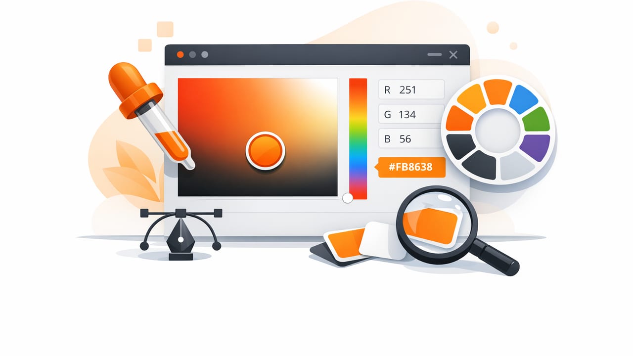
An image color picker is one of the fastest ways to translate real-world inspiration—paint chips, packaging, street photography, textiles, nature—into usable digital color palettes. But “fast” doesn’t always mean “accurate.” Lighting, camera processing, reflections, and compression can shift colors enough to derail a brand palette, UI system, or interior mood board.
This guide walks through a practical, repeatable workflow to get reliable HEX colors from images, validate them, and turn them into palettes that hold up across screens, print, and materials.
What an image color picker actually measures (and why it matters)
When you tap a pixel in a photo, a color picker is reporting the color value of that pixel after the camera and software have processed the scene. That processing typically includes:
- White balance (warming/cooling the entire image)
- Tone mapping (lifting shadows, compressing highlights)
- Noise reduction (smearing fine color detail)
- Compression (introducing artifacts and banding)
So the goal isn’t “perfect truth” (often impossible) but consistent, decision-ready color values. With the right capture and sampling habits, your extracted HEX codes become much more dependable.
Step 1: Start with the best possible source image
Prefer originals over screenshots
Use the original photo when you can. Screenshots of social media or web images may be:
- compressed multiple times,
- resized (which blends pixels),
- color-managed differently depending on the app.
Watch for “beautiful lies” in HDR and filters
HDR and filters make photos look great, but they often push colors away from what you’d measure in a controlled environment. If accuracy matters (brand colors, product matching, paint selection), avoid heavy filters and prefer a neutral capture.
Lighting is your biggest variable
Color is inseparable from light. Two photos of the same wall paint can yield different HEX values because:
- one is taken under warm incandescent light,
- one is taken in cool shade,
- one includes strong window reflections.
Best practice: take multiple shots in different lighting conditions and compare sampled values. If a color is “real,” it tends to stay within a narrow range across images.
Step 2: Calibrate before you sample (a quick pre-check)
Before extracting colors, do a quick sanity check in your photo editor (even basic iOS editing works):
- Reduce extreme exposure: avoid blown highlights and crushed shadows in areas you plan to sample.
- Check white balance: if whites look yellow/blue, your sampled colors will inherit that cast.
- Zoom in: make sure you’re sampling a uniform surface, not a blend of pixels.
If the photo contains a neutral reference (white paper, gray card, a known black object), use it to judge whether the image has a color cast.
Step 3: Sample like a pro (avoid the 5 common traps)
Trap #1: Sampling edges
Edges often contain anti-aliasing (mixed pixels), motion blur, or sharpening halos. Sample from the center of a color area whenever possible.
Trap #2: Sampling specular highlights
Shiny materials (gloss paint, satin fabric, ceramics) reflect the light source, not the underlying pigment. Avoid bright glare spots; sample slightly off to the side.
Trap #3: Sampling shadows
Shadow pixels are a blend of surface color + shadow color. If you must sample a shadowed object, sample both the lit and shadow areas and compare.
Trap #4: Sampling noisy or textured areas
Wood grain, textiles, grass, and stone vary widely pixel to pixel. Instead of grabbing one pixel, take multiple samples and average mentally (or select a representative mid-tone that matches your intent).
Trap #5: Sampling small subjects
If the subject is tiny in the frame, you’ll likely sample mixed pixels. Move closer, use optical zoom, or choose a higher-resolution image.
HEX, RGB, HSL, HSB: which values should you save?
Most image color pickers can show multiple formats. Save more than one when you’re building a palette system.
| Format | Best for | What to watch |
|---|---|---|
| HEX (#RRGGBB) | Design handoff, CSS, quick sharing | Doesn’t describe hue/lightness explicitly |
| RGB (0–255) | Digital imaging, dev implementation | Harder to “reason about” visually |
| HSL | Building tints/shades systematically | Lightness isn’t perceptually uniform |
| HSB/HSV | Quick palette exploration and adjustments | Brightness can mislead when comparing colors |
Step 4: Build a palette that’s usable (not just pretty)
Pulling 10 attractive swatches from a photo is easy. Turning them into a palette that supports real design decisions takes a little structure. Try this framework:
1) Choose roles: base, surfaces, accents, and neutrals
- Base: the dominant color family that sets the mood
- Surface: background and large-fill colors (often lighter, lower saturation)
- Accent: high-attention colors for CTAs, highlights, decor pops
- Neutral: whites, grays, off-blacks that support typography and spacing
2) Reduce duplicates
Photos often contain multiple near-identical pixels. If two colors are visually indistinguishable at normal size, keep one and simplify. A tight palette is easier to use consistently.
3) Create a lightness ladder
If you design UI or presentations, you’ll need several steps from light to dark for backgrounds, borders, and states. Start with one sampled hue, then create tints/shades by adjusting lightness.
Step 5: Verify contrast (accessibility and readability)
A palette isn’t finished until you test whether text is readable on key backgrounds. At minimum:
- Test body text on primary backgrounds
- Test button text on accent colors
- Check muted text and disabled states
If you don’t have a contrast tool handy, a quick rule of thumb: if your accent color is mid-tone and saturated, white text may fail contrast—try near-black text or darken the background color.
Turn extracted colors into a reusable mini system (with CSS variables)
Once you’ve picked final swatches, define them as tokens so they’re easy to reuse consistently. Here’s a small example you can paste into a project:
:root {
  /* Neutrals */
  --color-surface: #F6F3EE;
  --color-text: #1C1B1A;

  /* Brand / accents (sampled + refined) */
  --color-primary: #2F6F6D;
  --color-primary-600: #245B59;
  --color-accent: #D97A4A;

  /* Utility */
  --color-border: #D8D2C8;
}

body {
  background: var(--color-surface);
  color: var(--color-text);
}

.button {
  background: var(--color-primary);
  color: #FFFFFF;
}

.button--accent {
  background: var(--color-accent);
  color: #1C1B1A; /* often better than white on mid-tone orange */
}
Notice the mix of sampled colors and refined steps (like --color-primary-600). The photo gives you the direction; the system gives you consistency.
Interior design use case: from a room photo to a paint-ready palette
If you’re using an image color picker for interiors, you’re usually extracting from complex lighting and textured materials. A reliable approach:
- Sample the fixed materials first: flooring, stone, tile, major furniture.
- Choose a neutral that harmonizes: often a warm off-white or greige pulled from the lightest area that isn’t glare.
- Pick one accent from decor: pillows, art, a vase—something you can change later.
- Compare swatches in multiple lighting photos: if the “same” wall color changes wildly, don’t lock it in yet.
For paint matching, treat your HEX values as a directional reference. Paint brands vary, and physical samples still matter—but a well-extracted palette dramatically narrows the search.
Graphic design use case: extracting brand-adjacent colors from photography
When you want a campaign palette that feels connected to a hero image:
- Pull 6–10 candidate colors from the photo.
- Select 1–2 accents with the highest visual energy (often the most saturated hues).
- Pick 2–3 neutrals from background areas for layouts and typography.
- Adjust lightness so type and UI elements meet contrast needs.
This keeps designs cohesive without forcing you to use an exact pixel value everywhere.
Troubleshooting: why your sampled color looks “wrong” elsewhere
Color matching is less about finding the perfect number and more about controlling the variables that change perception.
- Different displays: screens vary in calibration, brightness, and color profiles.
- Different surrounding colors: a swatch will look different on white vs. dark gray.
- Color management: apps may interpret embedded profiles differently.
- Compression: exported images can shift slightly after re-encoding.
If accuracy is critical, keep a single “source of truth” (a palette file or token list), and avoid re-sampling from exported graphics.
A practical checklist for consistent results
- Use original, high-resolution photos when possible
- Avoid sampling glare, edges, shadows, and heavy texture
- Take multiple samples and compare for stability
- Save HEX plus HSL/HSB to help build tints and shades
- Assign roles (surface, text, accent) instead of keeping random swatches
- Contrast-test your key combinations before finalizing
Conclusion
An image color picker is most powerful when you treat it as part of a workflow: capture thoughtfully, sample strategically, then refine into a small system that works across real deliverables. Whether you’re building a UI kit, planning a room refresh, or collecting inspiration for a client, these steps help your extracted colors stay consistent and usable.
If you prefer doing this directly on iPhone or iPad, an app like Color Viewfinder can help you extract HEX/RGB/HSL values from photos and organize them into palettes for export.
