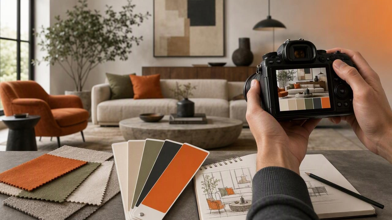
Photographers often notice color relationships before anyone else in the room. A warm oak floor against blue-gray walls, a terracotta vase beside cream linen, or afternoon light shifting across a green sofa can make an interior feel memorable. Turning those observations into usable color information is where an interior color palette app for photographers becomes valuable.
Rather than relying on memory, broad color descriptions, or screenshots saved without context, photographers can extract a palette from an interior image and record specific HEX, RGB, HSL, or HSB values. That information can support client mood boards, photo editing references, interior styling concepts, social media graphics, and design handoffs.
This guide explains how to build useful interior color palettes from photographs, which colors to sample, how to interpret the results, and where photo-based color extraction has important limitations.
Why photographers need interior color palettes
Interior photography is not only about documenting a space. It communicates atmosphere, material, proportion, light, and lifestyle. Color is central to that communication. A palette helps transform a visual impression into a repeatable system that can be discussed with clients, collaborators, editors, and designers.
A photographed room may contain dozens of visible shades, but not every shade deserves equal attention. A practical palette identifies the colors that establish the room's visual structure:
- Dominant colors: large surfaces such as walls, floors, ceilings, cabinetry, and rugs.
- Secondary colors: furniture, curtains, artwork, tile, and major decorative objects.
- Accent colors: smaller details that attract the eye, including cushions, flowers, lamps, books, and ceramics.
- Shadow and highlight tones: subtle dark and light values that define the room's depth.
For photographers, this is especially useful when preparing a shot list, creating a visual treatment, maintaining a recognizable editing direction, or selecting graphics that accompany a finished image series. It can also help an interior designer understand the color balance visible in a location photograph without treating the photo as a paint specification.
What a photo-based palette can and cannot tell you
Color extraction tools read the pixel colors present in an image. This makes them excellent for documenting the visual color relationships in a photograph. However, a sampled pixel is not necessarily the exact physical color of a painted wall, fabric, wood finish, or tile.
| Useful for | Not a substitute for |
|---|---|
| Creating mood boards and visual references | Physical paint matching |
| Choosing colors for a presentation or website | Guaranteed print color accuracy |
| Comparing color balance across images | Material or finish identification |
| Documenting an image's dominant tones | On-site color measurement under controlled light |
Camera settings, white balance, editing, window light, mixed artificial lighting, reflections, display calibration, image compression, and surrounding colors can all change the pixel values you see. A charcoal wall may appear blue in cool daylight; a white cabinet may become yellow under warm pendants. Treat extracted codes as digital references from that specific photograph, not guaranteed real-world specifications.
A practical workflow for extracting a room palette
1. Start with the strongest image
Choose a photograph that represents the room's intended mood. It should be reasonably well exposed, in focus, and free from extreme color casts unless that cast is part of the creative direction. A wide interior image often gives the best overview, while a detail image can reveal useful material tones such as wood grain, stone, upholstery, or artwork.
If you are comparing several angles of the same room, begin with the image that has the most balanced natural and artificial light. Avoid using an image with heavily clipped windows or deep shadows as the only palette source, because bright and dark areas can dominate the sampled values.
2. Identify the room's visual hierarchy before sampling
Do not simply collect the first five colors that look attractive. First, examine the image and decide which surfaces are visually important. Ask:
- What color occupies the most space?
- Which material makes the room feel warm or cool?
- What contrast directs the viewer's eye?
- Which accent would be useful in a title card, layout, or mood board?
This step prevents a palette from becoming a random collection of pixels. It also keeps your final palette relevant to the room rather than to incidental details such as a bright product label or a small reflection in glass.
3. Sample broad, representative areas
For large surfaces, sample areas away from strong edges, glare, deep shadow, or visible texture changes. A point selected in the middle of a painted wall is generally more representative than a point near a window frame. For materials such as marble, timber, and woven fabric, take several samples because their visible color naturally varies.
When working with a textured beige rug, for example, collect a light fiber, a midtone, and a darker woven strand. You may later choose one representative neutral for a simplified palette, or retain all three values if the texture itself is important to the project.
4. Limit the palette to a usable number of colors
Most creative projects do not need twenty extracted swatches. A working interior palette often becomes clearer when reduced to five to eight colors. This makes it easier to reuse in a presentation, image annotation, website draft, or editing reference.
A balanced starting structure is:
- One dominant light neutral
- One dominant dark or grounding tone
- Two material or furniture midtones
- One or two accent colors
- One optional highlight or shadow tone
Concrete example: a warm modern living room
Imagine a photograph of a living room with off-white walls, an oak coffee table, a muted olive sofa, a charcoal floor lamp, and rust-colored cushions. The image was shot near a large window in late afternoon, so the overall scene has a gentle warm cast.
Instead of extracting every visible variation, create a concise digital reference palette:
| Role | Example HEX | How it may be used |
|---|---|---|
| Wall neutral | #E8E0D3 | Background for a mood board or editorial layout |
| Oak midtone | #A9784E | Material reference and warm supporting color |
| Olive upholstery | #767A58 | Main secondary color for graphics or styling notes |
| Charcoal contrast | #3A3935 | Text, borders, or high-contrast visual anchor |
| Rust accent | #B65E3B | Callout, button, caption, or accent element |
This palette communicates the photographed scene: soft neutral, natural timber, muted green, dark contrast, and warm rust. It does not prove that the actual wall paint is #E8E0D3 or that the sofa fabric will look identical under another light source. If the image is edited cooler for publication, the values may also shift. Still, it provides a concrete and consistent starting point for digital creative work.
Choose the right color format for the task
Different color models answer different questions. Keeping more than one value for a selected swatch can make collaboration easier.
- HEX: practical for web pages, digital mood boards, slide decks, and design software.
- RGB: useful for screen-based design and communication with digital teams.
- HSL: helpful when adjusting a color's hue, saturation, or lightness in a controlled way.
- HSB: useful for quickly thinking about hue, color intensity, and brightness.
For instance, a photographer may use a HEX value to match a portfolio page background, while an interior stylist may refer to HSL when discussing whether an extracted olive green should feel lighter or less saturated in a concept board.
Using palettes in photography and interior projects
Once the palette is refined, it can do more than sit beside the original image. Consider using it in these practical ways:
- Photography treatments: establish an intended balance of warm, cool, bright, and muted tones before a shoot.
- Client presentations: pair room photographs with labeled swatches to make visual decisions easier to discuss.
- Editing consistency: compare images from a series to see whether their overall color direction is cohesive.
- Social content: select type, borders, templates, and graphic overlays that support the photographed space.
- Design handoff: share digital color references in formats such as CSS, CSV, JSON, or ASE when a collaborator needs them.
- Location scouting: record the visual character of potential spaces for future styling or campaign work.
When exporting palette data, label each swatch by function rather than leaving generic names. “Warm wall neutral,” “oak table,” and “rust cushion accent” are more useful than “Color 1,” “Color 2,” and “Color 3.” Functional names preserve the visual story behind the numbers.
Common mistakes to avoid
Sampling only the brightest colors: A small bouquet or vivid artwork can be visually exciting, but it may not represent the room. Include the large foundational colors first.
Ignoring lighting conditions: Photographing the same room in morning shade and evening tungsten light can produce noticeably different palettes. Note the lighting context when the project requires consistency.
Overcomplicating the result: A palette should guide decisions. If it has too many near-identical beige and gray swatches, consolidate them.
Using photo values as paint specifications: Digital extraction is a visual planning tool. Verify physical materials with real samples, appropriate lighting, and project-specific testing.
Build palettes that preserve the feeling of the photo
The best interior palette is not necessarily the one with the most technically precise-looking swatches. It is the one that captures the image's hierarchy and atmosphere in a form other people can use. Focus on dominant surfaces, material character, contrast, and accents. Keep the palette compact, name colors by their role, and remember the conditions under which the image was made.
For an iPhone or iPad workflow, Color Viewfinder’s guide to creating a color palette from a photo explains how to inspect photo colors and turn selected swatches into a shareable digital palette.
