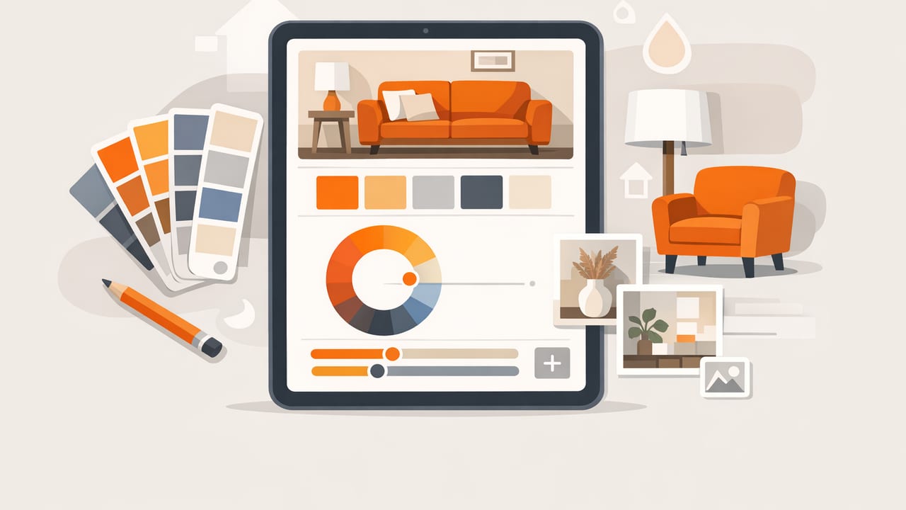
Choosing colors for a room sounds simple until you try to make everything work together: wall paint, flooring, textiles, artwork, cabinetry, trim, and lighting. That’s where an interior design color palette app can help—especially one that pulls accurate color values from photos. Instead of guessing whether that “warm white” leans creamy or gray, you can extract a few key swatches, build a balanced palette, and communicate it clearly to clients, contractors, or your future self.
This guide walks through a practical, repeatable workflow for turning inspiration photos (or snapshots of your actual space) into a reliable palette you can use across paint, furnishings, and digital mockups.
Why use an interior design color palette app (instead of eyeballing it)?
Human vision is heavily influenced by surrounding colors and lighting conditions. A beige in morning light might look pink at night, and a cool gray can suddenly look blue next to a warm oak floor. A good color-picking workflow adds objectivity:
- Consistency across decisions: You’re not re-guessing undertones every time you pick a new pillow or paint sample.
- Clear communication: HEX/RGB values are unambiguous when sharing with a designer, renderer, or brand team.
- Faster iteration: Build multiple palette options (warm, cool, high-contrast, low-contrast) from the same source image.
- Better matching: When you know the approximate color family and undertone, it’s easier to find a close paint equivalent.
Step 1: Start with the right photos (lighting matters more than you think)
Your palette is only as trustworthy as your source image. If you’re sampling from a magazine image or a screenshot, you’re inheriting that image’s editing. If you’re sampling your real space, you’re inheriting your lighting. You can still get great results—just be intentional.
Best practices for capturing usable photos
- Use indirect daylight when possible: Midday, near a window, with curtains diffusing harsh sun.
- Avoid mixed lighting: Don’t combine warm bulbs and cool daylight in the same shot if you can help it.
- Lock exposure/focus: On iPhone/iPad, press and hold to lock so the camera doesn’t “hunt” and shift brightness.
- Include neutrals: Capture trim, ceiling, or a white sheet of paper in-frame to help you judge if the photo is overly warm/cool.
- Shoot a close-up and a wide shot: Close-ups capture material color; wide shots capture how colors interact in context.
Tip: If you can, take two versions of the same scene: one in daylight and one at night with the lamps you actually use. You may end up building a “day palette” and a “night palette.”
Step 2: Extract colors intentionally (don’t sample everything)
Most rooms don’t need 20 colors. They need a small set of roles that can scale across surfaces and decor. When you use a palette extractor, aim for 6–10 swatches that represent the room’s structure.
A simple sampling framework for interiors
- Base neutral (1–2): wall color, large rug, or sofa
- Secondary neutral (1): trim, cabinetry, tile, or drapery
- Wood tone (1): floors, beams, furniture (sample both highlight and shadow if needed)
- Accent colors (2–3): art, pillows, books, pottery
- Dark anchor (1): hardware, frames, fireplace surround (often near-black)
When sampling, pick areas that are flat and evenly lit. Avoid strong highlights, reflections, and deep shadows—those are lighting artifacts, not the material’s true color.
Step 3: Translate extracted colors into “room roles”
Color values (HEX/RGB/HSL/HSB) are data. Interiors need decisions. The bridge is assigning each swatch a role so the palette becomes actionable.
Example: turning swatches into a plan
| Role | Where it appears | Practical guidance |
|---|---|---|
| Base | Walls / largest surface | Keep saturation low; undertone should harmonize with flooring. |
| Secondary | Trim / cabinets | Usually 10–20% lighter or darker than the base to create definition. |
| Material tone | Wood / stone / metal | Sample midtones (not glare) and keep consistent across rooms. |
| Accent | Textiles / art / decor | Choose 1–2 accents to repeat 3+ times for cohesion. |
| Anchor | Hardware / frames | Add contrast; prevents an all-neutral room from feeling washed out. |
Once roles are assigned, you can evaluate the palette like a designer rather than a color collector.
Step 4: Check undertones with HSL/HSB (a fast sanity check)
Even if you primarily use HEX, interiors benefit from looking at HSL/HSB because it reveals hue direction and brightness relationships.
- Hue: Helps you spot undertones (is that “gray” actually blue-green?).
- Saturation: Helps you keep neutrals calm; interiors often work best with lower saturation for large surfaces.
- Lightness/Brightness: Helps you maintain contrast between walls, trim, and anchor elements.
If your base neutral has a different hue family than your flooring (for example, a cool violet-gray wall with warm orange oak), you’ll often feel a subtle clash. Sometimes it’s a design choice; often it’s an accident. The numbers make it easier to tell which.
Step 5: Convert digital colors into real materials (paint, fabric, tile)
A common frustration: you extract a gorgeous HEX color from a photo and can’t find a paint chip that matches perfectly. That’s normal. Paint systems aren’t built around HEX, and lighting/printing/editing changes everything.
How to use your extracted colors effectively
- Use the extracted value as a direction, not an exact match: Identify the hue family and undertone first.
- Compare 3–5 paint candidates: Pull a fan deck or swatches that bracket your extracted color (slightly lighter/darker, slightly warmer/cooler).
- Test large samples: A small chip lies. Use peel-and-stick samples or poster boards painted with sample pots.
- Evaluate in the room’s real lighting: Morning, afternoon, evening, lights on/off.
Rule of thumb: Large surfaces read more intense than you expect. Many designers choose a wall color that’s a touch less saturated than the “perfect” screen color.
Step 6: Preview the palette in a simple digital mockup
You don’t need advanced 3D software to get value from your palette. Even a basic mood board or a flat layout can reveal whether the combination feels balanced.
A quick CSS-style preview (useful for presentations)
If you’re collaborating with someone who builds presentations or web-based boards, you can express your palette as CSS variables:
:root {
  --base: #E7E1D8;
  --secondary: #F6F3EE;
  --wood: #A57C5B;
  --accent-1: #3F6F7A;
  --accent-2: #C46A4A;
  --anchor: #1F2326;
}

.swatch { width: 120px; height: 80px; display: inline-block; }
This isn’t about turning your room into a website—it’s about making your color decisions easy to share, reuse, and keep consistent across documents.
Step 7: Build cohesion with repetition and proportion (the “how much” question)
Most palettes fail not because the colors are bad, but because the proportions are off. Use a simple proportion strategy to guide decisions:
- Dominant (about 60%): base neutral (walls, large rug, big sofa)
- Support (about 30%): secondary neutral + wood/material tones
- Accent (about 10%): 1–2 accent colors repeated in multiple places
In practice: if you love a bold teal from your extracted palette, make it the accent (pillows, vase, one piece of art), not the wall color—unless you’re deliberately designing for drama.
Common mistakes when using a color extraction workflow
1) Sampling highlights and shadows
Reflections make surfaces look brighter and cooler; shadows make them look darker and sometimes greener. Sample midtone areas whenever possible.
2) Treating one photo as “truth”
Photos lie for many reasons (white balance, editing, device display). Use 2–3 reference images or multiple shots of the same material.
3) Ignoring existing fixed elements
Flooring, countertops, large tile, and big furniture are your “fixed colors.” Build your palette around them rather than fighting them.
4) Too many accents
A room can feel chaotic if every object is a different color. Choose a small accent set and repeat it.
A quick checklist: your next room palette in 15 minutes
- Photograph the room in consistent lighting (wide + close-up).
- Extract 6–10 swatches (base, secondary, wood/material, 2–3 accents, anchor).
- Label swatches by role and remove duplicates.
- Check hue and saturation to confirm undertones.
- Choose paint candidates by bracketing (lighter/darker, warmer/cooler).
- Test samples in the real room at multiple times of day.
- Apply the 60/30/10 proportion rule and repeat accents 3+ times.
Putting it all together
An interior design color palette app is most powerful when it supports a system: capture good photos, sample with intent, assign roles, validate undertones, and then translate to real-world materials with testing. The result is a palette that looks cohesive in the room—not just pretty on a screen.
If you’re looking for a simple iPhone/iPad tool that extracts HEX/RGB/HSL/HSB values from photos and helps you organize palettes for export, you can try Color Viewfinder as one option.
