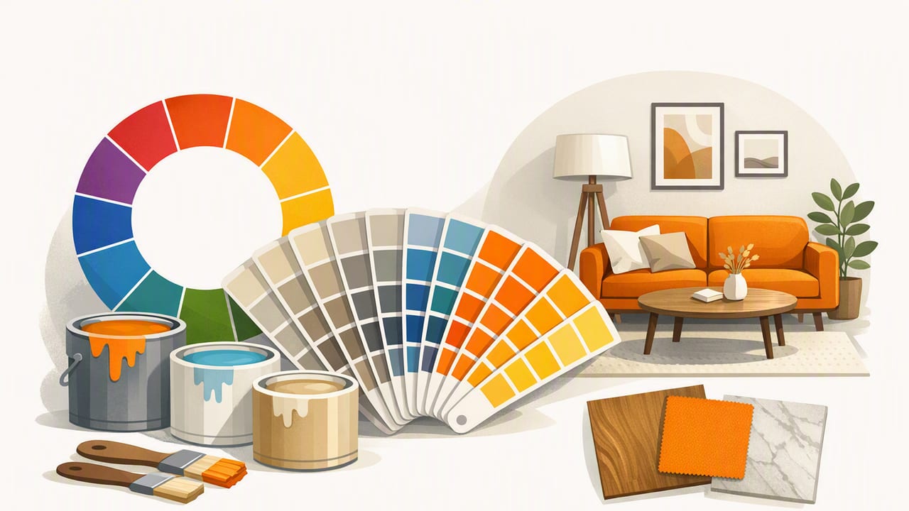
Choosing interior design colors can feel deceptively simple until you try to make a wall paint, sofa fabric, rug pattern, and wood tone all look intentional in the same room. The good news: you don’t need perfect taste or a design degree. You need a repeatable method that turns inspiration into a practical palette—one that holds up in real lighting and across real materials.
This guide shows a photo-first workflow for selecting interior colors that look cohesive, balanced, and “designed,” whether you’re decorating a home, staging a rental, or developing a look for client presentations.
Why start with photos for interior design colors?
Photos do two important things for color decisions:
- They anchor your palette in reality (nature scenes, travel shots, a favorite artwork, a tiled café floor you loved).
- They naturally contain harmony: lighting, materials, and textures already “agree,” which makes it easier to build a palette that feels coherent.
Instead of selecting colors in isolation (“I like sage green”), you’re selecting a set of colors that already work together (“this sage green works with this warm oak and this soft cream”).
The 60–30–10 rule (and when to bend it)
A classic way to keep interior design colors balanced is the 60–30–10 rule:
- 60%: dominant color (often walls, large rugs, big sectional)
- 30%: secondary color (upholstery, curtains, accent chairs)
- 10%: accent color (pillows, art details, ceramics, hardware)
It’s not a law; it’s a stabilizer. If your space already has strong fixed finishes (a brick fireplace, bold tile), your “60” may be a quieter neutral to let that feature be the star. If your home is open-plan, your 60–30–10 may span multiple rooms so sightlines stay consistent.
Step-by-step: extract a usable palette from an inspiration photo
1) Choose one “hero” photo
Pick a photo that captures the feeling you want: cozy, airy, dramatic, calm, playful. Ideally it includes at least one neutral and one accent. Avoid images with heavy color filters unless you want that stylized look.
2) Identify 5–7 core colors
For interior design colors, more isn’t better. Aim for:
- 2 neutrals (light and mid-depth)
- 1 grounded dark (charcoal, espresso, deep navy—optional but useful)
- 1–2 supporting hues (greens, blues, terracotta, etc.)
- 1 accent (a smaller “spark” color)
This gives you enough flexibility for paint, textiles, and accessories without turning the room into a patchwork.
3) Name each color by role (not by preference)
Label your palette by function to prevent “favorite color” decisions from breaking cohesion:
- Background neutral (walls, ceiling-adjacent surfaces)
- Secondary neutral (large textiles, cabinetry, drapery)
- Anchor (a dark note for contrast)
- Nature hue (green/blue/earth tone)
- Accent (metal, art highlight, statement object)
When you shop or spec products, you’ll know what each color is meant to do.
Undertones: the make-or-break detail
Most “mystery clashes” in interior design colors come from undertones, not the main hue. A beige can lean pink, yellow, green, or gray. A white can lean warm (creamy) or cool (blue-ish). Two colors can look similar in a swatch and still fight in a room.
Quick undertone checks you can do at home
- Compare to true white: Place a bright white sheet of paper next to the sample. Warm undertones look cream/yellow; cool undertones look blue/gray.
- Compare to a known warm wood: If the color looks greenish next to oak, it likely has a green/gray undertone.
- Use a neutral baseline: Put samples against a mid-gray background to reveal hidden color bias.
| Color Family | Common Undertones | Pairs Well With | Watch Out For |
|---|---|---|---|
| White | Cream/yellow, pink, blue, gray | Match undertone to flooring and stone | “Clean white” turning icy or dingy in low light |
| Beige/Greige | Green, purple, pink, yellow | Warm woods, natural textiles, matte metals | Green-leaning greiges next to red-toned wood |
| Blue | Gray, green, violet | Brass, walnut, crisp whites | Gray-blue feeling cold under daylight bulbs |
| Green | Yellow/olive, blue/sage, gray | Warm neutrals, terracotta, natural stone | Olive leaning muddy in dim rooms |
Lighting changes everything (so test like a designer)
Interior design colors don’t exist in isolation—they are light + surface + context. Before committing to paint or large purchases, test in conditions that match real life:
- Check the room’s orientation: north-facing rooms skew cooler; south-facing skew warmer.
- View samples morning, midday, evening: the color may shift dramatically.
- Match bulb temperature: 2700K is warm/cozy, 3000K balanced, 4000K+ cooler/cleaner.
- Test next to fixed finishes: flooring, counters, tile, brick. These “vote” on whether a color works.
Practical rule: If a color only looks good at one time of day, it isn’t the right “main” color. Save it for accents.
From digital colors to real paint and textiles
When you pull colors from a photo, you might capture values like HEX or RGB. That’s useful for consistency—especially when sharing with clients, creating a moodboard, or coordinating with digital renderings—but interior materials are physical and imperfect. Here’s how to bridge the gap:
- Use digital values to narrow choices, then choose real samples by undertone and lighting performance.
- Expect variation by material: the same “color” reads differently in velvet vs. matte paint vs. glazed ceramic.
- Match by perception, not math: your eye in the room is the final judge.
A simple “translation” workflow
- Extract 5–7 palette colors from your hero photo.
- Pick the closest paint deck matches for the background neutral and secondary neutral.
- Use textiles (pillows, throws, art) to carry the accent colors—this is cheaper to adjust than repainting.
Two reliable palette formulas for interior design colors
Formula A: Calm modern neutral + nature accent
- Background: warm white or soft greige
- Secondary: oatmeal / stone / taupe
- Anchor: charcoal or dark bronze
- Nature hue: sage, eucalyptus, dusty blue
- Accent: muted terracotta or brushed brass
Formula B: High-contrast classic
- Background: crisp white (undertone-matched)
- Secondary: mid-tone warm gray
- Anchor: deep navy or near-black
- Supporting hue: olive or deep teal (small area)
- Accent: warm metal (brass) or burgundy in art
These formulas are intentionally adaptable. Your extracted palette tells you which version fits your inspiration photo.
Making your palette easy to reuse (and easy to share)
If you’re collaborating with a contractor, working with a client, or planning multiple rooms, consistency is easier when you document your palette in a format others can follow.
Palette documentation checklist
- Color roles (background, secondary, anchor, accent)
- Digital values (HEX/RGB for references and presentations)
- Material notes (e.g., “secondary neutral: linen curtain,” “anchor: matte black hardware”)
- Do/Don’t rules (e.g., “no cool grays,” “metals: warm only”)
Optional: store colors as CSS variables for moodboards
If you create a simple web-based moodboard or share a mini style guide, CSS variables keep your interior design colors consistent across slides and pages:
:root {
  --bg-neutral: #F3EFE6;
  --secondary-neutral: #C9BBAA;
  --anchor: #2B2E34;
  --nature: #8FA48E;
  --accent: #C46A4A;
}

.swatch { width: 120px; height: 48px; border-radius: 10px; }
.bg { background: var(--bg-neutral); }
Common mistakes (and how to fix them)
- Picking colors from different “worlds” (cool gray paint + warm beige rug + red-toned wood). Fix: choose one temperature direction (warm, cool, or balanced) and stick to it.
- Using too many mid-tones so the room feels flat. Fix: add an anchor dark or stronger contrast through trim, hardware, or textiles.
- Overusing the accent color. Fix: reduce it to repeatable small moments (3–5 items) instead of a large surface.
- Ignoring the “unmovables” (flooring, countertops). Fix: start your palette by matching undertones to those finishes first.
FAQ: interior design colors
How many colors should be in an interior palette?
For most rooms, 5–7 colors is ideal: two neutrals, one anchor dark, one to two supporting hues, and one accent. Fewer can feel overly plain; more often becomes hard to control.
Should walls match the dominant color from my inspiration photo?
Not necessarily. Often the dominant “feel” comes from neutrals and materials. Use the photo’s strongest hue as a supporting or accent color unless you’re intentionally going bold.
How do I keep colors consistent across an open floor plan?
Repeat the same background neutral and at least one secondary neutral across connected spaces, then rotate accents by room. This keeps flow without making every room identical.
Putting it all together: a quick room plan example
Let’s say your hero photo is a coastal landscape: pale sand, driftwood, gray-blue water, deep slate rocks, and a pop of sea glass green.
- Background neutral (60%): sandy off-white for walls
- Secondary neutral (30%): warm driftwood tones in furniture and woven textures
- Anchor: slate/charcoal in hardware, picture frames, or a reading chair
- Supporting hue: gray-blue in curtains or a large rug pattern
- Accent (10%): sea glass green in pillows and ceramics
The result feels “pulled together” because every choice traces back to one coherent source.
A gentle tool note
If you want to speed up the photo-to-palette step, an iPhone/iPad color extraction app can capture HEX/RGB values from your inspiration images and help you organize swatches; for example, Color Viewfinder is one option that’s designed specifically for building palettes from photos.
