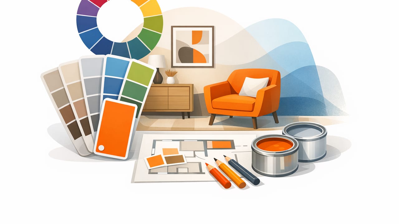
Choosing interior design colors can feel surprisingly high-stakes: a warm white that looks perfect online turns yellow in your hallway, or a soothing green reads gray once it’s on the wall. The good news is that you can reduce guesswork by building palettes from real spaces and real materials—floors, textiles, stone, wood, artwork—then translating those colors into a workable plan.
This article shows a practical, designer-friendly workflow for extracting colors from photos and turning them into room palettes you can actually use. You’ll learn what to capture, how to correct for lighting, how to pick a balanced set of neutrals and accents, and how to move from digital color values (HEX/RGB/HSL) to paint, fabric, and finish decisions.
Why start with photo-based palettes for interiors?
Unlike a purely theoretical color wheel approach, photo-based palettes begin with what you already love: a tiled backsplash, a vintage rug, a travel photo, or even a single pillow. This method works especially well for interior design because rooms are inherently multi-material—paint is only one part of the picture.
- Materials lead the palette: wood undertones, stone veining, metal finishes, and textiles set natural constraints.
- Consistency improves: when colors come from the same source, they tend to harmonize more easily.
- Faster decision-making: a small set of extracted swatches helps you compare options with less overwhelm.
“The goal isn’t to copy a photo perfectly—it’s to borrow its relationships: the contrast, the temperature, and where the eye rests.”
Step 1: Choose the right reference photo
Not every image is a good palette source. For interior design colors, pick images that contain materials and lighting similar to your space.
What makes a strong reference?
- Neutral anchor present: a wall, ceiling, or large upholstery area helps you define the “base” color.
- At least one warm + one cool element: this gives you flexibility (e.g., warm oak + cool gray stone).
- Clear midtones: avoid images that are mostly deep shadows or blown highlights.
- Minimal filters: social media edits can shift white balance and saturation.
Tip: If you’re photographing your own room or a showroom, take two shots: one wide shot for context and one close-up of key materials (rug, wood, tile, art). Close-ups often produce cleaner color reads.
Step 2: Capture colors intentionally (avoid the “lighting trap”)
Lighting is the #1 reason extracted colors can look “wrong” later. A beige wall in warm evening light may extract as a peachy tone; in cool daylight it can shift toward gray. Your goal is to sample colors that represent the material’s true character, not the temporary cast of a single light source.
Best practices for interior photo capture
- Use indirect daylight when possible (near a window, not in direct sun).
- Turn off mixed lighting (e.g., overhead warm bulbs + cool window light together).
- Avoid extreme HDR modes that flatten contrast and alter color relationships.
- Include a known neutral (white paper, a gray card, or a true-white trim) in at least one shot to sanity-check temperature.
If you must work from an online image, look for multiple photos of the same space from different angles. If the wall color changes drastically from photo to photo, that’s a sign the lighting is doing the heavy lifting—so treat those values cautiously.
Step 3: Extract a palette (aim for roles, not random swatches)
When you pull colors from a photo, you’ll usually get many similar tones. Instead of collecting everything, assign each swatch a role in the room. A simple structure keeps your palette usable across paint, textiles, and decor.
A reliable 6-color interior palette structure
- Base neutral (1): dominant background (walls, large sofa, cabinetry).
- Secondary neutral (1): trim, ceiling, or a second large surface.
- Material midtone (1): wood floor, leather, stone, major texture.
- Soft accent (1): subtle color for rugs/curtains (dusty blue, sage, blush).
- Bold accent (1): smaller punch (artwork color, statement chair).
- Dark anchor (1): grounding tone (charcoal, espresso, deep navy).
Why it works: most rooms need large quiet areas (neutrals), a few midtones (materials), and controlled contrast (dark anchor + accent). This prevents the common “everything is an accent” problem.
Step 4: Validate undertones (warm/cool/green/pink shifts)
In interior design colors, undertones matter more than the headline color name. Two “grays” can clash if one leans green and the other leans purple. After extraction, compare swatches side by side and ask:
- Does the neutral read warm (yellow/red) or cool (blue/green)?
- Is the accent muted (gray added) or clean/saturated?
- Does the dark anchor feel brown-based (warm) or blue-based (cool)?
A fast check: view the palette on a neutral gray background. If a “white” suddenly looks pink or green, that undertone will show up on a large wall too.
Step 5: Turn extracted values into a paint-and-material plan
Photo extraction gives you digital values (HEX/RGB/HSL). Paint and fabric swatches are physical, so you need a translation step. Use extracted colors as targets, then pick the closest real-world options with the right undertone.
Example palette table (with roles)
| Role | HEX | RGB | Where to use it |
|---|---|---|---|
| Base Neutral | #E8E2D8 | 232, 226, 216 | Walls, large upholstery |
| Secondary Neutral | #F7F5F0 | 247, 245, 240 | Trim, ceiling, built-ins |
| Material Midtone | #B08A64 | 176, 138, 100 | Wood tones, leather, baskets |
| Soft Accent | #8FA6A0 | 143, 166, 160 | Rug, curtains, bedding |
| Bold Accent | #C46A4A | 196, 106, 74 | Pillows, art, ceramics |
| Dark Anchor | #2F3436 | 47, 52, 54 | Hardware, frames, small furniture |
Bring it into your design files (optional CSS variables)
If you’re creating a mood board, a spec sheet, or a simple web-based presentation for a client, CSS variables keep your palette consistent:
:root {
  --base-neutral: #E8E2D8;
  --secondary-neutral: #F7F5F0;
  --material-midtone: #B08A64;
  --soft-accent: #8FA6A0;
  --bold-accent: #C46A4A;
  --dark-anchor: #2F3436;
}

.wall { background: var(--base-neutral); }
.trim { background: var(--secondary-neutral); }
Step 6: Stress-test the palette in your actual room conditions
Before committing, test how your interior design colors behave under the lighting you live with. A palette that looks balanced at noon can feel flat at night or overly warm under incandescent bulbs.
A simple testing checklist
- Daylight vs evening: check at least two times of day.
- Light bulbs: confirm your bulb temperature (e.g., 2700K warm vs 4000K neutral).
- Neighboring surfaces: carpets, countertops, and wood floors reflect color back onto walls.
- Scale: view large samples (big paint swatches, larger fabric cuts). Tiny chips mislead.
Pro move: If your palette includes a soft accent (like sage), test it next to the base neutral and the wood tone simultaneously. Undertone conflicts often only appear when the trio is together.
Common mistakes when choosing interior design colors from photos
1) Sampling highlights and shadows
Highlights skew lighter and often cooler; shadows skew darker and can pick up reflected colors. Sample midtone areas for more reliable values.
2) Over-indexing on saturation
Phones can make accent colors look more vibrant than they feel in person. In interiors, slightly muted accents usually age better and are easier to coordinate.
3) Ignoring finish (matte vs glossy)
Paint sheen changes perception. A glossy finish reflects light and can make a color feel brighter and more intense. A matte finish often reads calmer and slightly deeper.
4) Too many competing accents
If you extract five “fun” colors, you may end up with a room that feels busy. Keep one bold accent and let everything else support it.
How to adapt one palette to multiple rooms
One of the best parts of a structured palette is that you can reuse it across a whole home without repeating the same exact look.
- Keep the neutrals consistent (base + secondary) to unify the space.
- Swap the soft accent per room (sage in bedroom, dusty blue in office) while keeping the dark anchor stable.
- Rotate materials: repeat the wood tone, but vary the texture (oak table, rattan lamp, leather stool).
This approach gives you continuity without making every room identical.
Accessibility and contrast (yes, it matters in interiors too)
Interior color choices influence legibility and comfort. High-contrast elements help with wayfinding and usability—especially for stairs, door frames, switches, and signage in commercial or rental spaces.
- Use a darker anchor for railings, hardware, or key edges when needed.
- Avoid low-contrast transitions (e.g., pale flooring + pale stairs) that can be hard to read.
- Test readability for wall text/art labels if applicable (dark text on light wall, or vice versa).
A quick workflow recap
- Select a reference photo with materials similar to your space.
- Capture or choose images with clean, consistent lighting.
- Extract a small set of swatches and assign roles (base, secondary, midtone, accents, anchor).
- Validate undertones on a neutral background.
- Translate digital colors into real paint/material options and test them in-room.
Final thought: treat extracted colors as a compass
Photo-based palettes aren’t about chasing a perfect match; they’re about building a coherent direction. Once you have a grounded set of interior design colors, decisions get easier: you can evaluate new rugs, paint cards, and furniture by asking whether they support the palette’s temperature, contrast, and mood.
If you prefer doing this on an iPhone or iPad, a color-extraction tool like Color Viewfinder can help you pull consistent HEX/RGB values from your reference photos and organize them into usable palettes.
