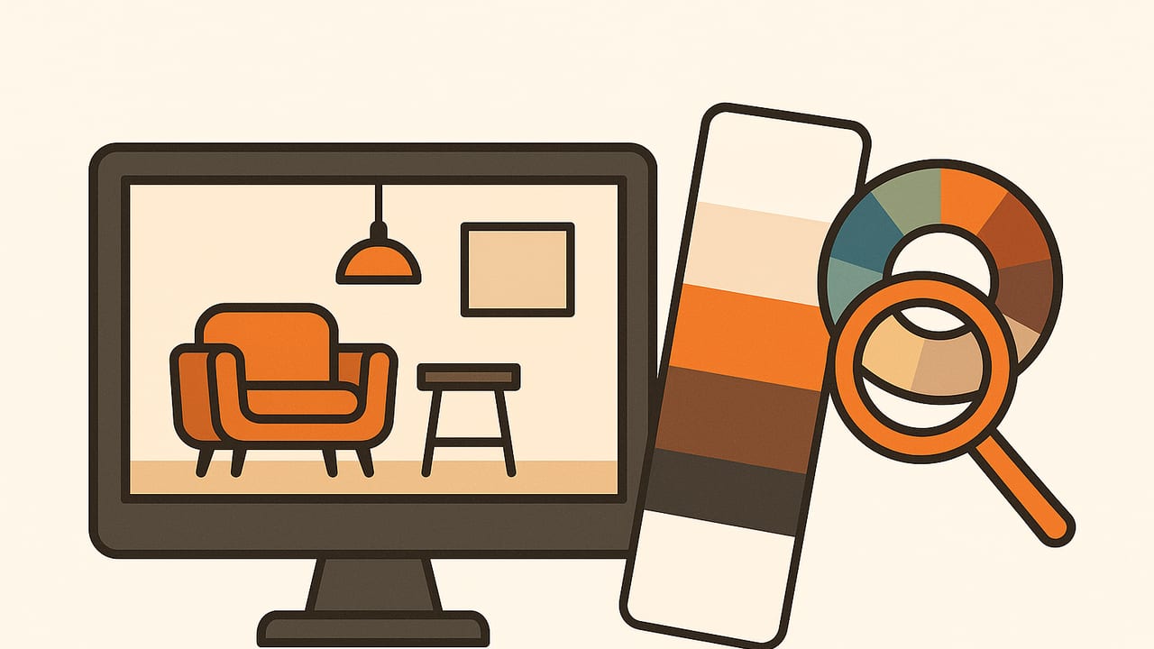
Turning a single photo into a cohesive room palette is one of the fastest ways to build a mood, echo a client’s story, and align choices across paint, textiles, and finishes. This guide shows how to create an interior designer color scheme from images with accuracy and intent—from capture to sampling, color modeling, paint matching, and practical application in a space.
Workflow: From Photo to Room-Ready Palette
Approach every palette with a repeatable process. Here’s a proven, professional flow:
- Choose the right image: Favor photos with clear lighting, minimal filters, and a defined subject/mood (e.g., a coastal scene or vintage café).
- Correct lighting: Adjust white balance and exposure before sampling. If possible, include a gray card in source shots.
- Crop with intent: Remove distracting elements (e.g., bright signage) that skew color averages but won’t appear in the room.
- Extract a candidate palette: Use a color picker or clustering method (e.g., k-means) to find dominant hues and supporting tones.
- Assign roles: Map colors to base (walls), secondary (large furnishings), accent (pillows, art), trim/metal, and wood/stone.
- Test in context: Simulate on room photos or swatch boards. Adjust lightness and saturation for daytime and evening conditions.
- Translate to materials: Convert HEX/RGB to paint swatches and fabrics. Confirm matches under the project’s actual lighting (CRI, CCT).
Color Models: Which Values to Work With—and When
Designers encounter multiple color models when converting image pixels to materials. Each has a role:
| Model | What it is | Best for | Notes |
|---|---|---|---|
| HEX | Hexadecimal notation of RGB | Digital swatches, quick sharing | Compact, ubiquitous on web and apps |
| RGB | Additive red-green-blue | Sampling from images and screens | Device-dependent; not perceptually uniform |
| HSL | Hue, Saturation, Lightness | Adjusting mood (muting/brightening) | Intuitive for tweaking tones |
| HSB/HSV | Hue, Saturation, Brightness/Value | Accent tuning and highlight control | Similar to HSL with a different lightness curve |
| Lab (CIELAB) | Perceptually uniform space | Paint matching, Delta E comparisons | Best for accuracy; needs conversion from RGB |
For interior designer color schemes from images, sample in RGB/HEX, refine in HSL/HSB, and evaluate paint matches in Lab using Delta E (difference) metrics.
Extraction Methods Compared
There isn’t one “best” algorithm—choose based on the image and the design goal.
| Method | How it works | Pros | Cons | Use when… |
|---|---|---|---|---|
| Manual sampling | Pick points with an eyedropper | Designer control; avoids noise | Time-consuming; subjective | Curated palettes from styled shoots |
| K-means clustering | Groups pixels into K dominant colors | Finds main hues quickly | Can miss subtle neutrals | Clear subjects; brand-color extraction |
| Median cut / histograms | Bins color space by frequency | Good coverage of tones | May elevate background noise | General-purpose image palettes |
| Edge-aware segmentation | Segments objects, then samples | Object-level accuracy | More setup; slower | Rooms with mixed materials |
| Semantic models | Detects sky, foliage, skin, etc. | Context-aware choices | Requires ML; may need cloud | Complex lifestyle photos |
Quick k-means example (Python)
from sklearn.cluster import KMeans
import numpy as np
from PIL import Image

img = Image.open('source.jpg').convert('RGB')
arr = np.array(img).reshape(-1, 3)

# optional: downsample pixels for speed
sample = arr[np.random.choice(arr.shape[0], 50000, replace=False)]

k = 6  # number of palette colors
km = KMeans(n_clusters=k, n_init=8, random_state=0).fit(sample)
centroids = np.rint(km.cluster_centers_).astype(int)
hex_colors = ['#%02x%02x%02x' % tuple(c) for c in centroids]
print(hex_colors)
Accuracy Pitfalls (and How to Fix Them)
- Color casts: Tungsten adds warmth; fluorescent can green-shift. Fix with white balance or a neutral reference (gray card).
- Overexposed highlights: They erase nuance in whites and beiges. Pull back exposure before sampling.
- HDR/filters: Social filters exaggerate saturation; sample from unfiltered files.
- Specular reflections: Avoid sampling from glossy highlights on tile or metal.
- Screen color profiles: Calibrate displays; export sRGB for consistent cross-device viewing.
Simple white balance correction
If your photo contains something neutral (gray/white), you can normalize channels toward that reference before sampling.
# R, G, B are channel averages of a neutral patch
scale_r = 0.5 * (G + B) / R
scale_g = 0.5 * (R + B) / G
scale_b = 0.5 * (R + G) / B
# multiply image channels by scale_* (clamp 0..255)
Mapping Pixels to Paints and Materials
Screens use RGB; paint lives closer to Lab and real-world reflectance. To make reliable matches:
- Convert RGB to Lab: Use a color library or a trusted converter.
- Compare against a fan deck: Many brands provide Lab values. Compute Delta E (CIEDE2000); under 2 is a near match.
- Check LRV (Light Reflectance Value): Higher LRV brightens small rooms; lower LRV adds drama and depth.
- Confirm on-site: View swatches in the room at daytime and evening with the project’s lighting.
Delta E matching (Python, using colormath)
from colormath.color_objects import LabColor
from colormath.color_diff import delta_e_cie2000

# sampled Lab from image (example)
sampled = LabColor(lab_l=75.1, lab_a=-2.3, lab_b=8.9)

# iterate through paint deck list of Lab values
best = None
best_de = 1e9
for swatch in paint_deck:  # [{'name': 'Brand Shade', 'L':..,'A':..,'B':..}, ...]
    lab = LabColor(lab_l=swatch['L'], lab_a=swatch['A'], lab_b=swatch['B'])
    de = delta_e_cie2000(sampled, lab)
    if de < best_de:
        best, best_de = swatch, de

print(best['name'], best_de)
Pro tip: If your sampled wall color looks slightly dull when painted, raise Lightness (L) or reduce Saturation (via A/B) rather than changing Hue; this preserves the image’s mood.
Room Recipes: From Image to Roles
1) Coastal Landscape → Airy Living Room
Image cues: Sand neutrals, soft sky blues, seafoam accents, driftwood.
- Base (walls):
#E9E3D7sand - Secondary (sofa/rug):
#C7D8E6misty blue - Accent (pillows/art):
#7FB9C2seafoam,#2F5F7Adeep ocean - Trim/metal:
#F6F5F2crisp white; brushed nickel - Wood/stone: weathered oak, pale rattan
Why it works: High-LRV base color keeps it bright; cool accents balance warm sands.
2) Vintage Café → Cozy Kitchen
Image cues: Espresso browns, brass, aged green tiles, cream foamed milk.
- Base (cabinets/walls):
#EDE7DAcream - Secondary (tile):
#5F7A66aged green - Accent:
#8B5A3Cespresso,#C7A15Bbrass - Trim:
#F3F1EAwarm white - Wood/stone: walnut, honed travertine
Why it works: Muted saturation prevents heaviness; metals add warmth and heritage.
3) Botanical Macro → Calm Bedroom
Image cues: Leafy greens, soft blush petals, cool shadows.
- Base:
#F2EDEAblush neutral - Secondary:
#8FAE8Dleaf green - Accent:
#3E5B49deep foliage,#A67D8Cmuted mauve - Trim:
#FFFFFFclean white - Wood/stone: ash wood, veined marble
Why it works: Low-contrast base supports restfulness; darker greens ground the palette.
Contrast and Readability (Labels, Art, Textiles)
Even in residential spaces, consider contrast for signage, labels, framed quotes, or embroidered monograms. Aim for a luminance contrast ratio of at least 4.5:1 for small text; 3:1 for large text.
# WCAG contrast ratio for two HEX colors
import math

def rel_lum(c):
    def f(v):
        v = v/255.0
        return v/12.92 if v <= 0.03928*255 else ((v+0.055)/1.055)**2.4
    r,g,b = c
    return 0.2126*f(r) + 0.7152*f(g) + 0.0722*f(b)

def hex_to_rgb(h):
    h = h.lstrip('#')
    return tuple(int(h[i:i+2],16) for i in (0,2,4))

def contrast_ratio(h1, h2):
    L1, L2 = sorted([rel_lum(hex_to_rgb(h1)), rel_lum(hex_to_rgb(h2))], reverse=True)
    return (L1 + 0.05) / (L2 + 0.05)
Exporting and Sharing Palettes
Deliver palettes in multiple formats to collaborate smoothly across teams and software:
- HEX/RGB lists: For quick reference and web boards
- HSL/HSB: For mood tweaks and rendering tools
- ASE/ACO/GPL: Adobe and open-source swatch formats
- SVG swatch sheets: Printable, scalable handouts
- CSV/JSON: For developers and visualization pipelines
Checklist: Interior Designer Color Scheme from Images
- Capture neutral, well-lit photos or correct white balance
- Crop distractions; sample representative areas, not highlights
- Use clustering to find dominants; refine with manual picks
- Work in HEX/RGB for sampling; Lab for paint matching
- Evaluate Delta E against fan decks; verify on-site
- Assign roles (base, secondary, accent, trim, material)
- Test under daylight and artificial lighting
- Export swatches for teams and vendors
“The best palettes don’t just match colors—they preserve the story and lighting of the original image while respecting the room’s scale, function, and materials.”
Final Thoughts
Photos are powerful briefings. With a disciplined workflow—accurate sampling, perceptual evaluation, and real-world verification—you can transform any image into a palette that performs in paint, fabric, wood, and metal. If you prefer a fast, mobile workflow for extracting HEX, RGB, HSL, and HSB values from photos and organizing palettes, consider trying Color Viewfinder on iPhone or iPad.
