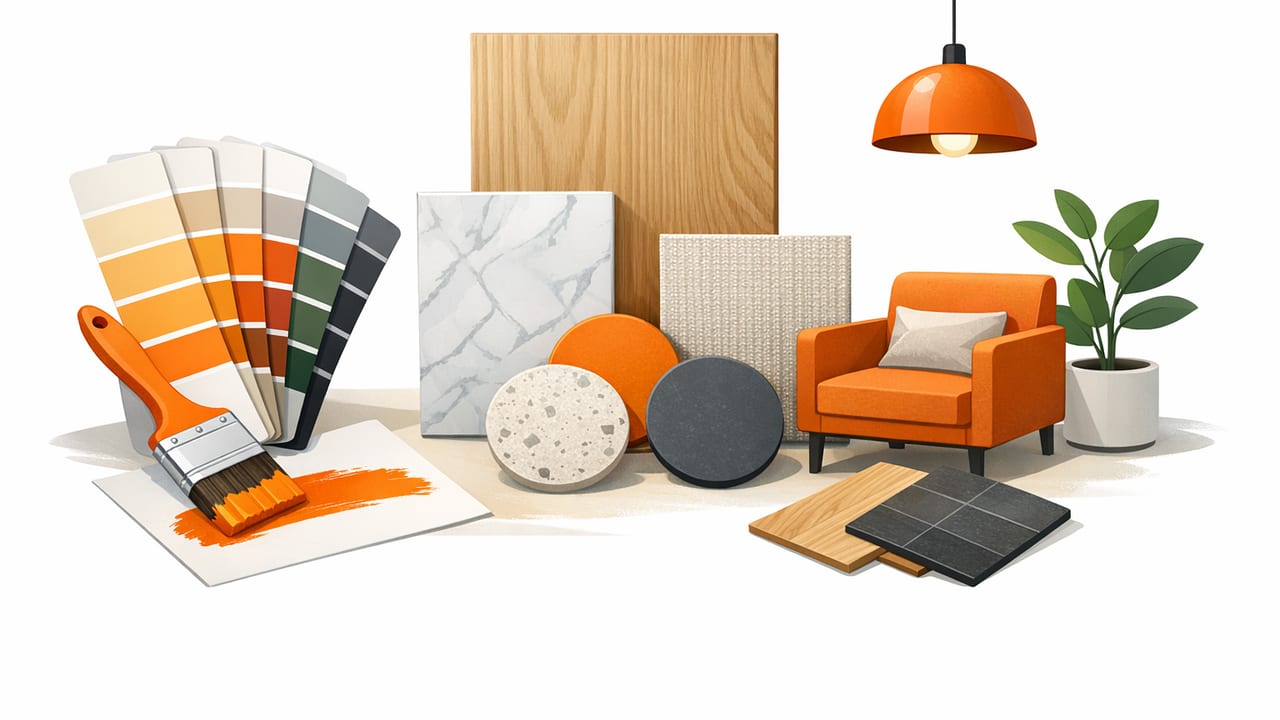
Great interiors rarely happen by accident. The rooms that feel “pulled together” usually share one invisible feature: a consistent color system. If you’ve been collecting inspiration photos but still can’t translate them into paint, textiles, and finishes, the missing step is often turning inspiration into an intentional palette.
This guide focuses on interior palette ideas you can actually apply—using photo-based inspiration, simple balance rules, and practical HEX examples you can share with a painter, cabinet maker, or digital mood board. Whether you’re refreshing one room or coordinating an open-plan space, you’ll leave with a repeatable method and several ready-to-adapt palettes.
How to Build a Cohesive Interior Palette (Without Overthinking)
1) Start with one “anchor” you won’t change
Your anchor is the thing you’re least likely to replace. Common anchors include:
- Fixed finishes: flooring, countertops, tile, brick, large wood furniture
- A hero textile: a rug, curtains, statement sofa, bedding
- An inspiration photo: a room, landscape, artwork, or vintage piece you love
Anchors matter because they quietly dictate undertones (warm vs. cool) and contrast level (soft vs. bold). Choose one anchor and build around it.
2) Extract 5–7 colors, then edit down to 3–5
Inspiration images contain dozens of colors. Your job is to reduce them into a workable set:
- Pull 5–7 candidate colors (dominant, secondary, shadow, highlight, and one accent).
- Identify duplicates (two beiges that read the same in your room).
- Keep 3–5 final colors: usually 1–2 neutrals, 1 mid-tone, 1 deep, 1 accent.
Too many colors can look busy. A smaller palette can still feel rich if you vary texture (linen, velvet, matte paint, glazed ceramic) and sheen (flat vs. satin vs. gloss).
3) Use the 60–30–10 rule as a starting point
This classic distribution helps a palette feel balanced:
- 60% = main color (often walls or large rugs)
- 30% = secondary color (sofas, drapery, cabinetry)
- 10% = accent color (art, cushions, small furniture, décor)
It’s not a strict formula, but it prevents the common mistake of giving every color equal visual weight.
4) Decide your contrast: soft, medium, or bold
Before choosing paint, decide how dramatic you want the room to feel:
- Soft contrast: colors close in lightness (airy, calm, minimal)
- Medium contrast: a mix of light and mid-tones (inviting, flexible)
- Bold contrast: deep tones + crisp light tones (graphic, modern, high-impact)
Tip: If your space is visually “busy” (open shelving, lots of windows, exposed beams), a simpler palette often looks more intentional.
7 Photo-Inspired Interior Palette Ideas (With HEX Codes)
Use these palettes as templates. Swap one color at a time to match your anchor (flooring, tile, fabric), then test in your lighting. The table includes suggested usage so you can apply the 60–30–10 rule immediately.
| Palette | HEX Colors | Best Uses |
|---|---|---|
| 1) Warm Minimal Linen | #F4EFE6, #D8C7B2, #A68C6D, #3F3A34, #B56A4A | Living rooms, calm bedrooms, open-plan spaces |
| 2) Coastal Quiet (Not “Theme-y”) | #F7F7F2, #C9D6D2, #7AA7A5, #2E4B4C, #D9B08C | Bathrooms, kitchens, light-filled dining areas |
| 3) Earth + Clay Modern | #F2E6D8, #C97B63, #8C5A3C, #2E2A27, #A7B08A | Entryways, studios, kitchens with wood tones |
| 4) Moody Library Green | #E8E1D4, #B4A89B, #2F4A3A, #13261E, #A67C52 | Offices, dens, dining rooms, statement walls |
| 5) Soft Pastel + Black | #FAF6F8, #E7C7D4, #BFD7EA, #C9D3C2, #1C1C1C | Nurseries, creative rooms, modern apartments |
| 6) Desert Dusk | #F6E7D4, #E2BDA5, #C46E5A, #6B4E3D, #3A536B | Bedrooms, lounges, boho-modern spaces |
| 7) High-Contrast Monochrome Warmth | #FAF8F3, #D9D2C6, #8C857A, #2B2B2B, #B08D57 | Modern kitchens, hallways, gallery-style walls |
How to apply any palette in a real room
- Main (60%): pick the lightest neutral for walls or the largest rug area.
- Secondary (30%): choose a mid-tone for upholstery, cabinetry, or curtains.
- Accent (10%): add the boldest hue in art, cushions, vases, or a single chair.
- Deep tone: use sparingly for contrast (frames, hardware, lamp bases).
Room-by-Room Tweaks (So the Same Palette Works Everywhere)
Living room
Prioritize comfort and longevity. Use your palette to decide:
- Walls: light neutral (easy to repaint later)
- Upholstery: mid-tone that hides wear
- Accents: rotate seasonally (throws, cushions, art prints)
Kitchen
Kitchens read “busier” because of appliances and hard edges. Keep the palette tighter:
- Choose two main colors for cabinets + walls.
- Use the accent color in bar stools, a runner, or small appliances.
- Match undertones between countertop and backsplash before paint decisions.
Bedroom
Bedrooms can handle softer contrast and more texture. If you want calm:
- Keep accent colors desaturated (dusty rose instead of hot pink).
- Repeat one color in three places (e.g., cushions, art, bedside ceramic).
Bathroom
Bathrooms look best when you treat tile like the “hero rug.” Pull two colors directly from tile veining or grout, then add one accent via towels or art.
Common Mistakes That Break a Palette
Mixing undertones without noticing
Not all whites are equal. A warm cream next to a cool gray can look “dirty” rather than intentional. When in doubt, compare your samples against:
- a true white sheet of paper
- your flooring in daylight and evening light
Choosing accent colors that are too saturated
Bright accents are fun, but most rooms benefit from “muted” accents (think terracotta, olive, deep teal) instead of neon. If you love a vivid hue, use it in small, movable items.
Forgetting finish and texture
Two items can share the same color family but look wrong together if sheen clashes. For example, glossy black next to matte charcoal can be stunning—or messy—depending on repetition. Repeat sheen choices on purpose (e.g., matte black hardware + matte black frames).
A Quick Workflow: From Photo to a Shareable Palette
- Pick one photo that matches the vibe you want.
- Extract 5–7 colors (dominant, mid, deep, accent, highlight).
- Sort by lightness to see your contrast level.
- Assign roles (60/30/10 + deep tone).
- Test in your room: paint swatches and fabric samples under morning and evening light.
- Document your codes so you can match accessories and digital mockups.
Optional: Use your palette in a simple mood board (CSS variables)
If you’re sharing ideas with a partner or contractor, a tiny web mockup can help. Here’s a minimal example:
:root {
  --base: #F4EFE6;
  --secondary: #D8C7B2;
  --mid: #A68C6D;
  --deep: #3F3A34;
  --accent: #B56A4A;
}

.wall { background: var(--base); }
.sofa { background: var(--secondary); }
.wood { background: var(--mid); }
.hardware { background: var(--deep); }
.decor { background: var(--accent); }
This isn’t about “coding your room”—it’s about making your color decisions easy to visualize and share.
Mini Checklist: Sanity-Check Your Choices Before You Buy
- Does the palette have at least one neutral you can expand across multiple rooms?
- Do you have a deep tone for contrast (even if it’s just frames/hardware)?
- Can you point to one anchor item that explains the palette?
- Have you tested samples in daylight and evening?
- Have you repeated each main color at least twice in the room?
When you’re collecting interior palette ideas, the goal isn’t to find the “perfect” scheme—it’s to find a system you can apply consistently. Start with one anchor, reduce your colors, assign roles, and test in real light. You’ll get a home that feels cohesive, not copied.
If you like working from photos, an iOS/iPad tool such as Color Viewfinder can help you capture consistent HEX/RGB values from inspiration images and keep your palette documented.
