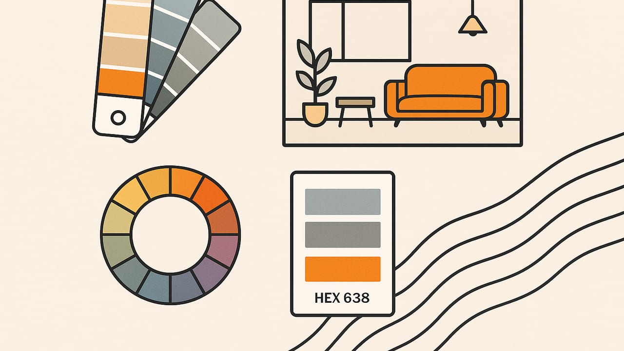
Choosing colors is the fastest way to shape how a room feels—and the easiest way to get overwhelmed. This guide compiles practical interior palette ideas you can apply right away, with clear HEX examples, lighting advice, and room-by-room suggestions. Whether you’re updating a rental or planning a full renovation, you’ll learn how to build harmonious schemes that work with your daylight, finishes, and furnishings.
Great palettes don’t start with paint—they start with mood, light, and the materials you already own.
Start With Outcomes: Mood, Function, and Focal Points
Before comparing swatches, define the room’s purpose and feeling. Your palette is a tool to express that outcome. Use these prompts to guide your first decisions:
- Mood: Calm, bright, cozy, elegant, playful, focused, restorative?
- Function: Conversation, sleep, deep work, dining, cooking, play?
- Focal points: A fireplace, a rug, a view, artwork, or cabinetry?
- Constraints: Existing floors, trim color, fixed stone, metal finishes.
When you translate these into color, think in terms of value (light/dark) and chroma (muted/vivid). Calm spaces usually lean light-to-mid value with low chroma; energetic rooms embrace stronger contrast and higher chroma accents. Keep a short list of adjectives on your phone so every palette choice traces back to the mood you want.
Color Theory Primer for Interiors
A little color theory goes a long way inside a home. Here are the most useful frameworks for interior palette ideas:
- Analogous: Colors next to each other on the wheel (e.g., blue–blue-green–green) create soft transitions—great for bedrooms and baths.
- Complementary: Opposites on the wheel (e.g., blue and orange) give energetic contrast; use one dominant and one as an accent to avoid visual noise.
- Split-complementary: A hue plus the two hues adjacent to its complement (e.g., teal with red-orange and yellow-orange) offers contrast with more flexibility.
- Triadic: Three evenly spaced hues (e.g., red, yellow, blue) feel lively; works best with muted versions and one color leading.
Combine theory with the classic 60–30–10 rule: 60% base (walls/large surfaces), 30% secondary (furniture/textiles), 10% accent (art, decor, small upholstery). For modern interiors, a 70–20–10 split often reads more serene. In open plans, keep adjacent rooms within one step of value or chroma so transitions feel intentional.
Lighting and Finishes: Why the Same HEX Looks Different
Paint chips and digital HEX values don’t account for your room’s light. Two key considerations influence perceived color:
- Light temperature: Warm bulbs (2700–3000K) enrich reds/oranges and mute blues; cool bulbs (4000–5000K) amplify blues/greens and can flatten warm beiges. Natural light shifts through the day: north light cools, south light warms.
- Finish and texture: Matte diffuses and looks softer; satin/semigloss reflect more, appearing slightly lighter and cleaner. Textured plaster and wood grain introduce shadows that darken the read.
Account for metamerism—colors that match under one light but diverge under another. Always test swatches at wall scale in at least two spots and view at morning, midday, and evening. If you use metal finishes (brass, chrome, blackened steel), remember they act like colored light sources, warming or cooling adjacent surfaces.
Room-by-Room Interior Palette Ideas
Use these ready-to-apply concepts as a starting point. Adapt the values to your light level and material palette.
| Space | Palette Name | HEX Trio | Usage Notes |
|---|---|---|---|
| Living Room | Warm Minimal | #F5F2EA (base), #CBBBA0 (secondary), #3D4A3C (accent) | Off-white walls, taupe upholstery, deep olive in pillows and art. Brass or black accents. |
| Living Room | Coastal Modern | #EEF4F7, #88AECB, #1F4E67 | Light cool walls, misty blue textiles, navy accents; oak or rattan for warmth. |
| Kitchen | Green + Copper | #EDEAE3, #516B57, #C2683D | Soft warm white walls, sage cabinetry, copper hardware and lighting. |
| Kitchen | Monochrome Stone | #F7F7F5, #B7B7B5, #333333 | Marble-look quartz, light gray cabinets, charcoal bar stools; chrome or black metal. |
| Bedroom | Restorative Analog | #F3F5F1, #A9C2A8, #6A8F83 | Soft white walls, eucalyptus bedding, muted teal throw and lamp bases. |
| Bedroom | Moody Luxe | #EAE7E1, #4A4553, #9D7D50 | Warm white trim, deep plum-gray walls, cognac leather and aged brass details. |
| Bathroom | Spa Neutral | #FAFAF7, #C8C5BD, #4E6B6A | Matte off-white walls, stone-look floor, desaturated teal vanity. |
| Home Office | Focus Blue | #F2F6F8, #6F8DAA, #2E4D67 | Cool white ceiling, smoky blue walls, deep blue-black shelving for visual anchor. |
| Kids’ Room | Playful Pastel | #FFF6F1, #F2B6B7, #8FD2C6 | Warm white base, blush textiles, mint accents; avoid oversaturation for longevity. |
| Rental-Friendly | Layered Greige | #F0EEE9, #C9C1B8, #6B6B6B | Greige walls, oatmeal textiles, charcoal accents; swapable color via art and plants. |
Material-First Palettes: Build Around Wood, Stone, and Metal
Fixed finishes often dictate your best options. Start by identifying undertones:
- Oak and maple: Warm yellow undertones pair with muted blues and cool grays. Try #F2F2EF (base), #8DA3B8 (secondary), #364350 (accent).
- Walnut: Rich brown with red-violet undertones likes moss, teal, and off-white. Try #F6F3EE, #6B7A61, #2D5454.
- Calacatta marble: Slightly warm white with gray veins—balance with soft greige and charcoal: #FAF8F4, #CFC9C0, #2F2F31.
- Polished brass: Adds warmth; cool blues/greens keep it sophisticated: #EDEFEF, #86A8A4, #B07B33.
Hold your samples right against the material under actual room light. If an option looks “dirty,” you’re fighting undertones—try shifting the hue slightly cooler or warmer instead of jumping to a different color family.
Neutrals That Aren’t Boring
Neutrals carry most of the wall area, so choose thoughtfully:
- Soft white (slightly warm): #F7F4EF feels sunlit without yellowing.
- Greige (balanced gray-beige): #D7D1C8 works with wood, stone, and both warm/cool metals.
- Mushroom (earthy taupe): #B6AFA5 adds depth but stays calm.
- Charcoal (anchor): #3A3A3A grounds light rooms and frames views.
Pair a warm neutral with a cool accent or vice versa to retain visual energy. On trim, choose one step lighter or darker than walls for subtle dimension.
Accents and Saturation: Get the 10% Right
Accents deliver personality without overwhelming the space. Keep saturation in check and think strategically about placement:
- Concentrate saturated color into movable pieces—pillows, stools, lamps—so you can pivot with seasons.
- Repeat the accent at least three times in a room for cohesion (e.g., rug stripe, vase, book spine color).
- Try a “10 + 5” rule: 10% primary accent, 5% micro-accent in a neighboring hue for richness.
Go-to accent HEX starters: #B5544D (terracotta), #4E7D7D (deep teal), #8A6BBE (lavender-gray), #D4A73A (antique gold), #E27C5E (salmon-coral).
Workflow You Can Trust (From Inspiration to Specification)
- Collect references: Gather 6–8 images that match your mood words. Focus on value and temperature, not specific paints.
- Extract colors: Pull 5–7 key colors that repeat across your references. Note their approximate HEX so you can communicate clearly and test purposefully.
- Name your chips: Assign roles (Base, Secondary, Accent A/B, Metal, Wood) to avoid duplication and drift.
- Mock up quickly: Apply the 60–30–10 ratio on a simple floor plan or mood board to pressure-test balance.
- Test at scale: Paint large swatches or use peel-and-stick samples on at least two walls; observe morning, midday, evening.
- Check materials: Place swatches against floors, countertops, fabric. Adjust until undertones agree.
- Document: Save final HEX, paint brand/finish, and placement notes by surface to streamline ordering and touch-ups.
Common Mistakes to Avoid
- Choosing in the store: Big-box lighting skews perception; always test at home.
- Ignoring finishes: The same hue reads different in matte vs. satin; specify finishes per room function.
- Too many heroes: If walls, sofa, rug, and art are all loud, nothing stands out. Pick one or two focal heroes.
- One-size-fits-all white: North-facing rooms often need warmer whites to avoid going icy.
- Accent overload: Keep saturated colors to small, repeatable moments.
Quick Reference: HEX Ideas by Interior Style
Use these mini-maps to kickstart your scheme; tweak value and saturation to fit your light.
| Style | Base | Secondary | Accent | Suggested Metal |
|---|---|---|---|---|
| Scandinavian Calm | #F6F5F2 | #C9D1D3 | #6D8B99 | Matte black or brushed steel |
| Modern Rustic | #EFEAE3 | #A08F7A | #375345 | Oil-rubbed bronze |
| Art Deco Revival | #F1EEE9 | #3C3A4A | #B98B3B | Polished brass |
| Japandi | #F4F1EA | #B9B6AA | #556B61 | Brushed nickel |
| Mid-Century Fresh | #FAFAF7 | #C4A788 | #2E7D6B | Brushed brass |
FAQ
How many colors should a room palette include?
Five to seven is a practical sweet spot: one base, one or two secondaries, one or two accents, plus metals and wood tone. Fewer colors demand more attention to value and texture; more colors require strict role assignment so the room doesn’t feel busy.
What if my rooms have different styles—how do I connect them?
Use a repeating thread: a shared trim color, consistent metal finish, or one accent hue that pops up in each space at small scale. Keep adjacent rooms within one value step and reuse your base neutral so transitions feel cohesive even if the personalities differ.
How do I pick a white that doesn’t look too blue or too yellow?
Match white to light: in cool light (north-facing or 4000–5000K bulbs), choose a slightly warm white (#F6F2EB). In warm light (south-facing or 2700–3000K bulbs), use a neutral-to-cool white (#F2F5F7). Always test at scale—small chips exaggerate warmth and coolness.
Bringing It Together
The best interior palette ideas are specific to your light, materials, and mood. Start with the feeling you want, test colors at wall scale, and document your final selections so every decision builds toward a cohesive whole. If you like working from photos of art, textiles, or views, the iOS app Color Viewfinder can quickly pull accurate HEX, RGB, and HSL values from images and export clean palette layouts for planning.
