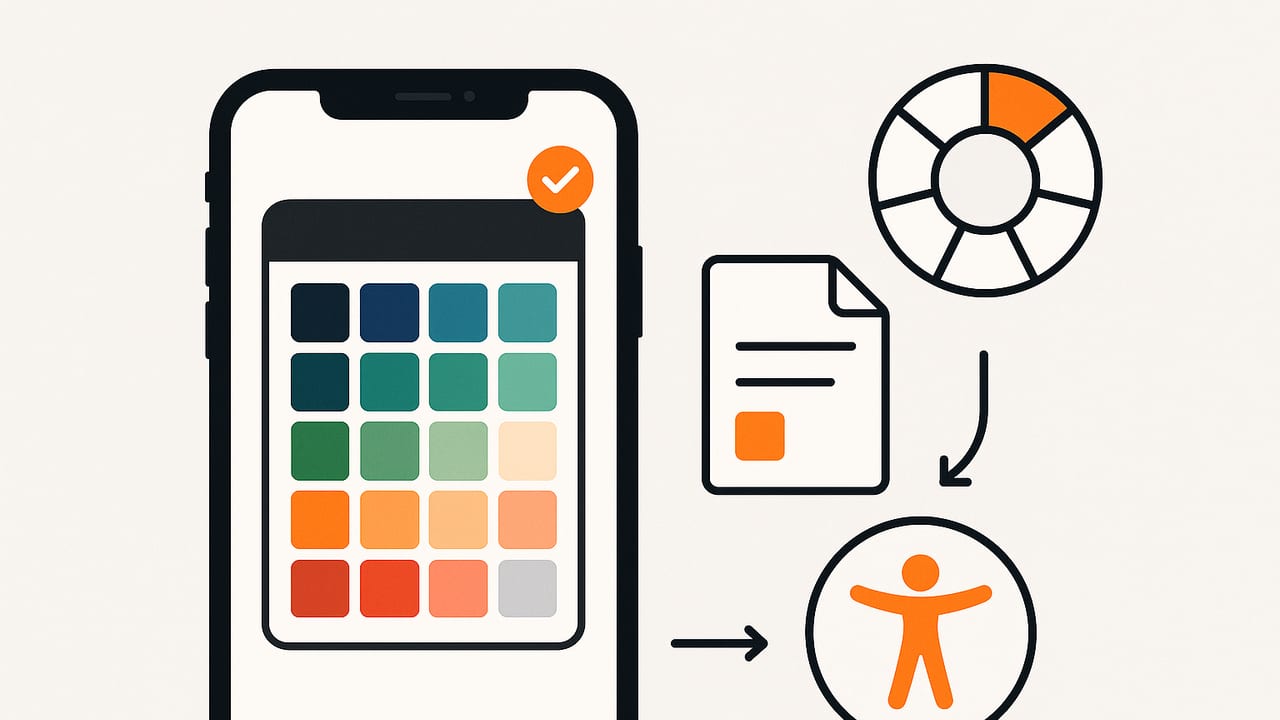
Whether you’re refining a brand, styling a room, or polishing a UI, color is a language—and the right iOS color palette app can translate the world around you into usable swatches in seconds. This guide shows how to evaluate apps, build palettes from photos, export in the right formats, and ensure your colors stay accurate and accessible across devices.
What to Look For in an iOS Color Palette App
Before you commit to a workflow, make sure your toolset covers the essentials. If you’re choosing an ios color palette app for everyday work, consider the following criteria:
- Accurate sampling: Eyedropper with adjustable sample radius (e.g., 1×1, 3×3, 5×5) to reduce noise from grainy photos.
- Multiple color models: HEX, RGB, HSL, and HSB (HSV) for designers, plus CMYK estimates for print workflows.
- Smart extraction: Auto-generate palettes with clustering (e.g., k-means) and allow manual refinement.
- Color management: Respect iOS color spaces (sRGB and Display P3) and embed profiles on export.
- Accessibility tools: Built-in contrast checker, light/dark preview, and WCAG targets.
- Flexible exports: CSS variables, JSON, SVG, PDF, PNG swatches, and design app formats (e.g., ASE, ACO, Procreate swatches).
- Editing and layout: Rearrange, rename, group, merge near-duplicates, and present palettes in different layouts (stripes, tiles, gradients).
- iOS and iPadOS features: Share Sheet, Shortcuts automation, drag-and-drop, Files integration, iCloud sync.
- Batching and organization: Save, tag, and search palettes; duplicate for variants (e.g., dark mode).
- Pricing: A generous free tier with optional upgrades for advanced exports and pro controls.
| Capability | Why it matters | Priority |
|---|---|---|
| HEX/RGB/HSL/HSB | Universal targets across web, print, and UI | Essential |
| Sampling radius | Reduces noise; truer averages | Essential |
| Contrast checker | Meets WCAG AA/AAA | Essential |
| Display P3 support | Vibrant, wide-gamut colors on newer iPhones/iPads | Nice-to-have |
| Shortcuts & automations | One-tap routines, team consistency | Nice-to-have |
| ASE/ACO export | Smooth handoff to Adobe tools | Pro |
| K-means clustering | Fast, balanced palette extraction | Pro |
Color Theory Essentials for Better Palettes
Algorithms can propose palettes, but design principles keep them usable. Here’s a quick refresher you can apply directly in your app workflow:
- Monochromatic: One hue, varied by brightness and saturation. Clean and cohesive for brand systems.
- Analogous: Neighboring hues on the color wheel. Naturally harmonious; great for interiors and visuals with gentle contrast.
- Complementary: Opposites on the wheel (e.g., blue–orange). High contrast; ideal for calls to action and focal accents.
- Split-complementary: A base hue plus two neighbors of its complement. Balanced punch with less tension.
- Triadic/Tetradic: Three or four evenly spaced hues. Vibrant; requires careful balancing of one dominant hue.
For practical use, anchor your palette with:
- Base neutrals for backgrounds and body text.
- Primary brand hue for identity and key surfaces.
- Accent hue(s) for focus and interactive states (hover, active, alerts).
From Photo to Palette: A Practical iOS Workflow
- Capture or import. Shoot in good, diffused light to reduce color casts. If importing, prefer high-resolution images and avoid filters that skew hues.
- Auto-extract, then refine. Start with an automatic palette (e.g., 5–8 colors). Use the eyedropper with a 3×3 or 5×5 radius to replace noisy samples and align with visually dominant areas.
- Cluster and merge near-duplicates. Combine swatches within a small Delta E threshold (e.g., ΔE < 2–3) to remove redundancy.
- Name meaningfully. Use context-based names, not just hex codes: “Primary Indigo,” “Accent Coral,” “Muted Sand,” “Success Green.”
- Check contrast early. Test key pairs such as text vs background and button vs background. Aim for WCAG AA (4.5:1 for body text) and consider AAA for critical content.
- Preview in light and dark contexts. Ensure your primary and accent colors still communicate in both modes.
- Export for your stack. Choose formats that slot right into your workflow: CSS variables for web, ASE for Adobe, SVG for vectors, JSON for developers, and PNG/PDF for shareable style guides.
CSS Variables Export Example
:root {
  --brand-primary: #3A5DFF;
  --brand-accent: #FF7A59;
  --neutral-100: #F7F7F8;
  --neutral-800: #2B2B2E;
}

.btn-primary {
  background: var(--brand-primary);
  color: #fff;
}

.text-body { color: var(--neutral-800); }
.bg-soft { background: var(--neutral-100); }
Developers: Extracting Dominant Colors in Swift
If your team needs programmatic control, you can prototype a simple palette extractor by downsampling an image and running a lightweight k-means. This snippet demonstrates the gist (not production-hardened, but a useful starting point):
import UIKit

struct Swatch { let color: UIColor; let count: Int }

func downsampledPixels(from image: UIImage, maxDimension: Int = 64) -> [UInt8] {
    let size = image.size
    let scale = min(CGFloat(maxDimension) / max(size.width, size.height), 1)
    let newSize = CGSize(width: size.width * scale, height: size.height * scale)

    UIGraphicsBeginImageContextWithOptions(newSize, true, 1)
    image.draw(in: CGRect(origin: .zero, size: newSize))
    let resized = UIGraphicsGetImageFromCurrentImageContext()
    UIGraphicsEndImageContext()

    guard let cg = resized?.cgImage else { return [] }
    let w = cg.width, h = cg.height
    let bytesPerPixel = 4
    var data = [UInt8](repeating: 0, count: w * h * bytesPerPixel)
    let ctx = CGContext(data: &data, width: w, height: h, bitsPerComponent: 8,
                        bytesPerRow: w * bytesPerPixel, space: CGColorSpaceCreateDeviceRGB(),
                        bitmapInfo: CGImageAlphaInfo.premultipliedLast.rawValue)!
    ctx.draw(cg, in: CGRect(x: 0, y: 0, width: w, height: h))
    return data
}

func kMeans(colors: [(r: Float,g: Float,b: Float)], k: Int = 5, iterations: Int = 10) -> [(Float,Float,Float)] {
    guard !colors.isEmpty else { return [] }
    var centroids = Array(colors.shuffled().prefix(k))
    for _ in 0..<iterations {
        var buckets = Array(repeating: [(Float,Float,Float)](), count: k)
        for c in colors {
            let idx = centroids.enumerated().min(by: { a, b in
                let da = pow(c.r - a.element.r,2)+pow(c.g - a.element.g,2)+pow(c.b - a.element.b,2)
                let db = pow(c.r - b.element.r,2)+pow(c.g - b.element.g,2)+pow(c.b - b.element.b,2)
                return da < db
            })!.offset
            buckets[idx].append((c.r,c.g,c.b))
        }
        for i in 0..<k where !buckets[i].isEmpty {
            let s = buckets[i].reduce((0 as Float,0 as Float,0 as Float)) { ($0.0+$1.0,$0.1+$1.1,$0.2+$1.2) }
            let n = Float(buckets[i].count)
            centroids[i] = (s.0/n, s.1/n, s.2/n)
        }
    }
    return centroids
}

func extractPalette(from image: UIImage, k: Int = 5) -> [UIColor] {
    let data = downsampledPixels(from: image)
    var colors = [(Float,Float,Float)]()
    stride(from: 0, to: data.count, by: 4).forEach { i in
        let r = Float(data[i]) / 255, g = Float(data[i+1]) / 255, b = Float(data[i+2]) / 255
        colors.append((r,g,b))
    }
    let centroids = kMeans(colors: colors, k: k, iterations: 8)
    return centroids.map { UIColor(red: CGFloat($0.0), green: CGFloat($0.1), blue: CGFloat($0.2), alpha: 1) }
}
Tip: Convert to Display P3 for modern hardware if you’re handling wide-gamut images, then transform back to sRGB for web exports to avoid oversaturation.
iOS and iPadOS Features That Supercharge Color Work
- Share Sheet: Send palettes directly to Notes, Slack, or your design tool without leaving the app.
- Shortcuts: Automate palette extraction from the latest photo, rename with date/location, and export CSS/JSON with one tap.
- Drag & Drop (iPadOS): Pull swatches into Pages, Keynote, Figma Mirror, or your code editor side-by-side.
- Files Integration: Save ASE/ACO and JSON into project folders; version with Git if needed.
- Widgets & Quick Actions: Jump into “Pick from Photo” or “Create from Camera” flows from your Home Screen.
Accessibility: Check Contrast the Right Way
Contrast is non-negotiable for legibility. The standard formula uses relative luminance (Y) and computes a ratio between two colors:
Contrast ratio = (L1 + 0.05) / (L2 + 0.05), where L1 ≥ L2
Use your app’s checker, or try a small utility function like this in JavaScript:
function luminance(hex){
  const c = hex.replace('#','');
  const r = parseInt(c.slice(0,2),16)/255;
  const g = parseInt(c.slice(2,4),16)/255;
  const b = parseInt(c.slice(4,6),16)/255;
  const a = [r,g,b].map(v => v <= 0.03928 ? v/12.92 : Math.pow((v+0.055)/1.055, 2.4));
  return 0.2126*a[0] + 0.7152*a[1] + 0.0722*a[2];
}
function contrast(hex1, hex2){
  const L1 = luminance(hex1), L2 = luminance(hex2);
  const [hi, lo] = L1 > L2 ? [L1, L2] : [L2, L1];
  return (hi + 0.05) / (lo + 0.05);
}
Targets to remember: 4.5:1 for normal text (AA), 3:1 for large text, and 7:1 for AAA-level readability.
Common Mistakes and How to Fix Them
- Sampling glare or shadows. Fix: Use a larger sample radius or take another photo in diffused daylight.
- Too many swatches. Fix: Cap your core palette at 5–8 colors; create separate semantic roles (info, warning, success) as extensions.
- Ignoring color space. Fix: Convert P3 photos to sRGB before web export; keep a P3 master if you design for Apple displays.
- No naming convention. Fix: Adopt consistent names (Brand/Accent/Neutral/State), and include numeric scales (e.g., Neutral 50–900).
- Relying solely on auto-extract. Fix: Manually fine-tune key swatches to match human perception, especially skin tones and neutrals.
Example Palettes You Can Reuse
Modern UI Palette (Neutral + Accent)
- #0B0B10 — Ink
- #2E2F36 — Slate
- #E9EAEE — Mist
- #3A5DFF — Primary
- #FF7A59 — Accent
Warm Interior Palette
- #6A4B3C — Walnut
- #C9B39A — Linen
- #F3E8D5 — Oyster
- #D1654B — Terracotta
- #7A9E7E — Sage
Nature-Inspired Brand
- #1E3A3A — Deep Pine
- #2F6F6F — Teal
- #86BFBF — Seafoam
- #F0F6F6 — Foam
- #F2B705 — Sun
Use these as starting points—then adapt saturation and brightness for dark mode, print, or large-surface applications.
HSL vs HSB (HSV): Which Should You Use?
Both HSL and HSB share the same hue, but lightness vs brightness changes how you adjust values:
- HSL (Hue, Saturation, Lightness): Lightness equally balances black and white mixing. Good for building tints/shades while maintaining a clear mental model.
- HSB/HSV (Hue, Saturation, Brightness/Value): Brightness corresponds more closely to perceived intensity. Great for adjusting UI states (hover/active) without drifting hue.
In practice, designers often pick HSL for systematic palette generation and HSB for fine-tuning highlights and presses.
Export Formats: What to Choose and When
- CSS Variables (.css): Best for web apps and design systems; enables theming.
- JSON: Ideal for cross-platform design tokens and CI pipelines.
- ASE/ACO: For Adobe workflows (Illustrator/Photoshop).
- Procreate Swatches: For illustrators and lettering artists.
- SVG: Vector artifacts with embedded swatches for documentation and logos.
- PDF/PNG: Shareable swatch cards for clients and stakeholders.
Pro tip: Keep a single source of truth (e.g., JSON tokens), then generate secondary formats automatically via Shortcuts or a small script.
Quick FAQ
How many colors should a palette have?
Five to eight in the core set is a practical target: 2–3 neutrals, 1–2 primaries, and 1–2 accents. Extend with semantic colors as needed.
Can an iOS color palette app work offline?
Yes. Many apps handle sampling and palette editing entirely on-device. Cloud sync and online exports may require connectivity.
What about brand consistency across devices?
Lock your master swatches to sRGB for web and cross-platform products. Maintain P3 versions only if your deliverables are Apple display–first (and convert at export time).
What’s a good naming scheme?
Use roles plus scale: “Primary 500,” “Primary 700,” “Neutral 100,” “Neutral 900.” This maps well to design tokens and component theming.
Should I trust auto-generated palettes?
They’re a great starting point, but always refine by eye—especially for skin tones, product colors, and brand-critical hues.
If you’re looking for a straightforward iPhone and iPad tool that extracts HEX, RGB, HSL, and HSB from photos, lets you customize palette layouts, and exports to multiple formats—with a generous free core and optional extras—consider trying Color Viewfinder.
