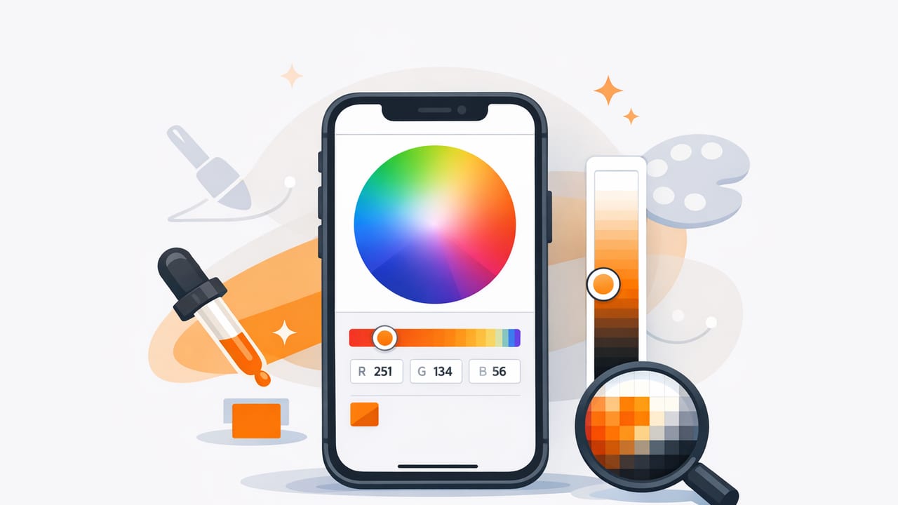
Pulling color from photos sounds simple—tap a pixel, copy a HEX code, done. In real projects, though, photo-based color extraction can drift into muddy neutrals, unpredictable lighting shifts, and palettes that look great in a screenshot but fall apart in UI, print, or interiors.
This guide lays out a practical, repeatable workflow for using an ios color picker app to create palettes you can actually reuse: consistent sampling, smart refinement, contrast checks, and clean exports that fit your design tools.
Why photo-based color extraction is harder than it looks
Photos are not “color truth.” They’re interpretations shaped by lighting, camera sensors, compression, and display settings. When you sample colors from images, you’re sampling the result of those variables. That doesn’t mean you can’t trust it—it means you should treat extraction as a starting point and apply a short calibration step before committing the palette.
- Lighting bias: Warm indoor bulbs, blue daylight, and mixed lighting shift everything.
- Shadows & highlights: Sampling a shadow can push colors gray; highlights can wash them out.
- Compression artifacts: JPEG noise creates “fake” pixels around edges.
- Material texture: Fabric, wood grain, and paint sheen produce micro-variation.
“Extracted colors are best viewed as a palette draft—then refined into a system.”
Step 1: Choose the right photo (or shoot it the right way)
A strong source image makes everything downstream easier. If you can control the photo, do it. If you’re using an existing image, choose one that minimizes distortions.
Photo selection checklist
- Prefer soft, even lighting (over direct sun or harsh spotlights).
- Avoid heavy filters (especially “vintage” or cinematic LUTs).
- Use the highest-resolution version you can get (less compression, cleaner sampling).
- Pick images with clear color areas (large surfaces: walls, skies, textiles).
- Watch for reflections on glossy objects (they borrow surrounding colors).
If you’re shooting for interior design or product mood boards, consider placing a neutral reference (even a plain white/gray card) in the frame. You don’t need pro gear—just a consistent reference you can sample later to detect color cast.
Step 2: Sample with intent (don’t just grab the prettiest pixel)
Most palette problems come from sampling too literally. Instead, sample like a designer: aim for representative colors, not outliers.
Where to sample
- Midtones first: For each area (fabric, wall, sky), sample the midtone before shadow/highlight variants.
- Multiple taps per region: Sample 3–5 nearby points and keep the most stable value.
- Large, flat areas: They give more reliable values than edges and fine details.
- Avoid edges: Anti-aliasing and compression can create blended pixels.
A simple sampling plan (works for UI, branding, and interiors)
Try extracting 7–9 colors to start:
- 2 neutrals (light + dark)
- 1 background tone (often the dominant photo tone)
- 2 supporting colors (secondary accents)
- 1 primary accent (strongest “brand” color)
- 1 optional highlight color (for emphasis or decor details)
- 1 optional “safety” neutral (for spacing, borders, dividers)
This gives you enough structure to build a system without drowning in similar shades.
Step 3: Convert the palette draft into a usable color system
Extraction gives you raw values (HEX/RGB/HSL/HSB). A usable palette needs roles: what color is used for what, in what proportions, and with what contrast requirements. This is where you turn a mood board into an operational palette.
Assign roles (example table)
Below is a role-based structure you can copy for design systems, marketing graphics, or room concepts.
| Role | Purpose | What to pick from the photo | Notes |
|---|---|---|---|
| Background | Main surface color | Largest area midtone | Keep saturation modest for readability |
| Surface | Cards, panels, secondary surfaces | Lighter neutral variant | Works as UI card or wall/trim companion |
| Text | Primary content color | Dark neutral from shadows/objects | Check contrast against Background/Surface |
| Primary | CTAs, focal points, hero accent | Most distinctive color | May need saturation/brightness tweaks |
| Secondary | Support accents | Second-strongest hue | Useful for charts, icons, decor accessories |
| Border/Muted | Dividers, outlines, subtle contrast | Soft neutral (often in bokeh/blur areas) | Don’t sample noisy textures—pick smooth areas |
Refine with HSL/HSB (quick adjustments that preserve “feel”)
When a sampled color is close but not quite usable, tweak it in HSL/HSB rather than guessing with random HEX edits:
- Hue: Nudge to correct lighting cast (e.g., too yellow under tungsten).
- Saturation: Reduce slightly for backgrounds; increase slightly for accents.
- Brightness/Lightness: Create a light/dark pair for states (hover/pressed) or interior layering.
A practical trick: if you extracted one great accent, build a mini-scale from it—one darker and one lighter version—so you can support states and hierarchy.
Step 4: Validate contrast (especially for UI and content)
If your palette is going into digital design, contrast is non-negotiable. A color that looks “high contrast” on a vibrant photo may fail badly on a clean white interface.
Minimum contrast targets
- Body text: aim for at least 4.5:1 against the background.
- Large text: aim for at least 3:1.
- Non-text UI (icons, controls): aim for at least 3:1 where possible.
If you’re using an ios color picker app for web or app design, consider storing both the chosen HEX and its tested pairings (e.g., Primary with white text, Primary with dark text) so you don’t re-check the same combinations repeatedly.
Optional: quick contrast calculation snippet
If you maintain a small palette library (Notion, Sheets, or a repo), this JavaScript snippet can help you programmatically check contrast between two HEX values:
// WCAG contrast ratio between two hex colors
function hexToRgb(hex) {
  const h = hex.replace('#', '').trim();
  const full = h.length === 3 ? h.split('').map(c => c + c).join('') : h;
  const n = parseInt(full, 16);
  return { r: (n >> 16) & 255, g: (n >> 8) & 255, b: n & 255 };
}

function srgbToLin(c) {
  const s = c / 255;
  return s <= 0.03928 ? s / 12.92 : Math.pow((s + 0.055) / 1.055, 2.4);
}

function relLuminance({ r, g, b }) {
  const R = srgbToLin(r), G = srgbToLin(g), B = srgbToLin(b);
  return 0.2126 * R + 0.7152 * G + 0.0722 * B;
}

function contrastRatio(hex1, hex2) {
  const L1 = relLuminance(hexToRgb(hex1));
  const L2 = relLuminance(hexToRgb(hex2));
  const lighter = Math.max(L1, L2);
  const darker = Math.min(L1, L2);
  return ( (lighter + 0.05) / (darker + 0.05) );
}

console.log(contrastRatio('#1B1B1B', '#F5F2EE').toFixed(2));
Step 5: Prepare exports that your tools can actually use
A palette becomes more valuable when it’s portable. Most workflows touch multiple tools: Figma/Sketch, Adobe apps, Procreate, PowerPoint/Keynote, or even paint matching and material selection.
Export formats to keep on hand
- HEX: standard for web/UI and quick sharing
- RGB: useful for many digital tools and quick adjustments
- HSL/HSB: best for controlled refinements and variant generation
- ASE/ACO (if available in your workflow): common for Adobe ecosystem
- Image palette preview: a visual strip helps stakeholders approve faster
Also consider naming conventions. A small naming upgrade saves time later:
- Role-based: Primary-600, Background-50, Text-900
- Context-based: Coastal-Sand, Coastal-Sea, Coastal-Slate
Common mistakes (and how to avoid them)
1) Over-sampling
Pulling 20–40 colors often produces duplicates and indecision. Start with 7–9, then add only when you have a role that needs filling.
2) Using shadows as your “dark neutral”
Shadows often carry color cast (blue, green, purple). If you need a reliable text color, sample a true dark object (ink, stone, metal) or adjust the hue toward neutral.
3) Ignoring material reality (interior design)
Paint, fabric, and wood behave differently under changing light. Use extracted colors to guide direction, then validate with physical swatches or manufacturer samples.
4) Treating one palette as universal
A palette for a warm lifestyle photo may not fit a minimalist dashboard. Keep multiple palette sets in a library and tag them by use case (brand, UI, editorial, seasonal, room type).
A repeatable 10-minute routine
When you need speed and consistency, run this routine every time:
- Pick a clean, high-resolution photo with even lighting.
- Sample 7–9 representative colors (midtones first).
- Assign roles: Background, Surface, Text, Primary, Secondary, Muted.
- Refine in HSL/HSB to remove lighting bias and create light/dark variants.
- Check contrast for key pairs (Text/Background, Primary/Text).
- Export HEX + a palette preview image and store it with a clear name.
When an iOS color picker app is the best tool
Desktop tools are great, but mobile wins when your inspiration is in the real world: a cafe wall, a vintage poster, a fabric swatch, a sunset gradient, or an on-site client meeting. An ios color picker app lets you capture and organize those colors before the moment passes—and then refine them later with role assignments and contrast checks.
If you’re looking for a simple way to extract HEX/RGB/HSL from photos and assemble palette layouts on iPhone or iPad, Color Viewfinder is one option to explore.
