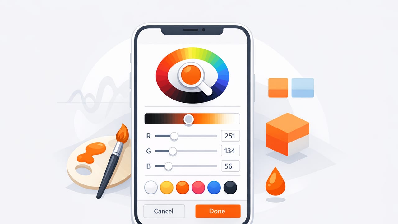
An iOS color picker workflow can turn a quick photo—of a room, a product label, a poster, or a landscape—into a dependable set of color values you can reuse in design files, mood boards, and digital products. The key is knowing how to sample colors (and how not to), then translating raw picks into a structured palette with roles, contrast, and consistent naming.
This guide focuses on a practical, repeatable method: capture clean source images, extract colors thoughtfully, refine them into a usable palette, and export values (HEX/RGB/HSL/HSB) for real creative work.
What an iOS color picker actually does (and why results vary)
Most iOS color picking tools sample pixel data from an image (or a live camera feed) and return color values such as HEX, RGB, HSL, or HSB. That sounds straightforward—until you remember that photos are affected by:
- Lighting temperature (warm indoor bulbs vs. daylight)
- Exposure (overexposed highlights shift toward white)
- Automatic processing (HDR, noise reduction, tone mapping)
- Shadows and reflections (a “white” wall may be blue in shadow)
- Compression (screenshots and messaging apps can alter colors)
So the goal isn’t just extracting colors—it’s extracting representative colors you can trust and reuse.
When to use an iOS color picker (best use cases)
Color picking on iPhone or iPad is most useful when you want to translate real-world inspiration into design decisions.
- Graphic design: match a photo’s mood, create a poster palette, build a social template theme.
- Interior design: sample upholstery, paint, tile, wood tones, and create a coordinated scheme.
- Brand exploration: pull candidate brand colors from reference imagery (then refine).
- UI design: generate initial tokens, then validate contrast and states.
Think of photo-picked colors as a starting point. A usable palette is curated, named, and tested—not just captured.
Step 1: Capture a source image that picks well
Your palette quality starts with the photo. Before you use an iOS color picker, improve sampling accuracy with these capture habits:
Use even lighting
Whenever possible, shoot in indirect daylight or evenly lit indoor light. Avoid mixed lighting (e.g., daylight + tungsten) because it creates multiple color casts across the same surface.
Control exposure
Tap to focus and adjust exposure so highlights aren’t blown out. Overexposed areas compress detail and push colors toward white, making picks look “chalky.”
Fill the frame with the material
If you’re sampling fabric or paint, get close. The more pixels belong to the material you care about, the less chance you’ll pick reflected colors from nearby objects.
Avoid reflective glare
Glossy paint, screens, and varnished wood can reflect windows or lights. Move slightly or change the angle to reduce hotspots.
Step 2: Extract colors like a pro (not like a screenshot tourist)
Once you have a good image, extraction becomes a process of sampling strategy, not random taps.
Sample from midtones first
Midtones usually represent the “true” color better than shadows or highlights. If you need a paint-like base color, start by picking from an evenly lit area away from edges.
Take multiple samples per color
For each intended color, pick 3–5 points across the surface and compare values. If one sample is noticeably warmer/cooler, it may be influenced by lighting. Choose the most consistent value.
Separate “material color” from “scene color”
A room photo includes both: the sofa color (material) and the warm light washing over it (scene). Decide what you’re building:
- Material palette: prioritize neutral lighting areas and midtones.
- Mood palette: intentionally include cast colors (golden hour warmth, neon signage, etc.).
Use a small set of deliberate roles
Instead of saving 20 similar picks, aim for 5–8 colors that serve distinct purposes (background, text, accent, etc.). You can always expand later.
Step 3: Refine raw picks into a reusable palette
Raw photo colors often cluster together (too many mid-saturation hues, not enough neutrals). Refinement turns “pretty” into “usable.”
Build around neutrals
Most real projects need neutrals for breathing room: off-white, warm gray, charcoal, near-black. If your photo doesn’t provide good neutrals, derive them by reducing saturation and adjusting lightness on your base color.
Choose one primary accent and one supporting accent
A common mistake is using too many “hero” colors. A stable approach:
- Primary accent: the color you want viewers to remember.
- Supporting accent: used sparingly for highlights, tags, or secondary elements.
- Functional colors: success/warning/error (only if you need UI states).
Create a tonal ramp for UI (optional but powerful)
If you’re designing interfaces, create lighter/darker steps of the primary accent (e.g., 100–900). This improves consistency across buttons, hovers, borders, and backgrounds.
Step 4: Validate readability with contrast (don’t skip this)
Even a gorgeous palette can fail if text becomes hard to read. Use contrast ratios as a quick gatekeeper. If you’re designing digital interfaces, aim for WCAG-friendly combinations.
| Use case | Recommended contrast ratio | Practical tip |
|---|---|---|
| Body text | ≥ 4.5:1 | Use a darker text color than you think; photos often push you too light. |
| Large text (headlines) | ≥ 3:1 | Still test on a real device in bright light. |
| UI icons & essential controls | ≥ 3:1 | Increase contrast or add a shape/background for clarity. |
| Decor/mood boards | Contextual | Contrast rules are flexible, but labels should remain readable. |
If a color you love fails contrast, you usually don’t need to abandon it—just shift lightness (and sometimes reduce saturation) until it works.
Step 5: Name and store colors so you can reuse them
Palettes become valuable when they’re searchable and consistent. Two naming patterns work well:
- Role-based: Background / Surface / Text / Primary / Secondary
- Token-based: primary-500 / neutral-100 / neutral-900
Role-based naming is easier for decorators and visual designers. Token-based naming is ideal for UI systems and teams.
Keep a small “palette card” record
For each palette, save:
- Source image (or a link)
- Color values (HEX + RGB at minimum)
- Intended roles (what each color is for)
- Notes (lighting conditions, adjustments you made)
Step 6: Export colors into real project formats
Once your iOS color picker gives you final values, export in the format your tools need. Common targets include:
- HEX for most design tools and web work
- RGB when you need channel control
- HSL/HSB for systematic adjustments (lightness/saturation)
Example: Convert your palette into CSS variables
Here’s a practical way to store your extracted palette for web projects:
:root {
  --color-bg: #F6F2EA;
  --color-surface: #FFFFFF;
  --color-text: #1C1B1A;
  --color-primary: #2F6F8E;
  --color-primary-contrast: #FFFFFF;
  --color-accent: #D18C3A;
}

.button {
  background: var(--color-primary);
  color: var(--color-primary-contrast);
}
Example: Use HEX in SwiftUI (quick reference)
If you’re prototyping on iOS, many teams store HEX in design docs and convert to Color. A common pattern is a small helper initializer (implementation varies by project):
// Pseudocode-style example (implementation omitted)
// Color(hex: "#2F6F8E")
The key idea: keep a single source of truth for your palette values so your app, website, and design files don’t drift.
Common iOS color picker mistakes (and quick fixes)
- Picking from shadows: results look too cool or too dark. Fix: sample midtones, then create a deliberate dark shade.
- Over-relying on one tap: one pixel can be noisy. Fix: average mentally by comparing multiple samples.
- Saving too many similar colors: the palette becomes unusable. Fix: reduce to distinct roles and add neutrals.
- Ignoring device viewing: colors look different on different screens. Fix: preview on at least two displays if the work is critical.
- Forgetting context: a color that looks great alone may fail next to text. Fix: test combinations and contrast.
A simple checklist you can reuse
- Capture a clean photo (even lighting, correct exposure, minimal glare).
- Use your iOS color picker to sample midtones and take multiple picks.
- Select 5–8 colors with clear roles (neutrals + accents).
- Adjust lightness/saturation to create a balanced set.
- Check contrast for any text/icon usage.
- Name and export values in HEX/RGB (and HSL/HSB if you iterate).
Closing thought: keep the workflow mobile, but make the palette systematic
Picking colors on iPhone or iPad is fast—perfect for capturing inspiration in the moment. The real payoff comes when you treat those picks as inputs to a system: curated roles, tested contrast, and exports that plug into your tools without rework.
If you prefer doing this directly on-device, an app like Color Viewfinder can help extract HEX/RGB/HSL/HSB from photos and organize them into shareable palettes.
