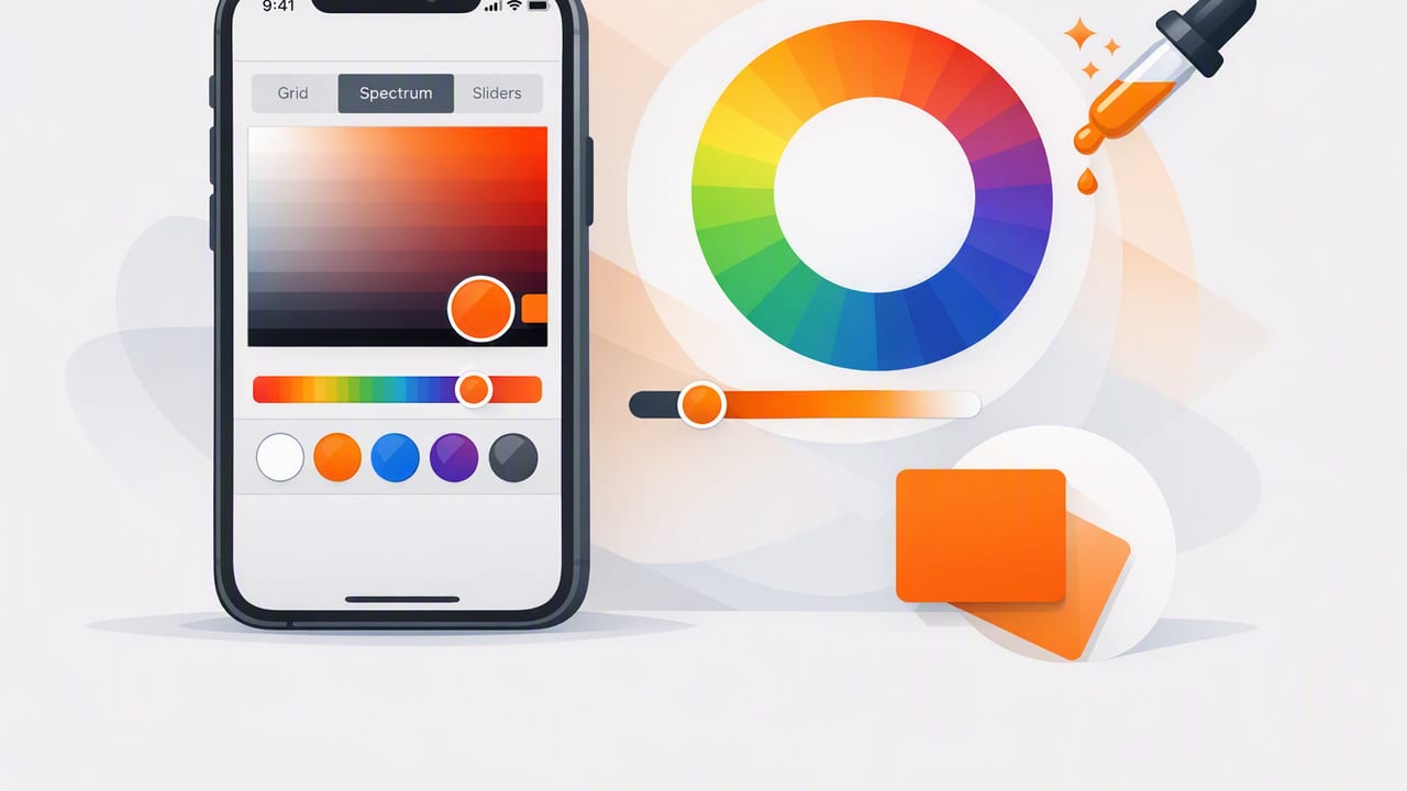
An iOS color picker sounds simple: point at an image, grab a HEX value, and move on. In practice, color sampling can get messy fast—different lighting, compression artifacts, screen settings, and color profiles can all shift the result. If you’ve ever sampled a “perfect” blue only to see it look wrong in your mockups or printed materials, you’ve run into the gap between color you see and color you can reliably use.
This guide walks through a repeatable, designer-friendly workflow for picking colors on iPhone or iPad, turning those samples into a usable palette, and exporting them into real deliverables (brand specs, UI tokens, and code). The goal isn’t just to extract a color—it’s to build a palette you can trust across graphic design, interior design mood boards, and creative projects.
What an iOS color picker is (and what it isn’t)
An iOS color picker typically samples pixel values from a photo, screenshot, or camera image and returns values like HEX, RGB, HSL, or HSB. That makes it great for:
- UI design: matching reference images, competitor screenshots, or brand assets
- Graphic design: building palettes from photography, posters, packaging, or illustrations
- Interior design: capturing paint-like tones from textiles, tiles, and real spaces
It’s not a laboratory instrument. A picker can’t fully correct for:
- mixed lighting (warm bulbs + daylight)
- camera white balance decisions
- glossy surfaces and reflections
- color management differences between devices and apps
That’s why the workflow matters more than the tool. Use your iOS color picker as a consistent sampling method, then validate and refine.
Step-by-step: a reliable iOS color picker workflow
1) Start with the best source image you can get
Accurate color extraction begins before you ever tap the picker.
- Prefer original files over images re-uploaded to messaging apps or social platforms (compression can shift colors).
- Use higher resolution images when possible—sampling a larger, clearer area reduces “pixel noise.”
- Avoid heavy filters unless your goal is to match the filtered look.
Tip: If you’re sampling from a website or social post, try to locate the original image or a press kit version. Your palette will be cleaner and more stable.
2) If you’re sampling from the real world, control lighting
When using the iPhone/iPad camera for color extraction (e.g., fabric, paint, packaging), lighting is the #1 variable.
- Use indirect daylight when possible.
- Avoid strong shadows across the sample area.
- Move closer to reduce the amount of background color “spilling” into your sample.
- Lock exposure/focus if your camera workflow allows it (so the phone doesn’t keep re-balancing).
3) Sample multiple points, not just one pixel
Most real-world colors aren’t uniform. Even flat-looking surfaces contain highlights, shadows, texture, and compression artifacts. Instead of grabbing one value and calling it done:
- Take 3–7 samples from the same intended area.
- Include a mid-tone region (avoid the brightest highlight and darkest shadow).
- Compare values and choose the most representative sample.
If your project needs extra consistency (branding, UI systems), consider averaging. Even a simple “eyeballed average” by selecting a middle sample can be more reliable than the first pick.
4) Capture more than HEX: record RGB and HSL/HSB too
HEX is convenient for web and design tools, but additional formats help you refine and scale a palette:
- RGB: practical for digital color and programmatic manipulation
- HSL/HSB: easier for creating tints/shades and consistent variations (adjusting lightness/value and saturation)
When you document a color, store at least HEX + RGB + a human-friendly name (e.g., “Ocean 600”).
Turn raw samples into a usable palette (not just a pile of swatches)
After sampling, the next step is making the colors actionable. A good palette has structure: clear roles, consistent naming, and predictable variations.
Define roles: primary, secondary, neutrals, accents
A practical palette structure for most creative work:
- Primary: the main brand or hero color
- Secondary: supporting color(s) used for variety
- Neutrals: background, surface, text, borders (often multiple)
- Accents: small pops for highlights, badges, charts, CTAs
Try to keep accents limited. Too many “special” colors makes a design system harder to maintain.
Use a simple naming convention
Names should help you pick the right color quickly and support scale. Two common approaches:
- Semantic names (role-based): Primary / Surface / Text / Danger
- Scale names (tone-based): Ocean 100–900 or Slate 50–950
Many teams combine both: a scale for source colors (e.g., Ocean 600) and semantic tokens that reference them (e.g., color.primary = Ocean 600).
Check accessibility: contrast is part of “accurate” color
For UI and content design, a color that looks great but fails contrast requirements can’t serve as a reliable text or button color. Validate key pairings early (especially text on backgrounds).
| Use case | Recommended minimum contrast | Notes |
|---|---|---|
| Body text (normal) | 4.5:1 | Most common requirement for readable text |
| Large text (18pt+ or 14pt bold+) | 3:1 | Headlines can tolerate lower contrast |
| UI icons / inactive elements | 3:1 (context dependent) | Check platform guidance; don’t rely on color alone |
| Non-text (charts, boundaries) | 3:1 | Helps distinguish adjacent regions |
If your sampled “brand color” fails as a text color, that’s normal. Keep it as a brand swatch, then create an accessible companion shade for text and UI states.
Export your palette into real workflows (design + code)
Once you’ve validated your core swatches, package them so they’re easy to use everywhere: design tools, web, and native iOS.
Design deliverables
- Figma/Sketch: add colors as styles; map semantic tokens to scale colors
- Brand guide: list each color with HEX/RGB and usage notes (background, text, accent)
- Print handoff: if printing is involved, consult your printer for CMYK conversion and proofing—don’t assume HEX will match ink
Web: CSS variables (design tokens)
This is a clean way to keep your palette consistent across pages and components:
:root {
  /* Scale */
  --ocean-100: #D9F2FF;
  --ocean-600: #1E88E5;
  --slate-50:  #F8FAFC;
  --slate-900: #0F172A;

  /* Semantic tokens */
  --color-primary: var(--ocean-600);
  --color-surface: var(--slate-50);
  --color-text:    var(--slate-900);
}

.button {
  background: var(--color-primary);
  color: var(--color-surface);
}
iOS: SwiftUI Color from HEX
If your workflow includes iOS development, keeping a single source of truth for HEX values helps reduce drift between design and implementation:
import SwiftUI

extension Color {
    init(hex: String) {
        let hex = hex.trimmingCharacters(in: CharacterSet.alphanumerics.inverted)
        var int: UInt64 = 0
        Scanner(string: hex).scanHexInt64(&int)

        let a, r, g, b: UInt64
        switch hex.count {
        case 3: // RGB (12-bit)
            (a, r, g, b) = (255, (int >> 8) * 17, (int >> 4 & 0xF) * 17, (int & 0xF) * 17)
        case 6: // RGB (24-bit)
            (a, r, g, b) = (255, int >> 16, int >> 8 & 0xFF, int & 0xFF)
        case 8: // ARGB (32-bit)
            (a, r, g, b) = (int >> 24, int >> 16 & 0xFF, int >> 8 & 0xFF, int & 0xFF)
        default:
            (a, r, g, b) = (255, 0, 0, 0)
        }

        self.init(.sRGB,
                  red: Double(r) / 255,
                  green: Double(g) / 255,
                  blue: Double(b) / 255,
                  opacity: Double(a) / 255)
    }
}

// Usage:
// let primary = Color(hex: "#1E88E5")
Troubleshooting: why your picked color looks “wrong”
If the extracted value doesn’t behave as expected, here are common causes and fixes:
- Compression artifacts: sample from a larger area; avoid edges and gradients; use a higher-quality source image.
- Highlights/shadows: re-sample from a mid-tone region; take multiple samples.
- Color profiles: screenshots and exports can differ between apps; keep a consistent pipeline (same source file, same export settings).
- Device appearance: True Tone/Night Shift can change perceived color. For evaluation, temporarily disable them and set brightness consistently.
- Transparent pixels: if sampling overlays or PNGs, confirm whether the picker returns blended color or raw pixel color.
A quick example: building a palette from a photo
Imagine you’re designing a landing page inspired by a coastal travel photo. You sample:
- a deep blue from the ocean (candidate primary)
- a pale sky tint (surface/background option)
- a sand tone (warm neutral)
- a coral accent from a sunset detail
Instead of using all four at full intensity, you:
- Pick one primary and build a small tone scale (lighter + darker).
- Choose two neutrals for background and text.
- Reserve coral as an accent only (badges, highlights, small UI moments).
- Run contrast checks for text on your main background and for buttons.
The result is a palette that still feels like the photo, but behaves like a system—consistent, accessible, and easy to apply.
Choose an iOS color picker that supports your process
The best iOS color picker is the one that makes it easy to sample consistently, view multiple color formats, organize swatches into palettes, and export in formats that match your workflow. If you’re looking for a dedicated option built around extracting HEX/RGB/HSL/HSB from photos and assembling palettes on iPhone or iPad, Color Viewfinder is one tool that fits naturally into the workflow described above.
