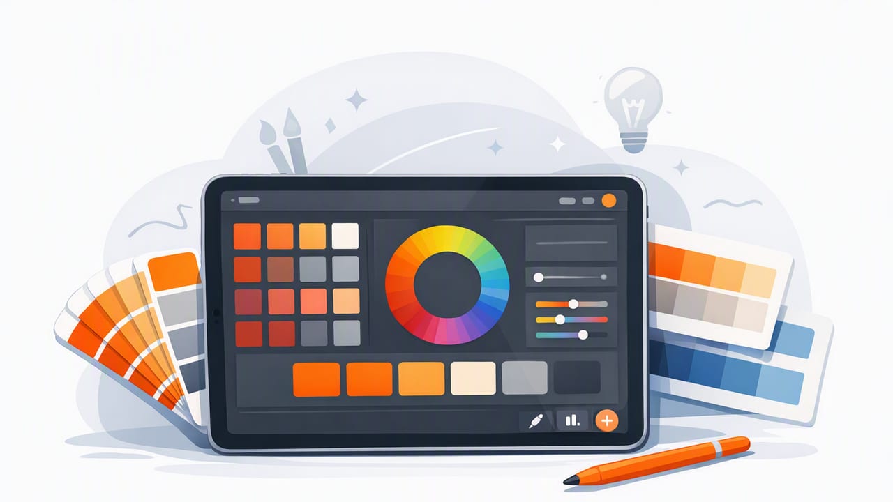
Building a strong color palette is rarely about “finding five pretty colors.” The palettes that hold up across real projects—brands, UI systems, posters, room designs, packaging—come from a repeatable workflow: sampling, organizing, refining, testing, and then applying color with intent.
An ipad app for color palettes can be a surprisingly powerful tool in that workflow because it sits between inspiration (photos, references, moodboards) and production (design files, code, presentations). With a camera roll full of textures, materials, and real-world lighting, your iPad becomes a portable palette lab.
This guide walks through a practical, designer-friendly process to go from a photo to a palette you can actually use—complete with checks for consistency, contrast, and common pitfalls.
Why build palettes from photos instead of from scratch?
Photo-based palettes have two advantages:
- They’re grounded in reality. Nature, materials, and lighting create color relationships that already “work,” especially for interiors and lifestyle branding.
- They speed up creative alignment. When stakeholders react to an image, your palette can inherit that emotional direction (calm, energetic, premium, playful) with less back-and-forth.
The downside is that photos are messy: shadows, glare, lens bias, and compression can produce inaccurate samples. That’s why the workflow matters more than the tool.
Step 1: Choose the right reference image (and prep it)
Start by selecting photos that represent the feel you want, not just colors you like. Then quickly check for issues that can distort sampling:
- Lighting bias: Warm indoor lighting can push neutrals yellow; overcast light can cool everything down.
- Overexposure: Highlights clip to near-white and erase subtle hue differences.
- Deep shadows: Shadows reduce saturation and can shift hue unpredictably.
- Filters: Social filters often compress tones and skew skin/material colors.
Tip: If you can, prefer images shot in consistent daylight or with neutral white balance. If you’re using a screenshot or a web image, try to use higher-resolution sources to avoid JPEG artifacts.
Step 2: Extract more colors than you need
When sampling from a photo, don’t aim for “the final five” immediately. Extract a wider set first—think 12–20 candidates. This gives you room to:
- separate true neutrals from tinted grays,
- pick accent colors that remain distinct at small sizes,
- avoid building a palette that’s too samey (e.g., all mid-tone blues).
Where to sample in the image
- Base neutrals: background walls, paper, fabric, sky haze, stone.
- Mid-tone supports: wood, foliage, clothing, architectural elements.
- Accents: signage, flowers, product labels, small high-saturation details.
If your palette will be used for UI or branding, aim for at least one dark anchor and one light anchor, even if the photo itself is mostly mid-tones.
Step 3: Organize by roles (not just by hue)
Palettes become usable when colors have roles. A simple role-based structure works across graphic design, UI, and interiors:
- Neutrals: background, surfaces, negative space (2–4 colors)
- Primary: main brand/UI color (1–2 colors)
- Secondary/support: supporting hues for variety (2–3 colors)
- Accents: calls-to-action, highlights, decor pops (1–2 colors)
This approach prevents a common issue with photo palettes: extracting five beautiful hues that don’t function well when you actually build layouts, screens, or room schemes.
Step 4: Refine using color attributes (HSV/HSB, HSL, RGB, HEX)
Most palette tools display multiple color models. Each is useful for a different refinement task. Here’s a quick reference:
| Model | Best for | Watch out for |
|---|---|---|
| HEX | Sharing colors for web/UI | Hard to reason about lightness/saturation by eye |
| RGB | Digital production consistency | Small numeric changes can be unintuitive |
| HSL | Tuning lightness to create steps (tints/shades) | Lightness isn’t perceptually uniform |
| HSB/HSV | Adjusting saturation and brightness quickly | Can over-simplify perceived contrast |
A practical refinement loop
- Normalize neutrals: If your grays look greenish or purple, reduce saturation and re-check under different backgrounds.
- Create tonal steps: For UI, you often need 3–6 lightness levels of a neutral (e.g., background, surface, border, text).
- Reduce “almost duplicates”: If two colors differ slightly but serve the same role, drop one.
- Protect accents: If your accent is too close in value to the primary, it won’t pop. Increase saturation or shift hue.
Rule of thumb: If you can’t describe why a color exists in your palette, it probably shouldn’t be there.
Step 5: Test contrast early (especially for UI and print)
A palette can look cohesive and still fail in real use. Contrast is the most frequent reason. Before you commit, test a few key pairings:
- Text on background: light text on dark, dark text on light
- Button states: default, hover/pressed, disabled
- Charts and tags: colors adjacent to each other
If you build for screens, consider WCAG contrast targets (common benchmarks are 4.5:1 for body text and 3:1 for large text). Even if you’re not strictly following accessibility standards, these checks prevent “looks good, reads poorly.”
Quick CSS example: make colors usable in a design system
Once you’ve refined your palette, convert it into named tokens. This makes the palette portable across prototypes and production.
:root {
  --color-bg: #F6F3EE;
  --color-surface: #FFFFFF;
  --color-text: #1C1B1A;
  --color-muted: #6E6A66;

  --color-primary: #2F6DA8;
  --color-primary-contrast: #FFFFFF;

  --color-accent: #D97941;
  --color-border: #E2DED6;
}

.button {
  background: var(--color-primary);
  color: var(--color-primary-contrast);
}
Tip: Name colors by role (primary, surface, text) rather than by hue (blue, beige). Role names survive rebrands and palette iteration.
Step 6: Build palette variations (tints, shades, and muted sets)
Most projects need more than a single “flat” palette. Create variations so you can handle states, hierarchy, and depth.
Three useful variation sets
- Neutrals ramp: 5–7 steps from near-white to near-black for layout and typography.
- Primary ramp: 3–5 steps for hover/pressed states and charts.
- Muted companions: slightly desaturated versions for backgrounds, large areas, or calm interior elements.
When muting colors, reduce saturation first before you change hue. Overcorrecting hue is how palettes drift away from the original inspiration image.
Step 7: Apply the palette in “stress tests”
Before finalizing, run your palette through quick stress tests. These reveal weaknesses faster than staring at swatches.
Stress test ideas
- UI test card: a screen with headings, body text, buttons, alerts, and borders.
- Poster layout: big type, small captions, background blocks, and a CTA.
- Room scheme board: wall color, trim, flooring, textiles, and a small accent object.
If anything feels off, identify the role that’s failing (usually neutrals or accents) rather than replacing random swatches. Iteration is faster when you adjust roles.
Common mistakes when using an iPad palette workflow (and fixes)
1) Sampling from shadows and calling it “navy”
Fix: Sample the same object in mid-light and compare. Shadows often introduce muddy saturation and false coolness.
2) Too many mid-tones
Fix: Force the palette to include a true light and a true dark. This improves legibility and adds depth.
3) Accents that don’t accent
Fix: Ensure at least one accent has higher saturation and a distinct value from your primary and supports.
4) Neutral drift (tinted grays everywhere)
Fix: Keep one neutral that is deliberately close to zero saturation. Use tinted neutrals intentionally, not accidentally.
Export and sharing: make your palette portable
After refinement, you’ll usually need to share colors with different collaborators:
- Developers: HEX, RGB, and token names
- Print designers: RGB/HEX plus notes for CMYK conversion and proofing
- Interior teams: HEX/RGB references plus material notes (paint brand codes, fabric references)
Even if you’re only working solo, exporting in at least one structured format (like a text list or ASE-like palette file) prevents the “I lost that perfect beige” problem later.
Putting it all together: a repeatable checklist
- Select a reference image with reliable lighting.
- Extract 12–20 candidate colors.
- Assign roles: neutrals, primary, supports, accents.
- Refine with HSL/HSB adjustments (normalize neutrals, remove duplicates).
- Contrast-check key combinations.
- Create ramps (tints/shades) for neutrals and primary.
- Stress test in a layout/screen/room board.
- Export with role-based names for reuse.
If you want to streamline the extraction and palette-building steps directly on iPad, a tool like Color Viewfinder can help you pull consistent HEX/RGB/HSL/HSB values from photos and assemble them into clean palette layouts for sharing.
