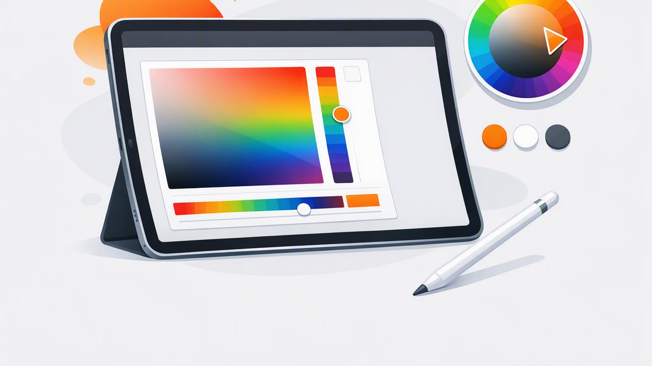
An iPad color picker can be more than a quick way to “grab a color.” With the right workflow, you can reliably extract color values from photos, turn them into consistent palettes, and reuse them across graphic design, UI systems, illustration, and interior design mood boards.
This guide walks through a practical, repeatable process: how to capture or import images, sample colors accurately, interpret color formats, refine a palette, and export the result so it stays useful outside the app you picked the colors in.
Why use an iPad color picker instead of guessing?
Designers often start with visual inspiration—product photos, brand photography, fabrics, paint chips, packaging, or a screenshot. Without a picker, you’re typically:
- Eyeballing colors and ending up with mismatched tones across screens
- Using generic palettes that don’t match the original reference
- Re-picking colors repeatedly because you didn’t save a structured palette
An iPad color picker helps you convert visual inspiration into usable color data (HEX/RGB/HSL/HSB) that you can store, share, and apply consistently.
Before you pick: set up for better color accuracy
No mobile color workflow is “perfectly calibrated” across every display and lighting condition, but you can dramatically improve consistency with a few habits.
1) Start with the best possible reference image
- Prefer high-resolution photos with minimal compression artifacts.
- Avoid images with heavy filters, aggressive HDR, or strong color grading unless that’s what you actually want to match.
- If photographing a real object, shoot in even light (indirect daylight is usually best).
2) Understand what a picker can (and can’t) “know”
A picker samples the color of pixels in your image. If your photo contains shadows, reflections, or mixed lighting, the sampled pixel color may not represent the object’s “true” material color.
Pixel color is not the same as object color. Your goal is to pick a color that behaves correctly in your design, not necessarily to replicate physics.
3) Reduce bias from your environment
- Use your iPad in neutral ambient light when possible.
- Turn off Night Shift / True Tone if you’re trying to compare colors precisely across devices.
- Keep screen brightness steady while you’re building a palette.
Core iPad color picker workflow (repeatable steps)
This section is the heart of the process. Whether you’re building a brand palette, UI theme, illustration swatches, or an interior scheme, the steps below keep your results consistent.
Step 1: Define the palette’s job
Before sampling anything, decide what you’re making:
- Brand palette: fewer colors, higher consistency, strict usage rules
- UI palette: includes neutrals, states, accessibility checks
- Illustration palette: includes highlights/shadows, wider range
- Interior palette: includes dominant surfaces + accent colors
This affects how many colors you extract and which variations you keep.
Step 2: Import or capture the image intentionally
If you’re photographing something (a wall, fabric, packaging), take multiple shots:
- One evenly lit “reference” photo
- One closer detail shot for texture
- One wider shot for context
If you’re importing from a website or camera roll, select the image with the least compression and the most neutral lighting.
Step 3: Sample more than you think you need
When using an iPad color picker, don’t grab only the obvious colors. Sample:
- The main dominant color
- A lighter variant (highlight)
- A darker variant (shadow)
- A neutral pulled from background/negative space
- A high-chroma accent (small but impactful areas)
This gives you flexibility later—especially if you must adjust for readability or printing constraints.
Step 4: Stabilize your pick (avoid single-pixel noise)
Photos often contain sensor noise, JPEG artifacts, and tiny color shifts across edges. To improve reliability:
- Pick from a flat area rather than along a boundary.
- If your app supports it, use an average/area sampling mode (or manually sample a few nearby pixels and compare).
- Zoom in to ensure you’re selecting the intended region.
Step 5: Convert picks into a structured palette
After sampling, group colors by role, not by the order you picked them. A practical structure looks like this:
- Neutrals: background, surface, border, text
- Primary: main brand/action color
- Secondary: supporting color
- Accent: sparingly used highlight
- Status colors: success/warning/error (optional)
This makes the palette portable across tools like Figma, Procreate, Sketch, Canva, and web projects.
Color formats you’ll see (and when to use each)
Most iPad color picker tools can output multiple formats. Here’s how to choose the right one for your workflow:
| Format | What it represents | Best for | Example |
|---|---|---|---|
| HEX | RGB encoded as a hex string | Web/UI handoff, CSS, design systems | #2F6BFF |
| RGB | Red/Green/Blue channel values | Screen-based design, detailed adjustments | 47, 107, 255 |
| HSL | Hue/Saturation/Lightness | Creating systematic tints/shades | 221°, 100%, 59% |
| HSB/HSV | Hue/Saturation/Brightness | Illustration workflows, intuitive color tweaking | 221°, 82%, 100% |
Refining your palette on iPad: practical adjustments
Once you’ve extracted colors, refinement is where your palette becomes usable.
1) Remove duplicates and near-duplicates
It’s common to sample five blues that are effectively the same. Keep one “true” representative and discard the rest, unless you need a deliberate scale (e.g., Blue 50–900).
2) Build a value ladder (light to dark)
For UI and editorial design, order neutrals and key hues by lightness. This makes it easier to assign roles (background, surface, text) and maintain contrast.
3) Create tints and shades deliberately
If you have HSL/HSB values, adjust lightness/brightness in consistent steps. This is often better than sampling “random” light and dark areas from a photo.
4) Check contrast for accessibility
If your palette is used for interfaces or text overlays, test color contrast. A quick rule of thumb:
- Body text should have strong contrast against its background.
- Accent colors often need a darker variant for text on light backgrounds.
Even if you don’t run formal WCAG checks inside your picker, you can flag risky combos early by trying sample text overlays in your design tool.
Turning extracted colors into design tokens (copy/paste friendly)
A great iPad color picker workflow ends with export that’s immediately usable. Here’s a simple token pattern you can adapt for web projects or documentation.
:root {
  /* Neutrals */
  --color-bg: #F7F7F5;
  --color-surface: #FFFFFF;
  --color-text: #1F2328;
  --color-border: #DADDE1;

  /* Brand */
  --color-primary: #2F6BFF;
  --color-primary-700: #1E4FE0;

  /* Accent */
  --color-accent: #FFB020;
}

.button {
  background: var(--color-primary);
  color: var(--color-surface);
}
If your workflow is more design-tool-centric, you can mirror the same naming (Primary, Primary/700, Surface, Text) as color styles in Figma or as swatches in illustration apps.
Common mistakes when using an iPad color picker (and how to avoid them)
- Picking from highlights: Specular highlights are reflections, not “true color.” Sample midtones instead.
- Picking from shadows: Shadows shift hue and reduce saturation. Use shadows only if you need a shadow tone for illustration.
- Using too many colors: A palette with 25 unrelated swatches is hard to apply. Start with 6–10 and expand only when necessary.
- No naming/roles: “Blue1, Blue2, Blue3” doesn’t help later. Name by function (Primary, Surface, Text, Accent).
- Ignoring context: A color can look perfect alone but fail next to a background or type. Always test in a layout.
Example: extracting a palette for interior design vs. UI design
Interior design mood board
When you sample from a room photo, you often want:
- One dominant wall/floor color
- One wood/metal neutral
- One textile color (sofa/rug)
- One accent (artwork, plant pot, cushion)
You can then create 1–2 lighter/darker variants for each to simulate paint options or fabric alternatives.
UI palette from product photography
When sampling from product shots (e.g., packaging), you’ll likely need:
- Primary brand color + darker variant for buttons and hover states
- A neutral ramp (background/surface/text/border)
- An accent color that still works with accessible contrast
Here, you typically refine more and sample less. The goal is a small, reliable system.
Choosing an iPad color picker app: what features matter
Most apps can pick a single color, but for real workflows, look for features that support repeatability:
- Multiple formats: HEX, RGB, HSL, and HSB/HSV outputs
- Palette management: save, reorder, and label swatches
- Layout options: swatches, grids, stripes—useful for presentation
- Export options: copy values, export palette files or shareable formats
- Fast sampling: smooth zooming and precise selection on iPad
Wrap-up: a simple checklist you can reuse
- Choose a clean reference image (or shoot in even light).
- Sample midtones first; avoid highlights and deep shadows.
- Pick extra candidates, then remove duplicates.
- Organize by role (neutrals, primary, accent) rather than by pick order.
- Create deliberate tints/shades and check contrast in context.
- Export as tokens/styles so the palette stays useful across projects.
If you want an iOS/iPad tool that focuses on extracting HEX/RGB/HSL/HSB values from photos and organizing them into shareable palettes, Color Viewfinder is one option to explore—especially if you like building palettes directly from images on your iPad.
