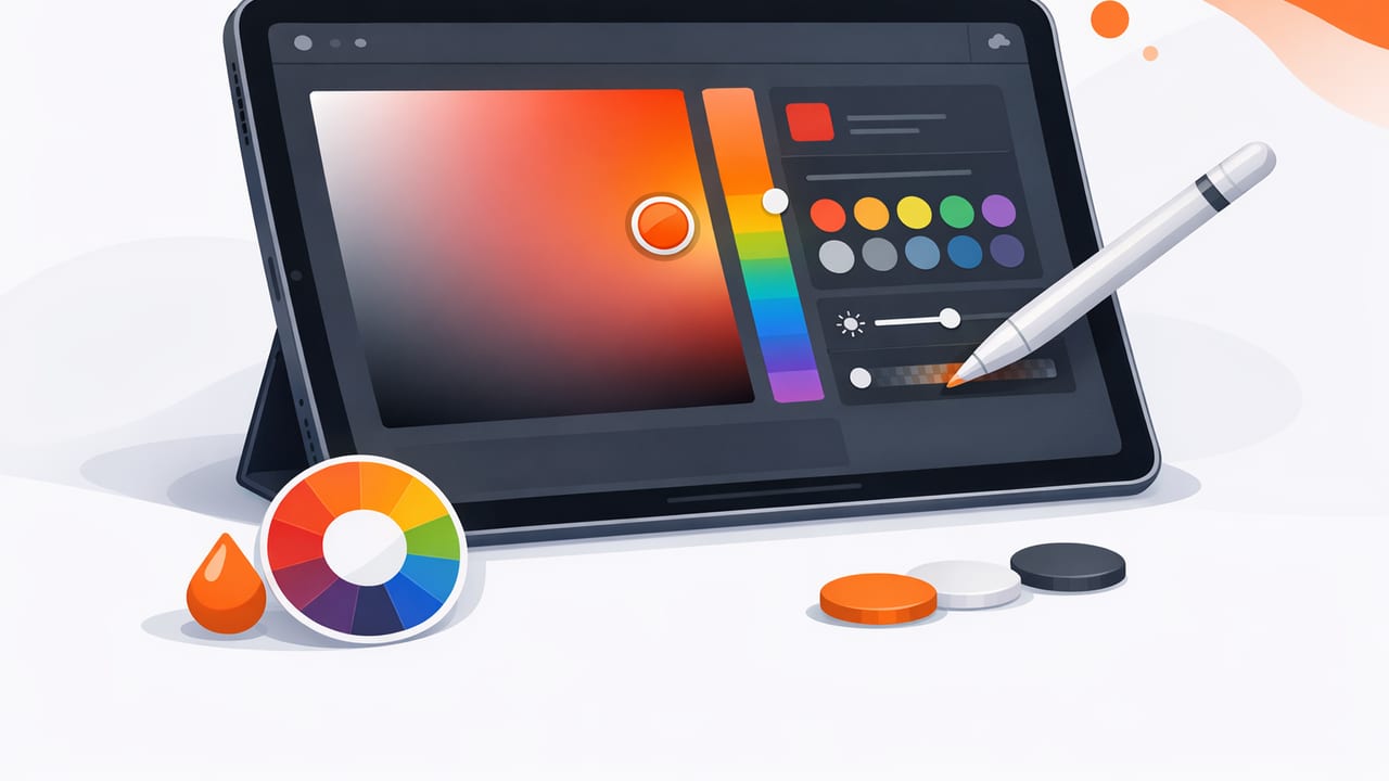
An ipad color picker can turn a quick photo into a usable design system: brand colors, UI tokens, paint references, textile palettes, mood boards, and presentation-ready swatches. But the difference between “close enough” and truly reliable color comes down to workflow. Lighting, camera processing, and inconsistent exports can shift hues and break consistency across devices.
This guide walks through a practical, repeatable process to capture colors, verify them, build palettes, and apply them in graphic design or interior design—using only an iPad and a color-picking app.
What an iPad color picker is (and isn’t)
An iPad color picker typically samples pixels from an image and returns color values like HEX, RGB, HSL, or HSB. It’s ideal for:
- Creating palettes from photos (rooms, products, landscapes, art)
- Matching accents (a tile glaze, a logo color, a fabric tone)
- Building consistent digital color sets for Figma/Sketch/Adobe tools
It is not a replacement for a calibrated physical colorimeter or paint spectrophotometer. Camera sensors and iOS image processing can shift colors, especially under mixed lighting. The goal is: repeatable accuracy for creative work, with smart checks to minimize drift.
Step 1: Capture a photo that’s “pickable”
Better input produces better color values. Before you sample anything, make your photo more color-stable.
Lighting rules that reduce color errors
- Avoid mixed light (e.g., window daylight + warm ceiling bulbs). Mixed light produces multiple color casts in one scene.
- Prefer indirect daylight or one consistent artificial source.
- Watch reflections on glossy paint, metal, and screens—highlights will read much lighter/whiter than the true color.
- Fill the frame with the surface you want. Tiny subjects invite noise and compression artifacts.
Camera settings and habits (simple but effective)
- Tap to focus on the surface you’ll sample, then hold to lock exposure if your camera allows it.
- Disable strong filters and avoid “enhancement” edits before sampling.
- Take two shots: one closer crop for sampling and one wider shot for context.
Rule of thumb: If you wouldn’t use the photo as a reference in a client presentation, don’t use it as a source for color picking.
Step 2: Sample colors like a pro (not a screenshot gambler)
Once your photo is in your app, the sampling technique matters as much as the tool.
Use multi-point sampling
Real materials vary. Paint has roller texture; fabric has weave; wood has grain. Instead of selecting one pixel:
- Pick 3–5 points within the same “color area.”
- Ignore highlights and deep shadows.
- Choose a median value (visually and numerically) to represent the base color.
Build a “role-based” palette
A useful palette is organized by function, not just by what looks pretty. Aim for:
- Base: dominant wall color, background tone, main surface
- Secondary: cabinetry, flooring, large furniture, UI panels
- Accent: decor objects, brand accent color, buttons/links
- Neutral: off-white, warm gray, charcoal for text and balance
Step 3: Understand the color values you’re exporting
Different values are better for different tasks. Here’s a quick reference you can share with teammates.
| Format | Best for | What to watch |
|---|---|---|
| HEX (#RRGGBB) | Web, UI design systems, CSS variables | Doesn’t show lightness/saturation directly |
| RGB (255, 255, 255) | Digital imaging, motion, compositing | Harder to “tune” by feel without HSL/HSB |
| HSL | Adjusting lightness for UI states and themes | Perceptual steps aren’t perfectly uniform |
| HSB/HSV | Picking hues quickly; decorator-style exploration | Brightness can mislead on very saturated colors |
Practical tip: Export HEX for implementation, but keep HSL/HSB handy for making coherent tints/shades that stay “in family.”
Step 4: Verify your palette (fast checks that catch mistakes)
Verification is where many workflows skip—and where most color issues start.
Check for lighting contamination
If your palette has weird green/yellow drift (common with indoor bulbs), do this:
- Sample a known “neutral” in the photo (a white trim, gray paper, black object).
- If it reads noticeably tinted (e.g., #F9F2D8), your whole scene likely has a warm cast.
- Consider sampling from a second photo taken under more consistent light.
Spot-check contrast for digital use
If any extracted color might become text, icons, or buttons, quickly test contrast before committing. A simple heuristic:
- Don’t place mid-tone text on mid-tone backgrounds.
- Prefer a clear separation: light background + dark text, or the reverse.
If your app provides contrast checking, use it; if not, you can still sanity-check by placing swatches next to each other in a notes app or design tool and viewing at small sizes.
Step 5: Turn extracted colors into a working system
Palettes become powerful when they’re reusable. Instead of naming colors “Blue 1, Blue 2,” map them to roles.
Example naming scheme (works for UI and presentations)
- Primary: the anchor color (brand or key accent)
- Surface: backgrounds and large blocks
- Text: high-contrast typography color
- Muted: borders, secondary text, subtle fills
- Accent: callouts, highlights, decorative notes
Optional: generate tints and shades
A common next step is building tints (lighter) and shades (darker) from one extracted color. If you work in CSS, creating tokens is straightforward:
:root {
  /* Extracted base */
  --primary: #2f6f8e;
  --surface: #f4f1ea;
  --text: #1b1f23;

  /* Simple derived steps */
  --primary-700: #24586f;
  --primary-500: #2f6f8e;
  --primary-300: #6fa3bb;
  --primary-100: #d7e8ef;
}
Even if you don’t compute these values programmatically, establishing a small range (100–700) makes it easier to design hover states, selected states, and hierarchy while staying consistent with your photo-sourced palette.
Two practical mini-workflows (interior + graphic)
Workflow A: room photo → decor palette
- Photograph the room in indirect daylight.
- Extract 1 base (wall), 1 secondary (floor/sofa), 2 accents (artwork/textiles), 1 text/charcoal.
- Compare your accents: if both are equally saturated, reduce one by choosing a calmer sample from the same object.
- Export and label by function (Base, Secondary, Accent 1, Accent 2, Neutral).
Result: a palette you can use to shop online (approximate matches), design a mood board, and communicate direction to a client without relying on subjective descriptions like “a warm-ish beige.”
Workflow B: product photo → brand social kit
- Use a close-up photo of the product under a single light source.
- Extract the hero color, then pick one neutral from packaging shadows (but not the darkest).
- Create one lighter tint for backgrounds and one darker shade for headings.
- Test readability by placing white and charcoal text over the hero color.
Result: quick, consistent colors for templates (stories, posts, slides) that stay tied to the product’s real-world appearance.
Troubleshooting: why your picked colors don’t match
If your ipad color picker values look “wrong,” it’s usually one of these issues:
- White balance shift: indoor lighting warms everything; shade outdoors cools everything.
- HDR/processing: the camera may lift shadows or compress highlights, changing perceived color.
- Specular highlights: glossy surfaces return the light source color, not the material color.
- Color profile differences: apps and exports may interpret color spaces differently.
- Screen brightness/True Tone: your display adapts to ambient light, changing perception.
Quick fixes
- Take a second reference photo under a different (cleaner) light source and compare samples.
- Sample from matte areas and midtones only.
- Temporarily disable display features that change appearance (like adaptive color temperature) when judging by eye.
Export checklist (so your palette survives handoff)
Before you send colors to a client or teammate, confirm:
- Each swatch has a name (role-based) and a HEX value.
- You’ve included at least one neutral suitable for text.
- Accent colors aren’t all the same intensity (you want hierarchy).
- You’ve saved the source photo alongside the palette for context.
Choosing an iPad color picker app: what features matter
Apps vary widely, but for real project work, prioritize:
- Multiple color formats (HEX, RGB, HSL/HSB)
- Palette layouts you can reorder and label
- Export options (copy values, share palettes, common design-friendly formats)
- Precision sampling (zoom, loupe, or targeted picking)
If you’re looking for a straightforward option on iOS and iPadOS that extracts HEX colors from photos and helps you assemble palettes, Color Viewfinder is one example to explore.
