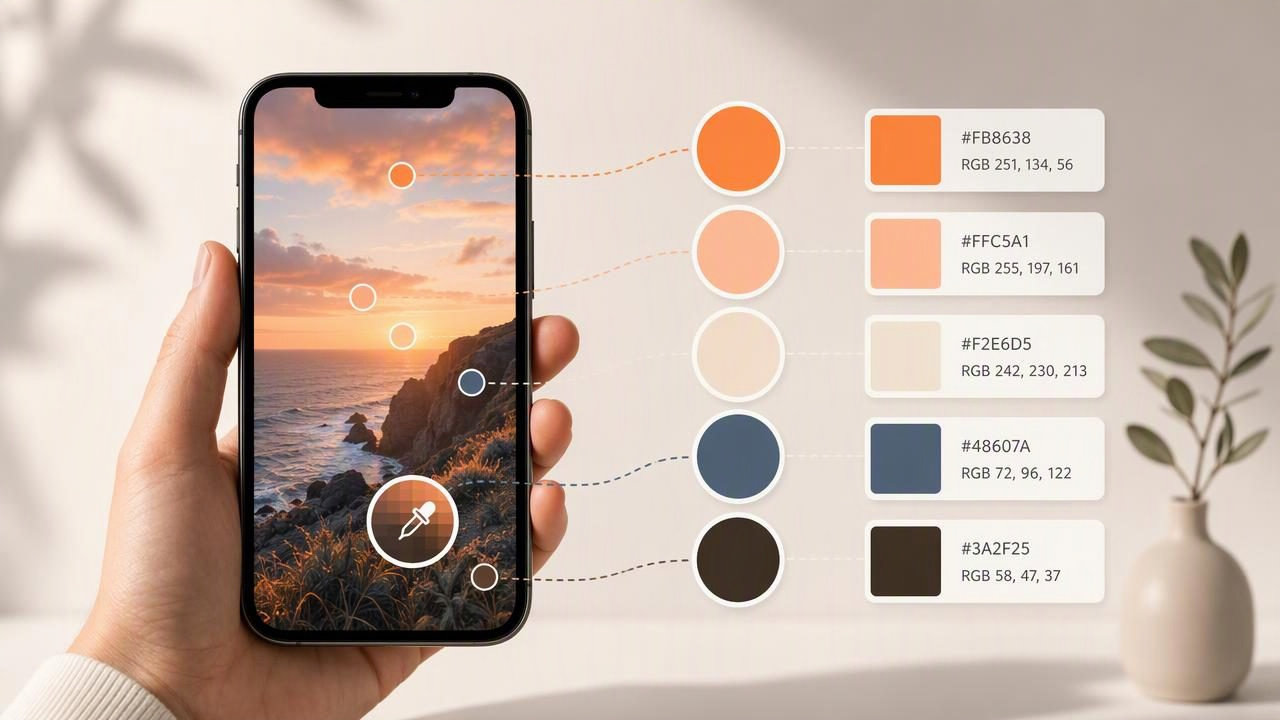
Photos are one of the best sources of color inspiration. A sunset, printed package, living room, artwork, café interior, or product image can contain a palette that feels more natural and memorable than colors chosen from a blank swatch library. The challenge is turning that visual inspiration into color values you can actually use.
An iPhone app to extract colors helps solve that problem by sampling pixels from a photo and displaying usable digital values such as HEX, RGB, HSL, and HSB. Instead of trying to estimate a muted blue or warm neutral by eye, you can inspect the exact color information and save it to a palette for graphic design, web work, mood boards, presentations, and interior design planning.
This guide explains how photo color extraction works, how to choose useful samples, and how to turn a picture into a practical color palette without relying on guesswork.
What Does It Mean to Extract Colors From a Photo?
Color extraction is the process of identifying the color of individual pixels or dominant groups of pixels within an image. A color picker lets you tap or position an eyedropper over a part of a photo, then returns the selected color as numerical values.
For example, if you select a blue wall in a photo, the app may show a value such as:
HEX: #4C7187
RGB: 76, 113, 135
HSL: 201°, 28%, 41%
HSB: 201°, 44%, 53%
Each format is useful in a different context. HEX is common in website design and CSS. RGB is widely used in digital graphics and screen-based design. HSL and HSB are helpful when you want to reason about a color’s hue, saturation, and brightness separately.
Photo-based extraction does not “discover” a single objectively correct palette. It gives you measurable digital samples from the image. Your role as a designer is to decide which samples support the intended project.
Why Use an iPhone App to Extract Colors?
A phone is usually nearby when you encounter a compelling color combination. That makes mobile color extraction particularly useful for collecting references before a project begins. Rather than taking a photo and hoping to revisit it later on a desktop, you can inspect colors while the visual reference is still in front of you.
- Capture inspiration immediately: Photograph a scene, object, fabric, display, or printed material when you see it.
- Get practical color codes: Convert visual impressions into values you can copy into digital tools.
- Build palettes on location: Save a small set of related colors while reviewing the image.
- Reduce manual estimation: Sampling is more consistent than trying to recreate a color from memory.
- Support cross-disciplinary work: The same photo can inspire a social post, interface, slide deck, mood board, or room concept.
This is especially valuable for designers who work between physical spaces and digital deliverables. An interior designer might photograph a textile pattern, while a graphic designer might capture an interesting storefront. In both cases, the extracted codes provide a starting point for further color decisions.
Understand the Color Values Before You Save Them
Seeing several color formats can feel redundant at first, but each one answers a slightly different question. Knowing when to use them makes the extraction process more useful.
| Color format | Example | Best use |
|---|---|---|
| HEX | #4C7187 | Web design, CSS, design-system notes |
| RGB | 76, 113, 135 | Digital graphics and screen-based applications |
| HSL | 201°, 28%, 41% | Adjusting lightness and saturation conceptually |
| HSB | 201°, 44%, 53% | Comparing hue, saturation, and brightness visually |
A practical rule is to copy HEX values when communicating with web developers or creating CSS variables. Use RGB when a software interface asks for red, green, and blue channels. Use HSL or HSB when you are trying to create lighter, darker, calmer, or more vivid variations of the same base color.
How to Extract a Useful Palette From One Photo
The strongest palettes rarely contain every color visible in an image. A photo may include shadows, reflections, compression artifacts, tiny background details, and incidental colors that do not belong in the final concept. Aim for a curated palette rather than an exhaustive inventory.
- Choose a clear source photo. Start with an image that has enough light and a visible color relationship. Blurry, heavily filtered, or extremely dark photos can make color selection harder.
- Identify the visual hierarchy. Look for the dominant color, supporting colors, a light neutral, a dark neutral, and perhaps one accent.
- Sample broad, even areas. Tap the center of a painted surface, fabric area, sky region, or object rather than a hard edge where two colors blend.
- Check multiple points on the same surface. Light and shadow can create dramatically different readings. Select the value that represents the role you need, not necessarily the darkest pixel.
- Save five to seven intentional colors. This is often enough to create flexibility without producing an unfocused palette.
- Name colors by function. Labels such as “primary,” “background,” “soft neutral,” and “accent” are more useful than generic names like “blue 1.”
The key is to separate extraction from selection. An app can identify color values quickly, but a coherent palette depends on how you edit and organize the results.
Concrete Example: Turning a Café Photo Into a Brand Palette
Imagine you take a photo inside a café with terracotta tiles, cream walls, dark wood furniture, leafy plants, and a muted teal menu board. Rather than extracting dozens of colors, you could build a five-color palette for a small hospitality brand concept:
| Palette role | Sampled color | Example value | Possible use |
|---|---|---|---|
| Primary | Muted teal | #3F6F70 | Logo details, headings, buttons |
| Accent | Terracotta | #B95F43 | Calls to action, highlights, icons |
| Light background | Warm cream | #E8DCC8 | Page backgrounds, cards, packaging |
| Dark neutral | Deep brown | #3E3028 | Body text, borders, contrast elements |
| Supporting color | Leaf green | #667451 | Secondary graphics and illustrations |
This palette works because every sampled color has a job. The teal and terracotta provide contrast and personality, while cream and brown create readable structure. The green connects the palette to the original environment without competing with the main accent.
For a website, the values might be documented as CSS variables:
:root {
  --color-primary: #3F6F70;
  --color-accent: #B95F43;
  --color-background: #E8DCC8;
  --color-text: #3E3028;
  --color-support: #667451;
}
Before publishing, test the text and background combinations for sufficient contrast. An attractive extracted color is not automatically suitable for small text, navigation, or accessibility-critical controls.
Common Mistakes When Sampling Colors From Images
Sampling shadows instead of the local color
A beige wall may appear gray-blue in shadow and yellow-white in direct sunlight. If your goal is a representative wall tone, sample several areas and choose the value that best fits the intended design role.
Choosing colors from edges and reflections
Edges often contain anti-aliasing, mixed pixels, glare, or reflected light. For cleaner results, sample the middle of a relatively uniform area and zoom in when possible.
Using every extracted value
A palette with fifteen unrelated swatches can slow decisions rather than support them. Begin with a limited set, then add variations only when the project needs them.
Assuming digital values match paint or print exactly
Screen color depends on the display, image lighting, camera processing, and color settings. A HEX or RGB value is useful for digital work, but it is not a guaranteed physical paint match or print-accurate specification. For physical production, consult appropriate material samples, print proofs, and professional color-management processes.
How to Make Extracted Color Palettes More Flexible
Once you have your initial samples, create a system around them. A functional palette usually includes more than attractive individual swatches; it needs enough tonal range for backgrounds, content, emphasis, and contrast.
- Create a lighter variation of the main color for large background areas.
- Create a darker variation for text, outlines, or hover states.
- Use one accent color sparingly to preserve emphasis.
- Add neutral tones for spacing, typography, and visual rest.
- Review the palette in the context of real content, not only as isolated squares.
For interior design mood boards, keep the extracted digital values as reference points, then compare them with actual materials under the lighting conditions of the room. For graphic design, test the palette in layouts containing real type, photography, and interface elements.
Export and Handoff Tips for Creative Projects
Color values are most useful when they can move easily into the next stage of the workflow. Depending on the software and project, you may want to copy individual codes or export a palette in a structured format.
- CSS: Useful for web projects and design documentation.
- CSV: Helpful for sharing a simple color list with names and values.
- JSON: Useful for digital design systems and development workflows.
- ASE: A common palette format for compatible Adobe workflows.
When handing off a palette, include more than raw values. Add a short note about each color’s intended use, such as “main background,” “button accent,” or “headline color.” This context prevents a carefully selected palette from being applied inconsistently.
Final Thoughts
An iPhone app to extract colors can turn everyday visual references into practical design information. The best results come from selecting a clear image, sampling thoughtfully, curating only the most useful values, and testing those colors in the real context of your project.
For a mobile workflow that lets you inspect photo colors and organize palette references, Color Viewfinder’s guide to choosing HEX colors from photos offers a useful starting point.
