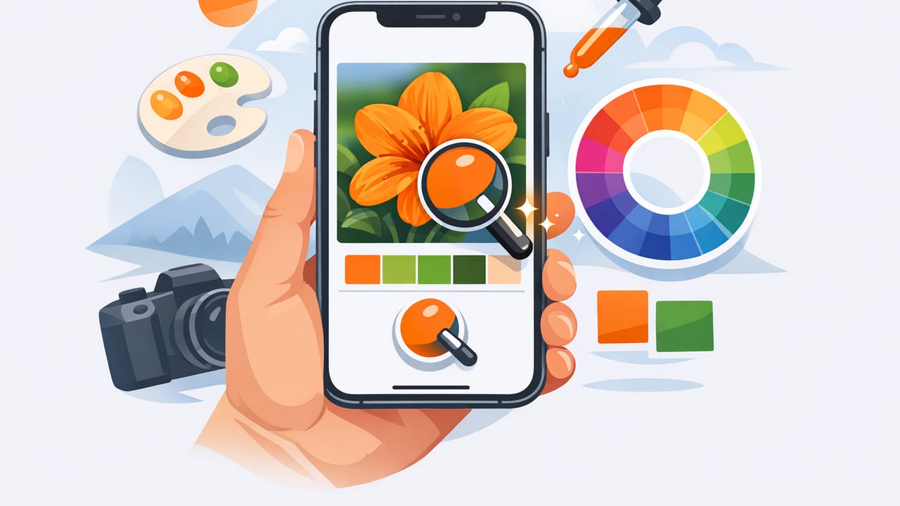
When you spot a perfect color combination in real life—a café wall, a product label, a sunset gradient—you usually have only one problem: how do you capture those colors accurately enough to reuse them? That’s where an iPhone app to pick colors from photos becomes a practical design tool. Instead of guessing in a graphics editor or eyeballing swatches, you can sample real pixels from an image and turn them into usable values like HEX, RGB, or HSL.
This guide walks through a reliable workflow for extracting colors from photos, building palettes that stay consistent across projects, and avoiding the most common sampling mistakes. It’s written for designers, decorators, marketers, and anyone who wants photo-based palettes that actually work in the real world.
Why photo-based color picking is harder than it looks
Picking colors from photos isn’t just “tap to sample.” Real-world images contain lighting shifts, camera processing, compression artifacts, and reflections. Two pixels that look identical to your eye may produce different HEX values, and a single surface often contains dozens of micro-variations.
Understanding what can distort color helps you choose better sampling points and build palettes that translate cleanly into print, digital UI, or interior design.
Common sources of color error
- White balance: warm indoor lighting can turn neutrals yellow; shade can push colors blue.
- Exposure: highlights wash out color; underexposure shifts hues and increases noise.
- Reflections: glossy paint, screens, water, and metal surfaces “borrow” nearby colors.
- Compression: JPG artifacts can create blocky pixel colors that don’t match the surface.
- HDR processing: can exaggerate saturation and contrast, changing perceived palette harmony.
Rule of thumb: sample from matte, evenly lit areas whenever possible, and avoid extreme highlights/shadows if you want stable, reusable colors.
What to look for in an iPhone color picker app
Not all color pickers are equally useful for design workflows. If your goal is to build palettes (not just identify a single color), prioritize features that reduce ambiguity and help you reuse values consistently.
- Multiple color formats: HEX + RGB + HSL/HSB so you can adjust and communicate color intent.
- Palette building: save multiple swatches from a single photo and organize them by role.
- Zoomed sampling: a magnified picker helps avoid selecting a noisy pixel.
- Export options: copy HEX codes, export palettes, or share in designer-friendly formats.
- Layout customization: helpful when presenting palettes to clients or teammates.
A dependable workflow: from photo to usable palette
Here’s a repeatable process that works for UI design, branding moodboards, illustration color scripts, and even paint selection planning.
1) Start with the best possible photo
If you’re taking the photo yourself, you can dramatically improve extraction accuracy before you ever open a color picker:
- Use even lighting: stand where the surface is evenly lit (avoid bright window glare).
- Lock exposure: on iPhone, tap-and-hold to lock focus/exposure, then adjust slightly if needed.
- Avoid filters: shoot in a neutral mode; filters can shift hues and crush shadows.
- Fill the frame: get closer so your target material takes up more pixels (less noise, more accuracy).
2) Decide your palette roles before sampling
Instead of grabbing random “pretty” colors, sample with a purpose. Most usable palettes include roles like:
- Primary: the dominant hue that carries the theme.
- Secondary: supports the primary without competing.
- Accent: high-attention color for buttons, highlights, or décor moments.
- Neutral(s): background and spacing colors (off-white, warm gray, charcoal).
This mindset prevents palettes that look great as a photo collage but fail in real layouts or rooms.
3) Sample smart: avoid the “one pixel trap”
Many apps sample a single pixel. That’s precise, but it can be misleading when the pixel is affected by noise, texture, or glare. Use these techniques:
- Sample multiple nearby points on the same surface and compare values.
- Prefer midtones rather than highlights/shadows (midtones best represent “true color”).
- Watch saturation: if a sampled color is unexpectedly intense, you may have hit a specular highlight or a compressed artifact.
- Check HSL/HSB: if hue is right but it’s too dark/light, adjust using lightness/brightness rather than guessing a new hue.
4) Build a palette with spacing (not just variety)
Great palettes usually have contrast structure: a range of light-to-dark values plus controlled saturation. If every swatch is equally bold, your design will feel noisy.
A practical trick: pick two neutrals (one light, one dark), one main hue, one supporting hue, and one accent. That’s five swatches—enough for most digital and décor projects.
Quick reference: which color format to use (and when)
| Format | Best for | What it tells you | Common pitfall |
|---|---|---|---|
| HEX | Web/UI, brand docs | Exact color code for screens | Not intuitive for adjusting light/dark |
| RGB | Digital design, motion | How much red/green/blue is emitted | Hard to adjust “tone” without shifting hue |
| HSL | Palette tuning | Hue + saturation + lightness | Lightness isn’t perceptually uniform |
| HSB/HSV | Artist workflows | Hue + saturation + brightness | Brightness can mislead vs real luminance |
Make your palette usable: contrast and accessibility checks
If your palette is headed for UI, social graphics, or presentations, contrast matters as much as beauty. A common issue with photo-derived palettes is that they cluster around similar midtones—gorgeous, but unreadable in text.
Simple contrast planning (without heavy math)
- Choose one very light background (near-white, not pure white).
- Choose one very dark text color (charcoal often feels better than pure black).
- Reserve your accent for small areas (buttons, links, highlights), and test it on both light and dark backgrounds.
If your app provides luminance/brightness indicators, use them to ensure you have enough separation between background and foreground choices.
Exporting and using extracted colors in real projects
The whole point of extracting HEX codes is reuse. Here are practical ways to move from “colors I found” to “colors I can ship.”
Web/UI: turn palette values into CSS variables
Once you have HEX values, drop them into a simple token setup. Example:
:root {
  --color-bg: #F7F3EE;
  --color-text: #262322;
  --color-primary: #3A6EA5;
  --color-secondary: #8FA9A2;
  --color-accent: #E07A5F;
}

body {
  background: var(--color-bg);
  color: var(--color-text);
}

.button {
  background: var(--color-accent);
  color: var(--color-bg);
}
This approach makes your palette consistent across components and keeps “random one-off colors” from creeping into the design.
Brand and print: document intent, not just codes
HEX is excellent for screens, but print workflows often involve CMYK conversions and paper-dependent shifts. Even if you’re not doing full print specs, add notes like:
- Usage: “Accent for CTAs only” or “Background neutral.”
- Do-not-use: “Avoid for body text” if contrast is insufficient.
- Color relationships: which colors pair well (primary + neutral, accent + dark neutral, etc.).
Interior design: account for lighting and materials
In a room, color changes with time of day and bulb temperature. Photo-based extraction is great for direction, but before committing to paint or textiles:
- Use extracted values to narrow options (find similar swatches/paint chips).
- Test candidates in the space (sample boards or swatches).
- Evaluate under daylight and evening lighting.
Troubleshooting: fixes for common photo-to-color problems
Problem: “My HEX codes look dull compared to the photo”
Photos contain context—adjacent colors and contrast make hues feel more vibrant. Solutions:
- Sample from a slightly more saturated region (not a highlight).
- In HSL/HSB, increase saturation modestly (e.g., +5 to +12) while keeping hue stable.
- Add a deeper dark neutral to increase overall perceived contrast.
Problem: “I keep getting different results from the same surface”
This usually indicates texture, noise, or lighting variation.
- Zoom in and sample a flatter area.
- Take multiple samples and pick the median-ish value.
- If possible, use a better photo: closer, sharper, evenly lit.
Problem: “The palette works on my phone but not on other screens”
Different displays render color differently (brightness, gamut, calibration). To reduce surprises:
- Avoid relying on ultra-dark near-black or ultra-bright near-white details.
- Use moderate saturation for large areas; keep intense colors for accents.
- Preview on at least one other device or in a desktop browser.
A mini-checklist you can reuse
- Start with a clean, evenly lit photo (no heavy filters).
- Define palette roles (primary, secondary, accent, neutrals).
- Sample midtones; avoid glare and deep shadows.
- Collect 5–7 swatches max for most projects.
- Check contrast early (especially for text and buttons).
- Export codes and implement as tokens/variables for consistency.
Final thoughts
An iPhone app to pick colors from photos is most powerful when you treat it as a workflow, not a novelty. With better source images, smarter sampling, and a role-based palette structure, you can turn everyday inspiration into repeatable, professional color systems—fast.
If you’re looking for a simple iOS tool that extracts HEX/RGB/HSL values and helps you assemble palettes from images, Color Viewfinder is one option to explore.
