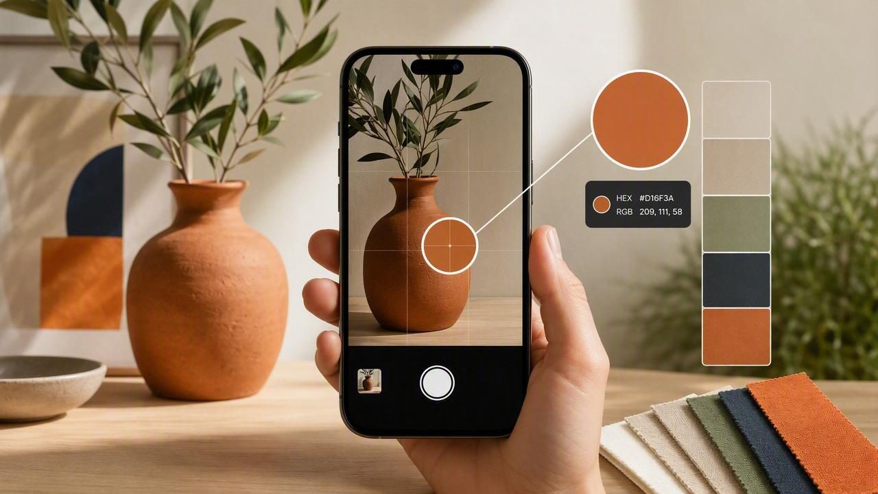
An iPhone color picker can turn everyday inspiration—packaging, paint chips, textiles, signage, nature, screenshots—into usable digital color values. But extracting a color that looks right is not the same as extracting a color that is reliable. Lighting, reflections, camera processing, and display settings can shift what you sample, which is why designers often end up with “almost right” HEX codes that don’t behave well across screens and materials.
This guide walks through a practical, repeatable workflow for using an iPhone color picker to capture accurate colors, validate them, and convert them into palettes you can confidently use in graphic design, UI, branding, and interior design.
What an iPhone Color Picker Actually Measures
Most iPhone color picker apps sample the color of pixels in an image (a photo or screenshot). That means you’re not directly measuring an object’s “true” color—you’re measuring the camera’s interpretation of that object under specific conditions.
In practice, your sampled color is influenced by:
- Lighting temperature (warm indoor light vs. cool daylight)
- Shadows and highlights (small changes can swing the sampled value)
- Gloss and reflections (especially on paint, tile, packaging, screens)
- Automatic camera processing (HDR, exposure, white balance)
- Compression and color profiles when images are shared or exported
Rule of thumb: if the photo isn’t controlled, the extracted color is a starting point—not a final spec.
When an iPhone Color Picker Is the Right Tool (and When It Isn’t)
An iPhone color picker is perfect when you need speed and direction: mood boards, early brand exploration, palette brainstorming, and quick “what color is that?” checks. It’s less appropriate when you need manufacturing-grade accuracy (paint matching, print proofs, product color QC) where a calibrated workflow or physical standards are required.
Great use cases
- Creating color palettes from reference photos for a design system
- Pulling accent colors from a room photo for interior decor planning
- Extracting UI colors from screenshots for redesign or audits
- Building cohesive social media templates from a visual theme
Use caution for
- Choosing a final print color without proofing
- Matching paint or fabric without physical samples
- Sampling glossy surfaces with strong reflections
Step-by-Step: A Reliable iPhone Color Picker Workflow
1) Capture a better reference photo
Your palette quality starts before you pick a single pixel. If you can retake the photo, aim for consistency and reduce “camera guesswork.”
- Use even light: stand near a window with indirect daylight when possible.
- Avoid mixed lighting: don’t combine daylight with warm lamps; it produces strange color casts.
- Watch reflections: tilt the camera or object slightly to reduce glare.
- Lock focus/exposure: on iPhone, press-and-hold to AE/AF Lock when you have a good exposure.
- Fill the frame: get close so the color area is large, giving you more “clean” pixels to sample.
Tip: if you’re sampling a wall paint color, avoid edges and corners where shadows deepen. Sample a flat mid-area.
2) Choose a sampling strategy (single point vs. average)
Many photos contain micro-variations: texture, noise, and lighting gradients. If your tool supports it, prefer an average/area sample (sampling a small region) rather than a single pixel.
- Single-point sampling: good for crisp UI screenshots or flat vector-like areas.
- Area/average sampling: better for materials, textiles, walls, and anything photographed.
3) Sample multiple candidates per color
Instead of trusting the first HEX value, sample 3–5 nearby points in the same material area and compare. If the values vary a lot, that’s a sign lighting or texture is affecting your result.
As a quick check, ask:
- Do the samples cluster tightly (small differences)? Great—your reference is stable.
- Do they swing widely (big differences in brightness or hue)? Reshoot or sample a different area.
4) Record both HEX and HSL/HSB for decision-making
HEX is convenient for digital use, but HSL/HSB makes it easier to adjust what you extracted:
- Hue tells you the family (red/blue/green)
- Saturation tells you intensity
- Lightness/Brightness tells you how light or dark it is
This helps when you need to create a scale (e.g., lighter/darker steps) while staying true to the original color.
5) Build a palette with roles, not just “pretty colors”
A practical palette needs structure. After you extract colors, assign them roles:
- Primary: the main brand/UI color
- Secondary: supports primary in layouts
- Accent: used sparingly for attention
- Neutrals: background, surfaces, text
- Feedback colors: success/warning/error (if relevant)
Common Problems (and How to Fix Them)
| Problem | Why it happens | Fix |
|---|---|---|
| Sampled color looks “too warm” | Indoor lighting or white balance shift | Retake in daylight; sample a neutral area; compare multiple points |
| Color looks flatter on your laptop | Display differences / wide-gamut vs. standard gamut | Validate on multiple screens; stay within sRGB for web UI work |
| Palette feels inconsistent | Mixed sources or uneven lighting across photos | Normalize by adjusting lightness levels; pick one “anchor” reference photo |
| Text fails contrast checks | Extracted colors are too close in brightness | Create lighter/darker steps; choose accessible text colors |
| Sampling glossy objects gives random values | Reflections create bright hotspots | Change angle; diffuse light; sample away from highlights |
Validate Your Colors: A Quick Accessibility & Usability Pass
Especially for UI and graphic design, extracted colors need to work in context. Two fast checks improve outcomes dramatically:
1) Contrast for text
If you’re using extracted colors as backgrounds or buttons, test text contrast. As a baseline, aim for WCAG-friendly contrast for body text and key UI labels.
2) Grayscale check
Convert your palette or mockup to grayscale. If key elements disappear, your colors may be too similar in brightness—even if the hues differ.
Turn Extracted Values Into a Reusable System (Example)
Once you have stable HEX values, make them easy to apply across projects. Here’s a simple way to store a palette as CSS variables (useful for web prototypes, design handoff docs, or component libraries).
:root {
  --color-primary: #2F6BFF;
  --color-secondary: #13B5A6;
  --color-accent: #FFB020;
  --color-surface: #F6F7FB;
  --color-text: #121826;
}

.button {
  background: var(--color-primary);
  color: white;
}
If you’re working in a design tool instead, the same idea applies: define tokens (Primary/Secondary/Surface/Text) rather than leaving colors unnamed.
Interior Design Tip: Extract Colors Without Overfitting the Photo
Room photos often include strong lighting gradients (window light vs. interior shadows). If you’re using an iPhone color picker for interior design palettes, try this method:
- Extract neutrals (wall, trim, floor) from mid-tone areas first.
- Extract materials (wood, stone, fabric) using area sampling.
- Choose one accent from decor (artwork, pillows) and slightly increase saturation if it gets washed out.
- Build a light-to-dark scale so you can plan contrast (e.g., trim vs. wall vs. cabinetry).
This approach keeps the palette grounded in the space while avoiding the most common mistake: picking a shadowed pixel and accidentally designing around a color that doesn’t exist in normal lighting.
How to Get More Consistent Results From Photo-Based Sampling
If you want your iPhone color picker results to feel consistent across projects, adopt a few standards:
- Use the same capture conditions when possible (similar time of day, similar lighting).
- Keep a “reference neutral” photo set (a white wall, a gray card, or a known neutral object) to sanity-check warmth/coolness.
- Prefer sRGB-friendly colors for web/UI deliverables to reduce cross-device surprises.
- Save palettes with notes (source photo, where sampled, intended use).
Quick Checklist: Before You Commit to a HEX Code
- Did you sample away from highlights and heavy shadows?
- Did you sample at least 3 points and compare results?
- Do your palette roles make sense (primary, neutrals, accent)?
- Did you check text contrast for UI uses?
- Did you preview colors on more than one screen?
Putting It All Together
A good iPhone color picker workflow is less about finding a magical “perfect” value and more about reducing variables: better photos, smarter sampling, role-based palettes, and quick validation checks. When you do that, colors extracted from real life become a dependable input for creative projects—whether you’re building a brand palette, designing a landing page, or coordinating a room.
If you’re looking for an iOS tool that extracts HEX/RGB/HSL/HSB from photos and helps you arrange and export palettes in multiple formats, Color Viewfinder is one option worth exploring.
