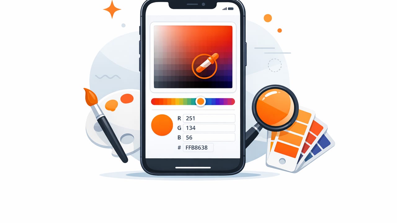
An iphone color picker is one of the fastest ways to translate real-world inspiration into usable design values. Whether you’re matching paint to a room photo, pulling a hero color from packaging, or building a brand palette from a mood shot, the goal is the same: get accurate color values you can trust and organize them so you can reuse them consistently.
This guide walks through a practical, repeatable workflow: capturing a clean reference image, sampling colors reliably, converting values (HEX/RGB/HSL/HSB), building a palette with roles, and validating accessibility before you ship. It’s written for designers, decorators, and anyone who needs “that exact color” from a photo—without turning it into a guessing game.
What an iPhone color picker actually does (and what it can’t)
At its core, an iPhone color picker samples pixels from an image and returns color values such as:
- HEX (e.g.,
#2F6F68) for web and most design tools - RGB (e.g.,
47, 111, 104) for screens and editing - HSL/HSB for intuitive adjustments (hue shifts, saturation tweaks, lightness/brightness control)
But there are limits. A photo is not a calibrated color measurement. Lighting, shadows, camera processing, reflections, and the material’s texture all shift the pixel value you sample. Think of a picker as a high-quality starting point, not a lab instrument.
Rule of thumb: sample for “design intent,” then refine for consistency and usability (contrast, harmony, and repeatability).
Step 1: Capture a better reference photo (accuracy starts here)
Your palette is only as reliable as the pixels you feed it. Before you even open a color picker, improve your source image:
Best practices for color-accurate photos
- Use neutral light: daylight near a window is usually better than warm indoor bulbs.
- Avoid mixed lighting: tungsten + daylight can create inconsistent color casts.
- Reduce glare: shift your angle slightly to avoid highlights that read as “lighter” colors.
- Tap to focus/expose on the surface you’ll sample (helps reduce muddy midtones).
- Fill the frame with the material (paint wall, fabric, tile) so the app samples true pixels instead of compression artifacts.
Optional: add a neutral reference
If you’re serious about matching (interiors, product color), place a small neutral card in the shot (white/gray). This makes it easier to correct white balance later. Even without a card, you can still create a stable palette—just be aware the photo may “lean” warm or cool.
Step 2: Sample colors like a pro (avoid one-click palettes)
The fastest way to get disappointing results is to sample just once per color. Real photos contain noise, texture, and gradients. Instead, sample systematically:
- Zoom in and sample from the most even area (avoid edges, seams, shadows, specular highlights).
- Take 3–5 samples for the same material and compare values.
- Choose the “middle” sample (not the brightest, not the darkest) for the base swatch.
- Create variants (light/dark) intentionally rather than accidentally sampling shadow pixels.
This approach matters in both graphic design and interior design. For example, a fabric sofa might have weave highlights and shadows; sampling a single bright thread will skew your palette.
Step 3: Understand the numbers you’ll use in real workflows
Most teams share colors in HEX, but adjustments are often easier in HSL/HSB. Here’s how to think about each:
| Model | Best for | Common pitfall |
|---|---|---|
| HEX | Web/dev handoff, design tokens, sharing exact values | Hard to “tweak” intentionally without tools |
| RGB | Screen-based edits, image tools | Not intuitive for adjusting hue or perceived lightness |
| HSL | Creating tints/shades, harmonizing a palette | Lightness doesn’t always match perceived brightness |
| HSB/HSV | Fast brightness and saturation tuning | Easy to oversaturate when “pushing” vibrancy |
In practice: sample in HEX for accuracy, then adjust in HSL/HSB to create a balanced system.
Step 4: Turn picked colors into a usable palette (roles, not just swatches)
A folder of random swatches isn’t a palette—it’s a collection. A palette becomes useful when each color has a job. Start by assigning roles:
- Primary: your anchor color (brand hero, dominant wall color)
- Secondary: supports primary (buttons, cabinetry, accent wall)
- Accent: sparingly used pop (call-to-action, decor objects)
- Neutrals: background, surfaces, spacing colors (off-white, warm gray, charcoal)
- State colors (digital): success/warning/error, if relevant
A simple palette-building method: 60–30–10
If you’re working on interiors or visual compositions, apply the 60–30–10 rule:
- 60% dominant (usually a neutral or low-saturation base)
- 30% secondary (supports and adds contrast)
- 10% accent (high-impact highlight)
Even for UI palettes, the principle holds: most screens should be neutral-heavy to preserve readability and let accents perform their job.
Step 5: Create consistent tints and shades (so the palette scales)
Once you have your base colors, you’ll usually need lighter and darker variants. Avoid sampling those from the photo—generate them intentionally so they’re consistent.
A practical approach:
- Pick a base color (e.g., your primary).
- Create 2 lighter tints (for backgrounds/hover states).
- Create 2 darker shades (for text/icons/pressed states).
If you’re adjusting in HSL, hold hue mostly steady, tweak saturation slightly (often down a touch for very bright tints), and step lightness in even increments.
Example: storing your palette as CSS variables
When you export or share values, format them into a structure your tools can reuse. For web work, CSS variables are a simple “single source of truth”:
:root {
  --color-primary: #2F6F68;
  --color-primary-600: #255A54;
  --color-primary-400: #3B847C;

  --color-neutral-900: #1B1D1F;
  --color-neutral-100: #F4F2EE;

  --color-accent: #D86A4A;
}
This makes it easier to keep your chosen iPhone-picked color consistent from prototype to production.
Step 6: Verify readability and accessibility (don’t skip contrast)
The most common palette failure isn’t “ugly”—it’s unreadable. Before you commit, check how your colors behave for text, icons, and key UI elements.
Quick contrast checklist
- Test text on background (especially body text on neutrals).
- Test buttons: label vs button fill color.
- Test disabled states: ensure they’re still legible enough for context.
- Test in low brightness (common real-world phone usage).
If your picked colors are close in value (common when sampling from moody photos), keep the hue but increase separation by adjusting lightness/brightness rather than saturation alone.
Step 7: Common problems when using an iPhone color picker (and fixes)
Problem: the color looks right in the photo but wrong in your design
Fix: you likely sampled a shadow/highlight. Re-sample from an evenly lit region and compare multiple points. Then generate a tint/shade ladder so you’re using a stable base value.
Problem: everything is too warm (or too cool)
Fix: correct the photo’s white balance first (even a small temperature shift helps), or compensate by nudging hue slightly and reducing saturation. Photos taken under warm bulbs often produce overly yellow neutrals.
Problem: neutrals aren’t neutral
Fix: aim for “useful neutrals,” not mathematically pure gray. But if you need a clean system, pick a neutral with low saturation and ensure your dark neutral isn’t accidentally tinted (common with navy/green shadows).
Problem: gradients and textures cause inconsistent values
Fix: sample larger, flatter areas; take multiple samples; choose the median. If your tool supports it, use an averaging or palette extraction mode rather than single-pixel picking for textured materials.
A practical mini-workflow you can repeat in 10 minutes
- Take (or choose) a well-lit reference photo.
- Pick 1–2 dominant colors and 2–3 supporting colors.
- Add 2 neutrals (light + dark).
- Generate 2 tints + 2 shades for the primary.
- Assign roles (primary/secondary/accent/neutrals).
- Check contrast for text and key UI elements.
- Export/share values in a consistent format (HEX + names/roles).
When to use photo-picked colors (and when not to)
Photo extraction is perfect when your goal is cohesion with a real-world reference: interiors, branding from product photography, event design, social templates, or matching a hero image in a landing page.
It’s less ideal when you need strict color standards (e.g., print-critical brand colors across different substrates). In those cases, treat the iPhone-picked color as inspiration, then confirm with official brand values or physical samples.
Final thoughts
A strong iphone color picker workflow is less about the tap and more about the system: good source images, careful sampling, intentional variants, role-based palettes, and contrast checks. Do that, and you’ll spend less time chasing “almost the same color” across tools—and more time designing.
If you want a lightweight way to extract HEX/RGB/HSL/HSB values and organize palettes directly on iPhone or iPad, an app like Color Viewfinder can help streamline the process.
