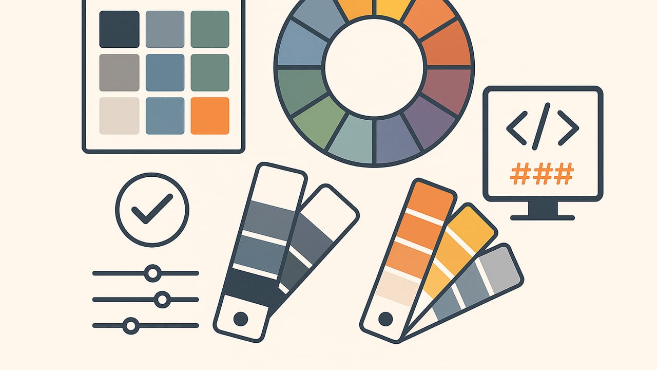
A well-crafted color palette is more than a pleasing set of swatches—it’s a system that guides mood, clarity, and brand recognition. Whether you are designing a mobile UI, an interior space, a data dashboard, or a campaign identity, your color choices shape how people feel and behave. This guide distills the fundamentals of color theory, shows how to build and test a color palette step by step, and explains practical ways to implement palettes across code and design tools. You’ll learn how to balance psychology with accessibility, how to choose between RGB, HEX, HSL, and HSB, and how to avoid common mistakes that lead to muddy or inconsistent results.
“Color is a power which directly influences the soul.” — Wassily Kandinsky
The Anatomy of a Color Palette
Before you pick swatches, define the roles each color will play. A robust color palette typically includes:
- Primary color: The hero hue that communicates brand or product voice.
- Secondary color(s): Supporting hues for emphasis and variety.
- Accent color: A high-energy hue used sparingly for calls to action.
- Neutrals: Grays, off-whites, and charcoals that provide structure and legibility.
- Semantic colors: Status-driven hues like success (green), warning (yellow/orange), and danger (red) for UI and dashboards.
Plan a palette with intentional depth by creating tints (lighter), tones (muted), and shades (darker). This depth lets you handle states such as hover, active, and disabled in interfaces, or highlight/shadow in illustrations and interiors. Keep your set small enough to be memorable, but broad enough to solve real problems. Many teams standardize 8–12 core swatches with a few tonal steps each.
Naming is strategy. Rather than “light blue 1,” use role-based tokens such as --color-primary-600 or --color-neutral-100. Role-first naming decouples the job (e.g., primary) from a specific hue, making future palette evolution painless.
Color Harmony Models That Work
Harmony models provide systematic ways to assemble a color palette that feels balanced. Below are common models, their strengths, and how to use them without falling into cliché.
| Harmony | Feel | Best For | Pitfalls |
|---|---|---|---|
| Complementary | High contrast, energetic | CTAs, sports brands, highlights | Can look harsh; balance with neutrals |
| Split-Complementary | Balanced contrast, lively | Marketing, product sites | Overuse can feel busy; set hierarchy |
| Analogous | Cohesive, calm | Interiors, editorial, wellness | Low contrast; ensure legibility |
| Triadic | Playful, dynamic | Startups, kids’ brands, dashboards | Needs disciplined saturation control |
| Tetradic (Double Complement) | Rich, complex | Illustration, themed systems | Hard to balance; define roles tightly |
| Monochromatic | Minimal, elegant | Luxury, portfolios, UIs | Monotony; add texture or accent |
Practical pick: Start with analogous, add a complementary accent
For many applications, choose two or three neighboring hues for cohesion, then add one complementary accent for key actions or focal points. This gives you calm surfaces plus decisive emphasis where you need it.
Color Models: RGB, HEX, HSL, and HSB
Color models are different lenses on the same light:
- RGB (0–255 per channel) is how screens emit color. Good for programmatic manipulation.
- HEX (
#RRGGBB) is a compact RGB notation widely used on the web. - HSL (Hue, Saturation, Lightness) expresses color in artist-friendly terms. It excels at creating systematic tints and shades.
- HSB/HSV is similar to HSL, emphasizing perceived brightness.
- CMYK is for print; convert thoughtfully and test proofs.
When building a color palette, many designers pick a base hue in HSL and derive tonal steps by adjusting Lightness and Saturation consistently. Store final values as HEX or RGB for implementation.
Step-by-Step: Build a Color Palette That Scales
- Define purpose and mood. Write 3–5 adjectives (e.g., “warm,” “confident,” “clean”). Collect reference images to align stakeholders. If it’s a UI, list typical components; if it’s an interior, list materials and lighting conditions.
- Choose a base hue and neutrals. Pick a primary hue in HSL that matches your mood. Pair with a neutral scale that suits the temperature: warm grays for cozy brands, cool grays for techy products.
- Expand systematically. Create 5–10 tonal steps for your primary (e.g., 50–900). Then define one or two accent hues. Keep a consistent increment—like 7–10 points of Lightness—to maintain rhythm.
- Test in context. Apply colors to a real UI component, a poster, or a room mockup. Does the accent pop? Do disabled states look appropriately subdued?
- Check accessibility. Target WCAG AA for body text (4.5:1) and large text (3:1). Inspect color-blind safety and provide non-color cues for state.
- Document tokens. Name colors by role (primary, surface, text), not by hue. Store source of truth in design tools and code.
Example mini palette (role-based tokens)
:root {
  /* Primary (blue) */
  --color-primary-50:  #eff6ff;
  --color-primary-100: #dbeafe;
  --color-primary-500: #3b82f6;
  --color-primary-600: #2563eb;
  --color-primary-800: #1e40af;

  /* Accent (orange) */
  --color-accent-500:  #f97316;

  /* Semantic */
  --color-success-500: #10b981;
  --color-warning-500: #f59e0b;
  --color-danger-500:  #ef4444;

  /* Neutrals */
  --color-neutral-50:  #f9fafb;
  --color-neutral-100: #f3f4f6;
  --color-neutral-700: #374151;
  --color-neutral-900: #111827;

  /* Text on light/dark */
  --color-text:        #111827;  /* near neutral-900 */
  --color-text-invert: #ffffff;
}

.button-primary {
  background: var(--color-primary-600);
  color: var(--color-text-invert);
}

.alert-success {
  background: var(--color-success-500);
  color: var(--color-text-invert);
}
Notice the palette includes roles and tonal steps, not just a scattered set of swatches. This approach supports light/dark themes, hover states, and semantic feedback.
Accessibility and Contrast in Color Palettes
A beautiful color palette must also be readable. Follow these principles:
- Contrast: Aim for WCAG AA: 4.5:1 for normal text, 3:1 for large (18pt+ or 14pt bold). AAA is ideal for dense content.
- Don’t rely on color alone: Use icons, patterns, or text labels to differentiate states—especially in charts and forms.
- Test color blindness: Simulate Deuteranopia, Protanopia, and Tritanopia. Pick redundant encodings (e.g., shape + color).
- Context matters: Check contrast in actual layouts, not just swatch-on-swatch. Gradients and images can reduce legibility.
Using Your Color Palette in Code and Design Tools
Make your color palette portable with design tokens and consistent configuration.
CSS Variables
/* tokens.css */
:root {
  --color-surface: var(--color-neutral-50);
  --color-surface-elevated: #ffffff;
  --color-border: #e5e7eb; /* neutral-200 */
}

.card {
  background: var(--color-surface);
  border: 1px solid var(--color-border);
}

.link {
  color: var(--color-primary-600);
}
.link:hover {
  color: var(--color-primary-800);
}
Tailwind (or similar) configuration
// tailwind.config.js
module.exports = {
  theme: {
    extend: {
      colors: {
        primary: {
          50:  '#eff6ff',
          100: '#dbeafe',
          500: '#3b82f6',
          600: '#2563eb',
          800: '#1e40af',
        },
        accent: {
          500: '#f97316',
        },
        neutral: {
          50:  '#f9fafb',
          100: '#f3f4f6',
          700: '#374151',
          900: '#111827',
        },
      }
    }
  }
}
In design tools like Figma or Sketch, set Styles using the same token names. Map components (buttons, cards, charts) to roles such as Surface, Text, and Accent so a single palette change updates the entire system.
Common Color Palette Mistakes (and Fixes)
- Too many hues: Limit to 1–2 primaries, 1 accent, and rich neutrals. Expand depth, not breadth.
- Over-saturation: Use saturation strategically. Reserve the boldest values for key actions or highlights.
- Poor contrast: Validate ratios early. Increase light/dark separation or adjust saturation for clarity.
- Inconsistent neutrals: Mixing warm and cool grays can look messy. Choose one family per product or space.
- No semantic mapping: Apply consistent success/warning/danger. Users should learn color meaning once.
- Hue drift across teams: Centralize tokens and automate linting or checks in CI.
Palettes by Domain: Practical Tips
- Brand identity: Anchor in a distinctive primary and a memorable accent. Build a neutral backbone for versatility. Test across print, web, and merchandise.
- UI and dashboards: Favor high-contrast neutrals for readability, with restrained use of colorful accents. For charts, ensure adjacent series have distinct hue and lightness—and provide patterns for accessibility.
- Marketing and ads: Push saturation and contrast for impact, but keep consistency with brand primaries. Use the accent for CTAs and legible type over imagery.
- Interior design: Start with analogous walls and furnishings for harmony, inject a complementary accent in textiles or decor. Assess under real lighting and daylight cycles.
From Photos to a Color Palette
Photography can be a goldmine for palette inspiration because it captures naturally harmonious combinations of hue, lightness, and saturation. To build a palette from a photo:
- Pick a photo whose mood matches your project (calm coast, urban neon, forest trail).
- Extract a few dominant hues and a couple of subtle neutrals from shadows/highlights.
- Translate them to HSL, then create a tonal ladder for each role (surface, text, accent).
- Test contrast and refine saturation to fit UI or print needs.
Maintaining and Evolving Your Palette
Treat your color palette as a living system:
- Versioning: Record changes with semantic versioning (e.g., adding an accent is a minor update).
- Design tokens: Keep a single source of truth and generate platform files (CSS, iOS, Android) automatically.
- Themes: Prepare light/dark themes and seasonal or campaign variants that map to the same roles.
- Governance: Create simple rules for contrast, saturation caps, and semantic mapping to keep teams aligned.
Quick Checklist: A Palette That Works
- Primary and accent colors defined with tonal steps
- Neutral scale aligned to warm or cool temperature
- Roles documented: surface, text, border, states, semantic
- Contrast checked for AA/AAA where needed
- Tokens implemented in code and design tools
- Tested in real layouts and under real lighting
Closing Thoughts
A strong color palette is a measurable asset: it improves clarity, consistency, and emotional resonance. Start with clear intent, use harmony models to guide selection, extend with disciplined tonal steps, and validate accessibility from day one. If you like to jumpstart ideation by extracting HEX, RGB, HSL, and HSB values directly from photos on iPhone or iPad, the Color Viewfinder app can help you turn inspiration into a structured palette you can use anywhere.
