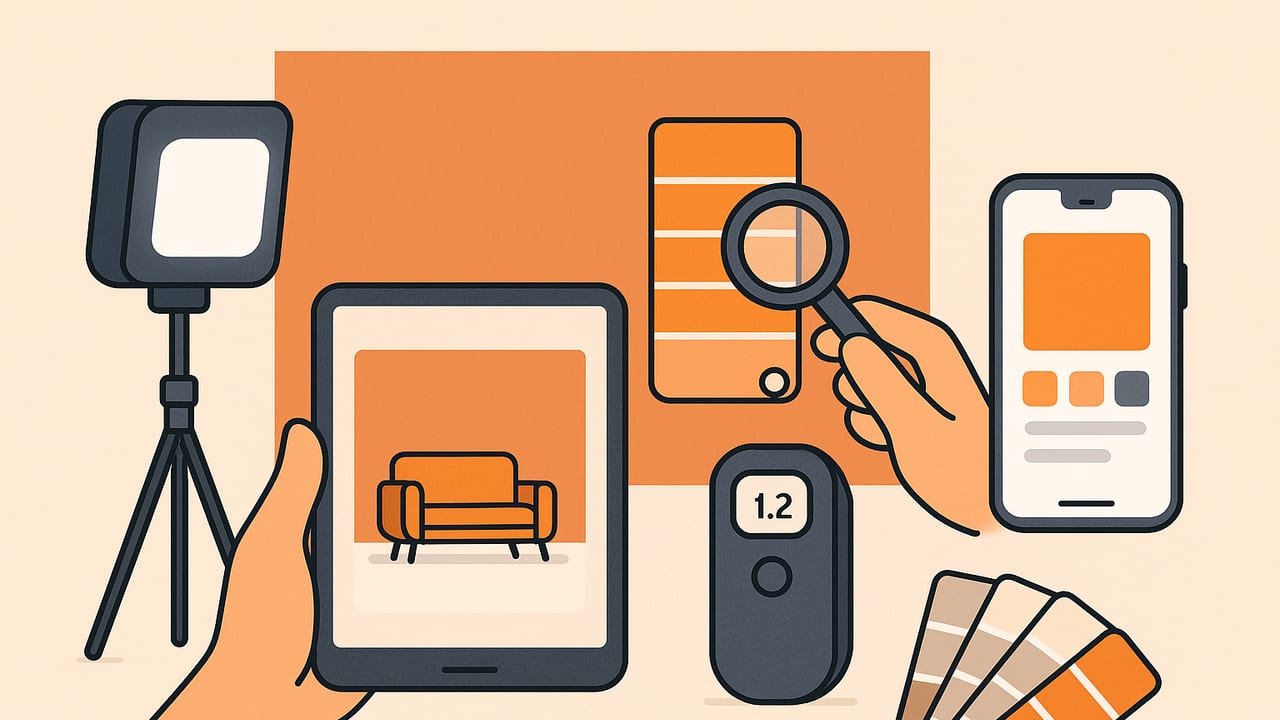
Need to repaint a scuffed wall or extend a color into a new room, but you no longer have the paint can? It is absolutely possible to match wall paint color from picture with high confidence when you follow a disciplined capture and evaluation process. This guide breaks down why photos can mislead, how to capture and correct a reference image, and how to validate color matches using measurable color difference (Delta E). You will also find comparisons of methods, practical shortcuts, and a concise checklist you can use on-site.
Why photos make paint matching tricky
Photos are interpretations of the scene, not ground truth. Several factors can skew a color:
- Lighting spectrum: Warm tungsten, cool LEDs, and daylight all shift perceived color. Mixed lighting creates uneven casts across the wall.
- White balance: Auto white balance guesses the neutral point and can be wrong, adding tint.
- Surface gloss and texture: Semi-gloss reflects highlights; matte absorbs light. Shadows, roller marks, and texture cause local variation.
- JPEG processing: Phones apply contrast, saturation, and noise reduction that change pixel values. RAW preserves more faithful data.
- Aging and soiling: Sun exposure, smoke, and dust alter paint color over time, so matching to a fresh formula may not match your aged wall.
Despite these challenges, a careful workflow can bring you very close to a perfect match.
Step-by-step: How to match wall paint color from picture
1) Capture the best possible photo
- Use diffuse daylight: Shoot near a window on a bright overcast day. Turn off interior lights to avoid mixed color temperatures.
- Add a neutral reference: Place a neutral gray card (18% gray) or a known white card on the wall. This gives you a trustworthy white balance target.
- Avoid glare: Angle the camera to minimize specular highlights on semi-gloss surfaces. Step sideways until reflections disappear.
- Stabilize and lock exposure: Hold steady, or use a tripod. If your camera app allows, lock exposure and focus to avoid shifts across shots.
- Shoot RAW if possible: A RAW capture retains linear data and avoids aggressive phone processing. If you must use JPEG, choose a neutral profile with reduced contrast/saturation.
2) Correct the image before sampling
- White balance to the gray card: Use an editor to set white balance using the gray reference. This neutralizes color casts.
- Normalize exposure: Adjust exposure so the gray card reads close to mid-gray; avoid clipping highlights or crushing shadows.
- Crop to the region of interest: Exclude shadows, window glare, and nearby strong colors that can bias perception.
- Convert to sRGB for consistency: Standardize the working space so RGB values mean the same thing across tools.
3) Sample the color correctly
- Avoid edges and defects: Don't sample near corners, tape lines, or patchy zones.
- Average multiple points: Take several samples across an even region and average them. A 5x5 or 9x9 pixel average reduces noise and texture influence.
- Note sheen: Semi-gloss walls may show micro-highlights. Favor matte-looking areas or sample slightly off-axis to minimize specular effects.
4) Convert and compare
- Record the color in multiple formats: HEX, RGB, HSL/HSB are helpful. For precision matching, convert to CIELAB (Lab).
- Compare to known swatches: Many paint brands publish digital swatches. Convert their sRGB values to Lab and compute Delta E versus your sample.
- Shortlist candidates: Pick 2–4 nearest swatches by lowest Delta E for physical evaluation.
5) Validate physically
- Get physical swatches or sample pots: Place swatches on the wall and view them across times of day. If possible, brush small patches.
- Check under multiple lights: Evaluate in daylight, warm LEDs, and cool LEDs. Watch for metamerism (a match in one light but not another).
- Blend edges: When testing paint, feather edges to judge how close the color is without edge contrast illusions.
Methods to match wall paint color: compared
| Method | Approx. cost | What you need | Typical accuracy | Pros | Cons |
|---|---|---|---|---|---|
| Phone photo + simple eyedropper | Free | Any smartphone | Low to medium | Fast, easy, good for rough matches | Lighting, white balance, and JPEG processing can mislead |
| Phone RAW + gray card + averaging | Low | Smartphone with RAW and a gray card | Medium to high | Significantly better color fidelity | Requires basic editing workflow and care |
| Dedicated colorimeter/spectrophotometer | Medium to high | Handheld device placed on the wall | High | Direct Lab measurements, minimal lighting influence | Cost; small aperture may read texture or dirt |
| Take a painted chip to a store scanner | Low | Removable sample of your wall | High | In-store spectro with brand formula suggestions | You need a removable sample; may still need tweaks |
| Brand paint-matching apps | Free | Phone + brand app | Medium | Instant brand swatch suggestions | Often assume ideal lighting; limited cross-brand options |
| Visual matching with fan decks | Low | Fan deck swatches | Medium | Immediate physical comparison under real light | Subjective; human vision adapts and is context-sensitive |
How to judge a match: Delta E in plain language
To quantify how close two colors are, convert both to Lab and compute Delta E (dE). Lower is closer. General thresholds:
- dE < 1.0: Essentially indistinguishable by most observers.
- 1.0–2.0: Very close; acceptable for most paint touch-ups.
- 2.0–3.0: Close; often acceptable once dry and in context.
- > 3.0: Noticeable difference; consider adjusting.
Remember: finish (matte vs semi-gloss) changes perceived color, even if the numeric match is tight. Always consider sheen when ordering paint.
Simple code to compute Delta E (dE76)
If you want to test digital swatches against your sampled pixel, here is a compact example in JavaScript that converts sRGB to Lab and computes dE76:
// sRGB (0-255) to Lab and Delta E 76
function srgbToLab(r, g, b) {
  // normalize
  r /= 255; g /= 255; b /= 255;
  // inverse companding
  [r, g, b] = [r, g, b].map(v => v <= 0.04045 ? v / 12.92 : Math.pow((v + 0.055) / 1.055, 2.4));
  // sRGB D65 to XYZ
  const x = r * 0.4124564 + g * 0.3575761 + b * 0.1804375;
  const y = r * 0.2126729 + g * 0.7151522 + b * 0.0721750;
  const z = r * 0.0193339 + g * 0.1191920 + b * 0.9503041;
  // normalize by D65 reference white
  const Xn = 0.95047, Yn = 1.00000, Zn = 1.08883;
  const fx = f(x / Xn), fy = f(y / Yn), fz = f(z / Zn);
  return [116 * fy - 16, 500 * (fx - fy), 200 * (fy - fz)];
  function f(t){ return t > 0.008856 ? Math.cbrt(t) : (7.787 * t) + (16/116); }
}
function deltaE76(Lab1, Lab2){
  const dL = Lab1[0] - Lab2[0];
  const da = Lab1[1] - Lab2[1];
  const db = Lab1[2] - Lab2[2];
  return Math.sqrt(dL*dL + da*da + db*db);
}
// Example usage:
const sampleLab = srgbToLab(203, 196, 186);
const swatchLab = srgbToLab(198, 190, 180);
console.log('dE76 =', deltaE76(sampleLab, swatchLab).toFixed(2));
dE2000 correlates better with human vision, but dE76 is often sufficient for shortlisting. If you need tighter comparisons, use a color library that provides dE2000.
Troubleshooting: common pitfalls and fixes
- Mixed lighting (daylight + lamp): Turn off interior lights. Shoot in stable daylight, or use a single high-CRI light source.
- Glossy or eggshell finishes: Move off-axis to avoid glare. If highlights are unavoidable, sample several non-glare areas and average.
- Textured walls: Use a larger sampling area (e.g., 11x11 pixels) to average bumps and micro-shadows.
- Dirt or scuffs: Clean a small section gently and let it dry before photographing. Debris can shift readings.
- Aged paint: If the color has faded, matching to the current wall is usually the goal. Be explicit when talking to a paint counter: you want the present color, not the original formula.
- Metamerism: If a match looks perfect in daylight but not under LEDs, ask for a small tint adjustment (add or reduce subtle green/red/blue bias) and retest.
Fast on-site workflow (clipboard checklist)
- Place a gray card on the wall in diffuse daylight.
- Turn off interior lights; avoid shadows and glare.
- Shoot RAW if possible; otherwise use a neutral JPEG profile.
- White-balance to the gray card; correct exposure.
- Sample multiple points; record average HEX/RGB.
- Convert sample to Lab; compare to paint swatches; shortlist 2–4.
- Order swatches or sample pots; test on the wall in varied lighting.
- Select sheen to match existing finish; blend edges when painting.
FAQ: matching paint color from photos
Can I match wall paint color from picture without a gray card?
Yes, but accuracy drops. If you lack a gray card, include a known neutral object (printer paper is close, though often slightly warm). Better yet, bring a simple pocket gray card; they are inexpensive and make a large difference.
Is printing my sampled color a good way to validate?
Generally no. Most home printers are not color-managed tightly enough, paper white varies, and paint is reflective in different ways than ink on paper. Physical paint swatches or brushed samples are the only reliable comparison.
What about changing sheen?
Sheen changes how we perceive color. A perfect color in matte can look different in semi-gloss due to surface reflections. When ordering, specify the same sheen as the wall (e.g., eggshell, satin, semi-gloss).
How close is close enough?
For small touch-ups, aim for dE < 2 and the same sheen. For repainting a full wall from corner to corner, dE up to ~3 often reads as the same color once dry, especially with consistent lighting.
Pro tips to improve accuracy
- Use high-CRI lighting if you can't shoot in daylight: Look for CRI 95+ LED bulbs for truer color rendering.
- Bracket exposures: Take several shots slightly brighter and darker, then choose the one that keeps the gray card mid-tone without clipping.
- Neutral surroundings: Bright adjacent colors can cause visual adaptation. Crop or mask them out when sampling.
- Account for drying: Paint can shift slightly as it cures. Evaluate samples after they dry fully per manufacturer guidance.
- Document your match: Save HEX/RGB/Lab values and a photo of the swatch label for future reference.
Bottom line
While no camera can perfectly capture the true paint color in every situation, a careful capture, white balance, and multi-point sampling routine gets you close enough to shortlist precise swatches. Validate with physical samples under your real lighting, match the sheen, and use Delta E to quantify closeness. With this workflow, you can confidently match wall paint color from picture and complete repairs or extensions without visible seams.
Note: If you prefer doing this on your iPhone or iPad, an app like Color Viewfinder can extract HEX, RGB, HSL, and HSB values from photos and help you build palettes you can compare to paint swatches.
