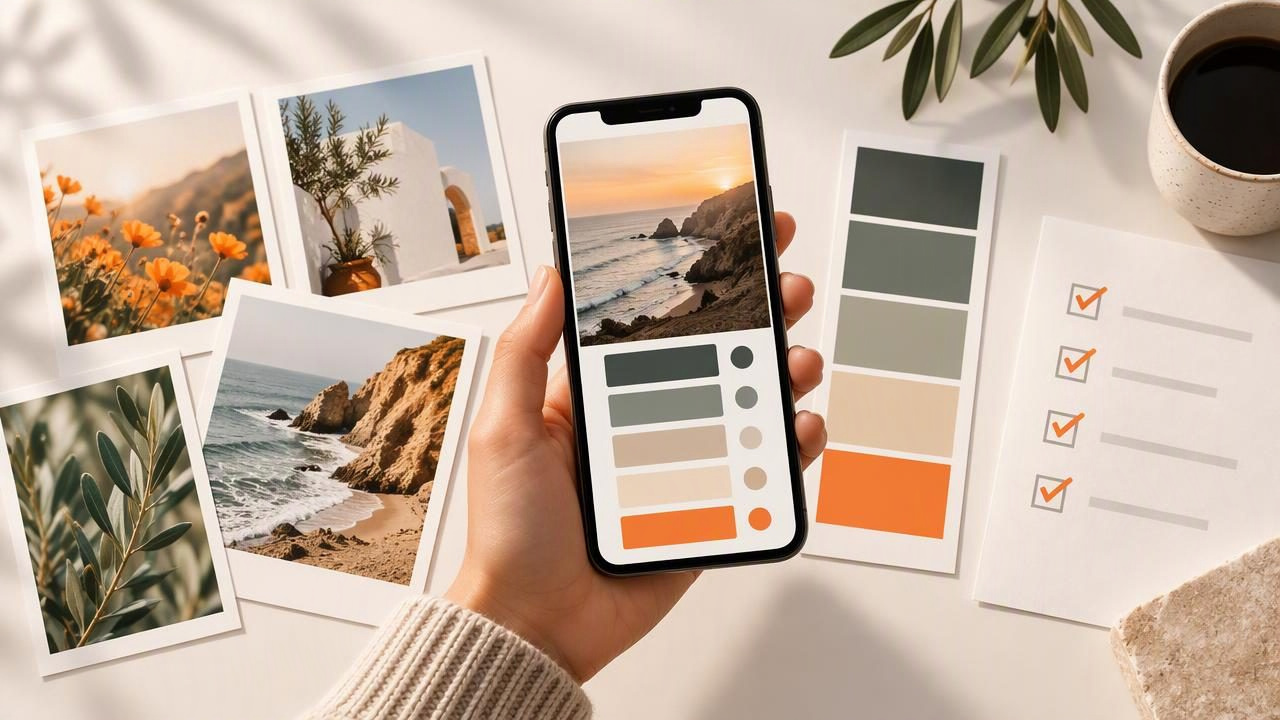
A mood board can collect beautiful images and still feel visually scattered. The difference between an inspiration folder and a useful design tool is often a clear system for sorting the colors inside each image. A camera palette app can help you turn photo inspiration into color values you can compare, label, and reuse across a creative project.
This checklist focuses on the work that happens around color extraction: choosing useful source photos, organizing palettes by role, checking contrast, and keeping codes easy to find. It applies to interior design, graphic design, styling, and personal creative projects. The aim is not to make every image match perfectly. It is to understand which colors support the mood you want and where each one belongs.
Start with a mood board question
Before collecting colors, write one sentence that describes the direction of the board. A question gives you a filter for deciding which photos are relevant and which colors deserve attention. For example: How can a small reading corner feel warm, calm, and connected to nature?
Imagine your references include a photograph of a terracotta mug beside a cream wall, a leafy plant near a window, and a blue-gray view outside. Those images may suggest a palette of warm neutrals, an earthy accent, muted green, and a cool supporting color. At this stage, treat those as visual cues—not finished specifications for paint, fabric, or printing.
- Write the mood: choose three to five descriptive words, such as calm, tactile, airy, or grounded.
- Set the project context: note whether the board is for a room, a brand concept, an illustration, or another use.
- Choose a scope: decide whether the board needs one main palette or separate palettes for different zones or concepts.
- Save a short brief: keep the sentence and keywords beside the images so color decisions stay connected to the original idea.
Checklist: prepare photos for color extraction
A photo is evidence of a color impression, not a neutral color sample. Lighting, shadows, reflections, camera settings, and image editing can all affect the colors visible in the file. Select references that communicate the project’s atmosphere, then record enough context to interpret their palettes later.
- Choose relevant images. Prioritize photos that show the materials, light, objects, or visual style you want to explore. A reference that only shares a fashionable color may be less useful than one that captures the overall feeling of the project.
- Keep a manageable set. Begin with a small group of strong references rather than importing every image you have saved. You can add more when you identify a gap, such as a missing dark accent or a warmer neutral.
- Check image conditions. Note whether a photo is strongly sunlit, shaded, artificially lit, or heavily edited. A blue cast from a window or a warm lamp can change how a surface appears.
- Record what caught your eye. Write a short note such as “soft green leaves,” “dark wood,” or “warm light on plaster.” This helps distinguish the intended inspiration from incidental pixels in the image.
- Keep the original source. Save the image or its source information with the project. If a sampled color seems surprising, the reference lets you check whether the image, rather than your palette organization, explains it.
Extract colors, then organize them by job
Color extraction gives you a set of candidate values from a photo. The next step is to decide what each color is doing. Sorting by role is more useful than keeping a long, unlabeled row of swatches: it helps you spot when a palette has plenty of accents but no flexible background, or several similar colors competing for the same purpose.
For the reading-corner example, you might organize extracted colors into roles like these. The descriptions are illustrative; actual values depend on the selected photographs and the areas sampled.
| Palette role | Example from the references | Question to ask |
|---|---|---|
| Base | Cream wall or light natural material | Can this support larger areas without overwhelming the mood? |
| Secondary | Muted leaf green or warm wood | Does it connect the main colors and materials? |
| Accent | Terracotta mug | Is this vivid or distinctive enough to draw attention in small amounts? |
| Contrast | Deep brown or blue-gray shadow | Does the board need a darker value to add definition? |
| Optional highlight | A pale reflection or soft sky tone | Does this add useful variation, or is it only present because of the lighting? |
Do not force every extracted color into the final palette. Some may be background details, reflections, or tiny areas that do not matter to the project. Keep a “consider later” group if you want to preserve options without letting them crowd the working set.
Checklist: inspect and label each palette
Color codes make a palette portable, but a code alone does not explain why you saved it. Use the available HEX, RGB, HSL, or HSB values to identify and communicate colors, while adding plain-language labels that preserve their design role.
- Give the palette a specific name. Use a project and source label, such as “Reading nook — window and plant references,” instead of “New palette.”
- Label colors by role or source. Names like “base cream,” “leaf green,” and “mug accent” are easier to interpret than “color 1” and “color 2.”
- Keep a consistent order. Arrange swatches from base to secondary to accent and contrast, or use another order that your team understands.
- Inspect the values that suit the task. HEX and RGB can be useful in digital design workflows; HSL and HSB describe color through different components that can help you compare hue, saturation, and lightness or brightness.
- Copy codes carefully. Check that a copied value is attached to the intended swatch, especially when several colors look similar on screen.
- Remove duplicates deliberately. Two nearby values may represent useful nuance, or they may be unnecessary repetition. Compare their purpose before keeping both.
For example, if two greens look nearly identical in the mood board, keep both only if one represents a broad background and the other a small botanical accent. If they serve the same purpose, simplify the palette. The goal is a set that supports decisions, not the largest possible collection of sampled colors.
Check relationships, not just individual swatches
A palette is a relationship between colors. Place the swatches together and ask whether the base leaves room for the accent, whether the darker color provides enough visual structure, and whether the overall mix still expresses your mood words. A single attractive swatch can feel out of place when it sits beside the rest of the palette.
Use the mood board to test broad proportions rather than treating a suggested percentage as a rule. A warm neutral might occupy most of a room concept, while terracotta appears in a few accessories. A graphic layout could use the same accent more prominently. Think about the intended application, scale, and surrounding materials before deciding how much of each color to use.
Also check the palette in context. A color can look different next to a very dark neighbor than it does beside white. Review the complete board at its intended viewing size, and include relevant imagery or material references so that color is not judged in isolation.
Keep palettes findable and ready to share
A useful mood board workflow includes a small amount of file organization. Decide on a naming convention before you build several versions. For example, use the project name, concept, and revision: “Reading nook — calm natural — draft 02.” Keep the corresponding reference photos and palette together, or use a shared folder structure that makes their relationship clear.
When a palette needs to move into another workflow, choose an export format that suits its destination. ASE, JSON, CSS, and CSV are available export options in supported color workflows; their usefulness depends on the application or process receiving the file. Keep a readable record of palette names and roles alongside an export when the file alone would not explain your choices. Check the destination workflow before relying on a particular format.
- Save a working version before making substantial changes.
- Mark the current selection so unused explorations do not look like approved colors.
- Keep codes with labels when sharing a palette with a collaborator.
- Review the board after export to confirm the selected colors and names still make sense in context.
Know what photo colors can and cannot tell you
Extracted values describe colors in the digital image, not guaranteed physical outcomes. A phone display, ambient light, photo processing, and the conditions under which a reference was captured can all influence what you see. A HEX or RGB code does not guarantee that a wall, textile, or printed piece will look identical to the photo. Treat sampled colors as a starting point for visual exploration, then evaluate real materials and production requirements separately.
Similarly, a palette is not a substitute for accessibility checks in a digital design, a physical sample review in an interior project, or a proofing process for print. Those decisions require checks appropriate to their medium. Keep the role of photo color extraction clear: it helps you organize inspiration and communicate digital color values, but it cannot remove the differences between a photograph, a screen, and a physical surface.
A final mood board review
Before calling the board ready, ask whether every selected image supports the brief, whether the palette has clear roles, and whether each saved code has a useful label. Remove colors that do not contribute, preserve the source context, and make sure the export format fits the next step. This turns a camera palette app from a quick sampling tool into part of a repeatable design process.
For a photo-based workflow, Color Viewfinder can help you extract and inspect colors from images, copy values, and export palettes; its guide to creating a color palette from a photo offers a relevant starting point. Use the checklist above to decide which extracted colors deserve a place on your mood board—and remember that photo-derived values are visual references, not guarantees of physical color matching.
