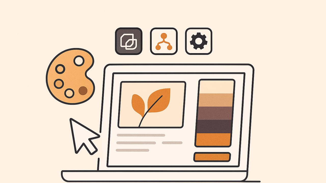
A palette maker app turns inspiration into actionable color systems. Whether you are a UI designer, illustrator, interior decorator, or hobbyist, the right tool can extract colors from photos, refine swatches with precision, and export palettes that plug directly into your workflow. This guide explains what a palette maker app is, which features matter, how the underlying algorithms differ, and a practical workflow to go from a reference image to a production-ready palette.
What Is a Palette Maker App?
A palette maker app is software that helps you build, edit, and organize color palettes. At a minimum, it lets you pick colors and save them as swatches. Modern apps go further: they extract dominant hues from images, provide harmony rules (complementary, triadic, analogous), support multiple color models (HEX, RGB, HSL, HSB), simulate accessibility scenarios, and export to formats you can use across design tools and codebases.
Some apps are photo-first (extract colors from images), while others are rules-first (generate harmonies from a seed color). Many blend both approaches and add features like naming, tagging, and versioning so your palettes are searchable and reusable.
Core Features That Matter
1) Color Accuracy and Color Spaces
Look for support for sRGB at a minimum, with Display P3 awareness if you work on wide-gamut displays. Advanced palette maker apps compute distances in perceptual spaces (Lab or LCH) to ensure the extracted colors match what you actually perceive. Perceptual math often produces better clusters and more consistent gradients than naive RGB comparisons.
2) Extraction Algorithms
When you extract colors from an image, the app typically relies on clustering algorithms:
- K-means: Fast, good general-purpose clustering; can be biased by large areas of similar color.
- Median Cut: Efficient quantization, historically used for palette reduction; stable results for photography.
- Octree: Good for large palettes; can preserve outliers if tuned.
Pro apps combine clustering with perceptual distance (e.g., CIEDE2000 in Lab) for better separation of similar hues.
3) Harmony and Contrast Tools
Useful generators: complementary, split-complementary, triadic, tetradic, analogous, and monochromatic schemes. Bonus points for tools that display simultaneous contrast, overlay palettes on sample UI or print templates, and compute WCAG contrast ratios automatically.
4) Editing Precision
Ensure you can view and edit HEX, RGB, HSL, and HSB values. Fine-grained sliders, numeric input, and eyedroppers with zoom and pixel averaging improve accuracy. Batch operations (lighten, saturate, rotate hue) speed up iteration.
5) Accessibility and Simulation
Built-in contrast checks (WCAG 2.1 AA/AAA) and color-vision deficiency simulators (protanopia, deuteranopia, tritanopia) are invaluable. An app that flags insufficient contrast and suggests alternative tones keeps your palette inclusive.
6) Export Formats and Interop
Design teams juggle many tools. Look for exports such as:
- ASE/ACO (Adobe), GPL (GIMP), CLR/SKETCHPALETTE (Sketch/Figma via plugins), Procreate swatches
- SVG with embedded color tokens
- CSS variables, SCSS maps, JSON design tokens
- CSV for handoff to data teams
7) Workflow and Automation
Time-savers include share extensions (send a photo straight from your library), Shortcuts or scripting hooks, batch exports, and palette versioning. A palette maker app that fits into your daily flow wins over one that lives on an island.
8) Performance and Offline Reliability
On-device processing protects privacy and keeps work moving without a network. For massive images, background processing and downsampling options help maintain speed without sacrificing fidelity.
9) Pricing and Ownership
Free cores with optional upgrades are common. Evaluate which features you truly need (e.g., unlimited palettes, wide-gamut export, or token automation) and verify that your palettes remain exportable if you switch tools later.
Choosing the Right Algorithm for Your Use Case
Different extraction algorithms shine in different scenarios. If your portfolio spans brand boards, UI mockups, and product shots, you may want an app that lets you choose or blend methods.
| Algorithm | Strengths | Trade-offs | Best For |
|---|---|---|---|
| K-means | Fast, widely supported, good general clustering | Sensitive to initialization; over-represents large uniform areas | Logos, UI screenshots, flat illustrations |
| Median Cut | Stable quantization; good color balance | May miss small but important accents | Photography, interiors, lifestyle |
| Octree | Handles many colors; preserves structure | More complex; may require tuning | Detailed photos, gradients |
| Perceptual (Lab + CIEDE2000) | Closer to human perception; separates near hues | Heavier computation | Brand work, accessibility-sensitive palettes |
Tip: After extraction, rank candidates by perceptual distance and remove near-duplicates. Then manually bring back one accent color that tells the story of the image (a neon sign, a flower center, a product stitch) to avoid a palette that feels too safe.
From Photo to Polished Palette: A Step-by-Step Workflow
- Pick a purpose: UI theme, brand mood, print poster, or room decor? Knowing the target informs the number of swatches, contrast, and gamut.
- Pre-process the image: Crop to the focal area and remove color casts with basic white balance. Even small corrections improve extraction.
- Choose extraction settings: Select k-means for graphics or median cut for photos. Set the number of colors (5–8 for UI themes, 8–12 for brand mood, 3–5 for decor accents).
- Enable perceptual metrics: If available, compute clusters in Lab and deduplicate with CIEDE2000 thresholds.
- Sample at multiple scales: If the app supports it, run a secondary pass focusing on edge detail to recover accent hues that the global pass may miss.
- Refine and normalize: Convert to HSL and nudge lightness to ensure the palette includes an anchor dark, a readable mid, and a highlight. Adjust saturation to avoid neon overload.
- Check contrast: Test text-on-background pairs for WCAG AA/AAA. If any fail, shift lightness or substitute the nearest compliant tone.
- Build variants: Create light, dark, and high-contrast variants by adjusting L in LCH or HSL by consistent steps.
- Name and document: Assign memorable names (e.g., "Ocean Mist", "Copper Roof") and technical tokens (e.g., color.primary.500). Notes on usage prevent misapplication later.
- Export and test: Export ASE/Procreate for creative tools and CSS/JSON tokens for code. Drop into a test layout or mood board to validate.
Good palettes are not just pretty; they are legible, adaptable, and intentionally constrained.
Measuring Accuracy and Consistency
Accuracy is not just math; it is workflow discipline. Use these checks:
- Color-managed displays: Work on calibrated displays with consistent lighting. Disable OS-level "vivid" modes that distort saturation.
- Device profiles: Confirm the app respects embedded ICC profiles. Mismatches between sRGB and Display P3 can shift hues.
- White balance sanity: Spot-check neutrals with the eyedropper. If grays lean warm or cool unexpectedly, correct before extraction.
- Cross-validation: Extract from the same image with two algorithms; compare deltas in Lab. Large divergences hint at sampling issues.
Accessibility and Contrast Essentials
Accessible palettes ensure readable text and clear UI states. Use these targets:
| Use Case | Minimum Contrast | Notes |
|---|---|---|
| Body text (normal) | 4.5:1 (AA) | 7:1 for AAA |
| Large text (18pt+ or 14pt bold) | 3:1 (AA) | 4.5:1 for AAA |
| Icons/UI controls | 3:1 (AA) | Against adjacent colors |
A palette maker app with real-time contrast checks and CVD simulators helps you choose compliant pairs fast. When a favorite hue fails, adjust lightness first; if that fails, tweak chroma or shift hue slightly while preserving the palette\u2019s mood.
Naming, Organizing, and Versioning
Structured palettes scale better across teams and time:
- Tokenize: Use semantic names (color.surface, color.text.muted) with numeric ramps (.50, .100, \u2026 .900).
- Tag and group: Group by collection (Brand Core, Seasonal, Data Viz) and tag by usage (UI, Print, Web).
- Version: Keep versions per release (v1.2) and changelogs explaining shifts. Small deltas avoid visual regressions.
Developer and Automation Tips
If your palette maker app exports code or tokens, you can automate adoption across projects. Here\u2019s a minimal Python example that extracts five colors using k-means, then prints HEX values:
from PIL import Image
import numpy as np
from sklearn.cluster import KMeans

def extract_palette(path, k=5):
    img = Image.open(path).convert('RGB')
    img = img.resize((400, 400))  # speed-up, preserve structure
    data = np.array(img).reshape(-1, 3)
    # sample to speed up clustering
    idx = np.random.choice(data.shape[0], size=min(50000, data.shape[0]), replace=False)
    sample = data[idx] / 255.0

    kmeans = KMeans(n_clusters=k, n_init=8, random_state=42)
    kmeans.fit(sample)
    centers = (kmeans.cluster_centers_ * 255).astype(int)

    def to_hex(rgb):
        return '#%02x%02x%02x' % tuple(rgb)

    return [to_hex(c) for c in centers]

print(extract_palette('reference.jpg', k=5))
Export CSS variables to wire palettes into apps and websites quickly:
:root {
  --color-primary-500: #2f5aa8;
  --color-primary-700: #1f3f7a;
  --color-accent-500:  #f3a712;
  --color-surface-50:  #f7f8fa;
  --color-text-900:    #1a1a1a;
}
Automate contrast checks in CI by parsing tokens and validating pairs against WCAG thresholds. This workflow prevents regressions when palettes evolve.
Common Pitfalls and How to Avoid Them
- Overfitting to the photo: A palette that mirrors a single image may not generalize. Add neutrals and a readable text color.
- Too many near-duplicates: In HSL or LCH, remove swatches with tiny hue or lightness deltas.
- Ignoring context: Test on real UI or print backgrounds; a color that pops on white may fail on tinted surfaces.
- No export discipline: Always export tokens and swatches; screenshots are not a source of truth.
Checklist: Evaluating a Palette Maker App
- Accurate sampling with perceptual color math (Lab/LCH, CIEDE2000)
- Multiple extraction algorithms and adjustable cluster counts
- Precision editors for HEX, RGB, HSL, HSB with fine control
- Harmony generators plus real-time contrast and CVD simulation
- Robust exports: ASE/ACO, Procreate, CSS/SCSS, JSON tokens, CSV
- Share extensions, batch export, and automation hooks
- On-device processing, color management, and wide-gamut awareness
- Tagging, naming, and versioning for long-term organization
Conclusion
The best palette maker app blends accurate color science with practical workflows: reliable extraction, perceptual editing, accessibility checks, and exports that meet your stack where it lives. Start with a clear purpose, validate in context, and document your choices. If you prefer working on iPhone or iPad, an option like Color Viewfinder can extract HEX, RGB, HSL, and HSB from photos and export polished palettes with minimal fuss.
