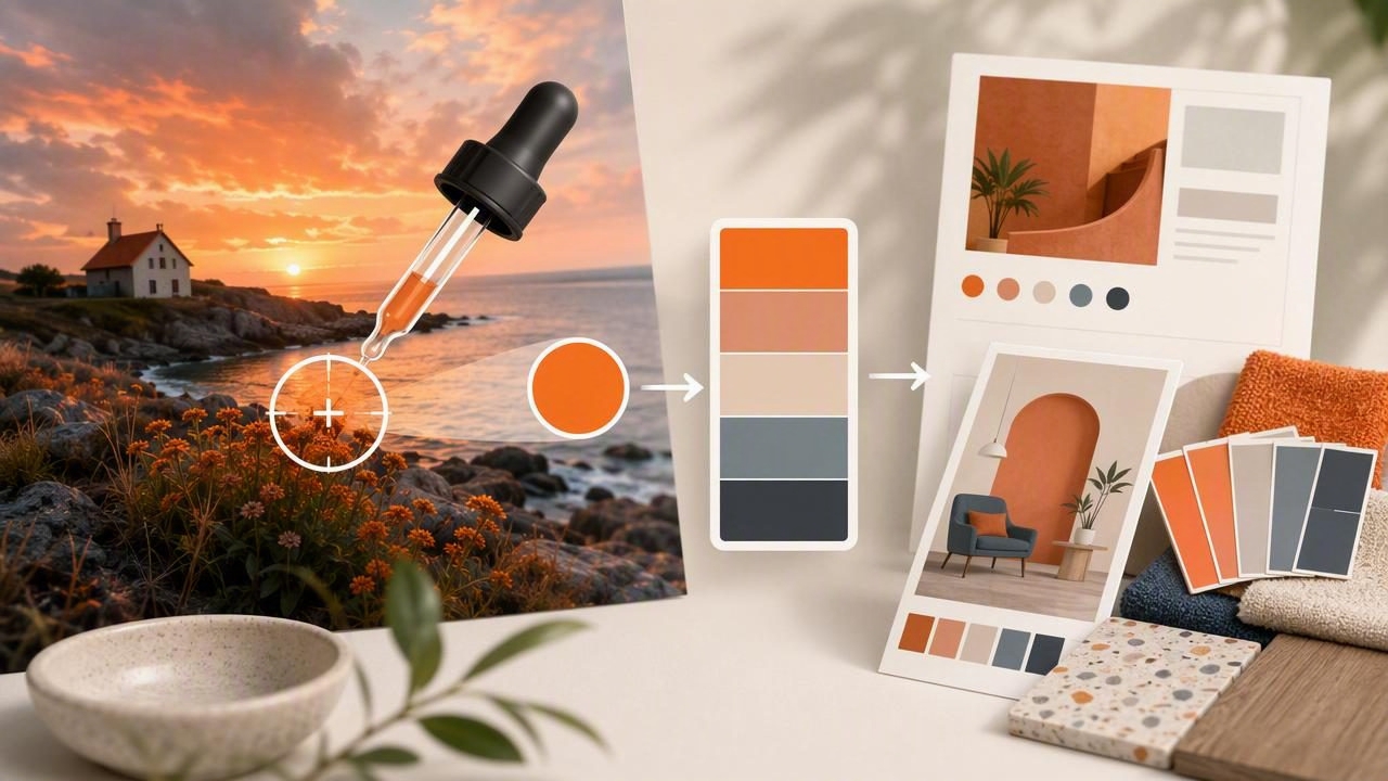
A photo color picker turns real-world inspiration—an outfit, a café wall, a product label, a sunset—into usable digital colors. But “pick a few pixels” is rarely enough for design work. Photos contain lighting shifts, compression artifacts, and mixed materials that can make sampled colors look wrong once they’re applied to UI, branding, or interiors.
This guide walks through a practical, repeatable workflow for extracting accurate colors from photos, refining them into a cohesive palette, and applying them across creative projects—without the common mistakes that lead to muddy neutrals, overly saturated accents, or inconsistent results.
Why photo-based palettes often fail (and how to prevent it)
Most color problems come from sampling the wrong data rather than choosing the wrong hue. Here are the most frequent issues:
- Lighting bias: Warm indoor lighting pushes everything yellow/orange; shade can push blue.
- Specular highlights: Glossy surfaces contain bright reflections that are not the “true” material color.
- Shadows: Shadows are not just darker—they often shift hue and saturation.
- Compression noise: JPEG artifacts can create pixel-level color spikes near edges and gradients.
- Auto enhancements: HDR, tone mapping, and filters can exaggerate saturation and contrast.
The solution is to sample intentionally, then normalize colors for real design constraints (contrast, harmony, consistency, and export format).
Step-by-step photo color picker workflow
1) Start with the right photo
You can’t “fix” a bad reference image into a reliable palette. Choose photos that are:
- Well-lit (avoid extreme mixed lighting when possible).
- In focus (blur averages pixels and hides true edges).
- Minimal filters (avoid heavy presets if you want real-world color accuracy).
- Representative of the mood you want (calm, bold, earthy, playful).
Tip: If the goal is product or brand color matching, prefer photos taken in consistent daylight or under a known light source. For mood palettes, aesthetic photos are fine—just expect more “interpretation” later.
2) Define your palette roles before sampling
Instead of grabbing random colors, decide what you need. A practical palette usually contains:
- Background / base (light neutral or dark neutral)
- Primary (main brand/UI color)
- Secondary (supporting hue)
- Accent (high-attention color used sparingly)
- Text / ink (near-black, near-white, or tinted neutral)
This role-first approach prevents the classic issue of extracting five similar midtones and calling it a palette.
3) Sample “color zones,” not single pixels
A reliable photo color picker workflow samples from areas that represent the material, not the lighting extremes:
- For an object, sample from the midtone area (not highlight, not shadow).
- For skies, sample multiple points across the gradient and keep the one that matches the intended mood.
- For fabric, sample away from wrinkles and seams to avoid deep shadow artifacts.
- For wood/stone, sample several spots and average mentally (or pick a representative midtone).
If your tool offers a magnifier or adjustable sampling size, increase it slightly to reduce noise from single pixels.
4) Extract 8–12 candidates, then curate down to 5–7
Pull more colors than you need, then edit. A common curation method:
- Keep 2 neutrals (one light, one dark)
- Keep 2 core colors that define the mood
- Keep 1 accent with higher saturation or contrast
- Optionally add 1 “bridge” color that transitions between warm/cool
5) Normalize the palette (the step most people skip)
After sampling, adjust the palette to make it usable across contexts:
- Correct obvious lighting bias: If everything is too warm, shift neutrals slightly cooler (or vice versa).
- Align saturation: Photos often produce one overly saturated chip that looks “neon” in UI.
- Separate values: Ensure you have distinct light/medium/dark steps for hierarchy.
- Unify undertones: Neutrals should share a subtle warm or cool direction for cohesion.
If you work in HSL/HSB, a quick normalization trick is to keep hue similar while gently adjusting lightness/value and saturation so each role is clear.
Color models: what to capture and when to use it
A good extraction workflow stores multiple formats because different tasks require different models.
| Model | Best for | What to watch out for |
|---|---|---|
| HEX | Web/UI specs, design handoff | Doesn’t describe perceptual relationships (like “lighter”) |
| RGB | Screen-based work, compositing | Hard to adjust systematically by “lightness” |
| HSL | Palette refinement, tint/shade creation | Lightness isn’t perfectly perceptual; still very practical |
| HSB/HSV | Brightness-driven tweaks, quick variations | Can encourage oversaturation if not curated |
Build variations: tints, shades, and states
Design systems need more than one chip per color. From each core color, create a small ramp:
- Tints (lighter): backgrounds, subtle fills
- Base: buttons, key UI elements
- Shades (darker): hover/pressed states, headings
Even for interiors, having tints and shades helps coordinate paint, textiles, and decor finishes that never match perfectly.
Example: store your extracted palette as CSS variables
Once you have final HEX values, keep them reusable in code:
:root {
  --color-bg: #F5F1EA;
  --color-ink: #1E1E1E;
  --color-primary: #2F6F8E;
  --color-secondary: #8FA35A;
  --color-accent: #D96C3B;
}

.button {
  background: var(--color-primary);
  color: var(--color-bg);
}

.button:hover {
  background: #285F79; /* a darker shade */
}
Contrast and readability: make the palette usable
A palette that looks beautiful as swatches can fail in typography. Before committing:
- Test ink on background and background on ink.
- Verify your accent color works for small UI elements (icons, links) without vibrating.
- Keep at least one high-contrast pair for accessibility and clear hierarchy.
If your extracted colors are too close in value, create separation by adjusting lightness/value rather than changing hue—this preserves the photo’s character while improving usability.
Practical examples: what to sample from common photos
Interior inspiration photo
- Walls: sample midtones (avoid window glare)
- Wood: sample an even plank area; avoid knots for “base wood” color
- Textiles: sample flat areas; avoid folds
- Accent object: use one saturated element (pillow, vase) as your accent color
Brand/product photo
- Logo color: sample multiple times; choose the most consistent reading
- Packaging: sample print areas away from shadows and curved edges
- Background: pick a neutral that supports legibility (often slightly tinted)
Nature/travel photo
- Sky/water: pick one primary and one lighter tint for backgrounds
- Foliage/sand/stone: use as secondary neutrals
- Small vivid detail: flowers, signage, or clothing can supply the accent
Export and handoff: keep palettes consistent across tools
To avoid “it looked different in the next app,” standardize how you store and share:
- Name colors by role (Primary, Accent, Surface, Ink) rather than “Blue 1.”
- Save HEX for web/dev handoff, and keep RGB/HSL for editing.
- Include usage notes: “Accent only,” “Text on light,” “Background tint,” etc.
- Export formats that match your workflow (ASE for Adobe, simple text/CSV for handoff, image swatches for presentations).
Quick checklist: a reliable photo color picker session
- Pick a clean reference photo with minimal filters.
- Decide palette roles before sampling.
- Sample midtones from multiple zones, not highlights/shadows.
- Extract 8–12 candidates, curate to 5–7.
- Normalize saturation and value for usability.
- Create tints/shades for real-world states.
- Test contrast and readability.
- Export with role-based names and notes.
Putting it into practice
The real power of a photo color picker isn’t just grabbing HEX codes—it’s translating a moment into a repeatable system you can reuse across screens, print layouts, or rooms. When you combine intentional sampling with normalization and contrast checks, photo-based palettes become consistent, flexible, and professional.
If you prefer doing this directly on iPhone or iPad, an app like Color Viewfinder can help you extract HEX/RGB/HSL/HSB values from photos and assemble palettes you can refine and export.
