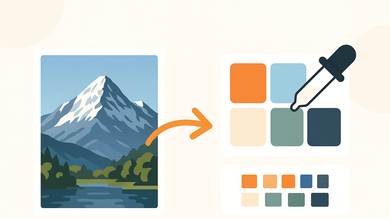
Turning a photograph into a clean, usable color palette seems simple: click a color and copy the code. In practice, achieving accurate, repeatable results requires understanding how cameras encode color, how algorithms cluster pixels, and how to account for lighting and display differences. This guide shows you how to extract colors from a photo with professional consistency, compare popular extraction methods, and export palettes that are ready for web, print, or UI work. You’ll find a practical step-by-step workflow, a Python code example, and tips for avoiding common pitfalls.
What it Really Means to Extract Colors from a Photo
When people search “extract colors photo,” they’re usually trying to solve one of three tasks:
- Identify a few dominant colors that represent the image (for branding, UI themes, or mood boards).
- Sample precise pixel colors from specific areas (for product matching, interior swatches, or retouching).
- Generate a full palette with tints, shades, and harmonies derived from the source image.
Each task requires a slightly different approach. Dominant-color extraction focuses on intelligent clustering. Precise sampling emphasizes color management and viewing conditions. Palette generation involves both extraction and palette design rules (contrast, balance, and context).
Accuracy Foundations: Color Spaces, Lighting, and Screens
Before you extract anything, align on these fundamentals:
- Color space: Most photos and design tools assume sRGB. Modern phones can capture Display P3 (wider gamut). If your pipeline is mixed, colors can shift. Convert to sRGB for web and cross-device consistency unless you explicitly need P3.
- ICC profiles: Embedded profiles tell software how to interpret colors. Keep profiles intact on import, or explicitly convert to your working space (sRGB) before analysis.
- White balance and lighting: Warm indoor lighting or mixed light sources skew extracted colors. Shoot reference photos near neutral light (D50–D65) or include a gray card to correct white balance.
- Gamma and tone curves: Clustering is usually performed on gamma-corrected sRGB values. Avoid working on linearized values unless you understand the implications for clustering centroids.
- Display calibration: Uncalibrated displays mislead the eye. When accuracy matters (brand and print), use a calibrated monitor and soft proofing where possible.
Methods to Extract: Sampling vs. Clustering
Two families of techniques dominate practical workflows:
- Direct sampling: Eyedrop pixels in regions of interest. Best when you know exactly what surface to sample (e.g., paint finish, logo mark). Use averaged sampling (a small radius) to reduce noise.
- Clustering/quantization: Algorithms reduce millions of pixels to a handful of representative colors. This is the fastest way to express the overall “mood” of an image.
Common Clustering Algorithms
| Algorithm | Strengths | Trade-offs | Use cases |
|---|---|---|---|
| K-means | Fast, widely available, good for general dominant colors | Sensitive to initialization; centroids may land between real pixels | Web/UI palettes, mood boards |
| K-medoids (PAM) | Centers are real pixels; more robust to outliers | Slower than k-means; fewer implementations | Product matching, sample fidelity |
| Median cut | Classic quantization; predictable splits | Can overemphasize large flat regions; less control over clusters | Icons, GIFs, legacy pipelines |
| Octree | Memory efficient; hierarchical control | Implementation complexity; tunable parameters | Embedded systems, limited-memory contexts |
A Step-by-Step Workflow for Clean, Usable Palettes
- Prepare the image
- Ensure the file has a valid profile; convert to sRGB if your target is web or cross-platform sharing.
- Optionally correct white balance using a gray reference or auto tools. Avoid heavy creative grading before extraction.
- Downscale large images to ~800–1600 px on the long edge for faster, noise-resistant clustering.
- Segment if needed
- For scenes with distinct subjects and backgrounds, extract colors from each region separately for more meaningful palettes.
- Mask out specular highlights or shadows that don’t reflect base color.
- Choose your method
- Direct sampling when matching a specific object.
- Clustering (k-means/k-medoids) when summarizing the whole photo.
- Decide the number of colors (k)
- Start with 5–7 for general palettes. Increase to 8–12 for complex scenes. Fewer colors improve clarity; more colors capture nuance.
- Post-process your palette
- Round to clear HEX values only after you finalize the selection to avoid cumulative rounding drift.
- Sort by lightness or hue to improve readability.
- Add tints (add white) and shades (add black) to create usable UI scales.
- Validate contrast and context
- Check WCAG contrast ratios for text-on-background pairs.
- Preview on both light and dark backgrounds; ensure at least one accent color works on each.
- Export cleanly
- Provide HEX, RGB, and HSL values; include names and usage notes.
- Export swatches to your design tool (ASE/ACO/CCS, JSON, or CSS variables).
Practical Code: Extract Dominant Colors with Python
The following example uses Pillow, NumPy, and scikit-learn to perform k-means clustering in sRGB. It downsamples for speed, removes near-transparent pixels, and returns HEX values sorted by prominence and lightness.
# pip install pillow numpy scikit-learn
from PIL import Image
import numpy as np
from sklearn.cluster import KMeans

def extract_palette(path, k=6, max_size=1024, remove_alpha=True, seed=42):
    # Load and convert to sRGB 8-bit
    img = Image.open(path).convert('RGBA')

    # Downscale for speed/robustness
    w, h = img.size
    scale = min(1.0, float(max_size) / max(w, h))
    if scale < 1.0:
        img = img.resize((int(w*scale), int(h*scale)), Image.LANCZOS)

    # To numpy
    arr = np.array(img)

    # Remove fully transparent pixels if present
    if remove_alpha and arr.shape[2] == 4:
        mask = arr[:, :, 3] > 0
        pixels = arr[:, :, :3][mask]
    else:
        pixels = arr[:, :, :3].reshape(-1, 3)

    # Optional: remove near-white specular highlights that skew clustering
    # pixels = pixels[np.linalg.norm(255 - pixels, axis=1) > 10]

    # Fit k-means
    km = KMeans(n_clusters=k, n_init=10, random_state=seed)
    labels = km.fit_predict(pixels)
    centers = km.cluster_centers_.astype(int)

    # Count frequency of each cluster
    counts = np.bincount(labels, minlength=k)

    # Sort by frequency, then by perceived lightness (Y from Rec. 709)
    def lightness(rgb):
        r, g, b = rgb / 255.0
        return 0.2126*r + 0.7152*g + 0.0722*b

    order = sorted(range(k), key=lambda i: (-counts[i], lightness(centers[i])))
    palette = [tuple(centers[i]) for i in order]

    # Convert to HEX
    to_hex = lambda c: '#%02X%02X%02X' % c
    hex_colors = [to_hex(c) for c in palette]

    return hex_colors, counts[order]

if __name__ == '__main__':
    colors, counts = extract_palette('photo.jpg', k=7)
    for c, n in zip(colors, counts):
        print(c, int(n))
Notes:
- For fidelity to real pixel values, consider k-medoids (e.g.,
scikit-learn-extra). It returns medoids that are actual pixels. - To avoid bias toward bright highlights, prefilter very bright or very dark pixels or weight by saturation.
- If you need device-independent comparisons, transform RGB to CIELAB and cluster there. Evaluate palette differences using ΔE metrics.
Quality Checks: Is Your Palette Truly Representative?
- Coverage sanity check: Recolor the image using your palette (nearest neighbor in LAB). If the recolored preview looks believable, your palette represents the scene.
- Outlier control: Remove tiny clusters (<1–2% of pixels) unless they are critical accents. Conversely, protect important small accents by allowing an extra cluster for them.
- Perceived balance: Humans notice saturation more than area. Consider including one saturated accent even if it has small pixel share.
- Repeatability: Fix the random seed for deterministic clustering, or run the algorithm multiple times and choose the most stable result.
Accessibility and Export: HEX, RGB, HSL, and Practical Deliverables
Once you extract a palette, package it for real use:
- Color formats: Provide HEX for web, RGB for screens, and HSL/HSB for systematic adjustments (tinting, theming). Keep one source of truth and derive others.
- Naming and roles: Assign roles like “Primary,” “Secondary,” “Background,” “Text,” “Accent.” This adds clarity beyond raw values.
- Contrast checks: Verify text colors meet WCAG AA or AAA depending on use. For example, body text over backgrounds should typically reach a 4.5:1 ratio.
- Swatch exports: Export ASE/ACO for Adobe apps, JSON or CSS variables for web, and PDF/PNG sheets for sharing with non-designers.
- Documentation: Include intended uses, exceptions (e.g., “Avoid using Accent on large areas”), and safe combinations.
Common Mistakes and How to Fix Them
- Sampling glare or shadows: Use an averaged sampler and avoid specular highlights; sample midtones on matte regions.
- Ignoring color space: Convert to sRGB for cross-device work. Mixed P3/sRGB pipelines cause apparent mismatches.
- Too many colors: Palettes with 12–20 colors look chaotic. Start at 5–7 and add only when necessary.
- Overfitting to background: Large sky or wall areas dominate clusters. Balance with at least one accent from the subject.
- No contrast validation: A beautiful palette can still fail accessibility. Always test text-on-background pairs.
Advanced Tips for Better Results
- Weight by saturation: Emphasize colorful pixels during clustering to avoid grayish palettes from neutral backgrounds.
- Pre-segmentation: Use simple masks or subject detection to extract separate palettes for foreground and background, then merge thoughtfully.
- Hybrid approach: Cluster to find dominant hues, then refine with direct sampling for precise product colors or materials.
- LAB-space tweaking: After clustering in sRGB, adjust lightness in LAB to normalize steps between tints and shades.
- Versioning: Keep versions for different contexts: UI (higher contrast), print (CMYK-safe), and mood boards (aesthetic emphasis).
Quick Reference: When to Use What
- Brand/theme mood: K-means with k=5–7, sorted by lightness; include one saturated accent.
- Product match: Direct sampling with averaged picker; confirm under neutral light.
- UI kit: Extract 5 bases; generate 8–10 tints/shades per base using HSL/OKLCH increments; verify WCAG.
- Interior palette: Cluster by room surface (walls, flooring, textiles) and extract per surface to avoid lighting bias.
Pro tip: If your goal is discoverability, include the phrasing users search for. For example, mentioning “extract colors photo” in documentation helps match intent while explaining the more natural “extract colors from a photo.”
Wrapping Up
To reliably extract colors from a photo, control your color space, use the right extraction method for the task, and validate the results against real-world constraints like accessibility and print. A disciplined workflow produces palettes that not only look good but also perform well across interfaces and media.
If you prefer a streamlined mobile workflow, an iOS and iPad app like Color Viewfinder can convert photos into palettes with HEX, RGB, HSL, and HSB values and export them in formats suitable for your design tools.
