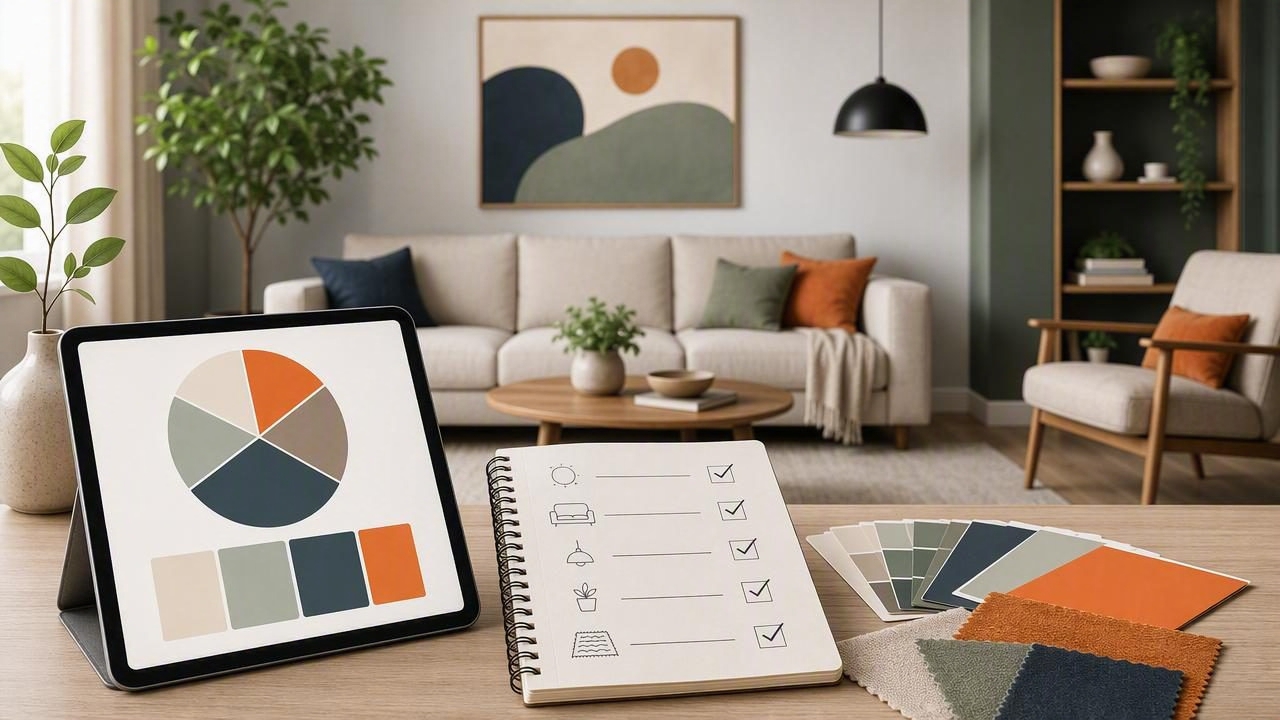
A successful room color scheme is more than choosing a favorite paint swatch. It is a practical system that connects walls, flooring, furniture, textiles, trim, lighting, and personal accents into one cohesive visual story. Whether you are refreshing a living room, planning a bedroom, or coordinating an entire home, a clear process can prevent expensive color mistakes.
This plan a room color scheme checklist with interior color palette app guide walks through a repeatable approach for collecting inspiration, extracting colors from real-world references, testing combinations, and making final decisions with confidence. It is useful for homeowners, decorators, interior designers, renters, and anyone managing creative projects where color consistency matters.
Why Room Color Planning Needs More Than Paint Samples
Paint is often selected first because it feels like the largest decision. In reality, wall color is usually one of the most flexible elements in a room. Repainting is far easier than replacing a sofa, a wood floor, a stone countertop, or patterned drapery.
Start with the materials that are difficult or costly to change. These fixed elements establish the undertones that your room color palette must respect. For example, a warm beige carpet, orange-toned oak floor, cool gray tile, or creamy marble can each push a room in a different direction.
A color palette app helps turn visual inspiration into usable values. Instead of relying on vague labels such as “soft blue” or “warm white,” you can sample approximate HEX, RGB, HSL, or HSB values from photos. Those values create a reference point when comparing paint options, digital mood boards, upholstery, and accessories.
Room Color Scheme Checklist: Start With the Essentials
Before opening paint decks or browsing décor shops, complete this foundational checklist. It gives every later decision a purpose.
- Define the room’s function: Is it for relaxing, entertaining, focused work, sleep, or dining?
- Identify the primary users: Consider children, pets, guests, accessibility needs, and daily habits.
- List fixed finishes: Include floors, countertops, tile, fireplace surrounds, cabinetry, doors, and existing large furniture.
- Assess natural light: Note window direction, shadows, seasonal changes, and nearby trees or buildings.
- Record artificial lighting: Check bulb warmth, fixture placement, dimmers, and nighttime color shifts.
- Choose a desired mood: Examples include calm, airy, grounded, energetic, elegant, cozy, or dramatic.
- Set a realistic budget: Prioritize reusable pieces and reserve changeable accents for experimentation.
This early planning stage keeps a beautiful online image from becoming an impractical design choice. A dark, dramatic palette may look stunning in a sun-filled loft but feel heavy in a small north-facing room with limited daylight.
Step 1: Gather Inspiration From Real Places
Inspiration images are most valuable when they show environments similar to your actual room. Save photos with comparable light levels, architectural details, flooring, and scale. A sprawling hotel lobby may offer great color ideas, but its palette may not translate directly to a compact apartment.
Collect references from nature, fabric samples, artwork, travel photos, magazines, and rooms you have visited. Aim for 10 to 20 images, then look for recurring color relationships. You may notice that you repeatedly save rooms with muted green walls, warm wood, cream textiles, and charcoal details. That pattern is more meaningful than a single image.
What to Look for in Each Reference Photo
- The dominant background color, often walls or large upholstery
- Mid-tone materials such as wood, rugs, curtains, or furniture
- Small dark anchors, including hardware, frames, or lighting
- Accent colors that add personality without taking over
- The balance between warm and cool undertones
Use color extraction carefully. Photos can be affected by editing, shadows, camera white balance, and screen settings. Treat sampled values as a starting point for comparison, not as an exact paint-match guarantee.
Step 2: Build a Balanced Interior Color Palette
Most cohesive rooms use color in different proportions. The familiar 60-30-10 guideline is a helpful starting framework, not a rigid design law. It encourages visual hierarchy so every surface is not competing for attention.
| Palette Role | Typical Share | Where It Often Appears |
|---|---|---|
| Dominant color | About 60% | Walls, major rug area, large curtains, or main upholstery |
| Secondary color | About 30% | Furniture, cabinetry, bedding, rugs, or substantial textiles |
| Accent color | About 10% | Pillows, art, lampshades, small décor, and decorative objects |
In interiors, neutral colors often occupy the dominant role. This does not mean the room must be beige or gray. A neutral can be warm white, mushroom, clay, taupe, soft olive, dusty blue, or deep charcoal, depending on saturation and context.
Try building a palette with five to seven colors rather than only three. Include a light neutral, a mid-tone neutral, a dark grounding color, a primary color, a supporting color, and one or two accents. This creates enough range for practical decisions without making the scheme confusing.
Step 3: Check Undertones Before You Commit
Undertones are the subtle hues beneath a color’s surface appearance. They are why two “white” paints can look completely different next to the same flooring. One may lean pink, yellow, green, blue, or gray. The same principle applies to woods, stone, fabrics, and metals.
To compare undertones, place samples beside the fixed finishes in the actual room. Avoid judging colors only under store lighting. A paint that seems like a balanced greige in a showroom might look noticeably purple beside a warm oak floor.
Quick Undertone Questions
- Does the existing floor read warm, cool, or neutral?
- Do countertops or tile show yellow, pink, green, blue, or violet notes?
- Are metal finishes warm brass, neutral black, cool chrome, or mixed?
- Will the proposed wall color support these undertones or fight against them?
- Does the palette have enough contrast to prevent the room from looking flat?
Matching undertones exactly is not always necessary. Intentional contrast can be beautiful. The important thing is that the relationship looks deliberate, rather than accidental.
Step 4: Use an Interior Color Palette App to Organize Ideas
An interior color palette app makes it easier to move from inspiration to action. Photograph your existing sofa, floor, tile, artwork, or favorite fabric. Then use color extraction to identify representative shades and save them in one palette. Sampling several points from the same object is often useful because material texture and lighting create variation.
For example, a patterned rug may produce a creamy base, faded terracotta, muted navy, and nearly black detail. Those four colors can guide decisions for walls, pillows, frames, and decorative accessories. The goal is not to reproduce every color in the rug; it is to identify a flexible visual language.
Practical tip: Sample from the middle of a flat-colored area whenever possible. Avoid shiny highlights, deep shadows, and edges where two colors meet.
Save each palette with a clear name, such as “Living Room Rug Options” or “Kitchen Cabinet Direction.” Add notes about where each color appears and whether it is a fixed finish, a possible purchase, or a paint candidate. This small organizational habit can prevent duplicate purchases and last-minute uncertainty.
Step 5: Test Colors in Daylight and at Night
Never finalize a room color scheme from a phone screen alone. Digital values are excellent for organization, graphic design references, and comparison, but physical samples remain essential for interior design decisions.
Order paint samples or create large test boards. Move them around the room and observe them in morning, afternoon, evening, and artificial light. Test near the floor, close to windows, behind furniture, and beside major fixed materials. A paint color can appear lighter on a large wall and may shift noticeably as the light changes.
For textiles, bring swatches home whenever possible. Hold them vertically against walls and horizontally over flooring. Fabric reflects light differently based on weave, pile, sheen, and direction, so a small sample is more reliable than an online product photo.
Step 6: Add Contrast, Depth, and Repetition
A palette becomes inviting when it includes contrast. If every element is a similar mid-tone, the room can feel visually unfinished. Add depth through light-dark contrast, texture, material changes, or controlled accents.
Repeat key colors at least two or three times around the space. A dark charcoal frame can relate to black lamp hardware and a narrow stripe in the rug. A muted rust pillow can connect to artwork and a ceramic vase. Repetition makes a room feel composed without requiring perfect matching.
- For calm spaces: Use low-contrast colors with varied textures.
- For energetic spaces: Pair a grounded neutral with one clearer, more saturated accent.
- For small rooms: Use a connected palette across walls and furnishings to reduce visual breaks.
- For large rooms: Create zones using related shades rather than unrelated color schemes.
Final Checklist Before Buying
Use this final review before placing large orders or scheduling painters:
- Have you identified all fixed finishes and their undertones?
- Does your palette include a light, mid-tone, and dark value?
- Have you assigned dominant, secondary, and accent roles?
- Have you viewed physical samples in multiple lighting conditions?
- Will the colors support the room’s intended mood and function?
- Are bold colors placed in elements that are easy to change?
- Have you repeated key tones enough to create cohesion?
A room color scheme works best when it is both beautiful and livable. Build from what is already in the room, use inspiration with intention, and give yourself time to test. For an easy way to capture colors from photos and keep palette references together, Color Viewfinder can support the early planning process on iPhone and iPad.
