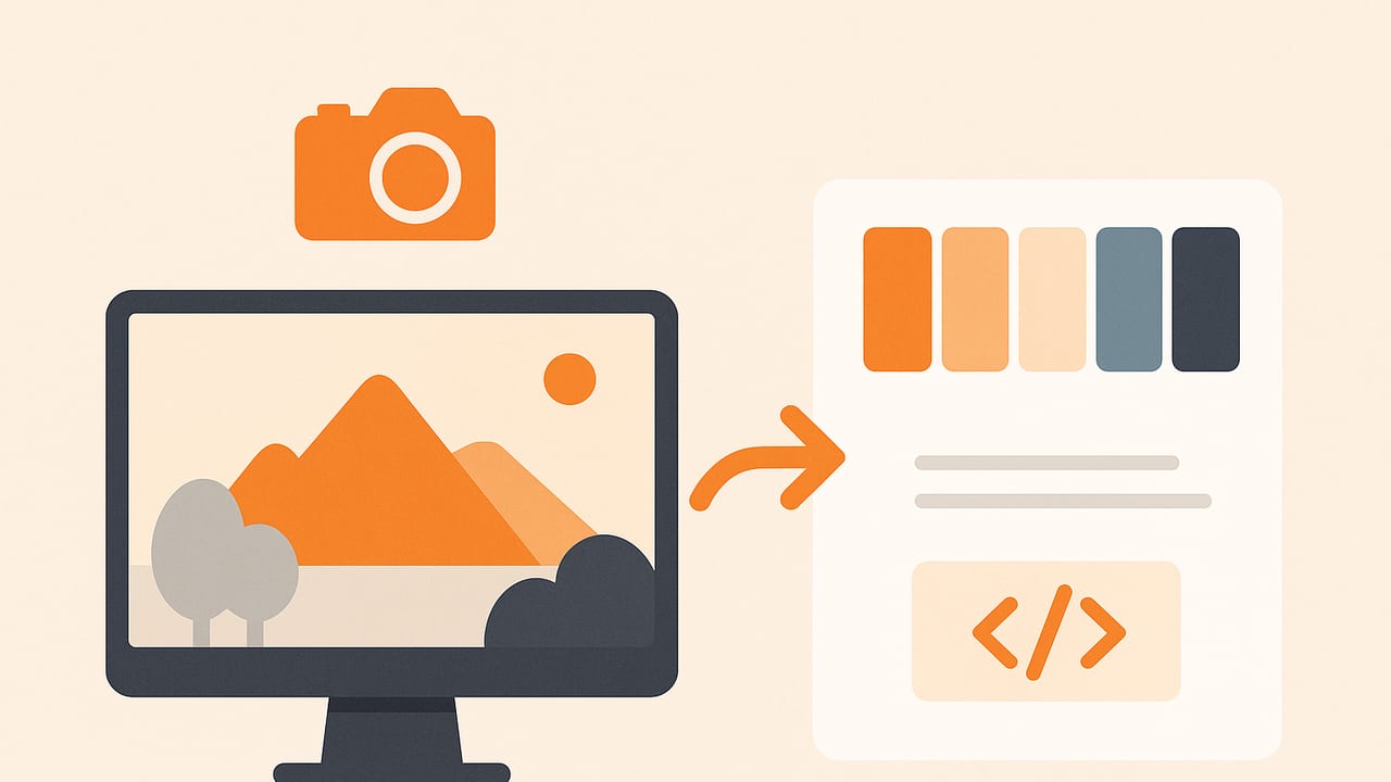
If you want to create color schemes from photos that hold up across screens, print, and real-world materials, you need more than a quick eyedropper. From capturing the photo to algorithm selection, preprocessing, and exporting, every step affects accuracy and usability. This guide gives you a practical, end-to-end workflow—plus sample code—to turn any picture into a reliable, reusable color palette.
The Anatomy of a Photo-Derived Palette
When you create color schemes from photos, you’re translating a scene’s light and material into controlled color values. Keep these fundamentals in mind:
- Color models: Work in RGB/HEX for screens, HSL/HSB for intuitive adjustments (hue/brightness), and CMYK for print comps. Convert with care to maintain consistency.
- Roles and hierarchy: Define primary (brand or dominant UI tone), secondary (supporting), accent (attention-grabbing), and neutrals (backgrounds, dividers).
- Distribution: Realistic palettes reflect what’s in the photo—large areas get larger weight; tiny details become accents.
- Harmony: Good schemes aren’t just extracted; they’re curated (complementary, analogous, triadic) and tuned for contrast and accessibility.
Capture and Prep: The Foundation for Accurate Colors
Algorithm choice matters, but input quality matters more. Follow this capture and preprocessing checklist before you extract colors:
- Lighting: Use consistent illumination (daylight or a single color temperature). Avoid mixed light (e.g., daylight + tungsten) to prevent hue splits.
- White balance: Set a manual white balance or use a gray card. Auto white balance can drift between shots.
- Exposure: Expose to preserve midtones; avoid clipped highlights. Slight underexposure is easier to correct than blown-out whites.
- Format: Shoot RAW when possible and export to sRGB with an embedded profile. If using JPEG, choose low compression.
- Surface and reflections: Matte beats glossy. Specular highlights skew averages toward white.
Preprocessing tasks for better extraction:
- Crop to the subject to reduce background bias.
- Downscale large images (e.g., longest side 800–1200 px) to speed up clustering while preserving color diversity.
- Mild blur (1–2 px) can reduce noise and texture that confuse algorithms.
- Color management: Convert to sRGB if you’ll share palettes on the web; many tools assume sRGB.
Tip: If a white object in the scene reads as anything but #FFFFFF-ish after white balancing, fix that first—don’t let the algorithm compensate for color cast.
Algorithms to Extract Dominant Colors
To create color schemes from photos programmatically, you’ll typically use color quantization or clustering. Here are the most common approaches:
K-means Clustering
How it works: Partitions pixels into k clusters by minimizing distance in RGB (or another color space). Outputs cluster centroids as palette colors.
- Pros: Flexible, widely available, good for dominant tones; easy to weight or filter.
- Cons: Sensitive to initialization; picks frequent colors, not necessarily perceptually distinct; can miss rare accents.
Median Cut
How it works: Recursively splits color space boxes to reduce variance, returning representative colors.
- Pros: Fast, simple; often used in GIF/PNG quantization.
- Cons: Can produce banding or dull mids; less control over perceptual spacing.
Octree Quantization
How it works: Builds an octree indexing RGB space; merges nodes to meet a target palette size.
- Pros: Efficient for large images; preserves dominant shades well.
- Cons: Implementation complexity; may favor dense regions at the expense of accents.
Hierarchical (Agglomerative) Clustering
How it works: Merges similar color clusters iteratively; can use perceptual distances (e.g., CIELAB ΔE).
- Pros: Good control over merge criteria; perceptual-friendly when using LAB.
- Cons: Slower on big images; requires careful stopping rules.
Semantic Segmentation + Clustering
How it works: Use a model to segment objects (sky, skin, foliage) and then cluster each region separately.
- Pros: Retains meaningful accents; avoids background bias.
- Cons: Overkill for many tasks; adds ML dependencies.
| Method | Speed | Perceptual Control | Accents | Typical Use |
|---|---|---|---|---|
| K-means | Fast–Medium | Medium (better in LAB) | Fair | UI/brand palettes |
| Median Cut | Fast | Low | Poor–Fair | Quick exports |
| Octree | Fast | Medium | Fair | Large images |
| Hierarchical | Slow–Medium | High | Good | Premium curation |
| Segmentation+Cluster | Slow | High | Excellent | Editorial/brand |
Tutorial: Create Color Schemes from Photos with Code
Below are minimal examples you can adapt. The pipeline is consistent: load image → preprocess → cluster in LAB or RGB → convert to HEX/HSL → sort → export.
Python (Pillow + scikit-learn)
from PIL import Image, ImageFilter
import numpy as np
from sklearn.cluster import KMeans

def rgb_to_hex(rgb):
    return '#{:02x}{:02x}{:02x}'.format(*(int(c) for c in rgb))

def rgb_to_hsl(r, g, b):
    r, g, b = [x/255.0 for x in (r, g, b)]
    mx, mn = max(r, g, b), min(r, g, b)
    l = (mx + mn) / 2.0
    d = mx - mn
    if d == 0:
        h = s = 0.0
    else:
        s = d / (1 - abs(2*l - 1))
        if mx == r:
            h = ((g - b) / d) % 6
        elif mx == g:
            h = (b - r) / d + 2
        else:
            h = (r - g) / d + 4
        h *= 60
    return (round(h, 1), round(s*100, 1), round(l*100, 1))

def extract_palette(path, k=6, blur_radius=1, resize=900, filter_near_white=True):
    img = Image.open(path).convert('RGB')
    w, h = img.size
    if max(w, h) > resize:
        scale = resize / float(max(w, h))
        img = img.resize((int(w*scale), int(h*scale)), Image.LANCZOS)
    if blur_radius:
        img = img.filter(ImageFilter.GaussianBlur(blur_radius))
    arr = np.array(img).reshape(-1, 3)

    # optional: drop near-white pixels (e.g., backgrounds)
    if filter_near_white:
        mask = np.linalg.norm(arr - 255, axis=1) > 20
        arr = arr[mask]

    # K-means in RGB
    kmeans = KMeans(n_clusters=k, n_init=10, random_state=42)
    labels = kmeans.fit_predict(arr)
    centers = kmeans.cluster_centers_.astype(int)

    # sort by cluster size then lightness (HL)
    counts = np.bincount(labels)
    order = counts.argsort()[::-1]
    centers = centers[order]

    colors = []
    for r, g, b in centers:
        hexv = rgb_to_hex((r, g, b))
        hslv = rgb_to_hsl(r, g, b)
        colors.append({'hex': hexv, 'rgb': (int(r), int(g), int(b)), 'hsl': hslv})
    return colors

if __name__ == '__main__':
    palette = extract_palette('photo.jpg', k=5)
    for c in palette:
        print(c)
Notes:
- Switch to CIELAB and K-means for perceptual uniformity (use skimage.color.rgb2lab).
- Adjust
filter_near_whiteto avoid backgrounds dominating the palette. - Sort by cluster size for primary/secondary; sort by HSL lightness for ramps.
JavaScript (Canvas)
<input type="file" id="file" accept="image/*" />
<canvas id="c" width="800" height="600"></canvas>
<script>
const input = document.getElementById('file');
const canvas = document.getElementById('c');
const ctx = canvas.getContext('2d');

input.onchange = async (e) => {
  const file = e.target.files[0];
  const img = new Image();
  img.src = URL.createObjectURL(file);
  img.onload = () => {
    const scale = Math.min(800 / img.width, 600 / img.height, 1);
    canvas.width = Math.floor(img.width * scale);
    canvas.height = Math.floor(img.height * scale);
    ctx.drawImage(img, 0, 0, canvas.width, canvas.height);
    const { data, width, height } = ctx.getImageData(0, 0, canvas.width, canvas.height);
    // Simple sampling for speed
    const samples = [];
    for (let i = 0; i < data.length; i += 4 * 25) { // every 25th pixel
      const r = data[i], g = data[i+1], b = data[i+2];
      // skip near-white
      if ((r + g + b) / 3 > 245) continue;
      samples.push([r, g, b]);
    }
    // Tiny K-means
    const K = 5;
    let centers = samples.slice(0, K);
    for (let iter = 0; iter < 8; iter++) {
      const buckets = Array.from({length: K}, () => []);
      samples.forEach(p => {
        let bi = 0, bd = 1e9;
        centers.forEach((c, i) => {
          const d = (p[0]-c[0])**2 + (p[1]-c[1])**2 + (p[2]-c[2])**2;
          if (d < bd) { bd = d; bi = i; }
        });
        buckets[bi].push(p);
      });
      centers = buckets.map(b => b.length ? b[0].map((_,j) => Math.round(b.reduce((s,p)=>s+p[j],0)/b.length)) : centers[Math.floor(Math.random()*K)]);
    }
    const hex = c => '#' + c.map(v => v.toString(16).padStart(2,'0')).join('');
    console.log('Palette:', centers.map(hex));
  };
};
</script>
For production, consider libraries with LAB color support and better initialization for stable results.
From Colors to Schemes: Harmonies and Roles
Extracted colors are raw ingredients. To create color schemes from photos that feel intentional, map colors to roles and use harmonies:
- Pick a base: Start with the most representative cluster (by area) or the color that matches brand personality.
- Derive harmonies (HSL): Shift hue by fixed angles, preserve saturation where possible, and normalize lightness across the set.
| Harmony | Hue shifts | Use |
|---|---|---|
| Monochromatic | 0°, vary S/L | Minimalist UIs, backgrounds |
| Analogous | ±30°–40° | Calm, cohesive interfaces |
| Complementary | ±180° | Accents, CTAs |
| Split-Complementary | +150° / -150° | Balanced contrasts |
| Triadic | ±120° | Playful, distinct roles |
Example workflow:
- Extract five colors: say
#405E7A,#B7D6E0,#F2E7D8,#D9896A,#2F4331. - Assign roles: primary
#405E7A, secondary#B7D6E0, neutral#F2E7D8, accent#D9896A, dark neutral#2F4331. - Create an analogous set for backgrounds by rotating the primary ±30° in HSL while fixing lightness at 94%.
- Add a complementary accent by rotating +180° from the primary for CTAs.
// Pseudocode: rotate hue while clamping saturation/lightness
function rotateHue(hsl, deg) {
  let [h, s, l] = hsl;
  h = (h + deg) % 360;
  if (h < 0) h += 360;
  l = Math.min(95, Math.max(5, l));
  s = Math.min(100, Math.max(5, s));
  return [h, s, l];
}
Always validate contrast for text/background pairs. Aim for WCAG contrast ratios of 4.5:1 (normal text) or 3:1 (large text).
Quality Control: Pitfalls and Quick Fixes
- Mixed lighting: If you see two distinct white balances (warm indoor + cool window), segment the image into regions and extract per region, or correct globally in a RAW editor first.
- Specular highlights: Filter near-white pixels or use a highlight-rejection threshold before clustering.
- Compression artifacts: JPEG blocks can create false colors. Slight blur and downscaling help.
- Outliers vs. accents: Tiny but meaningful accents (e.g., a red sign) get lost. Increase k, or oversample high-saturation pixels to preserve accents.
- Perceptual uniformity: Cluster in CIELAB and use ΔE for distance to avoid green/red dominance in RGB space.
- Device mismatch: Calibrate your monitor and embed sRGB profiles in exports. Don’t judge colors from uncalibrated screens.
Export and Integrate Your Palette
Once you create color schemes from photos, make them usable across tools and stacks:
- Design apps: Export ASE (Adobe Swatch Exchange), ACO (Photoshop), or GPL (GIMP). Many tools import these directly.
- Development: Export JSON, CSS variables, or Tailwind config. Keep semantic names (--color-accent) instead of raw hex references sprinkled across code.
- Print: Provide both HEX/RGB and approximate CMYK conversions. Soft-proof where possible.
CSS variables example
:root {
  --color-primary: #405E7A;
  --color-secondary: #B7D6E0;
  --color-neutral-100: #F8F5F1;
  --color-neutral-300: #F2E7D8;
  --color-accent: #D9896A;
  --color-dark: #2F4331;
}

.btn {
  background: var(--color-accent);
  color: white; /* verify contrast on target background */
}

.section {
  background: var(--color-neutral-100);
  color: var(--color-dark);
}
For iOS codebases, map palette values to SwiftUI Color assets or UIColor extensions. For Figma, import ASE or paste HEX into Styles; maintain naming conventions (Primary/500, Primary/700, etc.) for scale variants.
Putting It All Together: A Repeatable Workflow
- Capture: Single light source, manual white balance, well-exposed subject, matte surfaces when possible.
- Preprocess: Crop, resize, mild blur, convert to sRGB.
- Extract: Use K-means (k=5–8) in LAB or RGB, filtering near-white backgrounds and weighting saturated pixels if accents matter.
- Curate: Assign roles, enforce harmony rules (analogous/triadic), normalize lightness for UI consistency.
- Validate: Check WCAG contrast for text/background pairs; test on multiple screens.
- Export: Generate ASE/GPL for design, CSS/JSON for dev, and share a single-source-of-truth palette doc.
With this pipeline, you can reliably create color schemes from photos that are both faithful to the source and fit for production.
Further Optimization Ideas
- Adaptive k: Use silhouette score or gap statistics to pick palette size automatically.
- Perceptual spacing: After extraction, run a small optimization to maximize ΔE between role colors while preserving the original hue order.
- Scene-aware weighting: Segment skin, sky, foliage, and fabric for editorial control (e.g., keep skin tones stable across shots).
- Batch processing: For brand systems sourced from multiple photos, cluster across images to find a unified, stable palette.
If you prefer a fast, on-device workflow on iPhone or iPad, apps like Color Viewfinder can extract HEX, RGB, HSL, and HSB from photos and help you export curated palettes quickly.
