If you’ve ever sampled a color from a photo and received three numbers like R: 42, G: 129, B: 201, you’ve met RGB color. It’s one of the most common ways to describe color in digital design—used in everything from UI components and brand graphics to social posts and digital mood boards. But many creatives only interact with RGB as “those three sliders,” without a clear sense of what the numbers mean or how to use them reliably across tools and outputs.
This guide breaks down how rgb color works, how to interpret values, when to use RGB versus HEX or HSL, and how to build consistent palettes from real-world images—without color drift and guesswork.
What is RGB color?
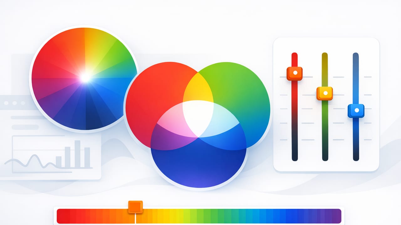
RGB color is an additive color model. That means you create colors by adding light—specifically red, green, and blue light. Each channel typically ranges from 0 to 255 in 8-bit color:
- R (Red): 0–255
- G (Green): 0–255
- B (Blue): 0–255
In practical terms:
- (0, 0, 0) is black (no light).
- (255, 255, 255) is white (full intensity of all three channels).
- (255, 0, 0) is pure red; (0, 255, 0) is pure green; (0, 0, 255) is pure blue.
Design takeaway: RGB is about light on screens. If your final output is digital (web, apps, presentations, video), RGB is usually the “native” language of your colors.
Why RGB matters when you extract colors from photos
When you pick a color from an image, you’re selecting a specific pixel (or averaged area). That pixel already exists in a screen-oriented color space, so the extracted result naturally appears as an rgb color value. From there, you can:
- Match colors in UI mockups or graphic layouts
- Build palettes that reflect real materials (painted walls, fabrics, nature, packaging)
- Create consistent brand assets by sampling from approved imagery
- Convert RGB to HEX for CSS or to HSL/HSB for easier editing
The key is understanding that a photo is rarely “one color.” Lighting, shadows, reflections, compression artifacts, and camera processing can shift values. So the goal isn’t just to extract an RGB number—it’s to extract the right one for your intended use.
How to read RGB values like a designer
A quick way to interpret an RGB triplet is to look for dominant channels and overall brightness.
1) Dominant channel = color bias
- If R is much higher than G and B, the color leans warm (reds/oranges).
- If G is highest, the color tends toward greens/yellows (because yellow is red + green).
- If B is highest, the color leans cool (blues/purples).
2) Similar values = neutral-ish
When R, G, and B are close together, the result is often gray, charcoal, off-white, or a subtle tint. For example, (210, 212, 208) is a pale neutral with a slight green bias.
3) Overall brightness = average intensity
A simple “brightness estimate” is the average of the channels. While not perfectly perceptual, it’s useful for quick checks:
brightness ≈ (R + G + B) / 3For UI work, brightness helps you decide if text should be light or dark on top of a sampled background.
RGB vs HEX vs HSL/HSB: when to use which
Design tools may show several formats for the same color. They’re just different ways of describing the same point in color space (with important workflow differences).
| Format | Example | Best for | Why it helps |
|---|---|---|---|
| RGB | rgb(42, 129, 201) | Digital design, image sampling | Directly reflects pixel data; intuitive for screen output |
| HEX | #2A81C9 | Web/CSS, handoff | Compact and widely used in code |
| HSL | hsl(205, 56%, 48%) | Tuning palettes | Hue/saturation/lightness can be easier to adjust systematically |
| HSB/HSV | hsb(205, 79%, 79%) | Creative exploration | “Brightness” slider feels intuitive for quick tweaks |
Practical rule: sample in RGB, hand off in HEX, and refine variations in HSL/HSB.
Converting RGB color to HEX (and back)
HEX is just RGB written in base-16 (hexadecimal). Each channel (0–255) becomes a two-digit hex number (00–FF).
RGB → HEX example
- R = 42 → 2A
- G = 129 → 81
- B = 201 → C9
So rgb(42, 129, 201) becomes #2A81C9.
If you want a lightweight converter for quick checks, here’s a short JavaScript snippet:
function rgbToHex(r, g, b) {
  const toHex = (n) => n.toString(16).padStart(2, '0');
  return `#${toHex(r)}${toHex(g)}${toHex(b)}`.toUpperCase();
}

rgbToHex(42, 129, 201); // "#2A81C9"
How to extract more reliable RGB values from a photo
Sampling “the wrong pixel” is the fastest way to end up with an rgb color that feels off in your design. Use these techniques to get values that translate better.
1) Sample an area, not a single pixel
Textures, JPEG artifacts, and sensor noise can make single-pixel picks unstable. If your tool offers an average sampler (3×3, 5×5, or similar), it often yields a more representative value.
2) Avoid highlight glare and deep shadows
Highlights can push channels toward 255 (washing the color out), while shadows can crush values toward 0 (making everything muddy). Sample midtones when possible—areas that feel “true” to the material.
3) Collect a set: base, shadow, highlight
Instead of hunting for one perfect RGB number, capture three related values:
- Base (midtone)
- Shadow (darker, lower brightness)
- Highlight (lighter, higher brightness)
This gives you an instant palette for UI states, gradients, or interior accent planning, while keeping the hue relationship consistent.
4) Check contrast early (especially for UI)
Once you have an rgb color for a background, test text colors immediately. As a quick heuristic, very light backgrounds usually need dark text, and very dark backgrounds need light text. For accessibility, consider a proper contrast checker later—but early checks save time.
Building a palette from RGB: a simple, repeatable method
Here’s a workflow that works for graphic design, content templates, and even mood-board-to-room concepts.
Step 1: Pick 5–7 sampled RGB colors
Capture candidates from distinct regions: main subject, background, neutrals, and an accent. You’ll likely end up with duplicates or near-duplicates—that’s fine at first.
Step 2: Group by role (not by prettiness)
- Neutrals: backgrounds, surfaces, whitespace
- Primary: the main brand or theme color
- Secondary: supporting tones
- Accent: small, high-attention pops (buttons, highlights, decor objects)
Step 3: Normalize lightness
Photos often produce colors that are too dark for UI backgrounds or too bright for text. Convert each rgb color to HSL and adjust Lightness into a controlled range (for example, backgrounds at 92–98%, text at 10–20%, mid accents around 40–60%).
Step 4: Create “tints and shades” for each key color
Instead of inventing new colors, create variations from the same hue family. This keeps designs cohesive.
- Tint: mix toward white (higher lightness)
- Shade: mix toward black (lower lightness)
Step 5: Document your palette in multiple formats
For smooth handoff, store each color as RGB + HEX + HSL. RGB is great for understanding and photo matching; HEX is easy for web; HSL helps future edits.
Common RGB mistakes (and how to avoid them)
- Sampling under colored lighting: A warm bulb can push neutrals toward orange. If possible, sample from images taken in neutral daylight, or compensate by comparing multiple photos.
- Ignoring device differences: Two screens can display the same rgb color differently. When precision matters, work on a calibrated display and avoid judging final color on a single phone screen.
- Mixing color spaces accidentally: Some workflows convert between sRGB and Display P3. If colors look unexpectedly vivid or dull, check the document color profile in your design tool.
- Using “perfect” channel values too often: Pure 255 reds and blues can look harsh. Real-world palettes usually have slightly softened channels (e.g., 242 instead of 255).
A quick reference: RGB values and what they suggest
This isn’t a strict rulebook, but it helps you sanity-check a sampled rgb color before committing it to a palette.
| RGB pattern | Often reads as | Notes |
|---|---|---|
| R ≫ G and B | Warm red/orange | Great for accents; watch saturation for large areas |
| G ≫ R and B | Green/yellow-green | Can shift strongly under lighting; sample multiple spots |
| B ≫ R and G | Cool blue/purple | Often works well for calm UI themes and backgrounds |
| R ≈ G ≈ B (low) | Charcoal/near-black | Use for text; confirm contrast on tinted backgrounds |
| R ≈ G ≈ B (high) | Off-white/near-white | Good base; add a slight tint for warmth/coolness |
Putting it all together: a practical mini-workflow
Let’s say you’re building a digital mood board from a travel photo. You sample:
- Sky: rgb(42, 129, 201) → #2A81C9
- Sand: rgb(214, 196, 156) → #D6C49C
- Rock shadow: rgb(58, 61, 64) → #3A3D40
- Foam highlight: rgb(245, 248, 250) → #F5F8FA
- Accent buoy: rgb(233, 88, 58) → #E9583A
Now assign roles:
- Background: foam highlight
- Surface/section: sand
- Text: rock shadow
- Primary: sky
- Accent: buoy
This simple role-based approach is what keeps photo-derived palettes from becoming chaotic. The rgb color values provide accuracy; the roles provide structure.
Final tip: keep RGB in your toolkit, not just HEX
HEX is everywhere, but RGB is often the most honest representation of what you sampled from an image. Keeping the rgb color values alongside HEX and HSL makes future edits easier—especially when you’re matching new assets to an existing palette or rebuilding a color system later.
If you do a lot of photo-to-palette work on iPhone or iPad, a tool like Color Viewfinder can help you capture RGB (plus HEX/HSL/HSB) quickly so you can focus on building a cohesive palette rather than re-sampling the same colors repeatedly.
