RGB color is the foundation of most digital visuals—from app interfaces and websites to social media graphics and digital mood boards. Yet many designers and creatives still run into the same frustrations: the color that looked perfect on one screen looks dull on another; the “same” blue exported in different formats doesn’t match; a color sampled from a photo feels inconsistent when applied to UI elements.
This guide explains RGB color in practical terms, shows how to interpret and convert RGB values, and provides a repeatable workflow for extracting accurate RGB values from images and turning them into reliable palettes.
What Is RGB Color (and Why It’s Everywhere)?
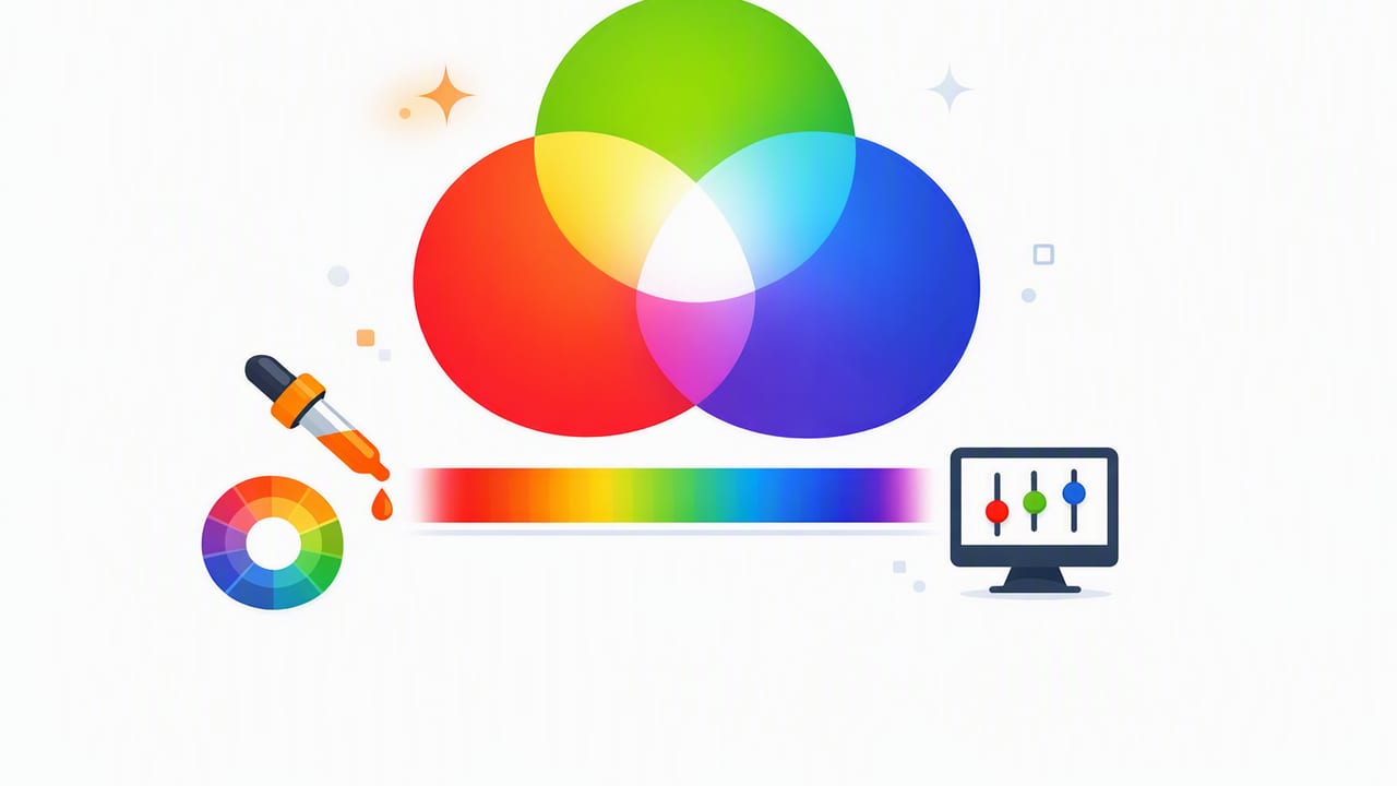
RGB is an additive color model that creates colors by combining light from three channels: Red, Green, and Blue. Each channel has an intensity value—typically from 0 to 255 in 8-bit color. When you add light together:
- (0, 0, 0) is black (no light).
- (255, 255, 255) is white (full intensity of all channels).
- (255, 0, 0) is pure red; (0, 255, 0) pure green; (0, 0, 255) pure blue.
Because screens emit light, RGB is the native “language” of digital design. Even when you see a HEX color like #1E90FF, it’s simply another way to represent the same underlying RGB values.
How to Read RGB Values (and Spot Common Mistakes)
An RGB color is usually written like this:
rgb(30, 144, 255)That means:
- Red = 30
- Green = 144
- Blue = 255
Common mistakes that cause mismatches
- Mixing up ranges: some tools show RGB as 0–255, others as 0–1 (floats). For example,
rgb(1, 0.5, 0)in 0–1 space is not the same asrgb(1, 0.5, 0)in 0–255 space. - Sampling compressed images: JPEG compression introduces artifacts that can shift channel values slightly, especially in gradients and shadows.
- Ignoring color profiles: the same pixel values can appear different if one app interprets them as sRGB while another assumes a different profile.
RGB vs HEX vs HSL/HSB: Which Should You Use?
Most workflows bounce between formats. RGB is ideal for screen-based work and for programmatic design systems. HEX is a compact notation used heavily in web design. HSL/HSB can be easier when you want to adjust color relationships (like “make it 15% lighter” without changing hue).
| Model | Best for | Example | Notes |
|---|---|---|---|
| RGB | Digital design, UI, coding, color sampling | rgb(30, 144, 255) |
Directly matches how screens render light |
| HEX | Web CSS, sharing colors quickly | #1E90FF |
Just a different representation of RGB |
| HSL | Adjusting hue/saturation/lightness intentionally | hsl(210, 100%, 56%) |
More intuitive for “lighter/darker” edits |
| HSB/HSV | Creative tools, palette building, tints/shades | hsb(210, 88%, 100%) |
Common in design apps; “brightness” is useful for contrast planning |
RGB to HEX (quick mental model)
HEX encodes each channel (0–255) into two hexadecimal digits (00–FF). So:
30becomes1E144becomes90255becomesFF
Result: rgb(30, 144, 255) → #1E90FF
Why Your RGB Color Looks Different Across Screens
It’s easy to blame “bad luck,” but color shifts usually come from predictable causes. Understanding them helps you design palettes that hold up in real-world viewing.
1) Display calibration and device variability
Different screens have different brightness, contrast, and gamut. A vivid RGB blue on a wide-gamut display may appear flatter on a standard laptop panel.
2) Color management and profiles
Most web and UI design assumes sRGB. If an image is tagged with another profile (or untagged), different apps may interpret its RGB values differently.
3) Transparency and blending
An RGB value on its own is not the full story when alpha blending is involved. For example, rgba(0,0,0,0.2) over white and over a photo will look completely different, even though the RGB values are identical.
4) Context and simultaneous contrast
Colors are perceived relative to their surroundings. The same RGB color chip can feel warmer or cooler depending on adjacent hues and background lightness.
Color is not just a value—it’s a relationship.
A Practical Workflow: Extract Accurate RGB Values From Photos
If your goal is to build palettes from real-world inspiration (interiors, packaging, nature, fashion), your workflow matters as much as the tool you use. Here’s a reliable, repeatable method.
Step 1: Choose the right source photo
- Prefer even lighting (avoid strong color casts from tungsten/LED mixes).
- Use higher-resolution images; avoid heavy compression.
- If you photographed the scene, shoot in consistent light and avoid “beauty” filters.
Step 2: Sample multiple points per material
Real surfaces aren’t uniform. A painted wall may have subtle shifts due to texture, shadows, and reflections. Instead of grabbing one pixel, sample:
- Highlight area (brightest)
- Midtone area (most representative)
- Shadow area (darkest)
Then choose the midtone as your “base” RGB color and keep highlight/shadow values for supporting tints and shades.
Step 3: Watch out for glare and specular highlights
Shiny objects (tiles, metal, glossy paint) often contain near-white reflections that are not the object’s real color. If your sampled RGB values suddenly jump toward (240,240,240), you probably hit a highlight.
Step 4: Normalize your palette in a consistent color space
For digital design, standardize on sRGB wherever possible—especially when exporting for web, UI, or shared team libraries.
Step 5: Test your palette in context (not as isolated swatches)
Create a quick “palette proof” with:
- Background + surface colors
- Text on those surfaces
- Primary/secondary accent buttons
This is where you’ll discover if your extracted RGB color values need adjustment for contrast or readability.
RGB Color in CSS: Practical Examples You Can Reuse
RGB is especially useful when you want transparency or when design tokens are generated programmatically.
1) Using RGB and RGBA
:root {
  --brand-blue: rgb(30, 144, 255);
  --brand-blue-20: rgba(30, 144, 255, 0.2);
}

.button {
  background: var(--brand-blue);
  box-shadow: 0 8px 20px var(--brand-blue-20);
  color: white;
}
2) Converting a palette into simple tokens
:root {
  --bg: rgb(248, 247, 244);
  --surface: rgb(255, 255, 255);
  --text: rgb(24, 24, 28);
  --muted: rgb(120, 124, 133);
  --accent: rgb(30, 144, 255);
}
This approach makes it easy to keep a consistent RGB color set across web, prototypes, and documentation.
How to Choose an RGB Palette That Actually Works
Extracting RGB values is only the start. A usable palette needs hierarchy, contrast, and a plan for states (hover, pressed, disabled). Use these guidelines:
Build roles, not just swatches
- Neutrals: background, surface, border, text
- Accents: primary action, links, highlights
- Support colors: success/warning/error, if needed
Create tints and shades from your base RGB color
If you start with a base accent like rgb(30, 144, 255), generate lighter and darker steps for UI states. Many designers do this in HSL/HSB for easier control, but you can store final outputs as RGB tokens.
Check contrast early
Even a beautiful RGB palette can fail if text contrast is too low. Test your text color on background and surface colors, and adjust lightness until you get comfortable readability.
Troubleshooting: When RGB Color Extraction Feels “Off”
- The photo is color-cast: indoor lighting often adds yellow/orange; shade adds blue. Sample from a neutral area (white/gray) to judge the cast and compensate.
- You sampled a shadow: shadows reduce channel values unevenly. Use midtones for base palette decisions.
- Your palette lacks neutrals: without stable neutrals, accents can feel too intense or too dull.
- Export format changed values: ensure your exports preserve sRGB and avoid unnecessary recompression.
A Simple Checklist for Consistent RGB Color Work
- Work in (and export to) sRGB for screen-first projects.
- Sample multiple points per material; choose midtones as base.
- Don’t trust highlights—avoid glare and reflections.
- Convert and store colors as tokens (RGB/HEX) with clear roles.
- Test colors in context: text, buttons, backgrounds, and real layouts.
Bringing It All Together
RGB color is more than a set of numbers—it’s the most direct representation of how digital displays create light. When you understand what those values mean, how they convert to HEX and HSL/HSB, and how lighting and profiles affect extraction from photos, you can build palettes that stay consistent across tools and screens.
If you regularly pull RGB values from real-world images to speed up palette building on iPhone or iPad, a color-extraction tool like Color Viewfinder can streamline sampling and exporting—especially when you want both RGB and complementary formats in one place.
