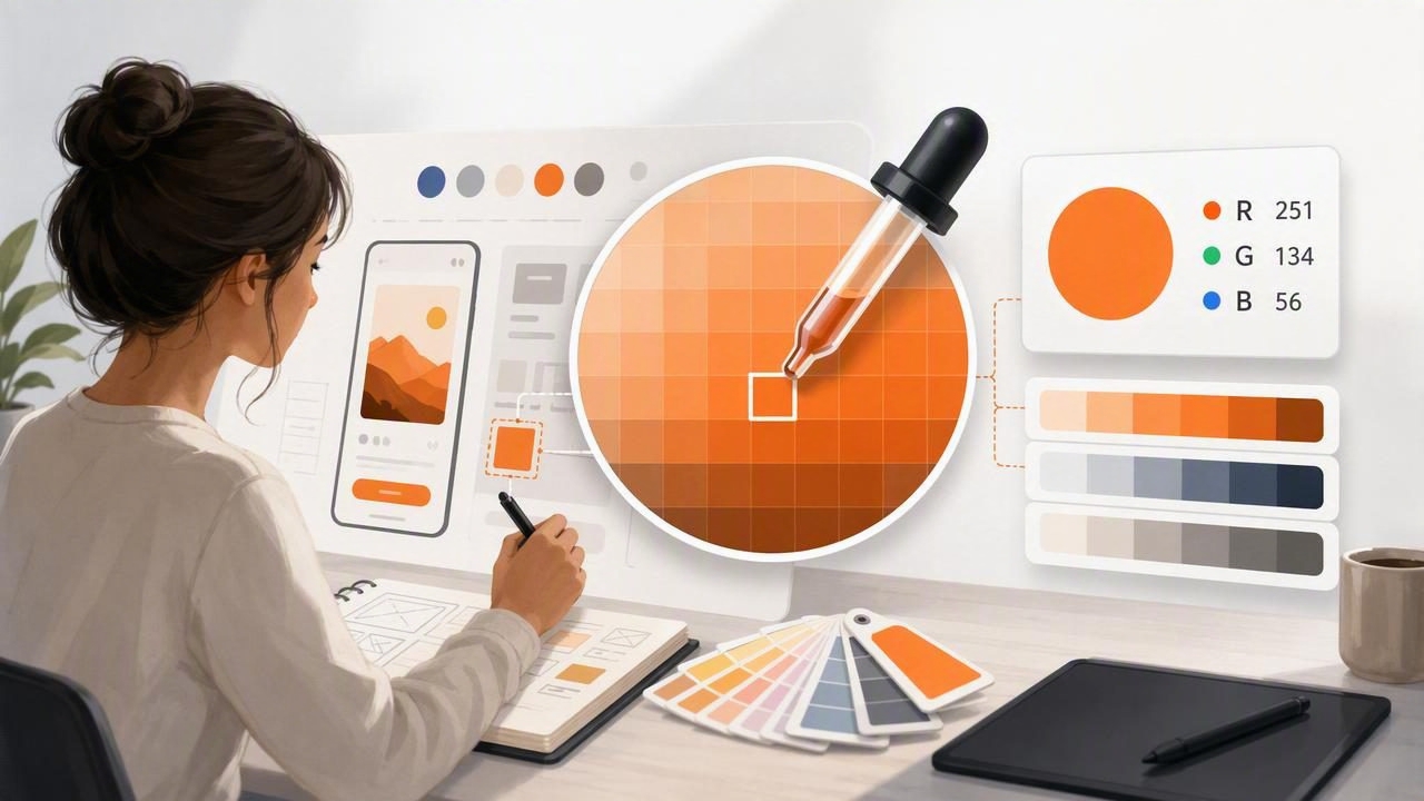
An RGB color picker for UI designers is more than a convenient way to copy a color value. It is a practical design tool for translating visual inspiration into consistent, accessible, and reusable interface decisions. Whether you are studying a product screenshot, aligning a new feature with an existing brand system, or extracting tones from photography, accurate RGB values help turn subjective color choices into documented design tokens.
Modern interface work happens across screens, devices, operating systems, and handoff tools. A color that looks close enough in one mockup can become noticeably inconsistent when it is used for buttons, states, backgrounds, icons, and data visualizations. A deliberate workflow with an RGB picker reduces that risk. It gives designers a clear starting point, helps teams communicate color precisely, and makes it easier to convert colors into HEX, HSL, or other formats required by design and development tools.
Why RGB Still Matters in UI Design
RGB stands for red, green, and blue, the additive color model used by digital displays. Each channel typically has a value from 0 to 255. Combining those channels creates the colors displayed on phones, tablets, monitors, and web browsers.
For example, a familiar interface blue may be expressed as:
RGB(36, 99, 235)
HEX #2463EB
HEX is often the format designers and front-end developers exchange most frequently, but RGB is valuable because it exposes the individual channel balance behind a color. That can help when adjusting a tone intentionally. Lowering the blue channel, for example, may make a cool neutral feel less icy; increasing red and green together can warm a gray without pushing it fully into brown.
An RGB color picker is especially useful when working from an image, screenshot, or real-world reference. Instead of estimating a color visually, you can sample it, inspect its components, and decide whether it belongs in the final interface palette.
What to Look for in an RGB Color Picker
Not every picker is equally useful for product and graphic design work. The best option depends on your workflow, but several capabilities make color sampling faster and more dependable.
- Precise sampling: The picker should let you inspect a small area or individual pixel rather than forcing a broad average.
- Multiple color formats: RGB, HEX, HSL, and HSB values make it easier to move between design, code, and visual adjustment workflows.
- Image support: Importing screenshots, brand references, photography, or sketches is essential when deriving a palette from existing visual material.
- Palette saving: Keep related samples together so a temporary exploration can become a reusable project resource.
- Export options: A picker should help you share colors with teammates rather than trapping values inside one device or file.
- Clear value display: Large, readable numbers reduce transcription mistakes when you are moving quickly between apps.
Accuracy is important, but context is equally important. A sampled pixel may represent compression noise, an anti-aliased edge, a highlight, or a shadow—not the intended base color. Treat a color picker as a measurement tool, then apply design judgment before adopting the result.
A Step-by-Step RGB Color Picker Workflow
1. Start with a useful visual reference
Choose an image that has a clear purpose. It might be a current product screen, a client logo, a campaign photograph, a material sample, or an interface you are auditing. Avoid beginning with a random inspirational image when the goal is to build a functional UI system. The closer the source is to the product’s intended tone, audience, and environment, the more useful your extracted colors will be.
For an app redesign, capture the current key screens first. This gives you a factual record of the colors users already recognize, including primary actions, background surfaces, alerts, dividers, and text.
2. Sample representative areas, not edges
Use your RGB color picker to sample the center of a flat color area whenever possible. Edges can contain blended pixels created by anti-aliasing, shadows, gradients, or image compression. A sample taken from a button border may not match the button fill. Likewise, sampling a bright reflection from a photograph may produce a value that is too light to serve as a reliable brand neutral.
Take multiple samples from large areas and compare the results. If values vary slightly, select the value that best represents the intended visual color rather than treating every pixel as a separate palette candidate.
3. Group colors by interface role
A collection of attractive swatches is not yet a usable UI palette. Assign every promising color a role. Roles create structure and stop teams from using a sampled color inconsistently.
| UI role | Typical purpose | Example RGB value |
|---|---|---|
| Primary | Main actions, active controls, links | RGB(36, 99, 235) |
| Primary hover/pressed | Interactive feedback | RGB(29, 78, 216) |
| Surface | Cards, panels, elevated content | RGB(255, 255, 255) |
| Background | Page or application canvas | RGB(248, 250, 252) |
| Text primary | Headings and body copy | RGB(15, 23, 42) |
| Success | Positive status and confirmations | RGB(22, 163, 74) |
This approach is more scalable than naming colors only by appearance, such as “bright blue” or “light gray.” Semantic names describe how a color should behave in the interface.
4. Convert and document the values
RGB values are easy to inspect, but different tools require different formats. Document each approved color in RGB and HEX at minimum. HSL can also be useful when creating controlled lighter and darker variants because hue, saturation, and lightness are easier to reason about separately.
Primary / 500
RGB: 36, 99, 235
HEX: #2463EB
HSL: 224, 83%, 53%
Keep the source image, sampling date, intended role, and any accessibility notes with your palette. That small amount of documentation prevents a common handoff problem: a developer receives a HEX value but does not know whether it is for default, hover, disabled, dark mode, or decorative use.
From Sampled RGB Values to a UI Color System
Extracted colors should inform a system, not replace one. A photo may provide a beautiful accent color, but it rarely provides every value needed for robust interface states. UI design requires readable text, visible focus indicators, error feedback, selected states, disabled controls, charts, and often both light and dark themes.
Build out a controlled scale around important colors. Instead of choosing ten unrelated blues, create tonal steps that support specific uses. For example, a lighter step may support tinted backgrounds, a middle step may serve buttons and links, and darker steps may support hover states or text on light surfaces.
- Select a sampled base color that fits the brand or visual direction.
- Check whether it works as a foreground, background, or accent.
- Create lighter and darker variants with intentional contrast changes.
- Test the colors in realistic components, not isolated swatches alone.
- Assign semantic tokens such as
color-action-primaryorcolor-text-muted.
When a sampled color fails a functional test, do not force it into a critical role. Preserve it as an illustration accent, marketing color, or decorative detail, then choose a more accessible alternative for interactive UI.
Check Contrast Before Finalizing Colors
Color accuracy does not guarantee usability. A precise RGB sample can still create text that is hard to read or controls that are difficult to distinguish. Contrast testing should happen as soon as a color is assigned to text, an icon, a border, or an action.
As a practical baseline, body text generally needs a contrast ratio of at least 4.5:1 against its background. Larger text may have different thresholds, but aiming for strong readability remains a good design decision even when minimum requirements are met. Also test non-text elements: focus rings, selected tabs, charts, form errors, and status badges must remain distinguishable.
Sampled color is inspiration; tested color is a usable interface decision.
Evaluate colors in real screens with actual content. A gray that appears clear on a white artboard may disappear beside a card shadow, image background, or disabled field. Review on physical devices as well, because screen brightness and environmental light can change perceived contrast.
Common RGB Picker Mistakes UI Designers Can Avoid
- Using every extracted color: A source image may contain hundreds of hues. A focused UI palette is usually more coherent and easier to maintain.
- Copying screenshot colors without context: An existing screen may contain legacy inconsistencies, overlays, or temporary states.
- Ignoring opacity: A sampled value from a translucent layer may look different over another background. Document alpha values separately.
- Skipping interaction states: A primary button needs more than one attractive base color; it needs hover, pressed, focus, disabled, and loading behavior.
- Relying on color alone: Error, success, and selection states should also use labels, icons, patterns, or other visual cues.
- Failing to centralize tokens: Repeated one-off HEX values lead to drift as the product grows.
Make Color Extraction Part of Your Design Process
An RGB color picker for UI designers is most effective when it supports a repeatable sequence: collect references, sample carefully, organize values by role, test them in components, verify contrast, and document approved tokens. This process gives you the creative freedom to draw from photography, branding, interiors, and everyday visual references without sacrificing interface consistency.
For designers who want to capture RGB, HEX, HSL, and HSB values from photos while building shareable palettes on iPhone or iPad, Color Viewfinder can fit naturally into that early color-exploration stage.
