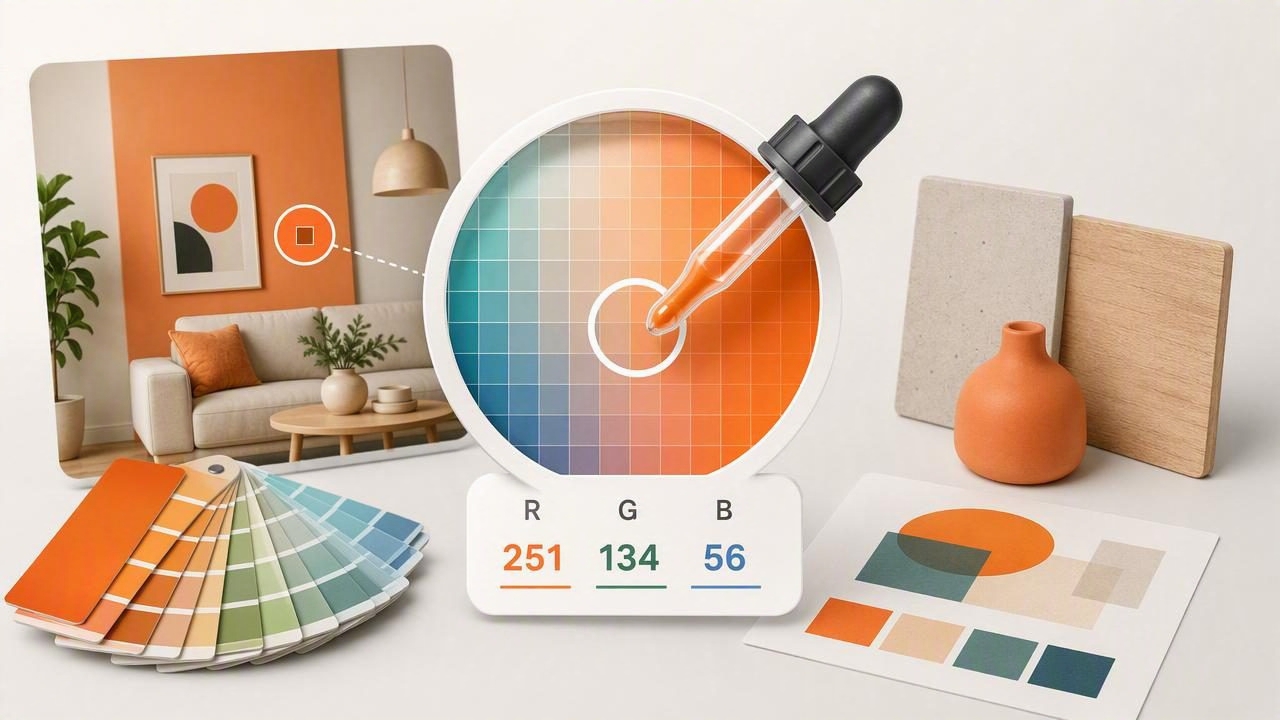
An RGB color picker is one of the most useful tools for translating visual inspiration into usable color data. Whether you are designing a website, creating a brand palette, editing a social graphic, or planning an interior project, a color picker helps you identify the exact red, green, and blue values behind a color you see in a photo or on screen.
Instead of guessing whether a shade is warm gray, dusty blue, or muted sage, you can sample it and get measurable RGB values in seconds. Those values can then be converted into HEX, HSL, or HSB formats for different creative tools and workflows.
This guide explains how an RGB color picker works, how to interpret RGB values, how to sample colors accurately, and how to turn individual samples into practical color palettes.
What Is an RGB Color Picker?
An RGB color picker is a tool that identifies or creates colors using the RGB color model. RGB stands for red, green, and blue—the three light-based channels used by digital displays. By combining different levels of red, green, and blue light, screens can produce millions of visible colors.
Each channel usually has a numeric value from 0 to 255:
- 0 means none of that color channel is present.
- 255 means the channel is at full intensity.
- Values between 0 and 255 create lighter, darker, brighter, or more muted colors.
For example, pure red is represented as RGB(255, 0, 0). It contains maximum red light and no green or blue light. White is RGB(255, 255, 255), while black is RGB(0, 0, 0).
| Color | RGB Value | What It Means |
|---|---|---|
| Red | RGB(255, 0, 0) | Full red channel only |
| Green | RGB(0, 255, 0) | Full green channel only |
| Blue | RGB(0, 0, 255) | Full blue channel only |
| White | RGB(255, 255, 255) | All channels at full intensity |
| Black | RGB(0, 0, 0) | No light in any channel |
| Soft gray | RGB(180, 180, 180) | Equal channel values create neutral gray |
Why RGB Values Matter in Digital Design
RGB is the language of light-based design. Websites, apps, presentations, digital advertisements, images, and social content all appear on screens, making RGB a core format for graphic design.
When you use an RGB color picker, you replace vague descriptions with exact specifications. A client may call a color “deep navy,” but that label can refer to dozens of different shades. An RGB value such as RGB(21, 43, 75) gives every collaborator a precise reference.
RGB values are especially valuable when you need to:
- Match colors from a logo, photograph, or existing design asset.
- Create consistent colors across websites, apps, and social media graphics.
- Check whether a sampled color is too bright, dark, cool, or warm.
- Share color specifications with developers and other designers.
- Build color palettes from visual references without relying on memory.
For web work, RGB is often converted to HEX. For example, RGB(52, 104, 173) becomes #3468AD. Both formats describe the same screen color, but HEX is especially common in CSS and design systems.
How an RGB Color Picker Samples a Photo
Most RGB color pickers work like a digital eyedropper. You upload or open an image, move a selection point over a pixel, and the tool reads the red, green, and blue values at that location. Some tools also show an enlarged pixel view, which helps you select a precise part of the image.
Sampling a photo can be more complex than choosing a solid swatch. Real-world images contain shadows, highlights, reflections, texture, grain, and changing light. A green wall may appear warmer near a window and cooler in a shaded corner. Fabric may include many slightly different colors because of its weave.
For that reason, the first sampled RGB value is not always the final color you should use. Treat it as useful data, then compare nearby samples and consider the larger visual context.
Simple RGB Sampling Workflow
- Choose a clear, well-lit photo of your subject.
- Open the image in an RGB color picker.
- Zoom in before selecting a small area.
- Avoid bright glare, deep shadows, and heavily compressed edges.
- Sample several nearby points rather than trusting one pixel.
- Save the most representative values in a color palette.
- Export RGB and HEX values for the tools used in your project.
A color sample is most useful when it represents the material or design element—not an accidental shadow, reflection, or camera artifact.
How to Read RGB Values More Confidently
You do not need to memorize every possible RGB combination, but learning a few patterns makes color selection faster. Start by comparing the three channel values.
- If all three values are similar, the color is likely neutral or nearly neutral.
- If red is much higher than green and blue, the color will lean red, orange, or pink.
- If green is dominant, the color will tend toward green, lime, olive, or teal.
- If blue is dominant, expect blue, violet, navy, or cool gray tones.
- High values across all channels generally create lighter colors.
- Low values across all channels generally create darker colors.
Consider these examples:
RGB(242, 231, 214) = warm cream
RGB(67, 83, 91)    = cool charcoal blue-gray
RGB(111, 139, 91)  = muted natural green
RGB(196, 103, 87)  = softened terracotta
The values do not just identify a color; they reveal relationships. In the warm cream example, red is highest and blue is lowest, creating a subtle yellow-orange warmth. In the blue-gray example, blue is higher than red, which gives the dark neutral a cooler feeling.
RGB vs. HEX, HSL, and HSB
One color can be represented in several ways. An effective color workflow often includes more than one format because each format answers a different question.
| Format | Best Use | Example |
|---|---|---|
| RGB | Digital displays and developer handoff | RGB(52, 104, 173) |
| HEX | CSS, web design, design systems | #3468AD |
| HSL | Adjusting hue, saturation, and lightness | HSL(214, 54%, 44%) |
| HSB/HSV | Visual color adjustment in creative apps | HSB(214, 70%, 68%) |
RGB is ideal for accuracy, but HSL and HSB can be easier when making deliberate adjustments. If a sampled blue is correct but too dark for a background, you may prefer to increase its lightness or brightness rather than manually changing all three RGB channels.
For a practical workflow, save multiple formats whenever possible. That gives graphic designers, developers, decorators, and clients the information they need without repeated conversion.
Using an RGB Color Picker for Graphic Design
In graphic design, color sampling is often the fastest way to build a cohesive visual direction. A single photograph can provide background colors, accent tones, neutrals, and text-color inspiration. For instance, a coastal image may contain pale sand, blue-gray water, dark slate rocks, and a warm sunset accent.
Rather than extracting every visible shade, choose colors with distinct roles:
- Primary color: the leading brand or composition color.
- Secondary color: a supporting tone that expands flexibility.
- Accent color: a higher-contrast shade for calls to action or focal details.
- Light neutral: useful for backgrounds and open space.
- Dark neutral: useful for type, borders, and visual balance.
Once you have selected colors, test them together in a real layout. A palette that looks beautiful as isolated swatches may not provide enough contrast for text, buttons, icons, or data visualizations.
Using RGB Samples for Interior Design Inspiration
An RGB color picker can also support interior design planning, especially during the early inspiration stage. Sample colors from furniture, artwork, tile, plants, textiles, or architecture to create a digital reference palette.
However, screen color should not be treated as an exact paint or fabric match. Physical materials respond to daylight, artificial lighting, finish, texture, and surrounding colors. A wall paint can look dramatically different in a north-facing room than it does in a product photo.
Use RGB values to organize your visual direction, compare undertones, and communicate a preferred mood. Then confirm final material choices with physical paint chips, fabric samples, or manufacturer specifications.
Common RGB Color Picker Mistakes to Avoid
- Sampling only one pixel: A single pixel may capture noise or a reflection. Compare several samples.
- Ignoring image lighting: Golden-hour photos and indoor lighting can shift colors noticeably.
- Choosing colors from blurry edges: Compression and anti-aliasing can create inaccurate mixed pixels.
- Using too many colors: A focused palette is usually easier to apply consistently.
- Skipping accessibility checks: Text and interface elements need sufficient contrast.
- Expecting screen values to match print: Print commonly uses CMYK, which has a different color range.
Build Better Palettes From RGB Data
The best RGB color picker workflow combines measurement with judgment. Use precise numeric values to capture what you see, then refine the palette based on contrast, purpose, mood, and the medium where it will appear.
For creative projects, it helps to name your saved colors by role rather than only by appearance. Labels such as primary navy, background cream, terracotta accent, and body-text charcoal make a palette much easier to use later.
A mobile color extraction tool such as Color Viewfinder can make this process more convenient by turning photos into organized palettes with RGB, HEX, HSL, and HSB references ready to save or share.
