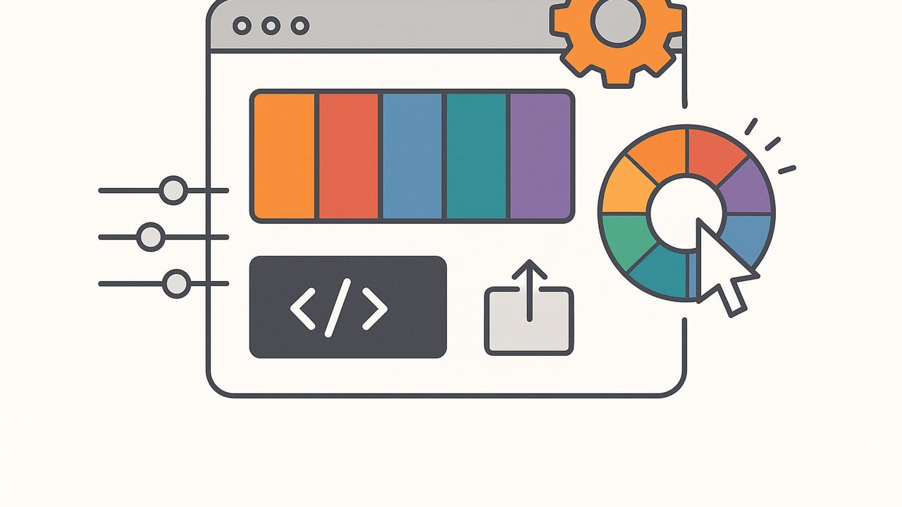
A modern color palette creator does far more than pick a few pretty swatches. It analyzes images, balances harmony rules, converts between color models, and packages your palette for code and design tools. Whether you’re building a brand system, refreshing a UI kit, or sampling hues from a photo, understanding how palette creators work helps you get cleaner results, faster.
This guide explains the algorithms behind color extraction, how to measure accuracy, accessible contrast rules, practical workflows, and exports that slot straight into design and development pipelines. If you’ve ever searched for a reliable color palette creator, use these principles to evaluate tools and improve your own process.
What a Color Palette Creator Actually Does
At a high level, palette creators perform three jobs:
- Extraction: Find dominant or representative colors from an image or screenshot.
- Generation: Create harmonized palettes from a base hue or seed color using rules (analogous, triadic, etc.).
- Conversion & Export: Convert between models (HEX, RGB, HSL/HSB, Lab) and export to formats used by design and code.
Under the hood, the choice of color space matters. Most screens display sRGB or Display P3, but clustering and distance calculations are more perceptually accurate in CIE Lab or LCH. A good color palette creator often converts pixel data to Lab/LCH before clustering, then outputs swatches in designer-friendly formats like HEX, RGB, HSL, and HSB.
Algorithms Behind Palette Extraction
Palette extraction is essentially a quantization problem: reduce thousands of colors to a handful without losing perceptual intent. Different algorithms trade speed for fidelity.
K-Means Clustering
How it works: Repeatedly assigns pixels to the nearest centroid and updates centroids until convergence. Works best when run in Lab/LCH with smart initialization (k-means++).
Pros: Flexible, strong for varied scenes. Cons: Sensitive to initialization, may miss small but important accents.
Median Cut
How it works: Recursively splits the color space along the longest axis to equalize population per bucket, then averages each bucket.
Pros: Fast, deterministic. Cons: Can produce banding and dull highlights/shadows, especially in small palettes.
Octree Quantization
How it works: Builds an octree of colors; trims nodes to reduce color count while preserving densely populated regions.
Pros: Good balance of speed/quality for large images. Cons: Implementation complexity; may overweight mid-tones.
Gaussian Mixture Models (GMM) & Hierarchical Methods
How it works: Models pixel distributions as mixtures of Gaussians; expectation-maximization estimates cluster parameters.
Pros: Captures nuanced color distributions and gradients. Cons: Heavier compute; can overfit without constraints.
| Algorithm | Speed | Perceptual Accuracy | Deterministic | Best For |
|---|---|---|---|---|
| Median Cut | Very fast | Medium | Yes | Quick previews, limited CPU |
| Octree | Fast | Medium–High | Yes | Large images, balanced quality |
| K-Means (Lab) | Medium | High | No (unless seeded) | General-purpose palettes |
| GMM | Slower | Very High | No | Photography, nuanced gradients |
Tip: Whichever algorithm you choose, sample pixels evenly (or using stratified sampling) and do calculations in Lab/LCH to better reflect human perception.
Measuring Color Accuracy
Evaluating a color palette creator means checking how close extracted swatches are to the image’s perceptual colors and how stable the palette is under different inputs.
- Use Lab + ΔE metrics: Compute Delta E (ΔE 76/94/2000) between candidate swatches and ground truth patches. ΔE00 is the most perceptually uniform.
- Normalize lighting: White-balance images or sample from neutral patches; raw phone photos can shift warm/cool dramatically.
- Color profile consistency: Convert Display P3 assets to sRGB before clustering if your output targets the web.
- Downscale wisely: Reducing image size speeds analysis but can erase accents; try bicubic downscale to around 1–2 megapixels for balance.
Quick ΔE Check (JavaScript)
The following sketch uses a tiny ΔE00 helper to compare two colors in Lab. In production, use a tested library for CIEDE2000.
// Minimal example: convert sRGB to Lab and compute ΔE00
// For accuracy, prefer a library like 'd3-color' + 'd3-cielab' or 'colorjs.io'.
function srgbToXyz(c){
  c = c.map(v => v/255);
  const lin = c.map(v => v <= 0.04045 ? v/12.92 : Math.pow((v+0.055)/1.055, 2.4));
  const [r,g,b] = lin;
  return [
    r*0.4124 + g*0.3576 + b*0.1805,
    r*0.2126 + g*0.7152 + b*0.0722,
    r*0.0193 + g*0.1192 + b*0.9505
  ];
}
function xyzToLab([x,y,z]){
  const ref=[0.95047,1.00000,1.08883];
  const f = t => t > 0.008856 ? Math.cbrt(t) : (7.787*t + 16/116);
  const [xr,yr,zr]=[x/ref[0], y/ref[1], z/ref[2]];
  const fx=f(xr), fy=f(yr), fz=f(zr);
  return [116*fy-16, 500*(fx-fy), 200*(fy-fz)]; // L, a, b
}
function hexToRgb(hex){
  const m = hex.replace('#','');
  return [
    parseInt(m.slice(0,2),16),
    parseInt(m.slice(2,4),16),
    parseInt(m.slice(4,6),16)
  ];
}
// Placeholder ΔE2000 approximation (use a proper implementation for real work)
function deltaE00(lab1, lab2){
  const dl = lab1[0]-lab2[0];
  const da = lab1[1]-lab2[1];
  const db = lab1[2]-lab2[2];
  return Math.sqrt(dl*dl + da*da + db*db); // Using Euclidean as a rough proxy
}
function deBetween(hex1, hex2){
  const lab1 = xyzToLab(srgbToXyz(hexToRgb(hex1)));
  const lab2 = xyzToLab(srgbToXyz(hexToRgb(hex2)));
  return deltaE00(lab1, lab2);
}
console.log('ΔE (rough):', deBetween('#3366FF', '#2F5FE8'));
For acceptance criteria, many teams aim for average ΔE00 under 2 for brand-critical swatches and under 5 for general UI accents.
Building Palettes from Scratch (Without an Image)
When you’re not sampling a photo, you can generate a palette from a seed color. Popular harmony rules:
- Analogous: Adjacent hues on the wheel, great for calm, unified designs.
- Complementary: Opposite hues; high contrast, high energy.
- Split-Complementary: Opposite-side neighbors; contrast with less tension.
- Triadic/Tetradic: Three or four evenly spaced hues; balanced yet vibrant.
In HSL, vary H for harmony, then build tints (raise L, lower S) and shades (lower L, sometimes raise S) to create usable ramps.
Generate Tints & Shades (JavaScript)
// Given a base color in HSL, produce tints and shades
function clamp(v, min=0, max=1){ return Math.max(min, Math.min(max, v)); }
function hsl(h, s, l){ return {h, s: clamp(s), l: clamp(l)}; }
function mix(a, b, t){ return a + (b - a) * t; }
function makeRamp(base, steps=5){
  const ramp=[];
  for(let i=steps; i>0; i--) { // shades
    ramp.push(hsl(base.h, mix(base.s, 0.9, i/steps), mix(base.l, 0.15, i/steps)));
  }
  ramp.push(base);
  for(let i=1; i<=steps; i++) { // tints
    ramp.push(hsl(base.h, mix(base.s, 0.25, i/steps), mix(base.l, 0.95, i/steps)));
  }
  return ramp;
}
const base = hsl(210/360, 0.65, 0.5); // blue
console.log(makeRamp(base));
Convert final HSL swatches to HEX/RGB for use in design tools or code. Small tweaks to saturation across the ramp improve perceived uniformity, especially on dark modes.
Accessibility and Contrast
A palette is only usable if it supports readable typography and distinguishable UI states. Follow key WCAG guidance:
- Text contrast: Minimum 4.5:1 for normal text, 3:1 for large text (≥18pt regular, ≥14pt bold).
- Non-text UI: Focus indicators and active states should have a 3:1 contrast ratio against adjacent colors.
- Color alone: Don’t rely on color to convey state; pair with icons, patterns, or text.
- Color vision deficiency: Test for deuteranopia/protanopia/tritanopia; avoid palettes with low luminance contrast.
| Foreground | Background | Contrast Ratio | Text Size | Status |
|---|---|---|---|---|
| #0B1F3B | #FFFFFF | 12.9:1 | Body | Pass (AA/AAA) |
| #3366FF | #F5F8FF | 6.8:1 | Body | Pass (AA) |
| #8892A0 | #FFFFFF | 3.4:1 | Large | Pass (AA large) |
As you refine your palette, keep a neutral anchor (e.g., grays scaled by lightness) for reliable text contrast and UI boundaries.
Workflow: From Inspiration to Export
Here’s a practical, repeatable workflow for turning inspiration into a production-ready palette.
- Capture & Normalize: Acquire your image/screenshots. If possible, correct white balance and ensure consistent color profiles (convert to sRGB for the web).
- Extract Candidates: Run your color palette creator using k-means (in Lab) to get 5–8 dominant swatches. Lock one or two as anchors.
- Refine & Harmonize: Build tints/shades for each anchor; adjust saturation to avoid muddy mid-tones and neon highlights.
- Name Swatches: Use functional names like Primary/Primary-600, Error/Error-500, or domain names like Sand, Terracotta, Ocean. Consistency beats cleverness.
- Check Accessibility: Test contrast for body text, large text, icons, focus rings, charts, and states (hover/active/disabled).
- Document Usage: Define roles: brand, text, background, borders, data visualization. Include do/don’t examples.
- Export for Teams: Provide tokens and files that slot into tools and codebases.
Useful Export Formats
| Format | Best For | Notes |
|---|---|---|
| HEX, RGB, HSL | Web & Mobile | Core formats for CSS, iOS, Android |
| CSS Custom Properties | Front-end | Themeable design systems |
| JSON Design Tokens | Design-to-code | Works with Style Dictionary, tokens pipelines |
| ASE/ACO | Adobe Apps | Importable swatches for Photoshop/Illustrator |
| SVG/PNG Swatch Sheets | Docs & Handoff | Visual reference and quick sharing |
Code-Ready Outputs
Feed your palette into code with tokenized exports. For example, CSS variables:
:root {
  --color-primary-50: #F5F8FF;
  --color-primary-100: #E6EFFF;
  --color-primary-200: #C7DAFF;
  --color-primary-300: #A0BEFF;
  --color-primary-400: #7AA2FF;
  --color-primary-500: #4D84FF;
  --color-primary-600: #3366FF; /* default */
  --color-primary-700: #2B57D6;
  --color-primary-800: #2347AD;
  --color-primary-900: #1B3785;
}
.btn-primary { background: var(--color-primary-600); color: #fff; }
.btn-primary:hover { background: var(--color-primary-700); }
Or JSON tokens:
{
  "color": {
    "primary": {
      "600": { "value": "#3366FF" },
      "700": { "value": "#2B57D6" }
    },
    "text": {
      "base": { "value": "#0B1F3B" },
      "muted": { "value": "#556070" }
    }
  }
}
Common Pitfalls and How to Fix Them
- Overfitting to a single image: A palette that sings on one photo may fail in UI. Validate against grayscale wireframes and sample screens.
- Ignoring gamut: Vibrant Display P3 colors can look dull on sRGB. Clamp or convert early and test on common devices.
- Rounding errors: Repeated conversions (RGB ↔ HSL ↔ Lab) can drift values. Keep high-precision internal representations; round only on export.
- Not accounting for modes: Dark mode needs adjusted lightness ramps and increased contrast for dividers and focus states.
- Color illusions: Surrounding colors shift perception (simultaneous contrast). Judge swatches on neutral backgrounds and in actual UI layouts.
- Too many colors: Limit primary accents; let neutrals carry structure. Extra hues increase cognitive load and maintenance complexity.
Quick Evaluation Checklist
- Does the color palette creator support Lab/LCH for clustering and distance?
- Are algorithms configurable (k-means k value, seeding, sampling density)?
- Can you build multi-stop ramps with consistent lightness steps?
- Are HEX, RGB, HSL, and HSB values visible and copyable instantly?
- Is there a built-in contrast checker and color-blind simulation?
- Do exports include CSS variables and JSON tokens, plus design swatch formats?
- Can you lock anchor colors and refine with tints/shades?
- Is performance smooth on large images and high-resolution photos?
A great palette isn’t just a set of colors—it’s a language your product team can read consistently in design, code, and content.
With these principles in hand, you can evaluate any color palette creator and build production-ready palettes that remain accurate, accessible, and easy to implement. If you prefer creating palettes directly from photos on iPhone or iPad, the app Color Viewfinder can extract HEX colors and provide RGB, HSL, and HSB values with customizable layouts and export options.
