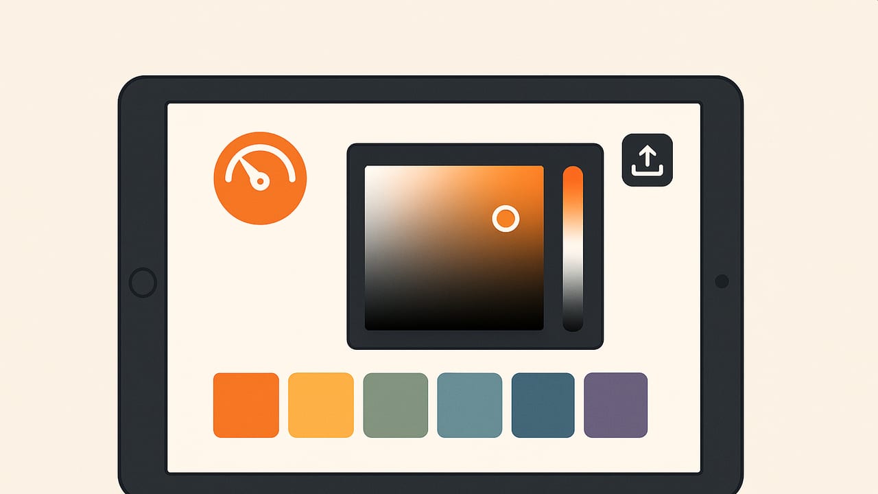
Whether you’re an interior designer, illustrator, or brand stylist, an iPad color app can turn real-world inspiration into accurate digital palettes in minutes. This blueprint walks you through calibration, capture techniques, color model conversions, accessibility checks, and export workflows so your colors travel reliably from photo to palette to production.
Calibrate first, then create. A consistent workflow beats guesswork every time.
Calibrate: Set up your iPad for reliable color
iPads offer bright, high‑gamut displays (often P3) that are excellent for color work, but accuracy depends on your environment and settings. Before you sample a single pixel, get your screen and scene dialed in.
- Disable color-shifting features: Turn off True Tone and Night Shift while working with color. These change white point and warmth, making hues drift.
- Set consistent brightness: Pick a comfortable, repeatable value (e.g., 60–80%) so your perception of contrast remains stable.
- Control ambient light: Avoid mixed lighting (window daylight + warm lamps). Neutral, diffuse lighting reduces color casts when capturing and viewing.
- Mind the gamut: Many workflows end in sRGB (web, UI). If your app supports display P3, preview both P3 and sRGB to avoid unpleasant clipping later.
- Use a gray card when possible: If photographing scenes for palette extraction, include a neutral card to correct white balance consistently.
Remember: tablets are color‑managed, but the world around them isn’t. Consistent settings help ensure the colors you pick today look the same next week.
Capture: Extracting trustworthy color from photos
An iPad color app can sample from photos, screenshots, or live camera feeds. The challenge is minimizing noise, reflections, and compression artifacts that warp your picks.
Photo capture best practices
- Prefer RAW or highest‑quality imagery: RAW (or highest‑resolution HEIC/JPEG) preserves subtle gradients. More data equals cleaner sampling.
- Use diffuse, even light: Harsh lighting produces specular highlights that push samples toward white. Cloudy daylight or soft boxes are your friends.
- Balance white properly: If your app supports setting white balance or applying a gray‑card correction, do it before sampling.
- Avoid extreme angles: Textured surfaces (fabric, paint) shift hue with angle. Shoot perpendicular to minimize metameric effects.
Sampling techniques that boost accuracy
- Zoom to pixel level: Magnify the area so you can see edges, noise, and compression blocks clearly.
- Use a sampling radius: A 3×3 or 5×5 average stabilizes color over grain and JPEG artifacts. Median sampling is more robust when outliers (e.g., a dust pixel) exist.
- Sample away from edges: Edges contain anti‑aliasing and can mix foreground/background. Aim for representative flat areas.
- Repeat and confirm: Sample multiple spots and compare. If your palette hinges on a hero color, you want consensus.
How palette algorithms work (and when to prefer each)
Most iPad color apps use clustering or quantization to find dominant colors. Knowing the basics helps you interpret results:
- Median Cut: Fast and reliable for thumbnails; splits color space into boxes. Can miss small but visually important hues.
- Octree: Efficient tree structure; good for reduced palettes but can show bias in dense regions.
- K‑Means: Iteratively finds cluster centroids; tends to give pleasing, distinct swatches. Sensitive to initial seeds; run multiple times or use k‑means++.
For perceptual accuracy, better apps convert to CIELAB before clustering and rank swatches by area and contrast. Post‑processing often merges near‑duplicates using ΔE (CIEDE2000) to keep palettes clean.
Convert: RGB, HEX, HSL, and HSB explained
You’ll frequently hop between color models. Here’s what they’re good for and where they can mislead.
| Model | Best for | Range | Pros | Gotchas |
|---|---|---|---|---|
| RGB | Screens, compositing | 0–255 or 0–1 | Native to displays, precise | Not intuitive for tweaking lightness |
| HEX | Web, CSS | #RRGGBB / #RGB | Compact, ubiquitous | No explicit alpha; still RGB under the hood |
| HSL | Design adjustments | H 0–360, S/L 0–100% | Intuitive lightness and saturation | Not perceptually uniform; equal steps ≠ equal visual change |
| HSB/HSV | UI pickers, painters | H 0–360, S/B 0–100% | Good for quick bright/dull tweaks | Like HSL, not uniform; brightness is model‑dependent |
Under the hood, color management references a white point (typically D65) and a transfer curve (gamma). If your iPad color app displays P3 but your destination is sRGB, preview both. Highly saturated P3 greens and reds may map to duller sRGB equivalents.
Validate: Check accessibility and contrast
Colors that look beautiful still need to be legible. For web and UI, follow WCAG contrast guidelines:
- Normal text: Contrast ratio ≥ 4.5:1
- Large text (≥ 18pt regular or 14pt bold): ≥ 3:1
- Non‑text UI elements: Use the same ratios for boundaries or adopt APCA for modern perceptual assessment
Pair your foreground and background swatches and test them. Many apps compute contrast instantly; if yours doesn’t, a simple function does the trick.
// Swift: HEX to UIColor and pixel sampling for quick checks
import UIKit
import CoreGraphics

func colorFromHex(_ hex: String) -> UIColor {
    var s = hex.trimmingCharacters(in: .whitespacesAndNewlines).uppercased()
    if s.hasPrefix("#") { s.removeFirst() }
    if s.count == 3 { // e.g., FFF -> FFFFFF
        s = s.map { String([$0, $0]) }.joined()
    }
    guard s.count == 6, let v = Int(s, radix: 16) else { return .clear }
    let r = CGFloat((v >> 16) & 0xFF) / 255.0
    let g = CGFloat((v >> 8) & 0xFF) / 255.0
    let b = CGFloat(v & 0xFF) / 255.0
    return UIColor(red: r, green: g, blue: b, alpha: 1)
}

extension UIImage {
    // Sample color at a point (in points). Accounts for Retina scale.
    func color(at point: CGPoint) -> UIColor? {
        guard let cg = self.cgImage else { return nil }
        let scale = self.scale
        let x = Int(point.x * scale), y = Int(point.y * scale)
        guard x >= 0, y >= 0, x < cg.width, y < cg.height else { return nil }
        var pixel: [UInt8] = [0, 0, 0, 0]
        let cs = CGColorSpaceCreateDeviceRGB()
        guard let ctx = CGContext(data: &pixel,
                                  width: 1, height: 1,
                                  bitsPerComponent: 8, bytesPerRow: 4,
                                  space: cs,
                                  bitmapInfo: CGImageAlphaInfo.premultipliedLast.rawValue)
        else { return nil }
        ctx.translateBy(x: CGFloat(-x), y: CGFloat(y) - CGFloat(cg.height) + 1)
        ctx.draw(cg, in: CGRect(x: 0, y: 0, width: cg.width, height: cg.height))
        return UIColor(red: CGFloat(pixel[0]) / 255.0,
                       green: CGFloat(pixel[1]) / 255.0,
                       blue: CGFloat(pixel[2]) / 255.0,
                       alpha: CGFloat(pixel[3]) / 255.0)
    }
}
You can build a contrast function on top of this to test swatch pairs using WCAG’s relative luminance formula.
Organize: Build, name, and export palettes
A tidy palette accelerates handoff and production. Think like a team, even if you’re solo.
- Use naming conventions: e.g., “Brand/Primary/500” or “Room A/Accent/Warm 1” for clarity.
- Group by role: Backgrounds, foregrounds, accents, neutrals, states (success/error/warning), and borders.
- Store source references: Keep a note of where a color came from (photo name, surface, lighting). You’ll thank yourself later.
Export in the formats your downstream tools will accept.
| Format | Use case | Notes |
|---|---|---|
| HEX/CSV | Web, quick handoff | Include names and roles per row |
| ASE/ACO | Adobe suite | Swatches for Illustrator/Photoshop |
| SVG | Vector workflows | Embed colors in defs or style blocks |
| CSS variables | Front‑end dev | Map tokens to :root custom properties |
| JSON | Design tokens | Perfect for cross‑platform pipelines |
| Procreate swatches | Digital painting | Share .swatches to iPad art workflows |
- Figma: Import via plugins or paste HEX; define as color styles.
- Adobe Illustrator/Photoshop: Import ASE/ACO; assign global swatches.
- Procreate: Import a .swatches file to keep your references on canvas.
- Affinity Designer/Photo: Import palettes and save to the Swatches panel.
Workflow examples for an iPad color app
Interior moodboard on site
- Capture: Photograph key surfaces (paint, fabric, wood) in diffuse daylight with a gray card in one shot.
- Correct: Adjust white balance based on the gray card. Disable True Tone and set screen brightness.
- Sample: Use a 5×5 sampling radius on flat areas to avoid texture bias. Confirm with 2–3 picks per surface.
- Curate: Run clustering (k‑means with 6–8 clusters). Manually promote accent hues that matter even if they’re small in area.
- Validate: Pair likely text and background colors and check contrast ratios.
- Export: Save a JSON design‑token set and a Procreate swatch for sketching.
Brand refresh from inspiration image
- Ingest: Load a high‑res, low‑compression image.
- Reduce noise: Median filter or sample radius to neutralize speckling.
- Cluster: Try k‑means with 5 clusters, then merge close tones using ΔE < 2.0.
- Map roles: Assign primary, secondary, neutrals, and accent tokens.
- Deliver: Export ASE for Adobe, CSS variables for web, and SVG swatches for vector assets.
Troubleshooting and pro tips
- Photos look warmer than reality: Recheck white balance; avoid mixed lighting; turn off Night Shift.
- Swatches change between apps: One app might be P3 and another sRGB. Convert or preview in the target gamut.
- Banding or blocking in gradients: Sample with a larger radius or use RAW images to sidestep compression artifacts.
- Gamut clipping on vivid fabrics: What you see in P3 may not fit sRGB. Keep a P3 master palette and a mapped sRGB export.
- Glossy surfaces read too bright: Sample next to the highlight or use a polarizing filter to cut reflections.
- Small accents disappear in clustering: Lower the cluster count or manually add swatches from targeted picks.
Quick QA: Common color questions
- Do I need a hardware calibrator? iPads don’t accept external LUT calibration, but consistent settings and good lighting go a long way.
- Are iPad displays color‑managed? Yes. Most modern models support wide‑gamut P3 and system‑level color management.
- Which color model should I use for web? Use HEX/RGB for implementation; HSL/HSB are great for exploratory adjustments.
- How many swatches is ideal? For a brand core: 6–10 (including neutrals). For illustration or interiors: 12–24 to cover accents and tones.
- What resolution is enough for sampling? Aim for the original or highest available; avoid heavily compressed screenshots for critical picks.
Make your iPad color app a trustworthy link in the chain
The core of a dependable color workflow is consistency: calibrate your viewing conditions, capture with care, use models and algorithms appropriately, validate contrast, and export in formats your collaborators expect. With those habits, an iPad color app becomes more than a picker—it becomes your portable color lab.
If you prefer an accuracy‑first tool that extracts HEX, RGB, HSL, and HSB from photos and exports palettes in multiple formats, consider Color Viewfinder on iOS and iPad as a streamlined option.
