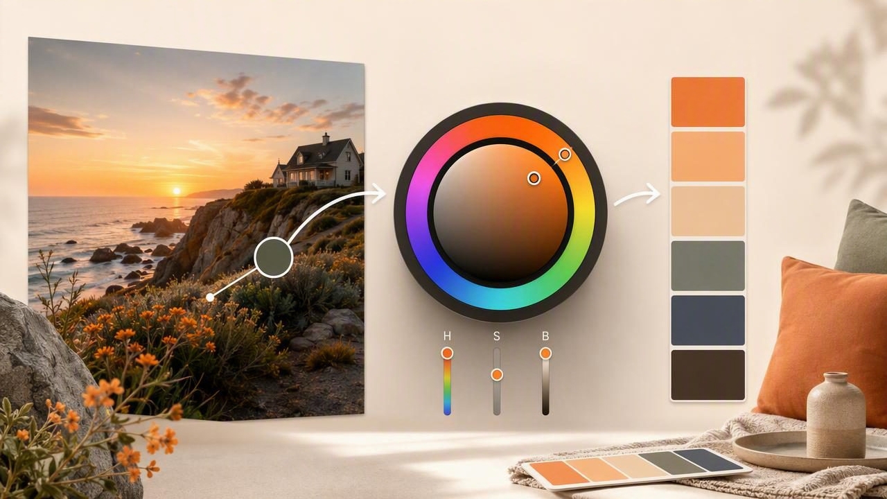
A photograph can be one of the most useful sources of color inspiration. A sunset, painted wall, ceramic tile, garden, fabric sample, or storefront can contain a complete visual direction waiting to be organized. The challenge is moving beyond simply copying attractive colors and creating a palette that is practical, balanced, and easy to use.
When you turn camera images into palettes with an HSB color picker, you can identify the exact hue, saturation, and brightness of colors in a scene. This makes it easier to refine a photo-based palette for graphic design, interior design, digital products, branding, and other creative projects. Instead of relying on visual guesses, you can make deliberate color decisions based on measurable values.
This guide explains how HSB color selection works, how to extract colors from camera images, and how to transform raw samples into a cohesive color palette.
Why Use Camera Images as Palette Sources?
Camera images capture color relationships that can be difficult to invent from scratch. Natural and designed environments already contain combinations of warm and cool tones, lights and shadows, and subtle neutral colors. A photograph can provide both a starting point and a reality check for your palette.
For example, a photo of a coastal landscape may include soft blue-gray water, pale sand, deep navy shadows, weathered green, and a small warm accent from a boat or sunset. Those colors can become a calm website palette, a living room scheme, or a visual identity for a wellness brand.
Color extraction is especially valuable because a photo often includes more nuance than the colors you notice at first glance. Sampling pixels can reveal muted supporting tones, near-black shadows, and off-white highlights that help a design feel more natural and layered.
What Is an HSB Color Picker?
HSB is a color model that describes color through Hue, Saturation, and Brightness. It is sometimes called HSV, where the V stands for value. For many visual tasks, HSB is intuitive because its controls reflect how people commonly describe color.
| HSB component | What it controls | Practical design question |
|---|---|---|
| Hue | The color family, measured from 0° to 360° | Is this blue, orange, green, red, or violet? |
| Saturation | The intensity or purity of the color, from 0% to 100% | Is this color muted and dusty or vivid and energetic? |
| Brightness | How light or dark the color appears, from 0% to 100% | Will this color work as a background, text, shadow, or accent? |
Consider a warm terracotta sample with values of HSB 16°, 68%, 73%. The hue tells you it sits in the orange-red family. Its relatively high saturation gives it warmth and personality, while its brightness keeps it from becoming a dark brown. If you want a calmer version, reduce saturation. If you need a deeper supporting shade, lower brightness while keeping the hue similar.
That level of control is why an HSB color picker is useful after color extraction. It lets you preserve the character of a photographed color while adjusting it for a specific design purpose.
How to Turn Camera Images Into Palettes Step by Step
A strong palette is not simply a collection of sampled pixels. Use the following process to go from image to usable system.
- Choose a focused reference image. Use a photo with a clear mood, material story, or lighting condition. Avoid heavily filtered images when accuracy matters.
- Inspect the image at full size. Look for broad color areas, not only tiny details. Large surfaces often provide better base colors than isolated pixels.
- Sample five to eight candidate colors. Start with dominant tones, then collect shadows, highlights, neutrals, and one or two possible accents.
- View the HSB values. Compare samples by hue, saturation, and brightness to understand their roles in the image.
- Remove duplicates. Two colors may look different in a photo but be too similar to serve distinct functions in a design.
- Adjust for usability. Use HSB controls to soften overly vivid colors, brighten dark tones, or create stronger contrast.
- Assign a role to every selected color. Label each as a background, primary color, secondary color, text color, border, shadow, or accent.
- Test the palette in context. Apply it to a sample layout, room board, social post, or interface before finalizing it.
Sample Colors From the Right Parts of an Image
Where you tap in an image matters. A color picker reads the pixel or small area beneath the selection point, so reflections, noise, compression, and changing light can affect the result. Sampling a glossy leaf, for instance, may return a bright highlight rather than the green you perceive as the leaf’s main color.
For more reliable color extraction, take multiple samples from the same object or surface. Sample the center of a painted wall rather than a corner with shadow. Select the matte area of a textile rather than a shiny fold. In a landscape, collect colors from large consistent areas such as sky, water, stone, or foliage.
Useful rule: Sample the color you want to use, not merely the most visually dramatic pixel in the photograph.
When working with a camera image for interior design, remember that paint, wood, fabric, and metal can look different under daylight and artificial lighting. Use photo-derived values as a planning tool, then verify important material choices with physical samples in the actual space.
Build a Balanced Palette With HSB Values
Once you have extracted colors, HSB makes it easier to identify whether the palette has enough variation. A well-structured palette usually has contrast in brightness, not just differences in hue. Five colors that all have a brightness near 70% may blend together, even if one is green, one is blue, and one is orange.
Use these HSB-based adjustments to create a more flexible palette:
- Make backgrounds quieter: lower saturation and increase brightness for soft, spacious background tones.
- Create hierarchy: reserve high-saturation colors for buttons, calls to action, decorative details, or focal points.
- Develop shades: lower brightness in the same hue family for borders, shadows, headings, or depth.
- Develop tints: reduce saturation and raise brightness to create gentle supporting colors.
- Protect accents: include only one or two energetic colors so they remain visually meaningful.
For example, imagine a palette extracted from a photograph of olive branches on a limestone wall. Your first samples may include olive green, muted sage, warm stone, charcoal shadow, and pale cream. If the olive sample is too dark for a button, you can preserve its hue while increasing brightness slightly. If the sage is too vivid for a page background, lower its saturation until it functions as a restrained wash of color.
Use the 60-30-10 Principle as a Starting Point
The 60-30-10 principle is a simple way to organize a palette. It is not a strict rule, but it can prevent every extracted color from competing for attention.
- 60% dominant color: usually a neutral, pale tone, or large-surface color.
- 30% secondary color: supports the main visual direction and creates structure.
- 10% accent color: provides emphasis, contrast, and personality.
In a digital interface, the dominant color may be an off-white background, the secondary color may appear in navigation and cards, and the accent may be used for key actions. In an interior, the dominant tone could be wall color, the secondary tone upholstery or cabinetry, and the accent a cushion, artwork, or lamp shade.
Convert Your Palette Into Practical Color Formats
HSB is excellent for exploration, but different creative tools require different color formats. Save each selected color in the formats relevant to your workflow.
| Format | Best use | Example |
|---|---|---|
| HEX | Web design, CSS, digital handoff | #C97852 |
| RGB | Screen-based design tools and digital graphics | 201, 120, 82 |
| HSL | CSS adjustments and lightness-based controls | 19°, 52%, 56% |
| HSB | Visual refinement and palette building | 19°, 59%, 79% |
For web projects, document your final colors as variables so the palette remains consistent across pages and components:
:root {
  --color-background: #F1E8D8;
  --color-primary: #66734D;
  --color-dark: #30352B;
  --color-accent: #C97852;
}
Before publishing a digital design, check text contrast separately. A color that looks beautiful beside a photo may not provide enough readability when used for small text. Contrast testing is essential for accessible buttons, body copy, labels, and navigation.
Common Mistakes When Extracting Colors From Photos
Using every color in the image
A camera image can contain hundreds or thousands of distinct colors. A usable palette does not need all of them. Limit the final selection to the colors that support your intended mood and function.
Ignoring lighting and white balance
Warm indoor light can shift white surfaces toward yellow, while blue-hour outdoor light can cool nearly every color in a scene. Decide whether you want to preserve that atmosphere or correct it for a more neutral result.
Choosing accents without enough contrast
An accent color needs a reason to stand apart. Compare its brightness and saturation with nearby colors, especially if it will be used for interactive elements or small details.
Confusing photo accuracy with design usefulness
The exact color from a photograph is not always the best final design color. Adjusting brightness or saturation slightly can improve legibility, consistency, and visual hierarchy while still honoring the image’s original mood.
A Quick Checklist Before You Export
- Does the palette include a light, mid-tone, and dark value?
- Does every color have a clear role?
- Are the accent colors limited and intentional?
- Have you checked text and interface contrast?
- Have you saved HEX, RGB, and HSB values where needed?
- Does the palette still communicate the feeling of the original camera image?
Learning to turn camera images into palettes with an HSB color picker gives you a repeatable method for finding color inspiration and shaping it into a usable visual system. Whether you are planning a brand identity, refreshing a room, creating social graphics, or designing an app interface, the key is to sample thoughtfully and refine with purpose. Tools such as Color Viewfinder can help make that color extraction process more convenient when working from photos on an iPhone or iPad.
