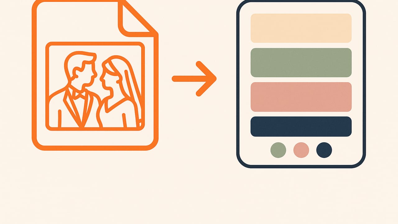
If you’re hunting for wedding palette ideas from a single photo, you’re already on a smart path. A meaningful image—your bouquet, a sunset at your venue, a vintage invitation, or the place you got engaged—can anchor your entire event’s color story with authenticity. This guide shows you how to turn one photo into a cohesive, practical, print-ready wedding palette, with pro steps, real examples, and tips for both digital and physical details.
Design tip: Start with a feeling, not a color. Your photo is a shortcut to that feeling—color just translates it.
Why Begin With a Photo?
Photos compress mood, texture, and context into a single frame, making them perfect for wedding palettes. A good palette should reflect:
- Place: Landscapes, architecture, and lighting influence undertones.
- Memory: Personal significance helps your colors feel intentional.
- Materiality: Fabrics, florals, and paper stocks in the photo suggest realistic, repeatable colors.
Choose the Right Photo
The source image matters more than any tool. Pick a photo that checks these boxes:
- Neutral or natural lighting: Avoid heavy filters and colored LEDs; look for daylight or shaded light for truer hues.
- Visible midtones: You want colors that aren’t only highlights or deep shadows; midtones convert to versatile HEX/RGB/HSL values.
- Rich texture: Bouquets, textiles, wood, stone, and sky gradients yield nuanced palettes.
- Minimal color cast: Watch for grass or walls tinting everything green or beige.
Great candidates: bouquet close-ups, a detail shot of your dress or suit fabric, your venue at golden hour, heirloom jewelry, pressed flowers, or your engagement location.
Extracting a Palette From One Photo: Step-by-Step
- Open the photo at full resolution. Zoom to avoid sampling compressed or pixelated areas.
- Sample 5–7 colors. Try this structure:
- 1 Base (dominant surface or flower)
- 1 Secondary (complementary large-area hue)
- 2 Accents (pops for florals, ribbons, signage)
- 2 Neutrals (light + dark for backgrounds and text)
- Optional: 1 Metallic (gold, silver, copper, champagne)
- Avoid extremes. Don’t pick only pure whites/black or hotspot highlights; grab midtones and subtle variants.
- Record multiple formats. Save HEX, RGB, HSL, and HSB—handy for web, print, and vendor communication.
- Name swatches by role, not just color. For example: Base Sage, Accent Blush, Neutral Dark. Roles help vendors apply colors correctly.
Design Ratios That Just Work
Use the 60–30–10 rule to keep palettes balanced:
- 60% Base
- 30% Secondary
- 10% Accents (split among one or two accents)
Neutrals and metallics float—use them for legibility (dark neutral for type) and highlight moments (metallic foil, flatware, edges).
Hone Your Palette With HSL
HSL (Hue, Saturation, Lightness) is a friendly way to refine colors without losing the photo’s essence:
- Tints: Increase Lightness 10–25% for airy, romantic vibes (great for paper and textiles).
- Shades: Decrease Lightness 10–30% for depth (text, suits, signage).
- Complementary pop: Shift Hue ~180° from your base for a bold accent that still harmonizes.
- Analogous calm: Shift Hue ±20–30° for closely related, serene tones—perfect for elegant weddings.
Make It Real: Print, Fabric, and Venue Light
- Paper stock matters: Uncoated paper softens/sinks color; coated papers appear more saturated. Ask your printer for swatch pulls.
- CMYK conversion: Bright neons and vivid blues may dull. Request CMYK proofs or Pantone spot matches for key hues.
- Metallic realism: Use foil or metallic ink instead of printing a “gold color.” It reads truer in person.
- Lighting checks: Test linens and florals under venue lighting (daylight, tungsten, LEDs) to catch color shifts.
Legibility and Accessibility
Romantic doesn’t mean unreadable. For invitations, menus, and signage:
- Aim for a minimum 4.5:1 contrast ratio for body text; 3:1 for large headlines.
- Reserve a dark neutral for type over light backgrounds, and a light neutral for type on dark fields.
- Test with a contrast checker to ensure names, dates, and directions are crystal clear.
5 Wedding Palette Ideas From a Single Photo
Below are ready-to-use examples, each derived from a plausible photo scenario. Use them as templates or starting points for your own extraction.
1) Coastal Sunset at the Venue
Photo: A beach horizon at golden hour with soft coral clouds and deepening sky.
| Role | HEX | Notes |
|---|---|---|
| Base | #E07A5F | Dusty coral (table florals, bridesmaid dresses) |
| Secondary | #F2CC8F | Muted peach (paper, napkins) |
| Accent 1 | #3D5A80 | Sea blue (ribbons, signage highlight) |
| Accent 2 | #98C1D9 | Hazy sky (small decor pops) |
| Neutral Light | #F4EDE4 | Sand (backgrounds) |
| Neutral Dark | #2B2D42 | Navy (type, suits) |
| Metallic | #C5A572 | Warm gold (foil, flatware) |
2) Garden Bouquet Close-Up
Photo: Sage foliage, blush roses, hints of lavender and butter-yellow ranunculus.
| Role | HEX | Notes |
|---|---|---|
| Base | #A3B18A | Sage (linens, foliage emphasis) |
| Secondary | #EEC9D2 | Blush (invitations, florals) |
| Accent 1 | #C3B7E5 | Soft lavender (ribbons, candles) |
| Accent 2 | #F4E6A6 | Butter (place cards) |
| Neutral Light | #FFF7E9 | Cream (papers) |
| Neutral Dark | #3E3E3E | Charcoal (type) |
| Metallic | #D6C38A | Soft gold |
3) Vintage Library Engagement Shot
Photo: Oxblood leather, mossy green book cloth, warm brass lamps, parchment paper.
| Role | HEX | Notes |
|---|---|---|
| Base | #6A1E1B | Oxblood (statement pieces) |
| Secondary | #556B2F | Moss (linens, accents) |
| Accent 1 | #E9E2D0 | Parchment (papers, signage) |
| Accent 2 | #B08D57 | Brass (decor touches) |
| Neutral Light | #F5F1E8 | Bone (backgrounds) |
| Neutral Dark | #1F1F1F | Ink (type) |
| Metallic | #9C7C38 | Antique gold |
4) Desert Terracotta Elopement
Photo: Red rock cliffs, cactus greens, big blue sky, pink clay trails.
| Role | HEX | Notes |
|---|---|---|
| Base | #C1684F | Terracotta (tableware, florals) |
| Secondary | #7E8D58 | Cactus (linens) |
| Accent 1 | #86BBD8 | Sky (ribbons) |
| Accent 2 | #E3A6A1 | Clay pink (details) |
| Neutral Light | #E9DFD3 | Dune (papers) |
| Neutral Dark | #3B2F2F | Espresso (type) |
| Metallic | #B66E41 | Copper (flatware, foil) |
5) Black-Tie Minimalism
Photo: Tux lapel, ivory dress fabric, emerald boutonniere, champagne bubbles.
| Role | HEX | Notes |
|---|---|---|
| Base | #111111 | Near-black (anchors the look) |
| Secondary | #F5F2EA | Ivory (papers, linens) |
| Accent 1 | #0E7C66 | Emerald (florals, details) |
| Accent 2 | #E6D3A3 | Champagne (soft pop) |
| Neutral Light | #B8B8B8 | Cool gray (balance) |
| Neutral Dark | #2A2A2A | Charcoal (type on light) |
| Metallic | #B9B9BD | Silver (foil, hardware) |
From Palette to Wedding Website: A Quick CSS Setup
Use your extracted HEX values as design tokens. Here’s a snippet using the Coastal Sunset palette:
:root {
  --color-base: #E07A5F;     /* dusty coral */
  --color-secondary: #F2CC8F; /* muted peach */
  --color-accent-1: #3D5A80;  /* sea blue */
  --color-accent-2: #98C1D9;  /* hazy sky */
  --color-neutral-light: #F4EDE4; /* sand */
  --color-neutral-dark: #2B2D42;  /* navy */
  --color-metallic: #C5A572;  /* warm gold */
}

body {
  background: var(--color-neutral-light);
  color: var(--color-neutral-dark);
  font-family: system-ui, -apple-system, Segoe UI, Roboto, sans-serif;
}

.button-primary {
  background: linear-gradient(135deg, var(--color-base), var(--color-secondary));
  color: var(--color-neutral-dark);
  border: 2px solid var(--color-base);
}

.badge-accent {
  background: var(--color-accent-1);
  color: #fff;
}

.card { border: 1px solid color-mix(in srgb, var(--color-neutral-dark) 15%, transparent); }
Pro tip: Keep at least one dark color for text on light backgrounds and one light color for text on dark sections.
Common Pitfalls (and Fast Fixes)
- Color cast from grass or walls: If everything looks a bit green or beige, re-sample from shaded areas or neutral objects (paper, stone) in the photo.
- Over-saturated filters: If you used a strong preset, try the unedited file to avoid neon or unprintable colors.
- All highlights or all shadows: Midtones are more reliable for print. Sample petals or fabric flats instead of bright reflections or deep folds.
- Too many accents: Limit to two accents. Let texture (linen weave, foil, florals) provide interest instead of adding more colors.
- Print disappointment: Convert to CMYK early and request hard proofs. Adjust saturation/brightness after seeing a physical sample.
- Illegible scripts: Pair delicate script fonts with high-contrast color combos and adequate size.
Quick Workflow Checklist
- Select a meaningful, well-lit photo with visible midtones.
- Extract 5–7 swatches: base, secondary, 1–2 accents, light/dark neutrals, optional metallic.
- Save HEX/RGB/HSL/HSB for flexibility across web and print.
- Tune with HSL: tints for romance, shades for depth.
- Apply 60–30–10 to decor, attire, paper goods, and web.
- Check contrast (4.5:1 for body text) to keep everything readable.
- Convert to CMYK and proof on your actual paper stock.
- Test under venue lighting; adjust neutrals or accents as needed.
Frequently Asked Questions
How many colors is ideal?
Five to seven. Fewer can feel flat; more can get chaotic. Distinguish roles (base, secondary, accents, neutrals) so vendors know where each color lives.
Do I need a metallic?
No, but a metallic replaces the need for another accent and photographs beautifully. Choose a metal that complements your undertones: warm palettes love gold/copper; cool palettes lean silver/platinum.
What if my photo is mostly white and black?
Zoom into micro-details—fabric texture, florals, skin tones, jewelry—for subtle hues. Add a single deliberate accent (emerald, navy, blush) to animate the monochrome base.
Can I reuse the palette for signage and a website?
Yes. Use the same HEX variables online and convert to CMYK/Pantone for print. Keep neutrals consistent across mediums to maintain brand-like cohesion.
Bring Your Photo to Palette—Smoothly
Whether you sample on desktop or mobile, the keys are consistent sampling, role-based naming, and real-world testing. If you’re on iPhone or iPad, the Color Viewfinder app can pull HEX, RGB, HSL, and HSB from any photo and export tidy palettes for sharing with planners, printers, and designers.
